A complete history of Pokemon box art
We peruse the covers of the Pokémon series
An earlier version of this article originally appeared on this site on October 12, 2012.
Gotta box 'em all!
Ah, Pokmon--what a colorful, fun franchise. For over a decade (actually, we're approaching two), Nintendo's franchise has sold millions of copies to gamers all around the world. And now, as it enters a new generation, we thought it was time to look back at the box arts that defined the phenomenon.
Join us as we chart the history of the Pokmon series via the visual medium of Pokmon box art, from 1996 to 2013. Along the way we will discover many fascinating things and make many artistic observations. You might learn something. You might not. But one thing's for sure, by the end you will have seen over 70 different Pokmon box arts. Note: Pokmon box arts have been ordered according to Japanese release dates.
Pocket Monsters Red, Green and Blue | 1996
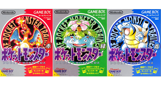
The three boxes that introduced Japanese gamers to Pocket Monsters for the very first time (Red and Green came first, with Blue following a few months later). The covers give a tantalising look at the final evolutionary stages of the games correspondingly coloured starter pokmon--Charizard, Venusaur and Blastoise--each drawn in the unmistakeable style of series character designer and art director Ken Sugimori.
Pokmon Red and Blue | 1998
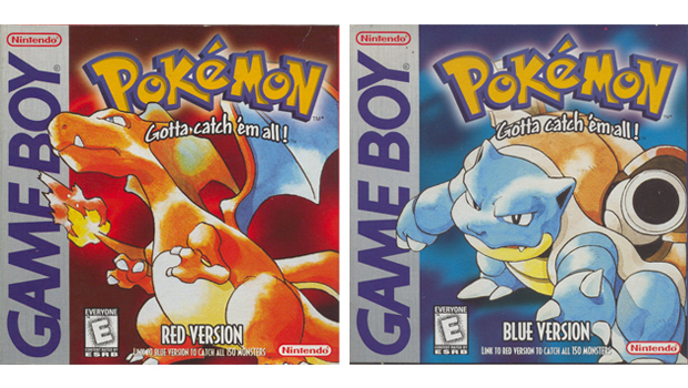
After enjoying massive success in Japan, gamers in the US and UK get their first taste of Pokmon with the original Red and Blue (Green was never released outside Japan). In addition to the confident spatial domination of Sugimoris deftly drawn Charizard and Blastoise, the now-classic Game Boy box designs are emblazoned with the English version of the Japanese Poketto Monsut logo, complete with Gotta catch em all slogan/call to arms. Ubiquity of both the logo and slogan was rapidly established.
Pocket Monsters Stadium | 1998
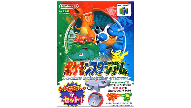
The cover for this Japan-only Stadium title (which featured just 42 of the original 151 pokmon) clearly aimed to capitalise on the soaring popularity of the Pokmon anime series at the time, with adorable show favourite Pikachu making the first of many box art appearances.
3D character renders are preferred to Sugimoris distinctive light water colours to better reflect N64s graphical muscle. Worth mentioning is Charizards left wing, which is oddly transparent, presumably to avoid the word Monster being almost completely obscured.
Sign up to the GamesRadar+ Newsletter
Weekly digests, tales from the communities you love, and more
Pokmon Yellow: Special Pikachu Edition | 1998
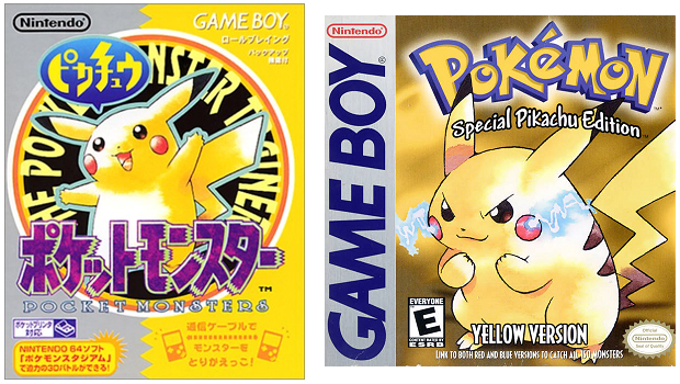
An example of perceived differences in box art consumer tastes with Japanese gamers getting happy Pikachu, while US and UK gamers are treated to angry/determined Pikachu. We want to cuddle both of them, which is testament to the strength of Sugimoris character design and drawing skills.
Hey You, Pikachu! | 1998
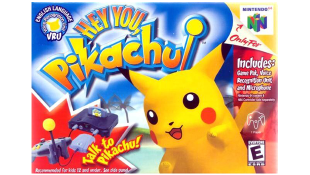
The absence of the iconic logo--this is the only Pokmon box frontage that doesnt feature the distinctive branding--is barely noticeable thanks to the jolly Pikachus hypnotising presence. The logo is loosely styled on the actual Pokmon logo, but with its gradient colour scheme, exaggerated outer glow and severe bevelled embossment, its a far more cartoonified approximation for a Saturday morning TV audience. Cant help but admire the lightning strike incorporated into the K though.
Pokmon Trading Card Game | 1998
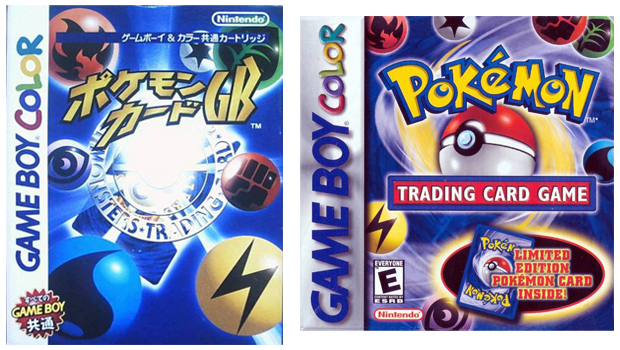
With the actual card game already rinsing kids of their money and an established brand goliath in its own right, its no wonder the box art for this is nothing more than a slightly tweaked version of the art used on the trading cards themselves. In terms of design its not dynamic or exciting or sexy, but brand recognition amongst its target demographic was so high it didnt have to be. This is only one of two Pokmon box-arts which dont feature any actual pokmon. Well come to the other one soon.
In case youre wondering, the Limited Edition Pokmon Card bundled in the box was a special Meowth card.
Pokmon Snap | 1999
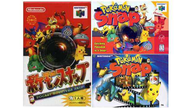
The first Pokmon box-art to feature significant differences between the US and European designs. The PAL cover replaces the Pok Ball colour scheme background with a blue and spotlight arrangement, ditches the cheesy tagline and chooses to use a reel of film instead of a camera lens to amplify the this is a game about taking pictures of Pokmon message suggested by the title. It also features a completely mental looking Psyduck, which instantly makes it the better box art.
Pokmon Pinball | 1999
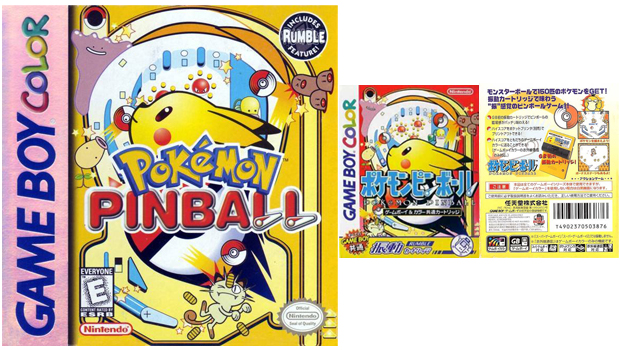
Love this cover. The stylised side-profile Pikachu. The happy Ditto. The unfortunate Dugtrio. The comedy Meowth spilling its coins. The ricocheting Pok Balls. The flippers incorporated into the logo. A really playful, colourful, fun, eye-catching box art.
Pokmon Stadium | 1999
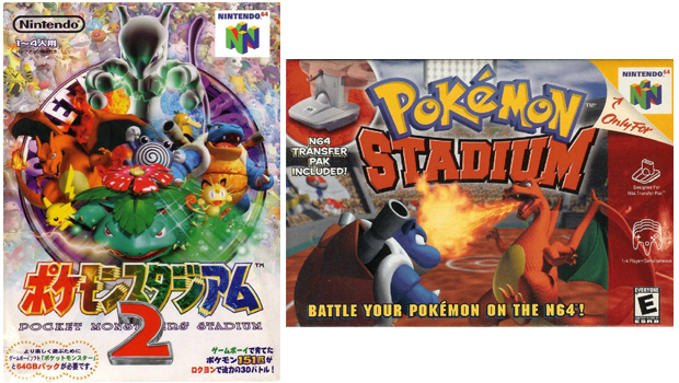
Two drastically different covers, with the Japanese design clearly keen to emphasise the fact this Stadium game (unlike its Japan-only predecessor) contains a full compliment of pokmon by squeezing as many of them as possible into a chaotic box-art montage. The US version gives centre stage exclusively to Red and Blue cover stars Charizard and Blastoise, which is the last time the original Pokmon reps appear together before a new generation of pocket monsters is introduced.
GamesRadar+ was first founded in 1999, and since then has been dedicated to delivering video game-related news, reviews, previews, features, and more. Since late 2014, the website has been the online home of Total Film, SFX, Edge, and PLAY magazines, with comics site Newsarama joining the fold in 2020. Our aim as the global GamesRadar Staff team is to take you closer to the games, movies, TV shows, and comics that you love. We want to upgrade your downtime, and help you make the most of your time, money, and skills. We always aim to entertain, inform, and inspire through our mix of content - which includes news, reviews, features, tips, buying guides, and videos.
