The evolution of Game of Thrones' title sequence - from basic map, to a deceptively deep part of the show's journey
The Game of Thrones opening titles are far more than an introductory garnish. Where other shows include intro sequences as an obligation - with which to dutifully dole out nods to principal cast, producers and directors - Game of Thrones' title sequence is much, much more. It's a great mood-setter and an iconic start to each episode, yes, but it's also a fundamental part of the layered, Game of Thrones experience.
There's a great deal going on under the surface of Thrones' credits. Quite literally, in fact, given that each of those growing, expanding clockwork towers and cities is built, despite their CG nature, with real, working mechanisms that would function completely in a real, physical model. While an inspired tonal counterpart to the series' grandiose themes of rising (and falling) factions and civilisations, and steadily expanding world-building, the sequence is more than a neatly executed visual metaphor. Quietly hard-wired into the very fabric of the show with real purpose, its multi-functional strength surprisingly comes from the fact that originally, it wasn't even a title sequence at all.
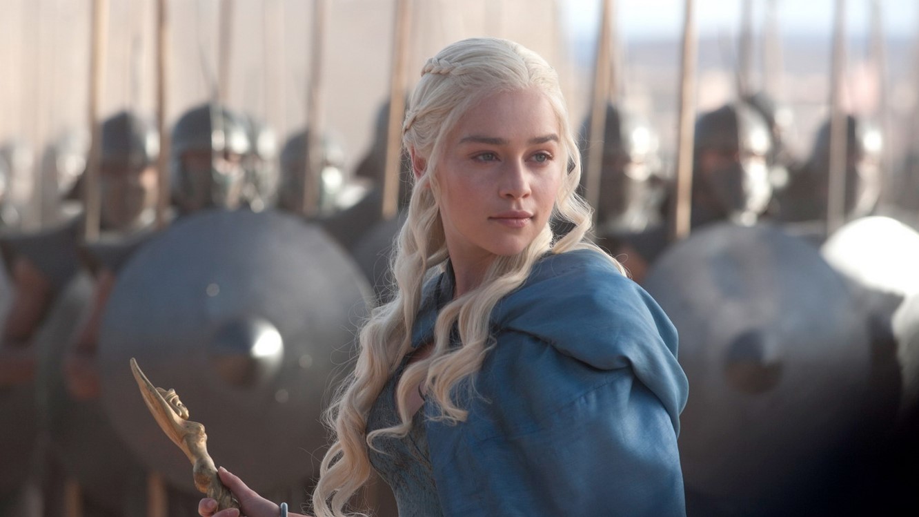
Back in the early days of the show, Game of Thrones' producers were – as well as thinking about credits – looking for a way to allow viewers to easily keep track of the story's constant movement between towns, cities, even entire continents. Depending on the narrative demands of each episode, in Thrones we can travel hundreds (if not thousands) of miles in a single scene change. And that presents challenges.
Of course, the show's moment-to-moment drama was always going to work on its own terms. But in order to become something greater than isolated scenes and relationships – to elevate Game of Thrones' twisting, multi-branching narrative of political machinations and mythic influences into a tangible, legitimate epic – it needed something else. It needed scale. But crucially, it needed a scale that would entice viewers rather than over-face them. As Angus Wall, creative director at credits maker Elastic explains, in an interview with Art of the Title, the early development process with executive producer Carolyn Strauss was kickstarted when Thrones' grand ambition hit a roadblock:
"We discussed a concern, which is that [Game of Thrones] doesn't take place on the Earth that we know. It takes place in a world that exists only in the books. So, similar to how the legend or map at the front of fantasy book works, she felt like there was a need for a map to the show.
"Now in the original pilot script, [show creators] Dan Weiss and Dave Benioff had written a title sequence in which a raven flies from King's Landing to Winterfell. We did some concept sketches around that idea but when the pilot was shot, they called us in and said, 'People are confused about where they are'."
Borrowing from the best
The first plan to combat this was to take the Indiana Jones approach. An animated map that would drop on-screen during scene transitions in order to track the story's movement from one far-flung location to the next. At one point, such a thing was to be a fundamental part of Game of Thrones. Five previsualization sequences were made for the pilot, and planning was done for every transition required for the full first series.
Sign up to the SFX Newsletter
Get sneak previews, exclusive competitions and details of special events each month!
Ultimately though, this element was dropped, Wall stating that it eventually detracted as much as it enriched. "It worked really well in terms of telling you where you were", he explains, "but it interrupted the narrative flow of the show". It's easy to imagine that it would have. After all, the frequency of location shifts, particularly in Game of Thrones' later seasons, would have led to a distinctly stuttery state of storytelling. In fact, thinking beyond the simple matter of pacing, it's entirely possible that an in-show travel map could have pushed away the huge audience that Thrones eventually garnered.
This is, after all, a show that thrives on intimate character investment and the believable integrity of its world. Frequent cuts out of the story to an explanatory map could have – unconsciously at least – had the effect of emphasising artificiality, pulling the viewer out of what they had just been reminded was, in fact, just a story. Immersion and alienation are very powerful factors in an audience's emotional enjoyment of a show. Anything that removes the viewer from an immediate experience has a brief, disconnecting effect that needs to be reconciled before moving on with the story. As a regular and frequent part of Thrones' flow, those cut-aways could have been disastrous.
So things changed. With the transitional map not working, the raven-based credits sequence was dropped in order to integrate the show's necessary navigational aid another way. The early concept of the Thrones titles as we know them was born. Inadvertently, perhaps, but with very good reason. But this was to be only the first of several important stages of evolution. The next stage, as these things often do, came about as much by accident and necessity as design.
"In the beginning, it was very simple, nothing animating and everything very flat", says Wall. "One of the things we realized early on was that you couldn't really tilt the camera up very far because it raised the question, what's beyond the map?"
There's that problem of world integrity again, now raising its head before the show even starts. But in response, ideas started to spin like gears and cogs, and the ultimate form of the title sequence began to come about. Underpinning all of the plans was a growing sense that the map should be justified as a real thing, a genuine part of Thrones' world rather than a pretty, throwaway abstraction.
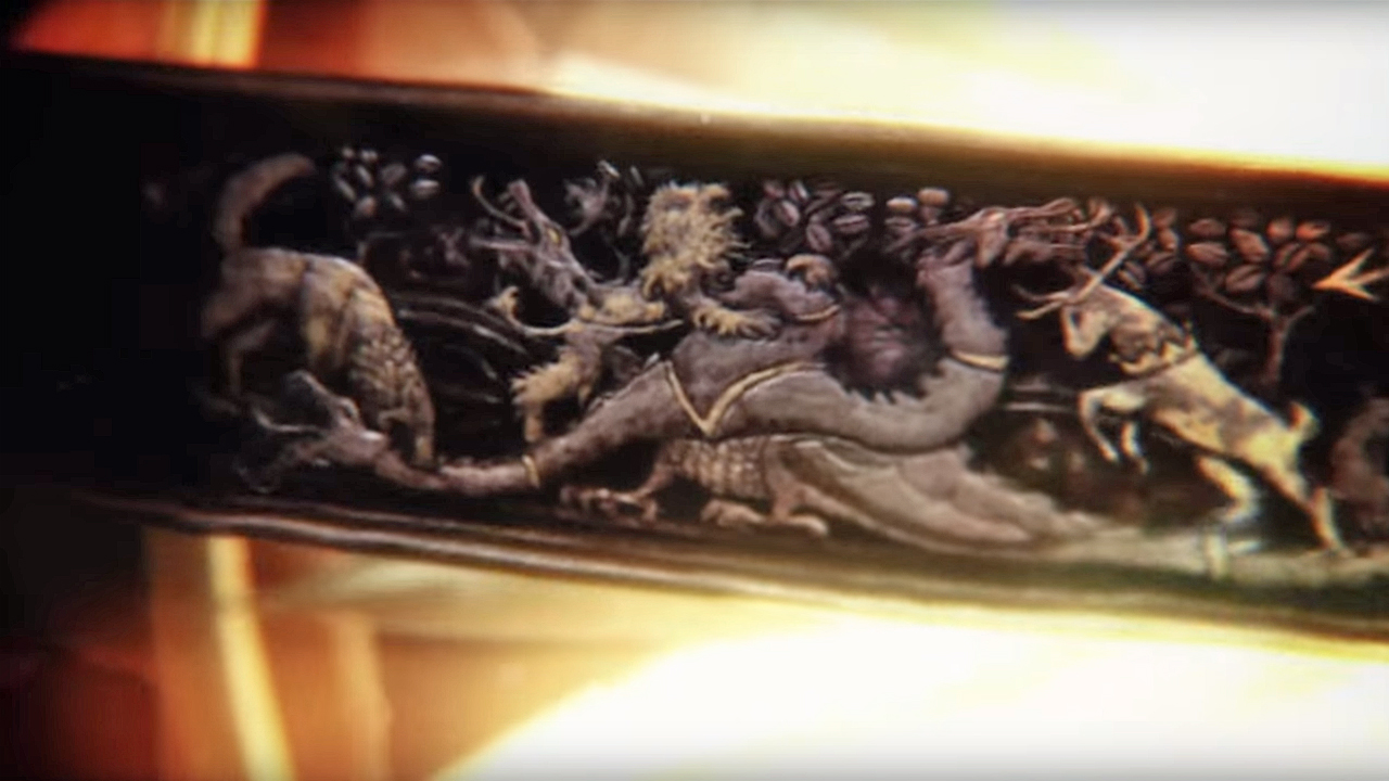
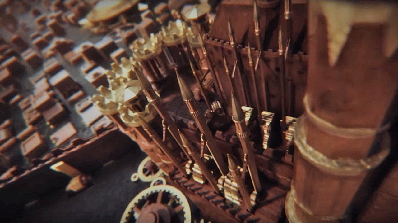
Wall had the idea of a mad monk in a tower somewhere, crafting a Leonardo DaVinci-style 'living' map with which to record not just the geography of the world, but its history too. This in turn resulted in the illuminated astrolabe that whirls through the map's 'sky', the art on its various bands illustrating metaphorically the semi-recent history of Westeros, from Targaryen conquest, to Baratheon rebellion and uprising. It might play the part of a sun as it flies over the map, but taking the form a scientific instrument it also has a meaningful part in creating the unseen, imaginary room in which the map exists. Suddenly, rather than breaking the integrity of Game of Thrones' world, the map was starting to add to it, with a coherent, internal narrative all of its own.
Keeping it real
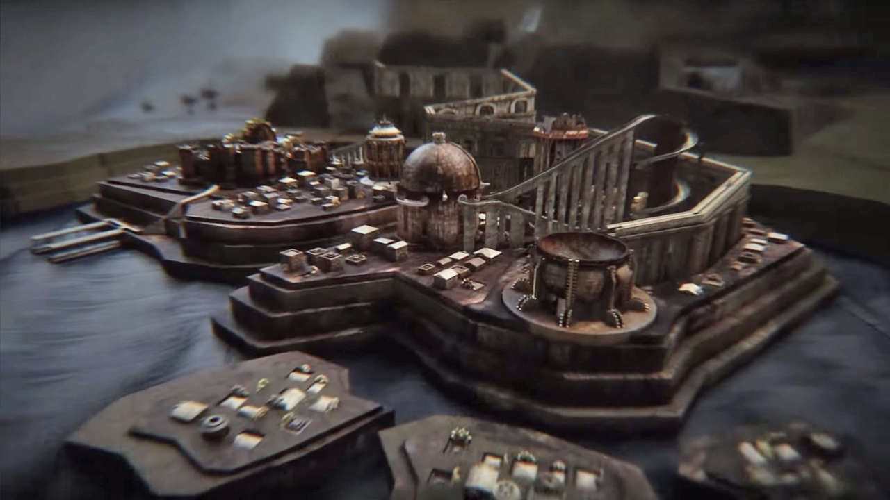
This demand for plausible consistency continued. The reason the astrolabe exists in the first place? The issue of avoiding what was 'outside the map' was eventually solved by giving the landscape concave, curved edges. It would have been easier, of course, to simply extend a flat map, filling out the screen with fuzzily defined, imaginary spaces, but that wouldn't have served Elastic's manifesto of tangible, rational purpose. It would have been easy too, to fashion those curves in abstract, without thought for justification. But that wouldn't do either. So, it was decided that, canonically, the map would exist on the inside of a wooden globe, like a hand-crafted Dyson sphere. And while, in turn, it would have been easy to leave the design at that, it was decided that a 'real' lighting source was needed, to justify the visibility of the now-enclosed vistas. And the astrolabe was born.
But while this might have, in a nutshell, been the end of the sequence's conceptualisation, it wasn't the end of that evolution I mentioned. That was to continue.
It all started with The Rules. Game of Thrones' title sequence was given its own design bible of regulations in much the same way that a full-blown TV show would be. The intro would always last 90 seconds, so as to not mess with the show's theme music. A soft-cap of six locations per episode was put in place to facilitate this, with capital cities used to stand in for key regions if a more obscure area was being visited in any particular episode.

Certain locations have remained mandatory inclusions. King's Landing, Winterfell, the Wall, and Daenerys' current location were locked in early as a constant, background reminder of the show's most important locations, characters, and happenings. The visual journey between them became a tracing of the show's storytelling spine, a weekly compass reference not just for Thrones' geography, but also the location of its narrative. Individual animations and camera movements could be sped up to facilitate these rules, but the rules must always be obeyed.
Again, more realism, more definition, more meaning, and more purpose.
The final evolution of that purpose though, intentionally or not, goes beyond the literal topography and story beats of Westeros and surrounding areas. It quietly cuts into the wider subtext of the show itself. Perhaps it happened coincidentally, perhaps not, but by crafting a miniature, clockwork study of Game of Thrones' world, the title sequence also set up an unspoken meta-commentary on what would steadily become the show's key themes.
Proud, arrogant, infighting kingdoms and capitals, reduced to the state of clockwork towers. Grand seats of assumed (and accepted) power rendered as artificial constructs, the human artifice at play clear in their very fabric. Bold symbols of authority and influence portrayed as intricate but fragile toys. The self-defeating, narrow-minded nature of the power struggles between Westeros' various competing factions has been a notable element of the show from the start, and has only become more and more explicit as the years have rolled on and bigger, outside threats have piled up. Subtly, the show's weekly introduction has been hammering home that small-view futility from day one.
These may be the flashpoints of major battles and cunning, political power-plays, but as the opening title sequence portrays them, they're also the quaint, childlike trinkets of a society unaware of how trivial its achievements ultimately are. Couple all of this with the blunt fact that the wooden Westeros is a literal, self-contained bubble-world, both artificial and physically cut off from the bigger picture, and illuminated only by the perceived glories of its own recent, political history, and you have a deft but profound statement on the wider philosophical view underpinning every event in the world the map depicts.
Growing from a functional illustration of a continent, to a tangible part of that world built of its own internal rules, to a guide for the narrative journey, and ultimately to a shrewd, subtextual commentary, the Game of Thrones title sequence has evolved far beyond the traditional roots of its medium. It looks cool, yes. And it's always exciting to watch out for the appearance of a new setting, and the promise of new story thread to explore. But the real reasons it remains so engaging, week in, week out, six years later, are entwined and engineered into the deepest inner workings of the show itself.
Game of Thrones Season 7 is available via Digital Download now.
