Japanese box art that's a billion times better than ours
...and why that is
Battle of the boxes
When the same video game launches in two different regions, language isn't the only thing that must be translated--so, too, must the game's box art. Why? Because what sells in America might not necessarily sell in Japan or Europe, and vice versa. Every now and then the changes made to a game's box art make sense--but 90-percent of the time, Japan's box art just looks infinitely better.
Chances are, you've known the frustration of buying a Japanese-made game only to find that its box art in your region is a bizzaro mutation of the near-perfect original. Or, maybe you've marveled at Japan's ability to turn hum-ho Western art into a masterpiece with a few alterations. In any case, we definitely prefer the Japanese box art of the following games over their North American counterparts.
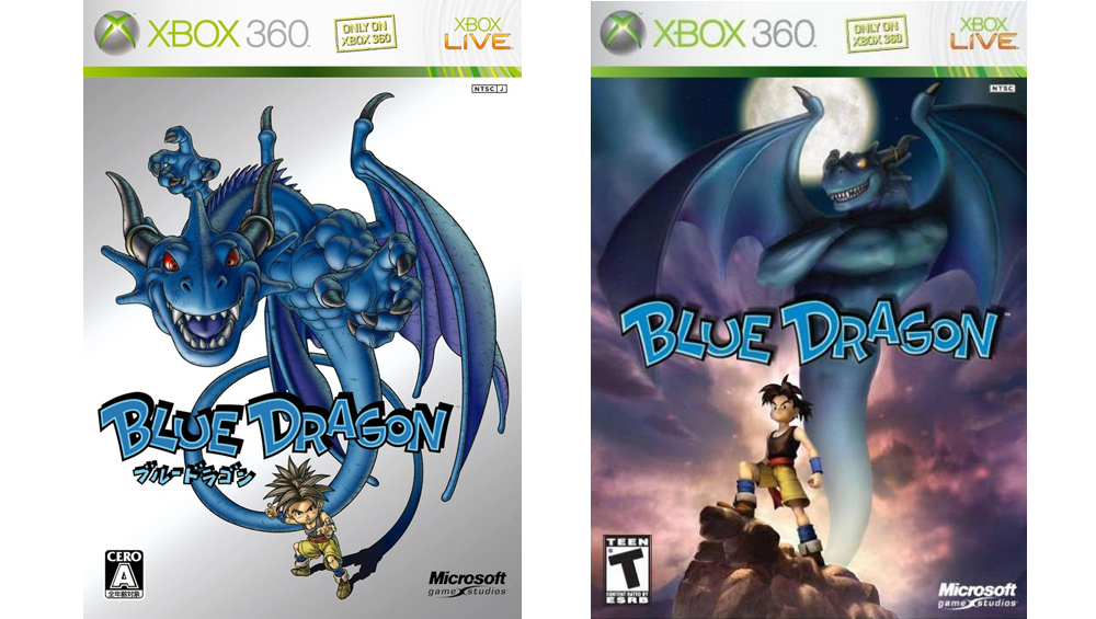
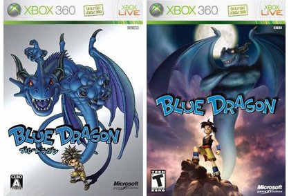
Blue Dragon
Left: Japanese version. Right: North American version.
Looking at the North American box art, you'd be forgiven for assuming that the blue dragon standing behind that Disney kid isn't a good guy. Looking at the Japanese version, it's easy to see that it's obviously drawn by Akira Toriyama (that DBZ style is, after all, his claim to fame), but also that the dragon and the kid are one and the same. Notice the shadow extending from baby Goku's legs to form the dragon? Subtle touch.
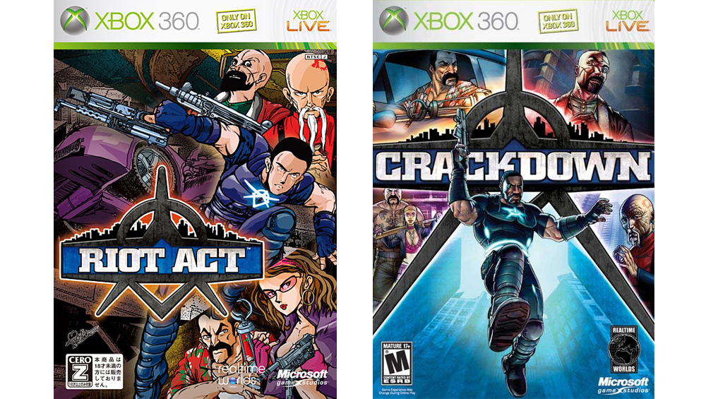
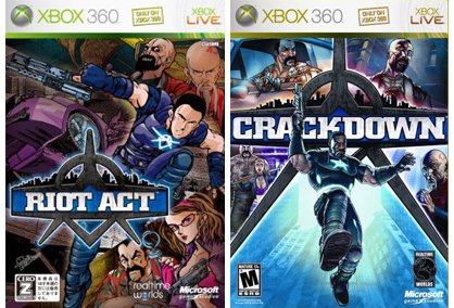
Crackdown
Left: Japanese version. Right: North American version.
Sure, giving a bunch of random characters their own little window to hang out in worked for GTA, but the manga-esque drawing of Riot Act is a far more compelling representation of its superhero-style gameplay.
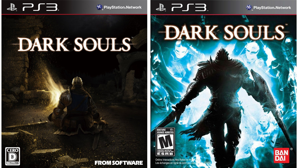
Dark Souls
Left: Japanese version. Right: North American version.
While we appreciate that the NA box art depicts the act of pushing through the many obstacles that one must overcome while playing Dark Souls, sometimes a subtle approach just works better. The Japanese version absolutely nails the ominous level of isolation newcomers feel upon first stepping foot into the game, a memorable experience that long outlasts the act of killing non-boss monsters once you're 20+ hours in.
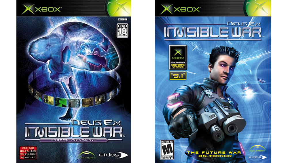
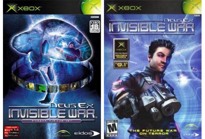
Deus Ex: Invisible War
Left: Japanese version. Right: North American version.
Nothing depicts an "invisible war" like a dude with spiky hair and a gun! The man curled up in the fetal position, who also happens to look like a brain, however...
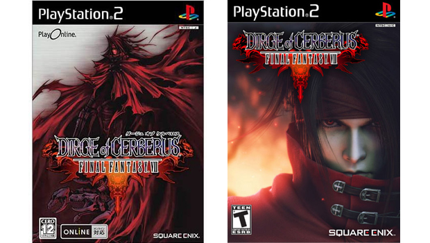
Dirge of Cerberus: Final Fantasy VII
Left: Japanese version. Right: North American version.
Fact: When it comes to Final Fantasy box art, the Japanese versions always wins. Like, seriously, there's no contest here.
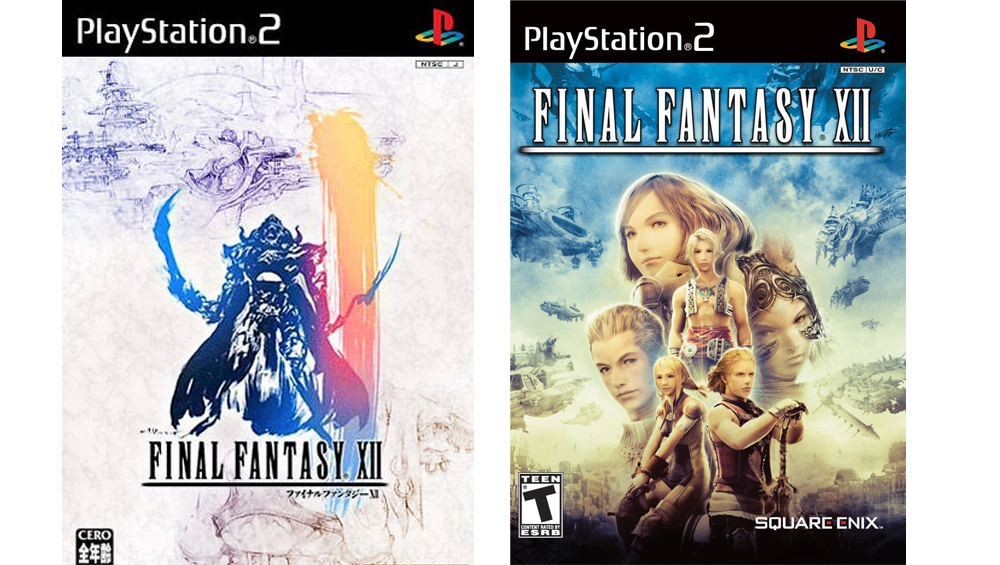
Final Fantasy XII
Left: Japanese version. Right: North American version.
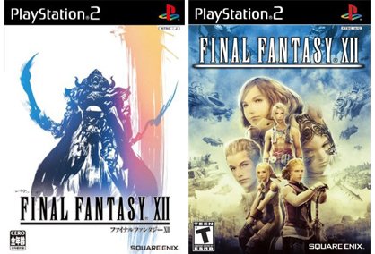
Again. Random white people and floating heads aren't nearly as visually stimulating as a hand-drawn person in armor dual-wielding swords with the ferocity of 1,000 suns.
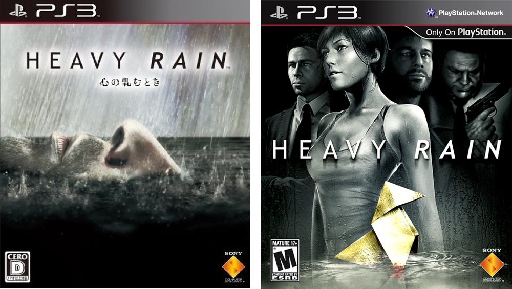
Heavy Rain
Left: Japanese version. Right: North American version.
Admittedly, this choice isn't as obvious as some of the others in this list, and neither boxes do a particularly good job of giving potential buyers an idea of what Heavy Rain actually is. Guess we just really dig the metaphors of the Japanese art.
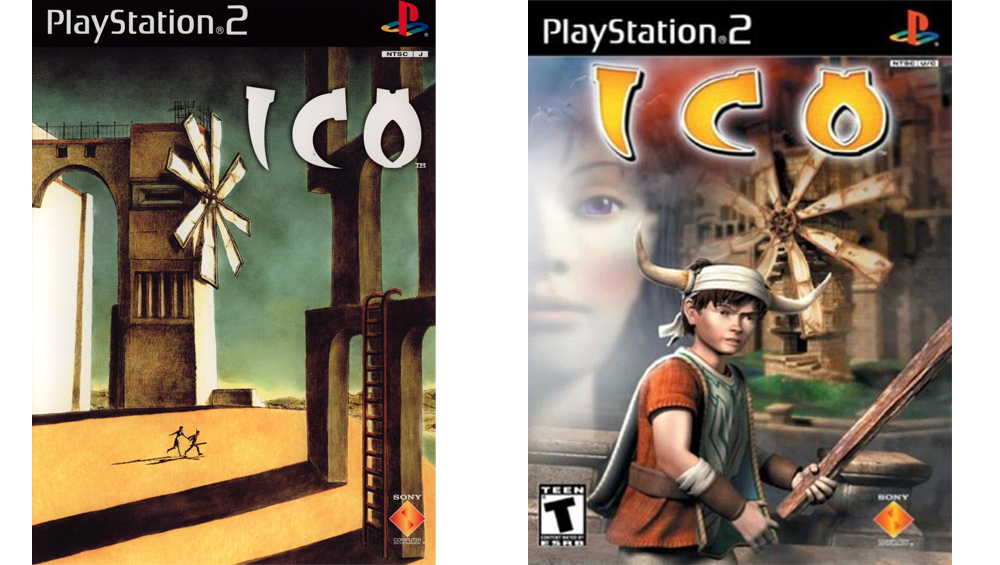
Ico
Left: Japanese version. Right: North American version.
If you know anyone--friends, family, pets, your weird next door neighbor who's obsessed with building koi ponds--that prefers the fugly image on the right to the beautifully illustrated art on the left, cease all ties with them immediately. They are factually wrong. Luckily you can get your hands on the Japanese art of Ico if you pick up the HD collection that comes packaged with Shadow of the Colossus. Speaking of....
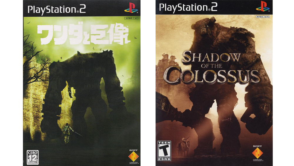
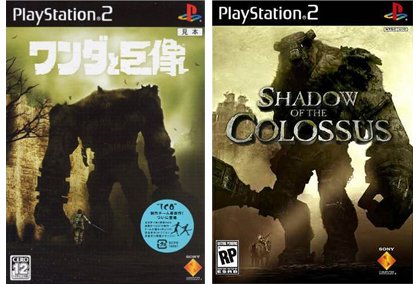
Shadow of the Colossus
Left: Japanese version. Right: North American version.
Neither of these are bad by any means. While the NA art better depicts the sense of scale in the game, its Colossus looks like a giant, huggable teddy bear. The one in the Japanese image, on the other hand, looks scary as hell.
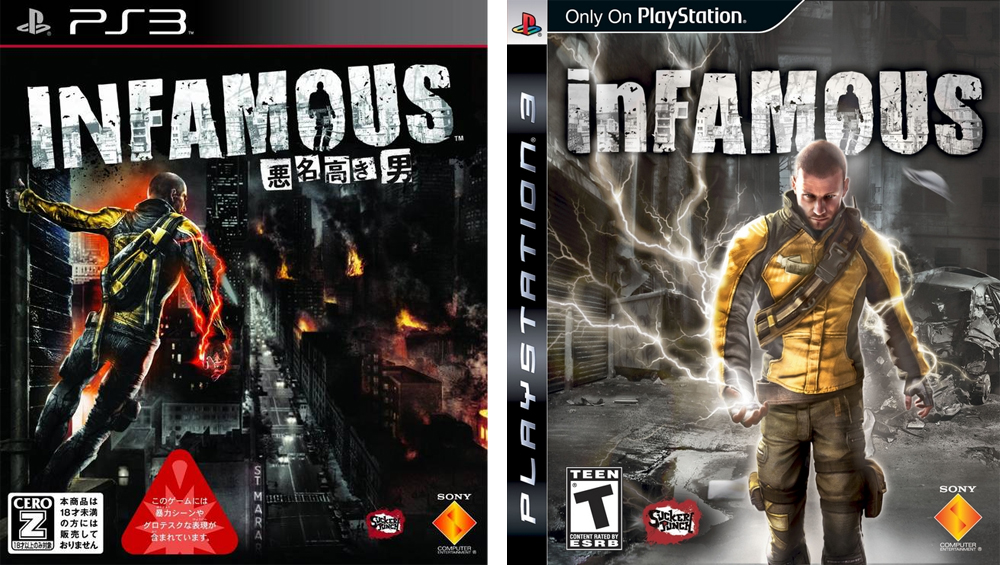
Infamous
Left: Japanese version. Right: North American version.
There are few things more boring on a box than a scowling dude walking toward the camera. There are few things more badass on a box than a dude hanging from a drainpipe while red electricity pulses from his body as he looks out across a smoldering city that he presumably destroyed.
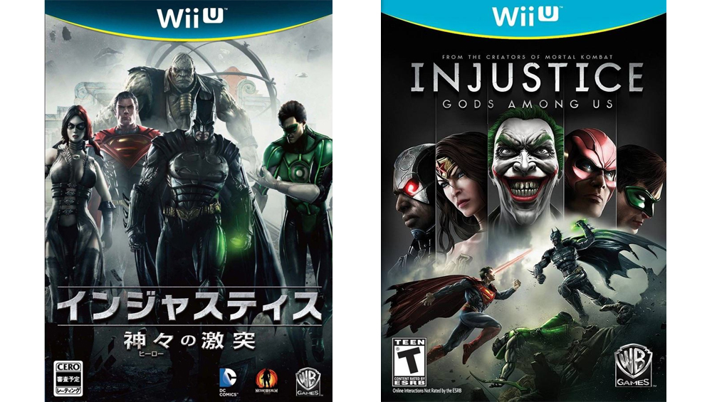
Injustice: Gods Among Us
Left: Japanese version. Right: North American version.
If not for the floating superhero faces, we'd be more inclined to go with the NA version on this one. Imagine how cool that image would've looked if it had just been a slightly larger shot of Batman and Superman beating the hell out of each other. But if you're gonna have a bunch of faces on a box, they might as well be attached to bodies. Plus, check out that Batman swag on the left.
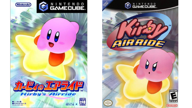
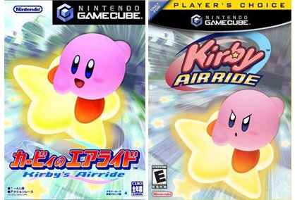
Kirby Air Ride
Left: Japanese version. Right: North American version.
Whenever we think of Kirby, he shows up in our minds as a smiling, carefree ball of... whatever he is. Only in our nightmares does he appear like one of the four horsemen of the apocalypse, riding his death star in to commit genocide.
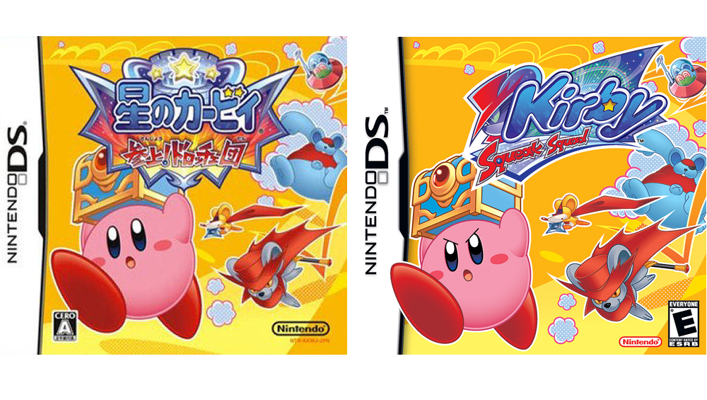
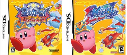
Kirby Squeak Squad
Left: Japanese version. Right: North American version.
Left version: Kirby's protecting his possessions from the thieving hands of murderous mice. Right version: Kirby's stealing everything that poor mice family owns, and they're trying to chase him down to get their clothes and cheese back; otherwise they'll starve to death.
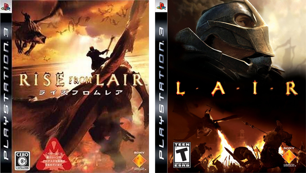
Lair
Left: Japanese version. Right: North American version.
Aside from the fact that the Japanese box has multiple dragons prominently displayed in the image, it's also a lot less cluttered and easier to digest. Also, why the hell is that knight on the right just watching from afar as a dragon incinerates his friends? How selfish.
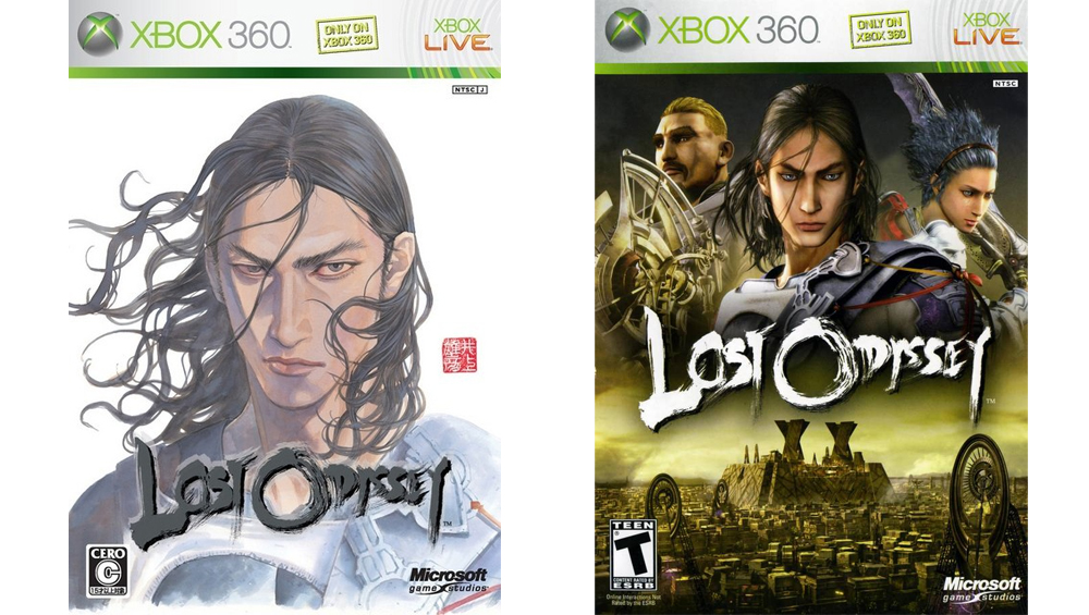
Lost Odyssey
Left: Japanese version. Right: North American version.
It's entirely possible that, had we not played through (and loved) Lost Odyssey, we might prefer the NA box art. But the painted Japanese version is more aligned with the game's story of an immortal man trying to find his place in the world, and parallels the incredible short stories you'll encounter throughout a single playthrough.
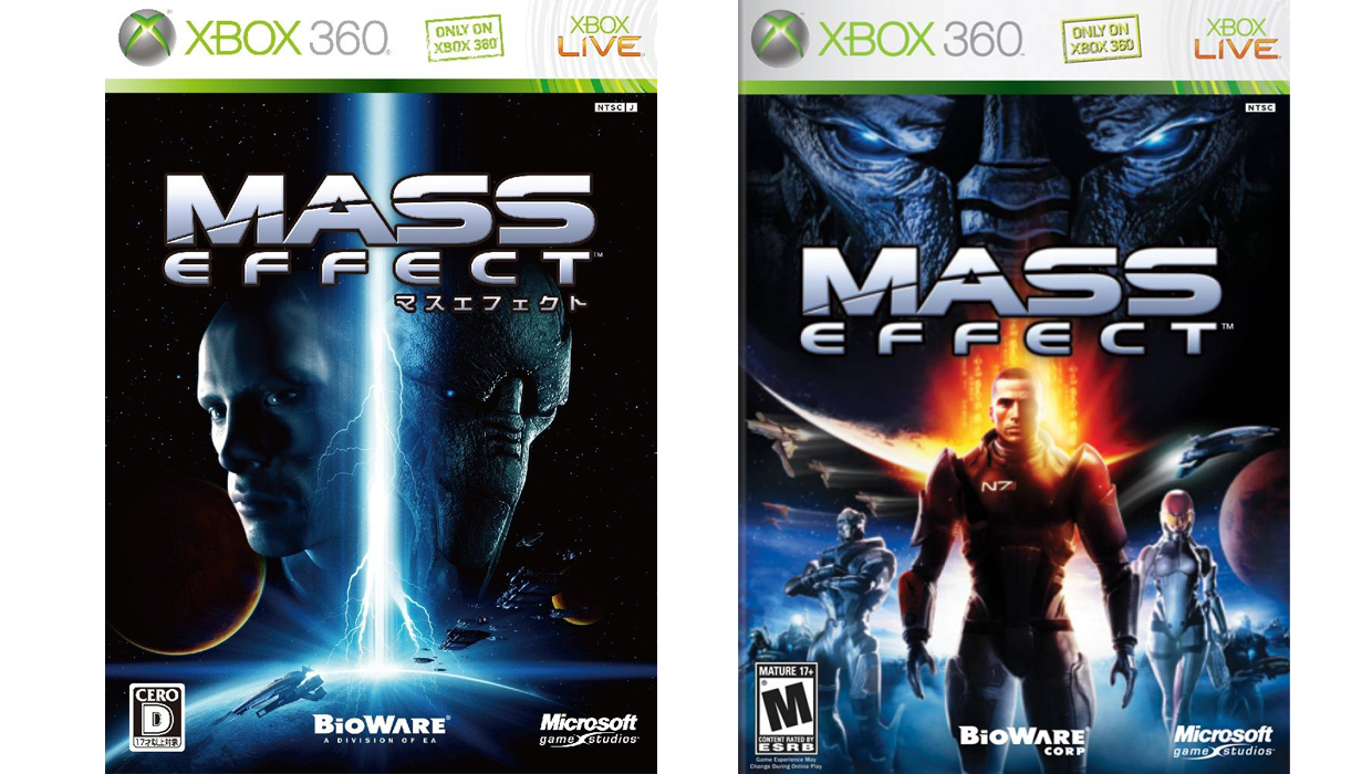
Mass Effect
Left: Japanese version. Right: North American version.
This was a close one. On the one hand, the NA box art has some really subtle touches that are pretty cool. Notice the way the surface of the planet on the left of the image looks like an angelic wing extending from Shepard's shoulder, while the ship near his other side looks sort of like a dark wing. We could be reading into it too much, but that positioning seems to reflect the game's Paragon / Renegade dynamic. Unfortunately, Shepard and his companions look like janky action figures more than they do character renders. The Japanese box art is simpler, and makes it immediately clear that Mass Effect is a sci-fi game. This is the only instance in which we'll admit to preferring floating faces to full character shots.
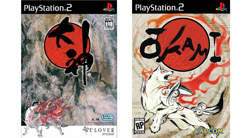
Okami
Left: Japanese version. Right: North American version.
Both of these boxes are gorgeous. Though the NA version is a more accurate depiction of Ammy's in-game character, the Japanese drawing looks super badass.
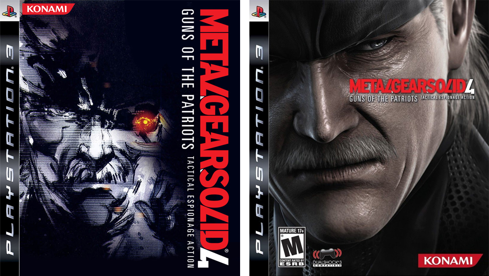
Metal Gear Solid 4: Guns of the Patriots
Left: Japanese version. Right: North American version.
As much as we love Solid Snake, he's not nearly as mesmerizing as the incredible artwork of Yoji Shinkawa.
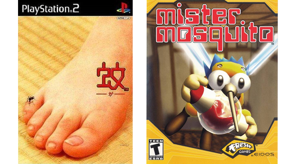
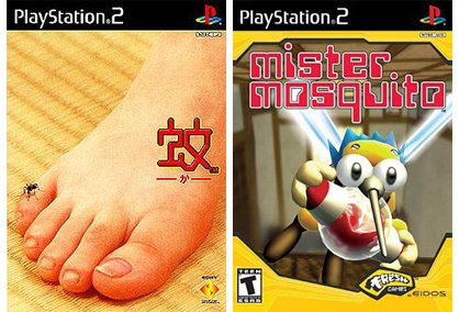
Mister Mosquito
Left: Japanese version. Right: North American version.
You wouldn't be able to tell what this game is by looking at either of these images, so the Japanese version wins out of sheer, bizarre presentation.
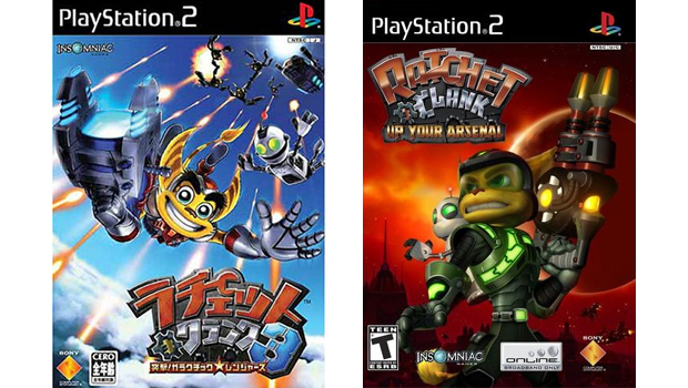
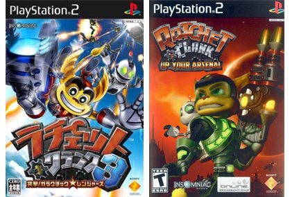
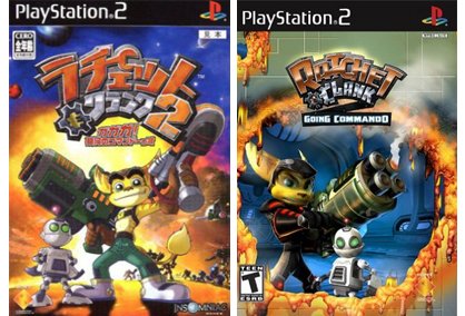
Ratchet & Clank: Up Your Arsenal
Left: Japanese version. Right: North American version.
Even in Ratchet & Clank's darkest games, you'll still play as an adorable, anthropomorphic dog thing with a cute robot companion. It seems a bit odd that the NA art here puts such a serious, grimacing look on its heroes, as if they're getting ready for a showdown with the Reapers. The Japanese art nails it: lots of shooting, lots of jumping and falling, lots of fun.
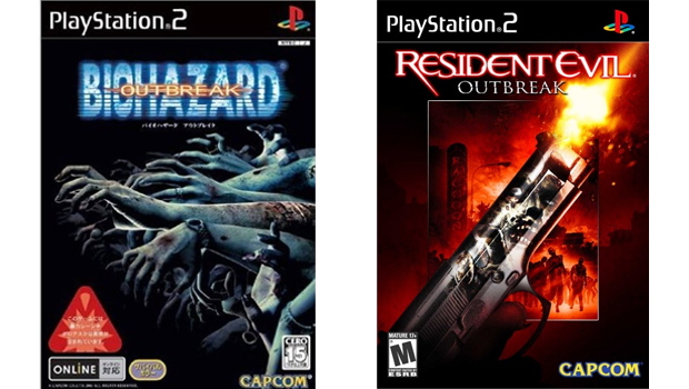
Resident Evil Outbreak
Left: Japanese version. Right: North American version.
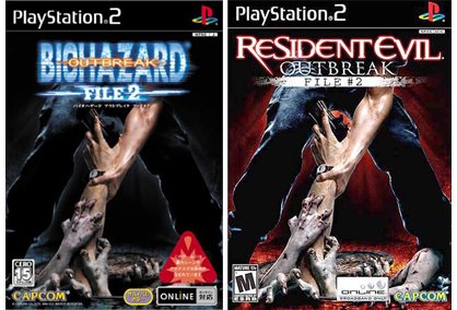
The reflection of a zombie in a shiny gun isn't nearly as terrifying as a hundred undead arms reaching out in an attempt to rip you into pieces.
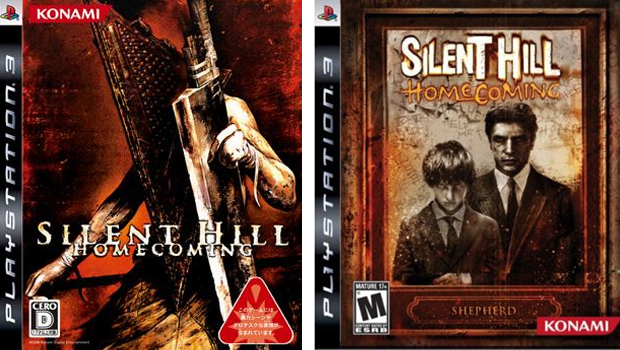
Silent Hill Homecoming
Left: Japanese version. Right: North American version.
Hmmm... One of Silent Hill's most iconic, badass monsters? Or grumpy dad (who's probably disappointed in his son's terrible little league baseball skills) with his grumpy kid in a family portrait? Tough call.
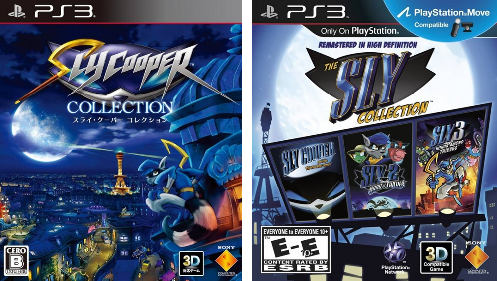
The Sly Collection
Left: Japanese version. Right: North American version.
As with many of the entries on this list, the Japanese box art for The Sly Collection is far more clean and attractive. Yes, it's important that gamers know that all three original Sly games are included on one disc, but we'd rather that be detailed with smaller text or on the back of the package. The series has some gorgeous art, and it belongs on the front of the box.
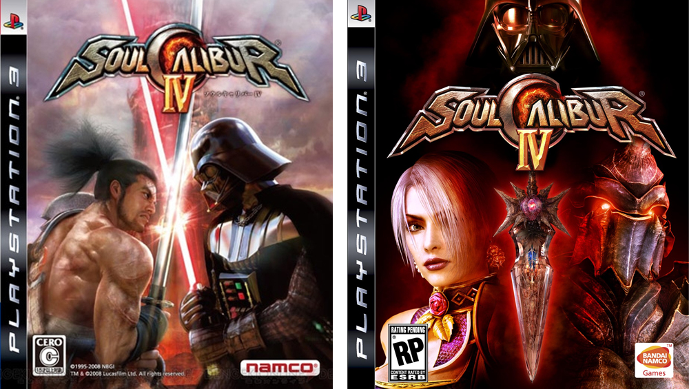
Soulcalibur IV
Left: Japanese version. Right: North American version.
Nothing says "fighting game" like two characters staring at the camera. Meanwhile, Mitsurugi is somehow fending off Darth Vader's lightsaber with a regular sword in the Japanese art, which is not only baffling, but far more compelling an image.
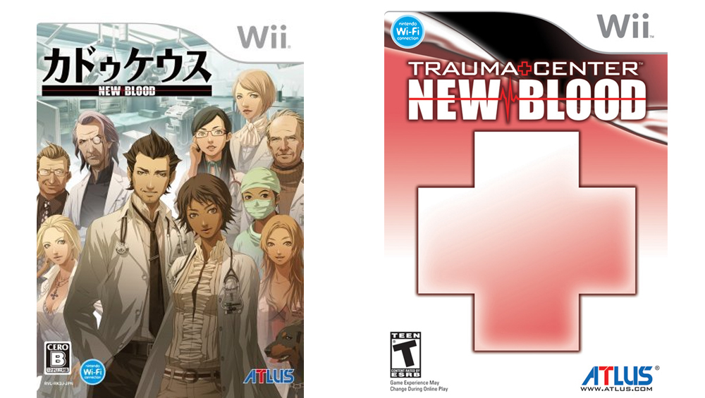
Trauma Center: New Blood
Left: Japanese version. Right: North American version.
Thoughts from looking at the NA art: Some kind of hospital game? Thoughts from looking at the Japanese art: A wonderfully bizarre hospital anime just waiting to unfold. Plus, why the hell is there randomly a dog in the image?
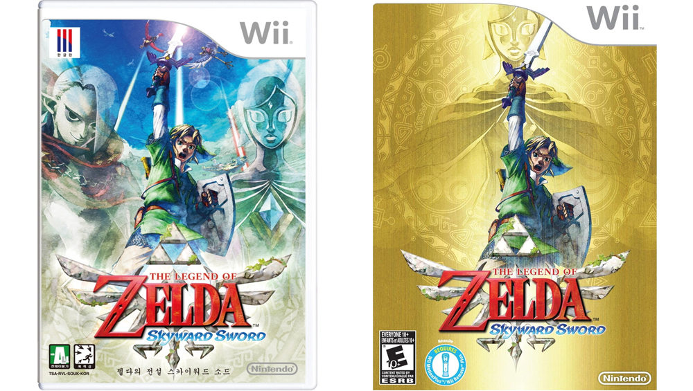
The Legend of Zelda: Skyward Sword
Left: Japanese version. Right: North American version.
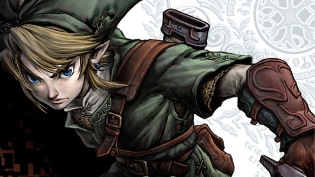
Look, we get that the gold background is a tradition that harks back to the original NES cartridge, and we don't have anything against it. Still, with the two Skyward Sword boxes side by side, we can't help but wish the Japanese version was at least a reversible option.
Out boxed
Do you generally like the aesthetics of Japanese box art more than the NA or European versions? Are there any on this list you don't agree with? Let us know in the comments below, and don't forget to check out the second page for reasons why we think Japanese box art is often better.
And if you're looking for more, check out the rarest and most valuable collector's editions in video games and 10 games that are great to spectate.
GamesRadar+ was first founded in 1999, and since then has been dedicated to delivering video game-related news, reviews, previews, features, and more. Since late 2014, the website has been the online home of Total Film, SFX, Edge, and PLAY magazines, with comics site Newsarama joining the fold in 2020. Our aim as the global GamesRadar Staff team is to take you closer to the games, movies, TV shows, and comics that you love. We want to upgrade your downtime, and help you make the most of your time, money, and skills. We always aim to entertain, inform, and inspire through our mix of content - which includes news, reviews, features, tips, buying guides, and videos.
You've seen cover comparisons before, of course, but have you ever wondered exactly what makes the Japanese versions so preferable? Or why gamers are constantly complaining about the mangled translations? We did, and after scouring through hundreds of examples, we discovered these nine undeniable trends.

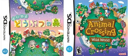
Game covers are usually pretty predictable. Is it a shooting game? Put a gun on the front! Is it a cartoon action game? Make sure to include awacky animalwith saucer-sized eyes! How about a kids' game? Eh, just throw together a bunch of shiny, candy colors.
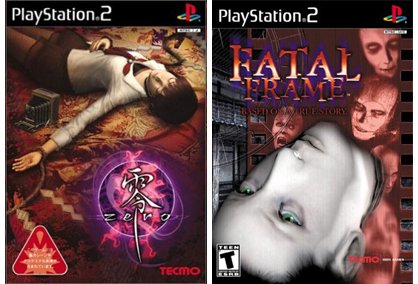
In Japan, they take chances. Strange and wonderful chances. The kids' title is marketed with images of healthy food and kitchen utensils. The cartoon actioner gets a photo of a foot. Yes, a foot. The shooter is sold with nothing more than a naked man, curled into a decidedly un-badass position.
Ironically, these bizarre scenes are actually much more accurate to the game experience than their Western counterparts.

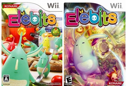

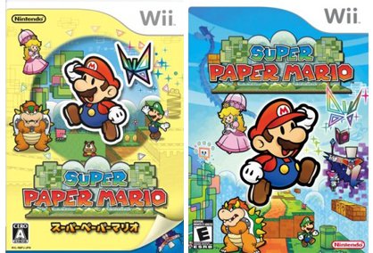
Guess what? Having fun is not necessarily a bad thing. Being happy is sometimes rather pleasant, really. Japanese developers understand this mysterious truth, but while they keep trying to export their eternally sunny characters to us, we just keep transforming them into gloomy, moody tough guys. And when we send over our own short-tempered mascots, they're forced to give them a makeover, lest our incessant misery rub off on any innocent Japanese children.


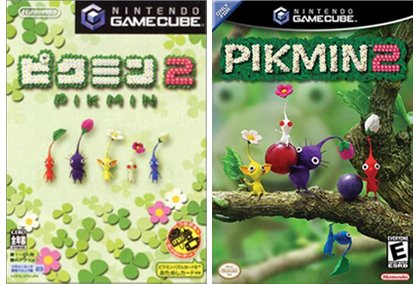
Hmm. In this case, we'll take the adorable Pikmin family, posing and waving, over the terrifying taxidermal lineup on the Japanese cover.


Ah, the disembodied head. So helpful. So necessary! Without those inexplicably hovering faces, how would we ever know whether the game has characters or not? Without that eye contact, how would we ever be convinced to buy?
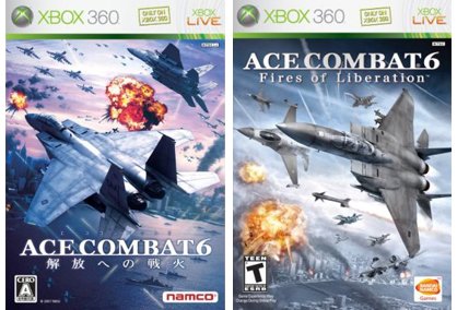
Japanese box art assumes that things like lightsabers, spaceships, fighter planes and school girls will be enough. How na%26iuml;ve.

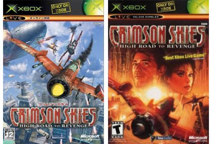
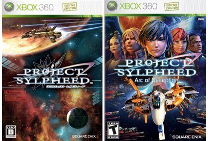
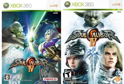
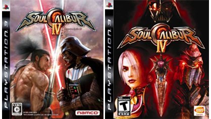

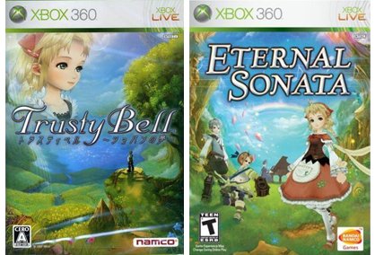
Eternal Sonata or Trusty Bell: Chopin's Dream? You have to admire that direct of a title, but points off for the lazy, probably last-minute addition of a drifting cloud head. Hey everyone, there's a girl in here!


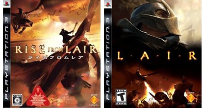
Okay, you'd think this would be simple. If you've got a game about dragons, you put friggin' dragons on the cover. Zombies? Zombies! Superheroes? Superheroes!
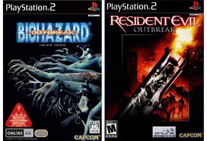
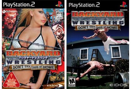
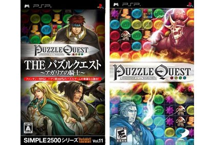
If you've got a game featuring both fantasy adventure and knockoff Bejeweled gameplay, you highlight the former and not the latter. If you've got a game about sweaty, shirtless men wrestling in their backyards, you lie and put a picture ofhalf naked womenon the front. Simple, see?


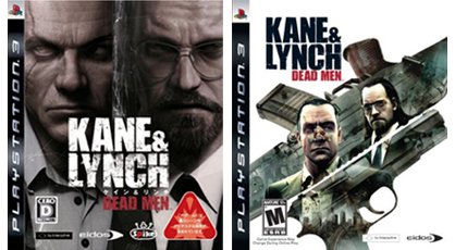
Whatever the hell your game is about, do not emphasize two balding middle-aged men on the box. If you must, at least don't force us to stare into the depths of every scar and wrinkle. Yuck.


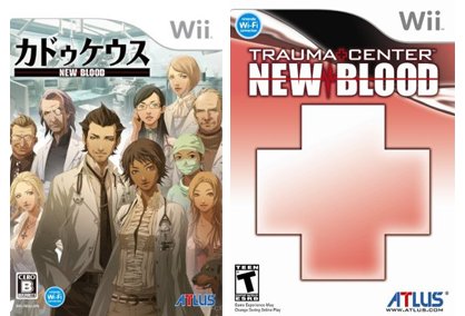

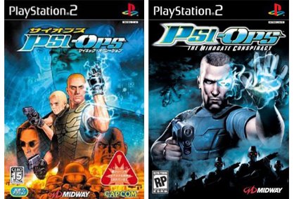
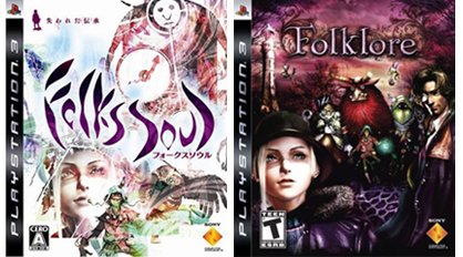

What's up with the guys on the left? Are they the unpaid interns for the guys on the right?

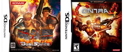

If we want gaming to reach the depth and maturity of cinema or literature, it should be about more than swords, guns, blood, violence and nonstop action. Often, however, gaming is about more - the Western packaging is just too afraid to let you know.
Japanese box art, however, isn't afraid to show off the game's sensitive side. Princess Farah joins the Prince of Persia cover. Ico and Yorda hold hands. And while Final Fantasy X International didn't release in the US, do you really think they would have kept the same cover if it had? Hurry, give Tidus something sharp!

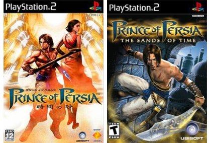
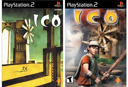
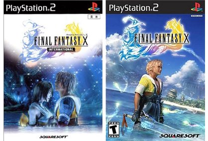

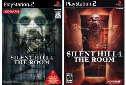
Must our box art always scream at us? If the artists don't add enough explosions, fangs and protruding female bosoms, are the games somehow invisible to us and our puerile minds? In Japan, understatement is okay. Possibly encouraged, based on the number of examples below.

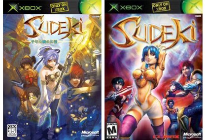
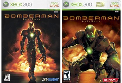
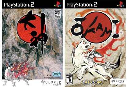
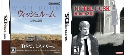

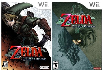
Yes, we know Link is in this game, Japanese box art. Thank you.


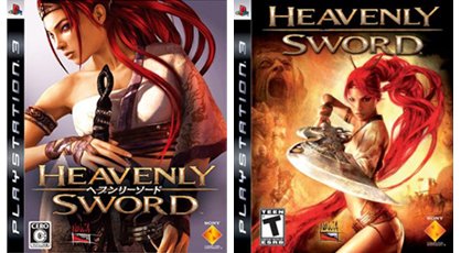
A lot of game packaging in Western countries comes across like a desperate flea market. If they cram as much crap into the tents as possible, surely you'll find at least one item you like, right? So if the pretty lady on the cover of Heavenly Sword isn't enough, maybe you'll be convinced by the screaming head or the vaguely viewed fat man in the background. If the title Final Fantasy isn't enough, perhaps some cosplayers and airships will get you to purchase. Please?
Japanese packaging is more confident, usually sticking with one strong and persuasive image.

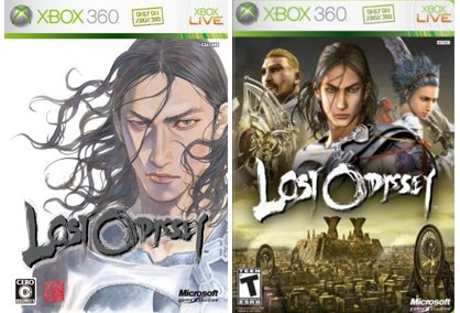
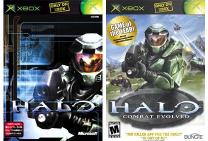

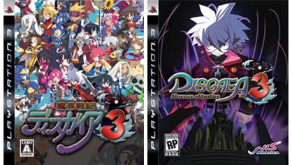
Okay, so maybe the flea market mentality is universal. At least when Japan does it, they go all the damn way. Seriously, is there any Disgaea character NOT on that rainbow spectrum below?

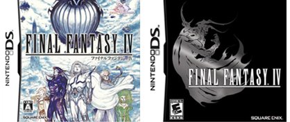
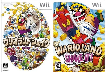
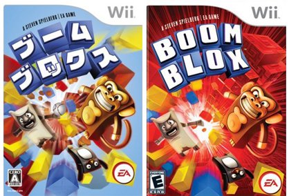
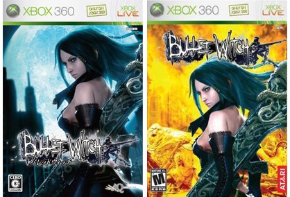
Our best guess? Either the companies had a lot of extra art lying around... or somebody felt they'd better change something if they wanted to justify their continued employment. Blue to red, and another job well done!

Jul 29, 2008


A look back at the games that fuglied up store shelves the most last year.

Hilarious printing errors definitely not concocted by our art team.

The blandest, dullest and all-around boring-est covers we could find.

It's not just bad, it completely misses the point.
