E3 2010: Sonic Colors first impressions
Looks like Sonic’s finally figuring out how to exist in a 3D world
Here we go again… We’re excited about a Sonic game again, yes, in spite of all he’s put us through. We know. Our anticipation and revulsion for all things Hedgehog has been known torise and fallwith the changing of the seasons. But Sonic’s taken a multi-year breather from “returning to his roots” and looks all the better for it. Hopefully, gamers won’t mind that he’s heavily borrowing from his old rival….

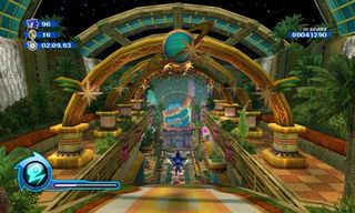
Mario Galaxy. That’s all we could think of once Sega unveiled Color’s overworld to us. Each level is represented by planets, tethered to together by Doctor Eggman’s fiendishly fun plot of creating the universe’s largest amusement park. We don’t think Sega will resent the comparison to Nintendo, because we sure as hell don’t. It’s the best thing the Wii’s got going, and we wish more games ripped off, instead of just straight up stealing Wii Sports.

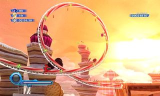
However, it’s not like simply being set in spaceis what made Galaxy great. It’s the idea that levels can be clumps of anything and everything, and don’t require a logistical explanation. And that’s exactly what Sonic Colors has going for it, thus freeing Sonic Team up to design gorgeously detailed environments without the creative restriction of open-worlds, sword, town folk banter or Werewolf-based cache.

Above: No Werehog, as far as the eye can see...
Sign up to the GamesRadar+ Newsletter
Weekly digests, tales from the communities you love, and more
Most Popular


