12 great games with god-awful box art
Don't judge a book by its cover
Let's pretend the internet doesn't exist, and that you'd have no way of knowing whether or not a game will be good without playing it yourself. In this scenario, the only way you might form a preconceived opinion about a game is by looking at its box art. As any scientist would tell you, first impressions are pretty important.
Good box art is both tasteful and indicative of at least a part of the experience at hand. Bad box art often takes form in horrible illustrations, shirtless muscle-bound barbarians, a comical misrepresentation of the game it woefully attempts to depict, or a combination of all three. Yes, tastes in art are subjective, but the following games have objectively hideous box art--a shame considering all of them are rather great.
Ico (PS2, 2001)
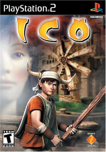
Perhaps the worst offender on this list, Ico's North American box art is a horrible bastardization of the actual game. Inside its plastic case, you'd find a beautifully conceived puzzle platformer whose minimalistic aesthetic supplements its fairytale story.
The attention to environmental detail, impressive lighting effects (for the time), and intelligent puzzle design all gelled together to create a compelling package. Judging by the outside of the box, though, you'd be forgiven for assuming the game was about a kid with a stick who fastened ram horns to his head with duct tape.
Amnesia: The Dark Descent (PC, 2010)
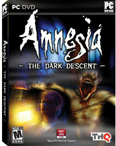
Amnesia: The Dark Descent is one of the creepiest horror games we've played in years--and if you haven't already had the pants-soiling pleasure of giving it a go, you should remedy that right away. Though it initially launched as a download-only game, THQ decided to publish a boxed retail version in 2011, resulting in this lovely gem of cover art.
We get what the illustrator was going for; you will unexpectedly cross paths with a few monsters as the main character tries to piece together his ties to a terrifying, haunted castle. But the ghoulish demons you'll encounter look a lot less like a mutated Donald Duck and a lot more like a oh-GOD-what-is-thattttt *heart explodes out of sheer terror.*
Phantasy Star II (Sega Genesis, 1990)
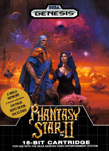
When you think of classic JRPG series, it's likely that Dragon Quest and Final Fantasy come to mind. But Sega's Phantasy Star II, a 16-bit JRPG, hit the Western market months before the original Final Fantasy did--it was not only a substantially bigger game, but was lauded for its grand sci-fi, character-driven story.
Sign up to the GamesRadar+ Newsletter
Weekly digests, tales from the communities you love, and more
It was not lauded, however, for its romance novel box art featuring an elder man with a fierce mane of gray hair and Satan in female form.
Mega Man 2 (NES, 1989)
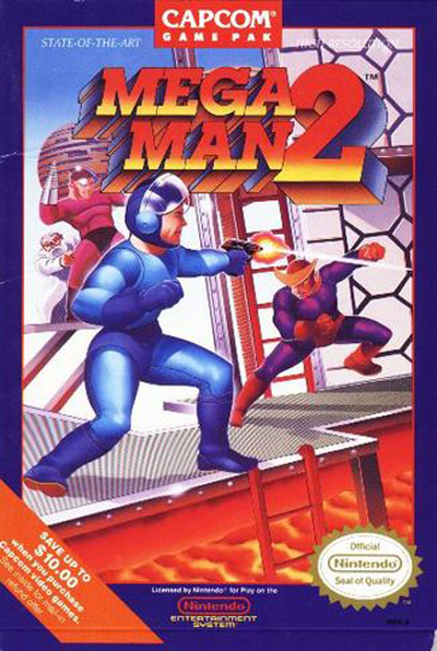
Capcom's beloved Mega Man series has a well-documented history of awful box art, and you may be surprised that we didn't immediately choose Mega Man 1 as our example. Why go with 2 instead? Because it was a far more popular and superior game, and we find it sad that Capcom squandered a chance to redeem itself after the horrendous illustration of the original (this would continue for a few more sequels).
The box art of Mega Man 2 was drawn by Marc Ericksen, who years later explained during an interview with Nintendo Age that the image so wrongly depicted the Blue Bomber because he was told by a Capcom employee that Mega Man was, in fact, firing a pistol. Womp womp.
Mega Man 1 (NES, 1987)
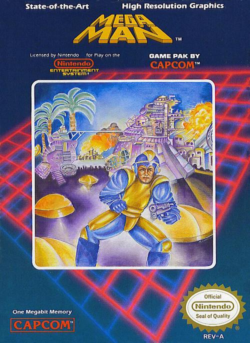
Okay, fine.
Earthbound (SNES, 1995)
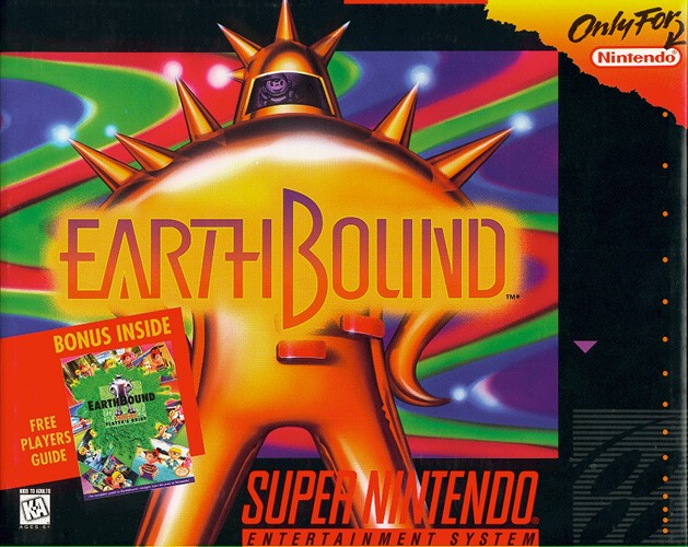
The second game in Mother trilogy of JRPGs, Earthbound is the only one to get an official localization in the West. More importantly, it holds a special place in the hearts of those who played it way back when thanks to its quirky humor and then-modern day setting.
We suppose one could argue that it's fitting for its comically-large box (gotta pack that strategy guide in somehow) to be adorned with a psychedelic Final Starman. But we just can't stop ourselves from thinking that if the box art had made even the slightest bit of sense to anyone who hadn't already played through the game, we might not have missed out on Mother 3. Alas.
God Hand (PS2, 2006)
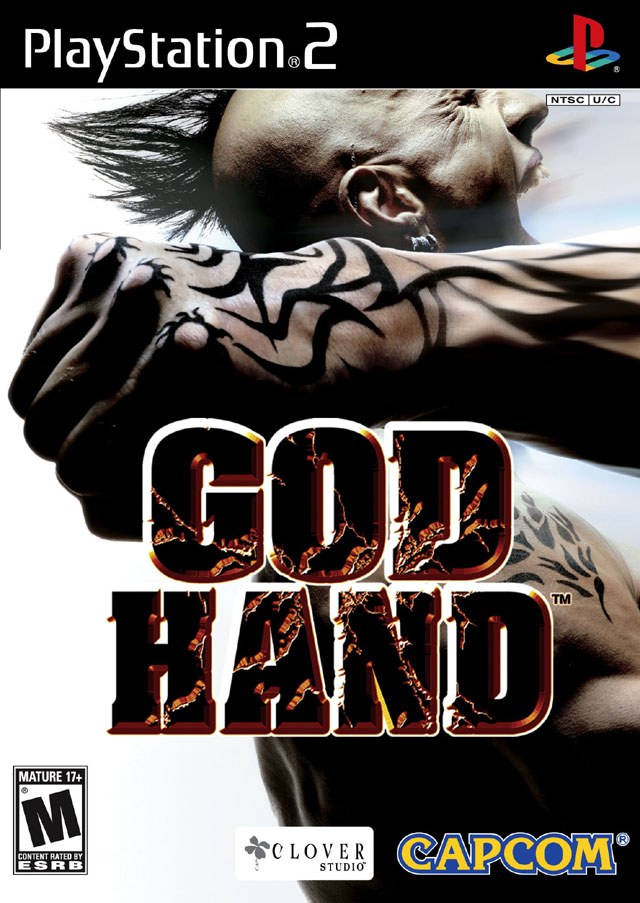
The final game to come from developer Clover Studio, God Hand was a genuinely enjoyable if not flawed 3D brawler that harks back to the days of 2D sidescroller beat-'em-ups. Its goal, according to Atsushi Inaba, God Hand's producer, was to strip away the reliance on weaponry traditionally found in then-modern brawlers and return to an emphasis on hand-to-hand combat.
Of course, nothing says hand-to-hand combat like a mohawked punk getting cold cocked by a guy who had seemingly overdosed on tribal tats.
Batman: Arkham City GOTY Edition (Xbox 360, PS3, PC, 2012)
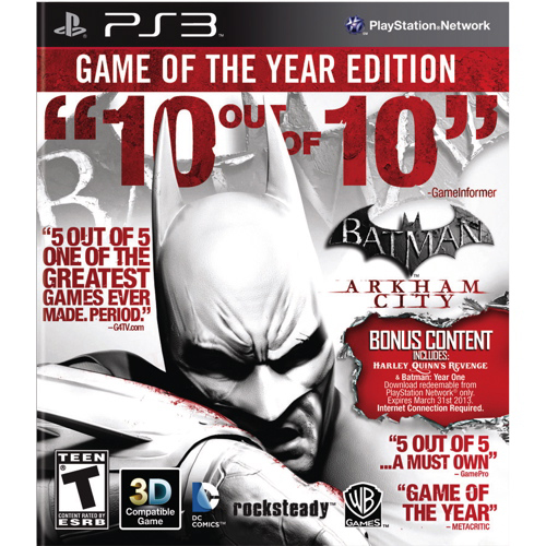
When a game such as Batman: Arkham City receives a ton of praise and game of the year accolades, it's not uncommon for it to be republished under "game of the year" branding. Oftentimes, such editions even include all downloadable content, creating an attractive bundle for those who might've missed out on the game the first time around.
But in the case of Arkham City, its GOTY edition was downright hideous, suffocated under garish lines of "10/10!" awards from various media outlets. A couple would've sufficed, but plastering them all over the box was a tad overkill.
Deadly Premonition Director's Cut (Xbox 360, PS3, 2013)
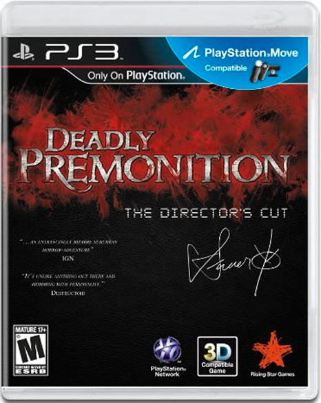
Saying that Deadly Premonition is a cult classic is a bit of an understatement, and it's probably the closest we'll ever get to a to a playable Twin Peaks. Its original box art was way better, showcasing a creepy image of a blindfolded person screaming while an axe murderer(?) stood in the shadows.
At least let you know that you were in for a delightfully weird experience. The box art for the Director's Cut, however, is just a red squiggly line with the game's title printed over it and a computer-printed signature from the game's director. Get it?
Echochrome (PSP, 2008)
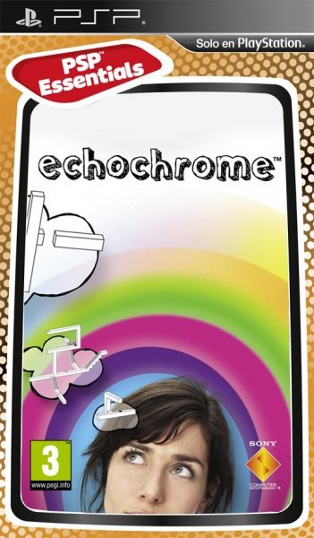
A wonderfully unique puzzle game, Echochrome is all about turning seemingly impassable obstacles into navigable pathways by shifting your perspective, much like the similar mechanic in Fez. Its art style is visually interesting, the puzzles challenging but fun, and you'll really have to use that noggin of yours to overcome its tougher obstacles.
The latter was probably what the box art was going for. Instead, it just turned out completely nonsensical.
The Orange Box (PC, PS3, Xbox 360, 2007)
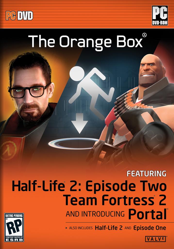
The Orange Box will forever go down in history as one of the greatest compilations of games ever offered in a single package, including the complete saga of Half-Life 2 (face it, Episode 3 will never be a thing), Team Fortress 2, and Portal, which holds the number one spot on our list of the best games ever made.
So how do you communicate such a high degree of awesomeness to the retail shopper looking at a shelf full of games? By cramming the visage of Gordon Freeman, a Team Fortress 2 Heavy, and a portal from Portal on the bundle's front cover, all placed over a garish orange backdrop.
Super Bust-a-Move (PS2, 2000)
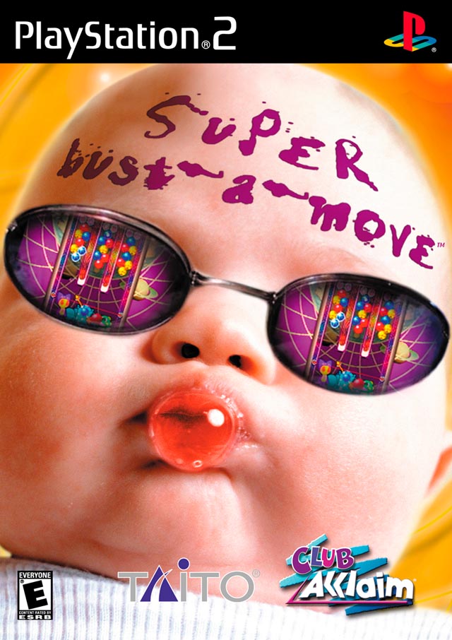
Not sure if classic tile-matching puzzle game, or cool baby blowing spit bubbles...
Ugly on the outside, beautiful on the inside
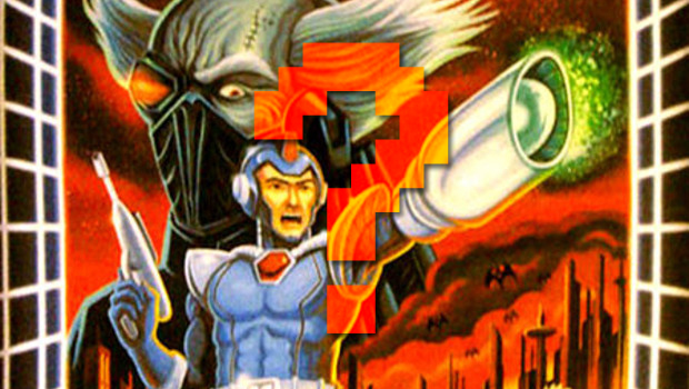
What other awesome games have you played that also had terrible box art? Which of the entries on this list do you disagree with? Let us know in the comments below.
And if you're looking for more, check out why Japanese box art is better and the rarest and most valuable collector's editions in video games.
Ryan was once the Executive Editor of GamesRadar, before moving into the world of games development. He worked as a Brand Manager at EA, and then at Bethesda Softworks, before moving to 2K. He briefly went back to EA and is now the Director of Global Marketing Strategy at 2K.

