20 games that looked way too good for their generation
The shape of things to come
Remember back in high school there was always that one kid who could somehow grow a full and luxurious beard? He always looked so mature, and interesting, and somehow more respectable. He was our de facto leader, the one true teen, blessed with the rich, rugged whiskers of a Brian Blessed or a Tom Selleck. While the rest of us made do with a paltry patch of lip fur - we still looked like late stage foetuses, regardless - this one kid was leaping way, way ahead of the curve. So, why am exactly I talking about this? Well, for a start, I owed Mr. Blessed a favour, and secondly - moustachioed adolescents just so happen to be the perfect metaphor for games that look light years ahead of their competition.
They may exist on the same hardware, but they're anything but equal - these are the gob-smacking, eyebrow raising, fist-pump inducing titles that looked so good they were very nearly next-gen, no new hardware required. Feast your eyes on these.
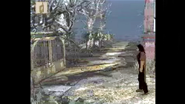
Alone in the Dark (Game Boy Color)
Egad, do you even remember what the Game Boy Color looked like? All those garish hues and simplistic sprites, swirling around the screen to the sounds of a Nokia 3210 begging for death. Doubtless New Nightmare was intended to be different - more immersive, and far darker than anything the GBC had previously witnessed. And different it certainly was - different from good - but while the game itself was absolute grade-A human manure, New Nightmare's visuals were a cut above its handheld contemporaries. Squint and you might even mistake it for a GBA title... almost.
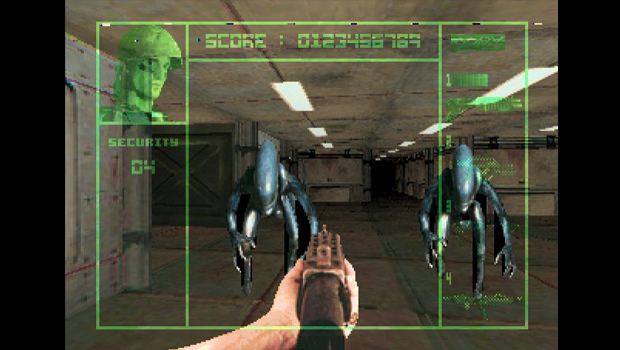
Alien Vs. Predator (Atari Jaguar)
Ah the Atari Jaguar, the overzealous hare to Ninty's turtle and Sony's, err, turtle and maybe Sega's turtle too. The point is that the Jag took a great big early jump into supposedly next-gen gaming, only to wind up losing the race in short order. Whether by ill luck or poor planning, Atari's final console found itself performing a weak, over-hyped, half-generational leap at a time when the rest of its competitors were revving up for the full double jump. It was the Dreamcast of its day, only without the great games and lasting legacy of warm, gooey feelings.
Yet despite its rapid obsolescence, Atari's machine did manage to produce one outstanding looker. It may not seem like much today, but at the time of its release, AvP was damn near the diamond-standard in home console visuals.
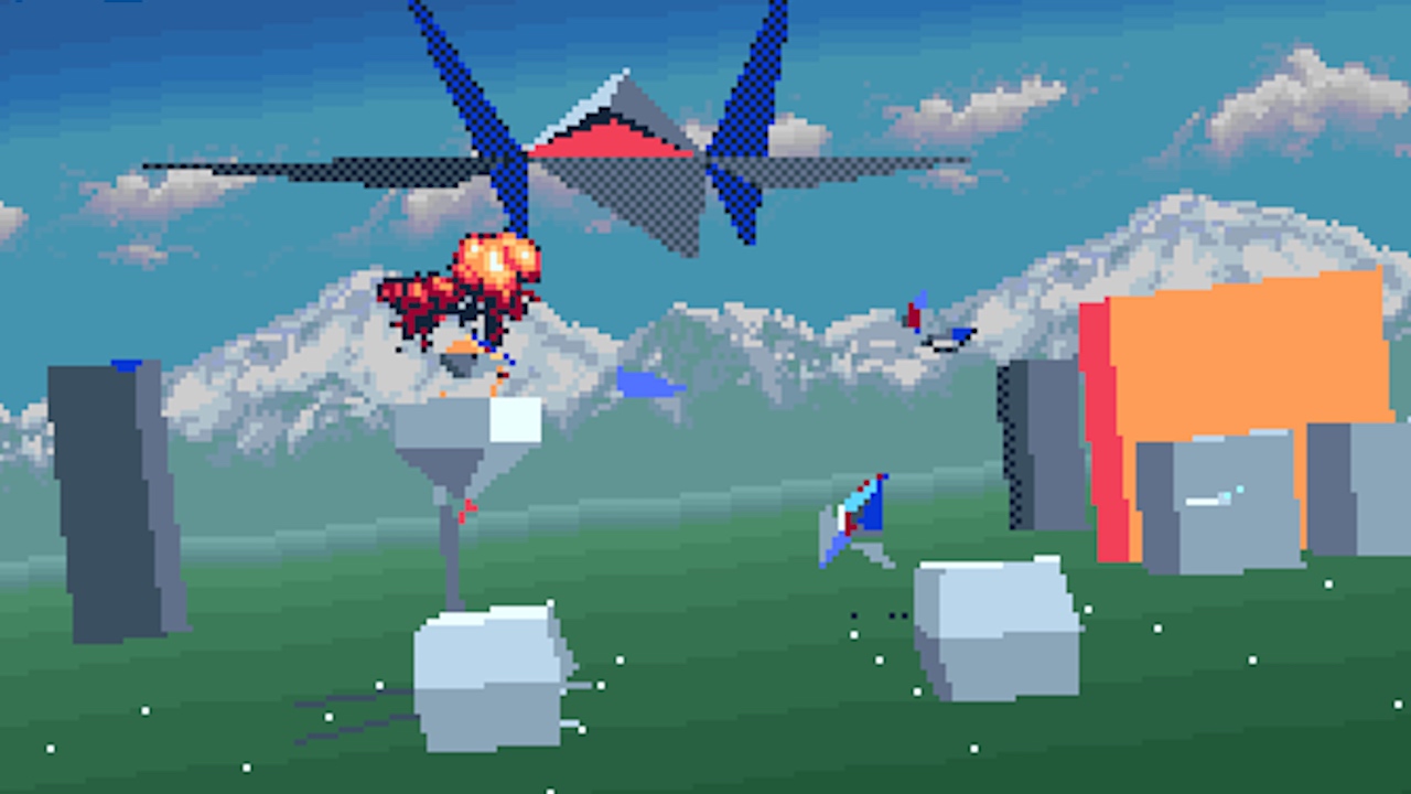
Star Fox (SNES)
Seeing slick 3D graphics emanate from your humble SNES must've seemed like pure witchcraft back in 1993. The machine itself was already some two years old by that point, and the standard was seemingly locked in. Oh sure, later games would continue to look better and better (the SNES was a particularly cocky console like that), but the kind of total, seismic shift entailed by Star Fox's release was a ludicrous advancement, regardless.
The game didn't even require one of those ultra faddish stop-gap peripherals to play. No Sega CDs here, oh no. Star Fox's technical wizardry all occurs inside of the cartridge itself, newly kitted out with the powerful Super FX chip. For a more modern comparison, imagine buying an Xbox One title that suddenly started throwing holograms across the room, firing off game-appropriate scents, or making you a cup of tea. That's how wildly unexpected this baby was back in the early '90s.
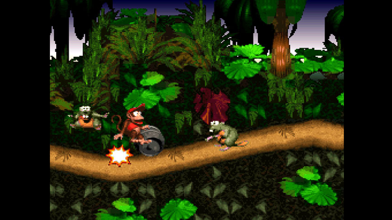
Donkey Kong Country (SNES)
As remarkable as Star Fox's appearance may have been to the comparative cavemen of the 1990s, DK's SNES outing was almost even more impressive. Not least because Rare achieved it all without the aid of the aforementioned Super FX. Instead the studio bet big on the relatively 'simple', hitherto underutilised technique of pre-rendering its art in 3D, before importing it into the game. The resulting title boasted some of the most extremely detailed graphics of the era, with the likes of Killer Instinct and Abe's Oddysee later following its lead.
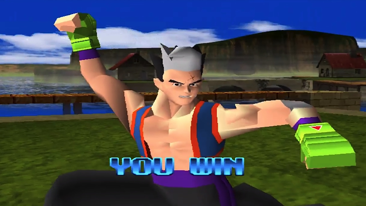
Tobal No.2 (PlayStation)
Unreleased and largely unknown in the west, Tobal No.2 represented Square's efforts at a competitive fighting title during the genre's most proliferate period. Despite being bundled with a demo of the hotly anticipated Final Fantasy VII, Tobal No.1 fared poorly enough in the region that it effectively put the kybosh on No.2's Western release. Too bad, because the game itself looked eyeball-blastingly fantastic - or at least it did at the time. Fluid animations, semi-rounded edges, somewhat recognisable faces - it's practically the holy grail of PSOne-era design.
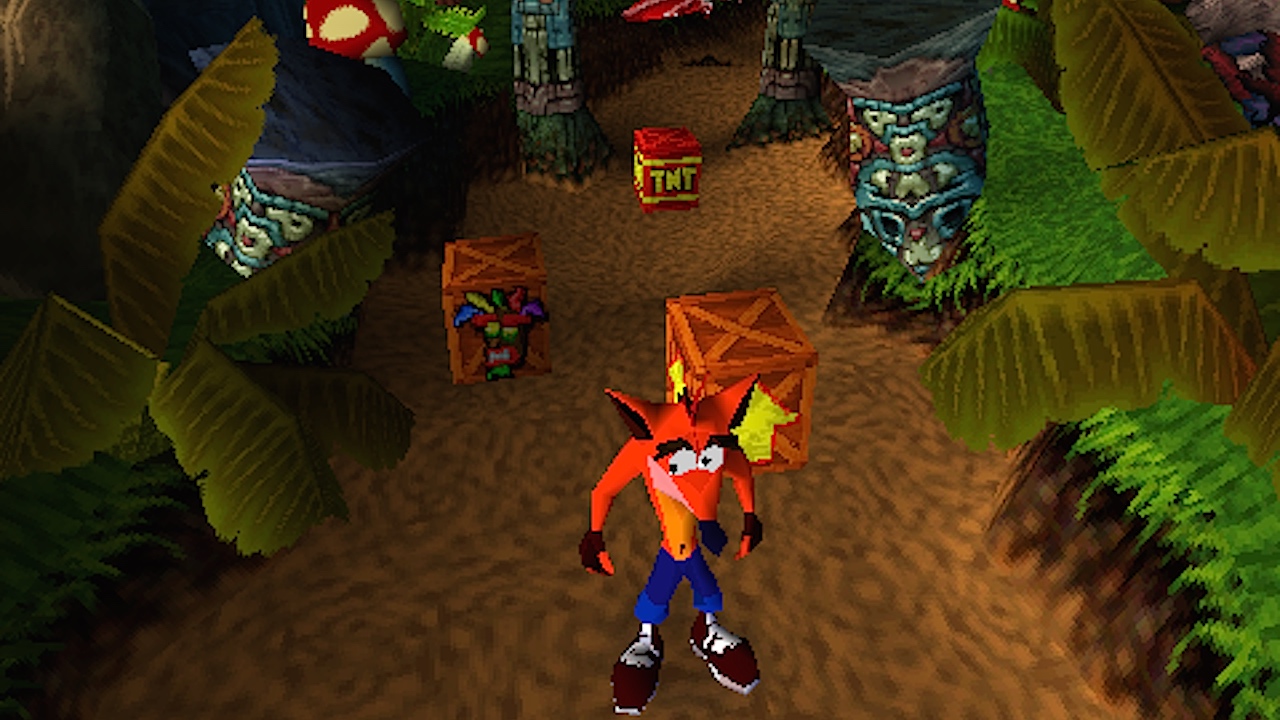
Crash Bandicoot (PlayStation)
It seems the name Naughty Dog and the term 'visually spectacular' oftentimes go hand in hand. That's because the fine folks behind Crash Bandicoot are absolutely, positively bonkers when it comes to wringing out every last drop of potential from Sony's home consoles.
When it came to creating Crash, the team did everything from writing a new programming language to completely ignoring Sony's memory restrictions. In many ways the game was a completely custom job, and one that even internal Sony programmers were unable to repeat. Crash co-creator Andy Gavin wrote all about it here - it's a fascinating read.
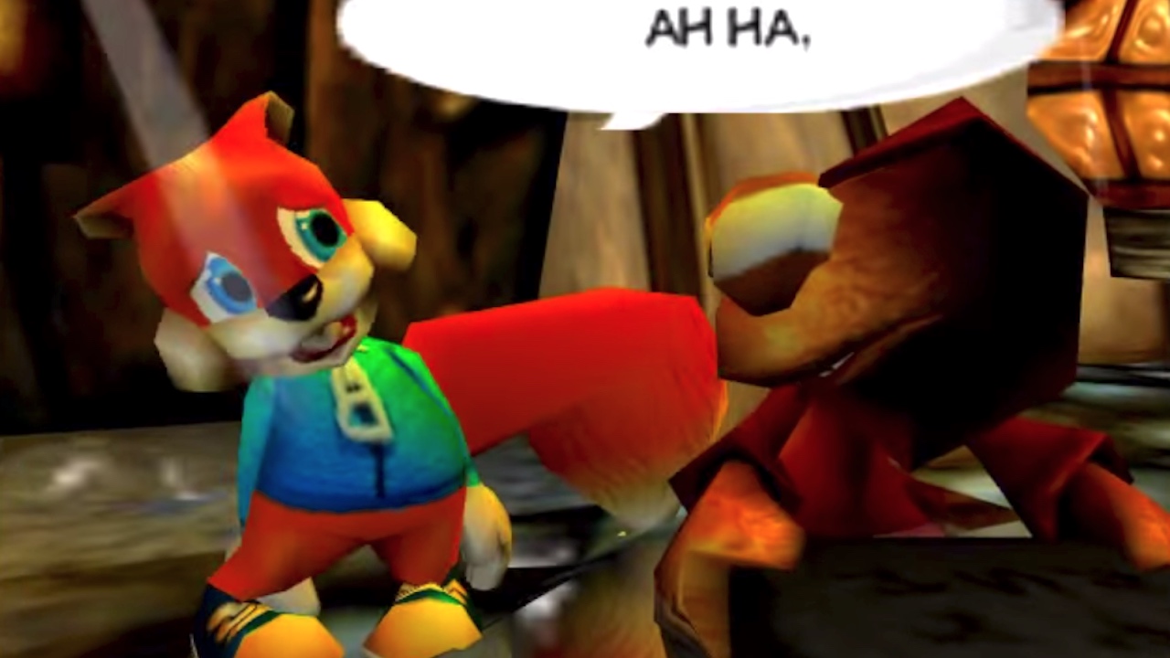
Conker's Bad Fur Day (Nintendo 64)
Conker's foul-mouthed tirades may have won him a great many admirers, but don't let that fool you - this scatologically-minded squirrel was no one trick pony. Rare's resident rascal also boasted some of the slickest, most lushly textured visuals of the entire 5th generation. Yes, he may have appeared late on in that cycle, but the visual difference between his game and, say, Super Mario 64 remains truly remarkable.
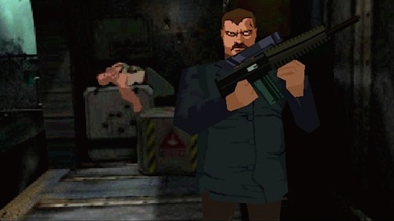
Fear Effect 2: Retro Helix (PlayStation)
'Boobs'. There, I've just about summed up the entire advertising campaign for Fear Effect 2. Luckily, the game itself isn't quite so shallow, though it remains just as aesthetically pleasing. Where other games of the era were content to model a crumpled up dustbin and call it a face, both Fear Effect and its sequel gave us actual human features, albeit in a slightly stylized form - mixing FMV backdrops with smooth cel-shaded characters.
Its no exaggeration to state that Fear Effect 2 could've easily passed for a PS2 title. Hell, it still looks good enough to be mistaken for a modern indie hit today. So, how on earth did developer Kronos accomplish this titanic feat? Perhaps through some sort of arcane ritual? Nope, they just shipped the thing on 4 full-to-bursting discs. That's four times the chances of your idiot uncle using one as a drinks coaster. No wonder they called it fear effect.
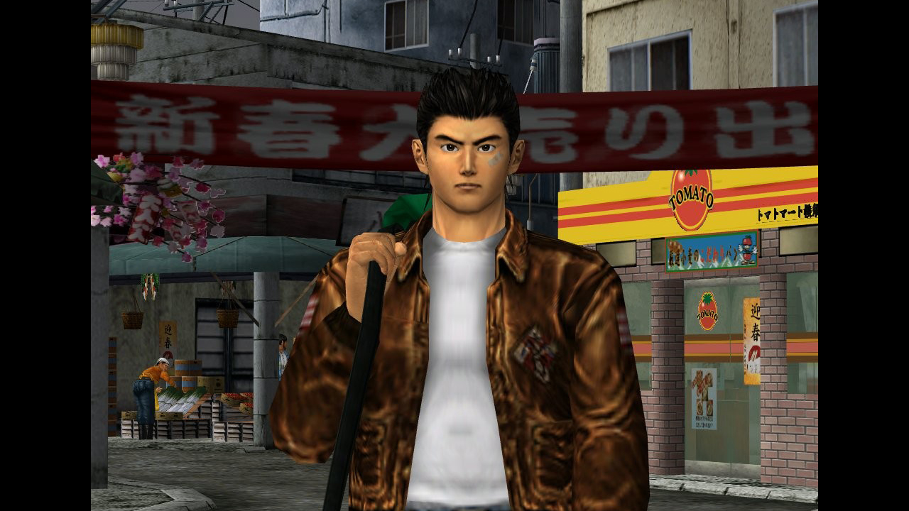
Shenmue (Dreamcast)
Poor old Dreamcast, you simply peaked too soon. Much too strong for the 5th gen, much too weak for the 6th. Though you might have had a chance, I suspect, if it werent for the poor fortune of facing off against the single most successful console of all time. Curse you PS2, and all of your brilliant games!
Still, the Dreamcast had plenty to recommend it, including the Shenmue series, a pair of ambitious open-world adventures boasting some seriously impressive visuals. Packed with colourful crowd scenes and vibrant environs that feel truly, uncannily alive, Ryo's epic tale looked every bit as revolutionary in 1999 as its 'real-life' RPG gameplay felt.
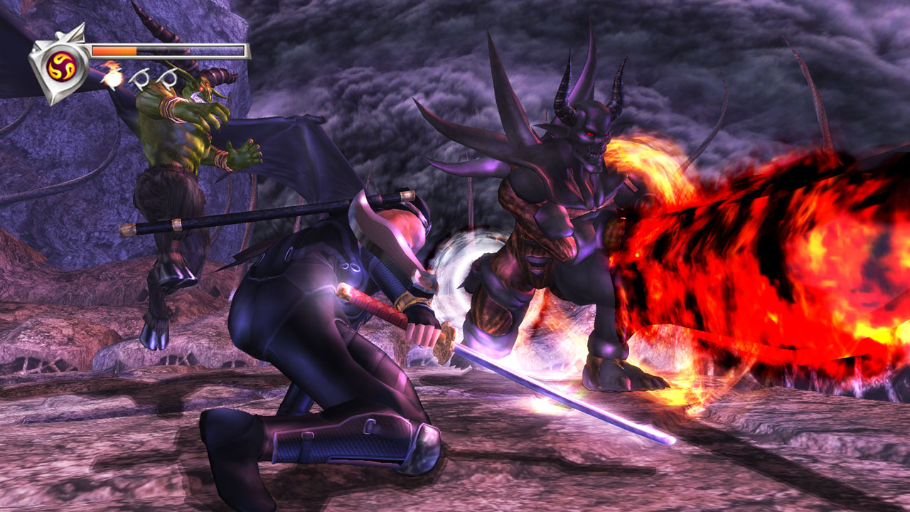
Ninja Gaiden Black (Xbox)
So beautiful, yet so cruel - Ninja Gaiden Black is the veritable cheerleader of the video game landscape. Smooth as silk and a joy to behold, if not always to play, (y'know, because it's so darn hard) - Black looks more like an Xbox 360 launch title than an original XB game. The very fact that its PS3 port (known as Ninja Gaiden Sigma) looked a little shoddier for the switch should speak volumes about just how pretty this original effort was.
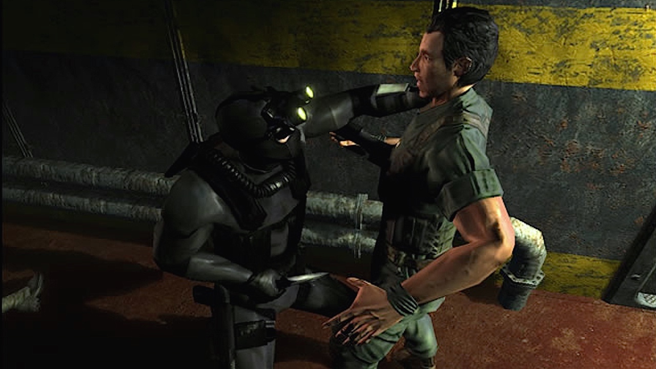
Splinter Cell: Chaos Theory (Xbox)
Early Xbox fanboys certainly had their work cut out for them as far as the all-powerful PS2 was concerned. Sony had the sales - roughly 6 times that of the Microsoft machine - the lineage, thanks to the PSOne, and the vast majority of both the timed and non-timed exclusives. Yes, Halo was great, but not enough to compete with the likes of God of War, Gran Turismo, Final Fantasy et al. The one solitary area in which Xbox aficionados could be certain of victory was in regards to graphical performance. Xbox games just looked better, and titles like Splinter Cell: Chaos Theory were instrumental in proving it.
Detailed environments, smooth animations, and a quality of lighting unheard of on home consoles of the day made Chaos Theory the poster child for the Xbox's visual supremacy. It also didn't hurt that the game's PS2 port utterly paled in comparison. Of course, what most fans neglected to mention is that the game looked better than just about every other Xbox game too
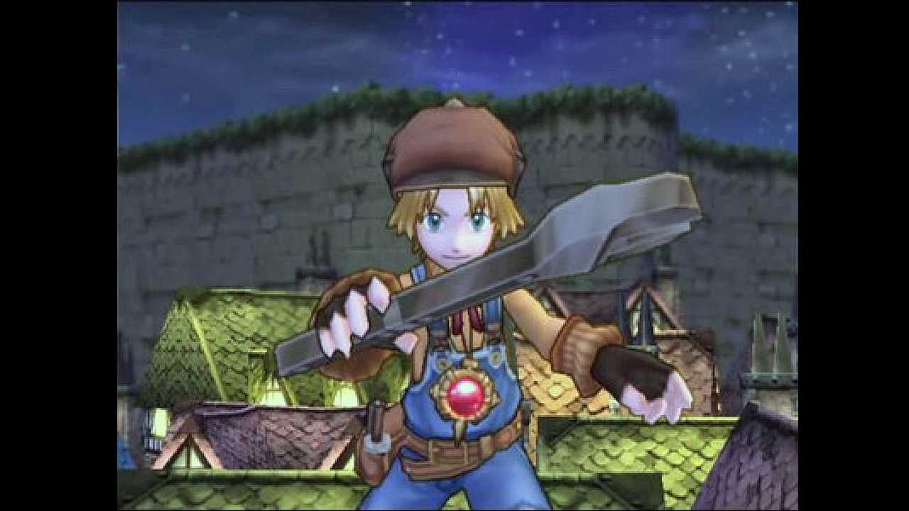
Dark Chronicle (PlayStation 2)
One of the single best ways to help a game stand the test of time is to try and eschew 'realistic' graphics in favour of a more artistic approach. Cel-shading - or 'the art of drawing big black lines around everything', because screw you high school art teachers - remains one of the most popular means to achieving that end.
2003's Dark Chronicle (aka Dark Cloud 2 in the states), stands as testament to the success of this method, looking just as good today as it did during the latter parts of the PlayStation 2's heyday. Though not as smooth as similarly styled Valkyria Chronicles, the titles remain a fair sight more comparable than any other '03/'08 pairing you could mention. Just ask the likes of Jedi Academy and The Force Unleashed, or Devil May Crys 2 and 4.
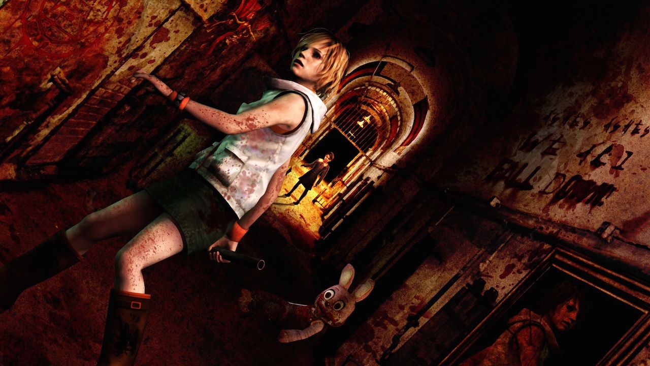
Silent Hill 3 (PlayStation 2)
This spot could just as easily have been filled by Silent Hill 4, another gorgeously gory title that somehow managed to look like a million blood-soaked bucks. So, If that's your preferred option, I say go wild. Run with the antelope, sing it in the valleys, scream it from the highest mountain top. But for me, Silent Hill 3 looks just a smidgen better.
Whatever the case, neither title has any business whatsoever working on a PS2. It's quite simply stunning what the developers were able to achieve here. Ultra smooth textures, believable character animations, icky schlong monsters. This game has it all!
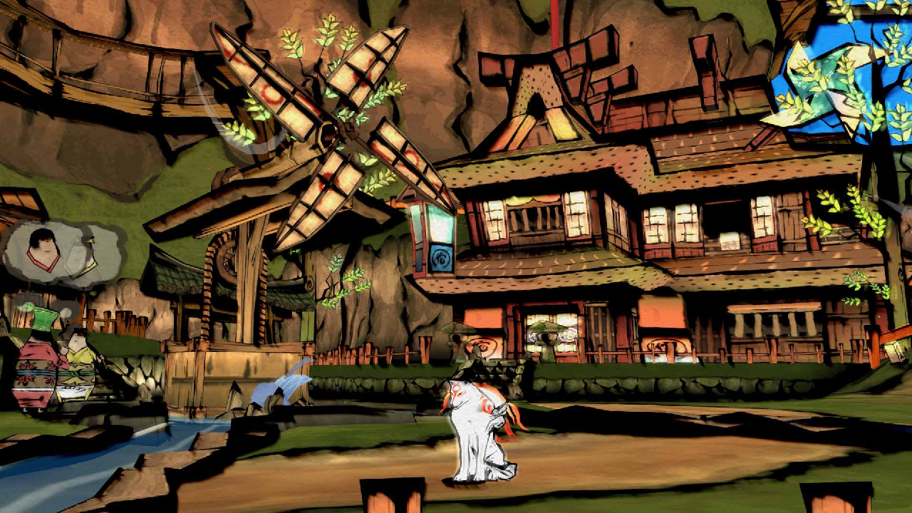
Okami (PlayStation 2)
As visually striking today as it ever was, Okami represents further proof that a strong art-style can and will endure the test of time. Where other, more 'realistic' games quickly become little more than running sight gags - i.e. "I can't believe we used to think this looked good" - Okami and its ilk remain just as vital as ever.
Sure Capcom may have opted to give it the whole HD treatment later down the line, but in truth the game barely needed it. When viewed on a proper, standard-def CRT TV, Okami positively glows, marrying cel-shaded design - there it is again - to ink wash-inspired visuals. There's little more that needs to be said here, other than to perform that weird kissing gesture that cartoon chefs are so fond of. Bellissimo!
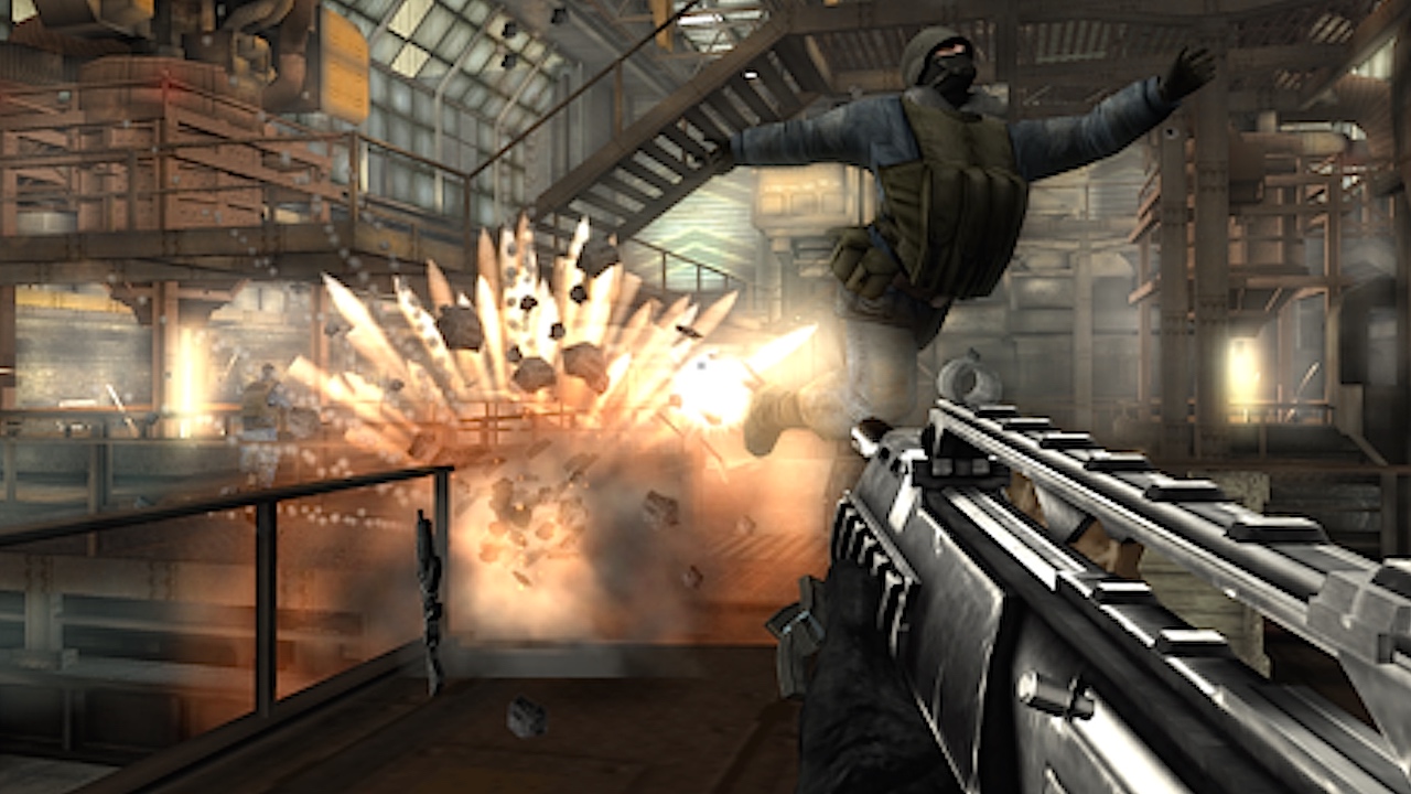
Black (PlayStation 2)
Black certainly isn't the prettiest game on this list, though that's largely by design. Few 6th generation titles nailed the grim and gritty aesthetic quite so well as this. What's even more surprising to note is the sheer level of attention being paid to destructibility, one of the game's biggest features and a major drain on resources.
With so much processing power being set aside for crumbly biscuit physics, you'd think the rest of the game's graphics would suffer. Not so, in fact they're some of the best on the platform. It seems the lesson here is a simple one: Don't compromise on anything ever, and everything will work out just fine. Just don't apply that to marriages. In every other respect, you're basically good.
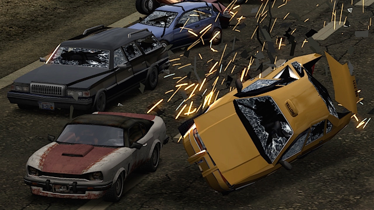
Burnout Revenge (Xbox)
Here's a rare example of a cross-platform title where the old-gen outing looks better than the new. Odd I know, and partially a matter of taste, but there are a few good reasons why this might've occurred. For one, the older system was far better understood than the then-cutting edge Xbox 360. With the game likely being made for the former and ported to the latter, there wouldn't have been many opportunities for true enhancement.
As such, the 360 title appears overly bright and blurry, representing a clear case of a studio throwing fancy effects at a game in the hopes of making it look somehow 'newer'. Still, that's one mighty fine looking Xbox game. Well done, you old geezer.
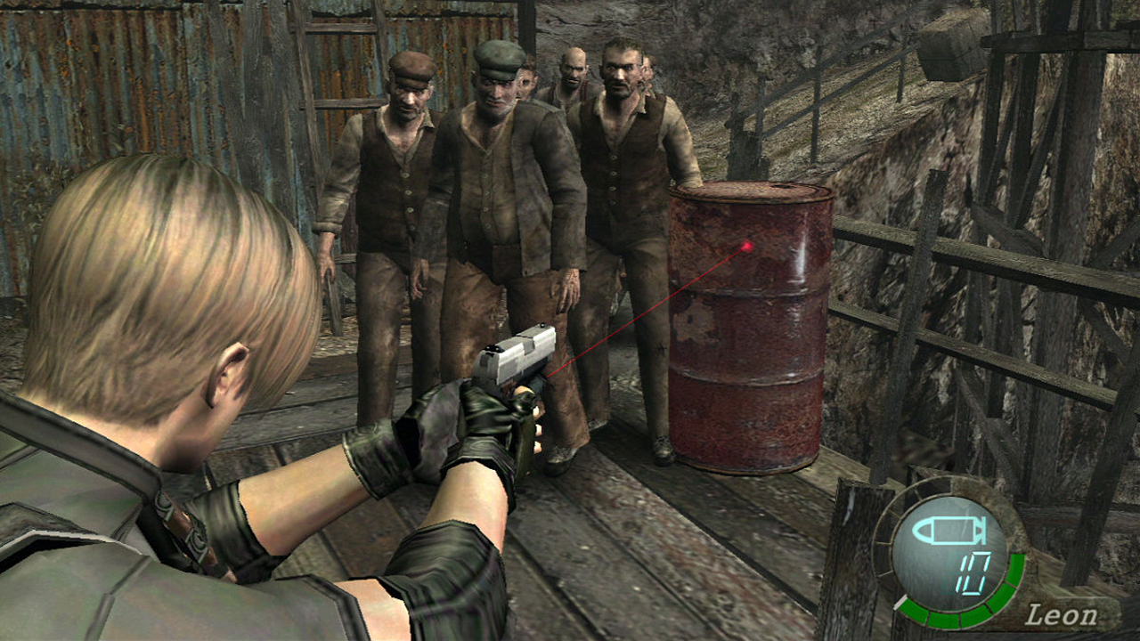
Resident Evil 4 (GameCube)
Proponents of the 'size doesn't matter' debate, look no further than this all-time great. Squished onto one of the GameCube comparatively tiny discs, Resident Evil 4 still managed to look a thousand times better than its eventual PS2 port. A few blurry textures aside, this is a title that could've shown up in the early days of the Xbox 360 and no one would've batted an eyelid.
This, of course leads to the obvious conclusion that the game was actually developed many years into the future, before being sent back in time as reward for our good behaviour. Cheers Capcom.
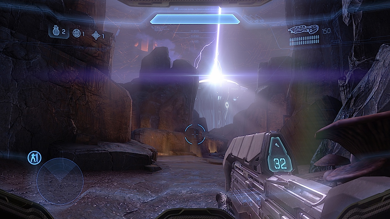
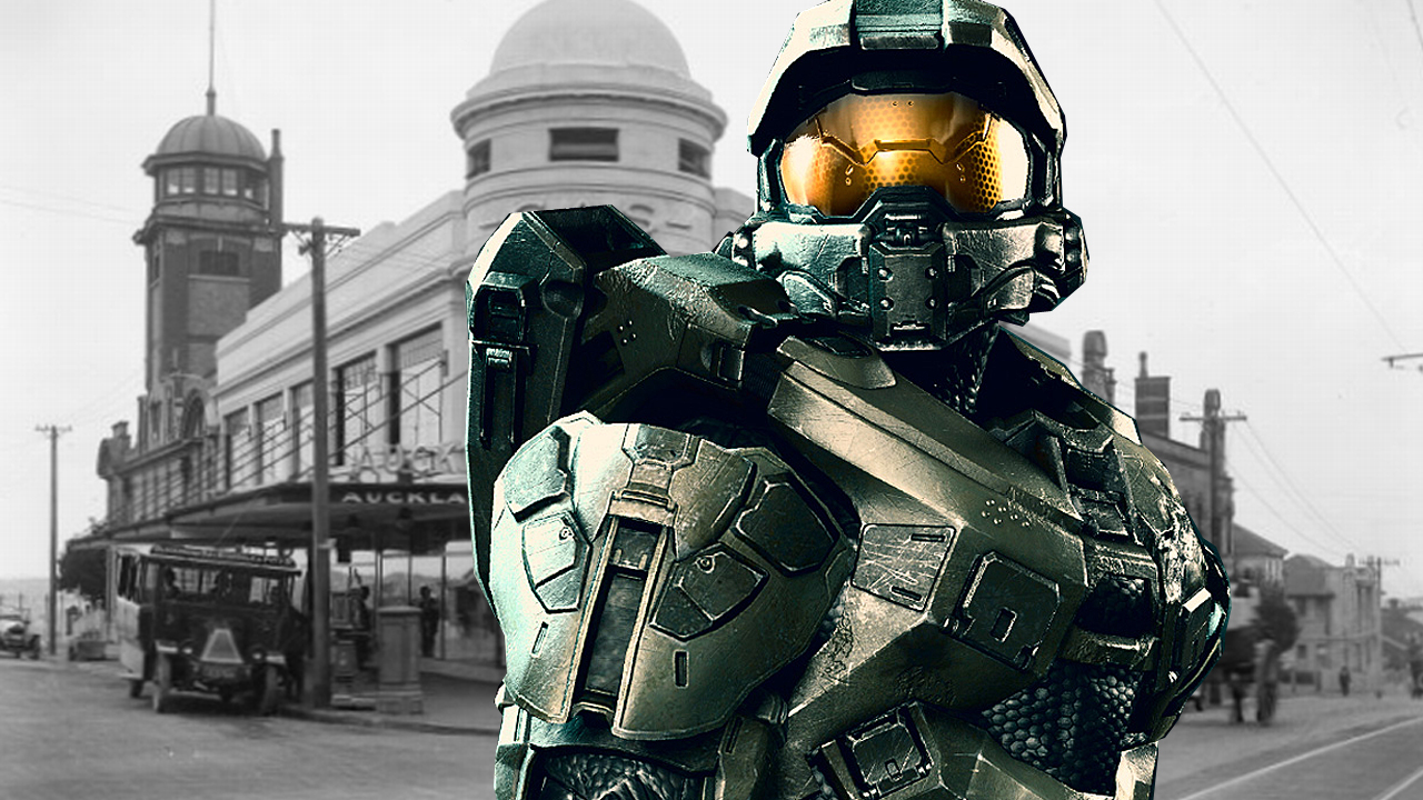
Halo 4 (Xbox 360)
It's no secret that the longer a development team has with a console, the more power it's able to procure from it. Games at the end of a cycle simply ought to look better than those at the start, where the pressure to go cross-platform and get to grips with some new-fangled technology tends to weigh heavy on the developer. Normally, these visual improvements emerge at a steady rate, eventually reaching a plateau of sorts during the mid-point of a PlayStation or Xbox's life cycle.
Halo 3 represented its series' starting point on the 7th gen. Halo: Reach therefore was its plateau - a modest improvement all around. Except, of course that it wasn't, for after wresting control of the franchise from long-time developer Bungie, 343 Industries set about sacrificing every goat it could get its hands on in order to summon up the sheer level of black magic necessary to produce Halo 4. It may not be 8th gen, but it's damn close enough for a game operating on 2005 hardware. Sumptuous stuff.
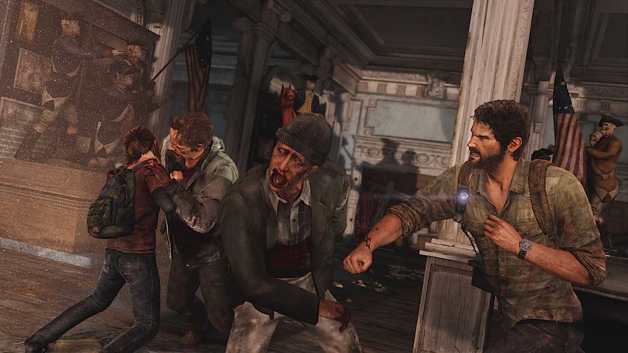
The Last of Us (PlayStation 3)
Alright alright, let's just get this one out of the way good and early: The Last of Us: Remastered looks a whole lot nicer than this initial effort. I suppose that's kinda the point. And yet for my money the game's PS3 incarnation already looked as good, if not better than most 8th-gen experiences. The whole thing just looks so soooo well, I don't know exactly, I guess it defies description. No amount of swooning superlatives could hope to do it justice, and so I'm just going to go ahead and coin a new one myself - 'fansplanshish'. The Last of Us for the PlayStation 3 looks absolutely fansplanshish. Go ahead and jam it in your eyeholes.
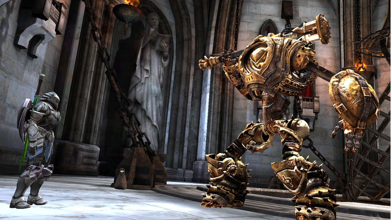
Infinity Blade (iOS)
Never have I been more sure of the Apple/ Satan relationship than after seeing this stunner in action. How else do you explain the sheer visual majesty on display on a smartphone screen? There can be little doubt about it. Some poor, unfortunate intern definitely wound up on an altar in order to make this happen.
The problem with adding a smartphone game to this list is that the format's generations don't tend to last so long or mean as much. Saying that Infinity Blade looked next-gen therefore doesn't really accomplish a great deal. Still, it's quite an achievement, and a clear winner over the medium's usual fare. When everything else looks like Angry Birds, Infinity Blade may as well be the second coming.
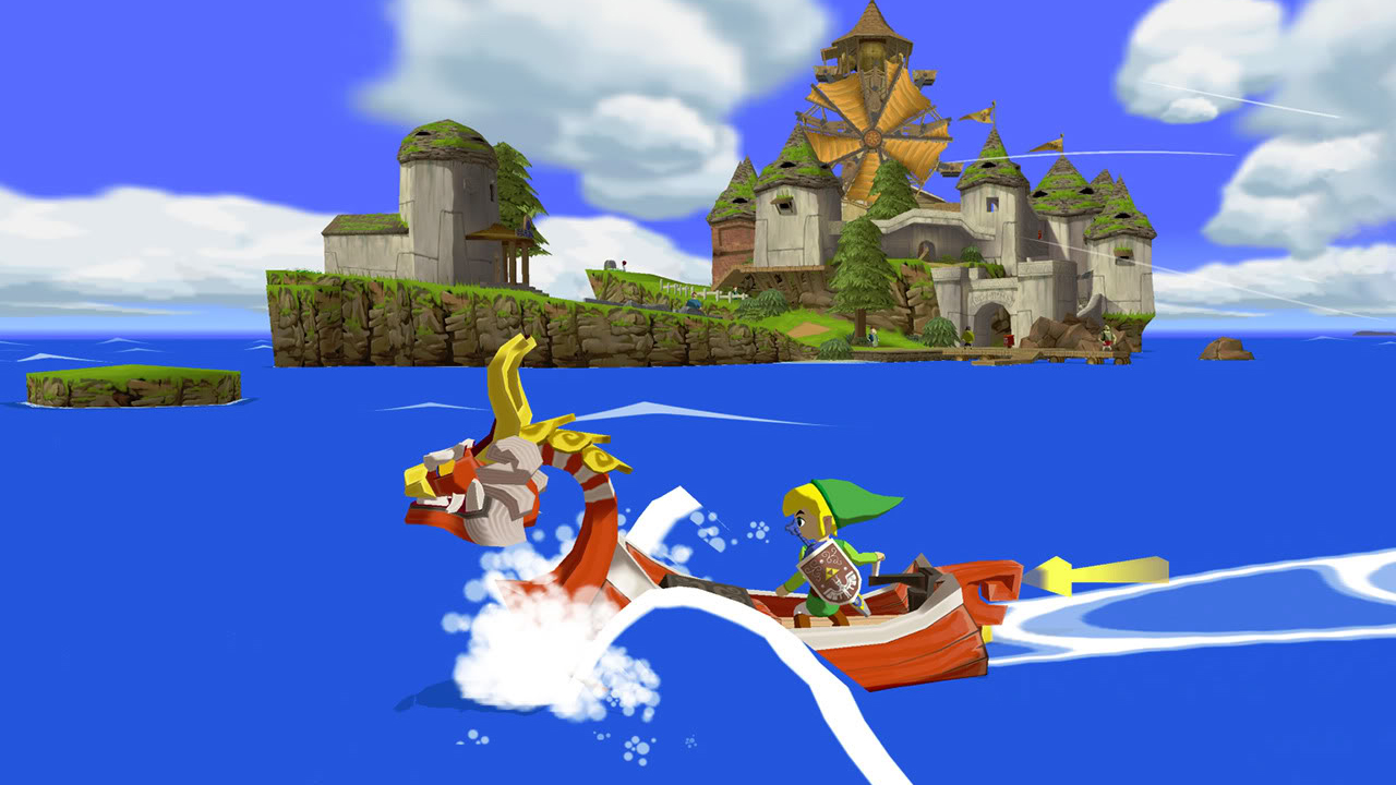
Honourable Mentions
There, that should minimise the deluge of 'But you for got about Game X, you idiot!' in the comments. But it won't, will it? Have at it, I can take it.

