The 20 laziest Pokemon designs ever
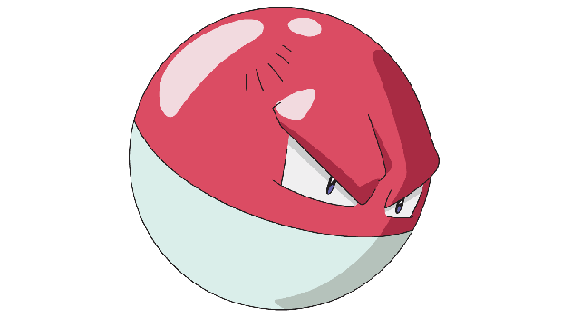
Voltorb

Here we are. The laziest Pokmon design in existence. We want you to appreciate for a moment what this thing actually is. Look familiar? Within the first generation, the design of a Pokball was the inspiration for one of the Pokmon. Surely the developers could have been a bit more creative than that. The only thing that really separates it from an actual Pokball are the intimidating eyes tacked on there. And what'd the designers do for the evolution Electrode? Flipped it upside-down. The "hardcore" Pokmon crowd loves to make fun of the newer generations, claiming they lack the alluring magic and creativity of the original 151 pocket monsters. Apparently they forget all about the lazy, dumb sphere that is Voltorb.
Be the best

There are obviously plenty of other derpy, lazy, and generic Pokemon, but we had to cut it off eventually. What do you think? What other Pokemon do you think should have been included on the list? Let us know in the comments, below!
And if you're looking for more, check out what the original 151 Pokemon would taste like and the top 7 most disturbing thing about the Pokemon universe.
Sign up to the GamesRadar+ Newsletter
Weekly digests, tales from the communities you love, and more


