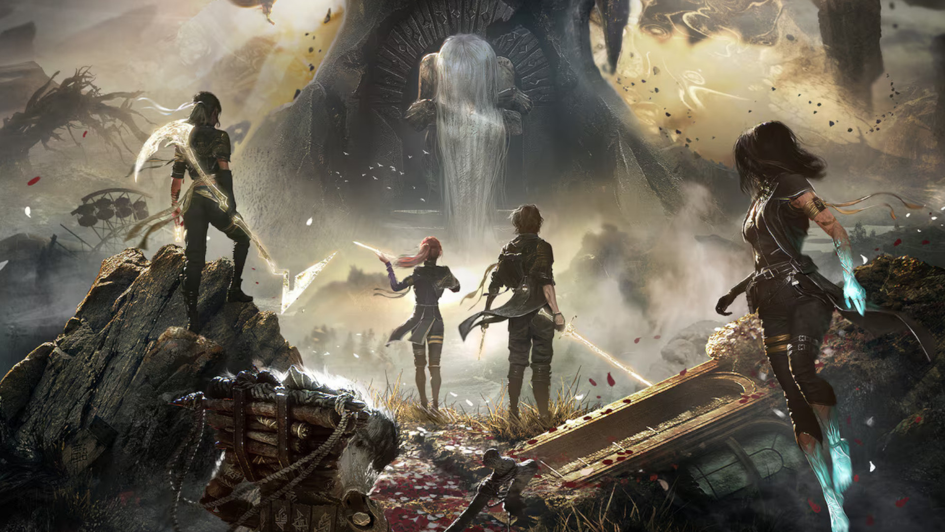
20 lessons from old game manuals
Features
By
GamesRadarTylerWilde
published
What product docs from the past can teach us about games, life, and hyperbole
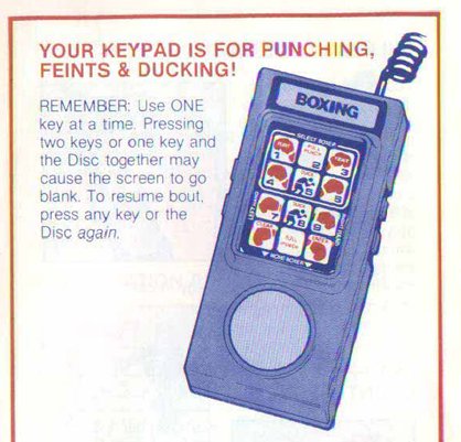
But don't get carried away - buttons aren't meant to be pressed simultaneously!
Lesson 7: You probably have had enough Digital Pictures

No matter how "too !@#$%&*! real" it is.
Lesson 8: The Sega logo isn't actually a part of the game, so just wait
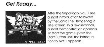
NO, keep waiting. The title screen isn't the game either. Now press the Start Button repeatedly.
Lesson 9: Cranky really hated Donkey Kong Country
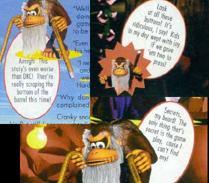
(It's because he's old.)
Lesson 10: It isn't ReadySoft's fault if Dragon's Lair sucks, it's YOUR FAULT
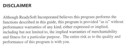
Why did you make this game you bought so bad?
Lesson 11: "Weak," "tender," and "vulnerable" should not be used together unless that's what you're going for

I don't think that's what they were going for.
Lesson 12: 3-D Tic-Tac-Toe looks AWESOME!
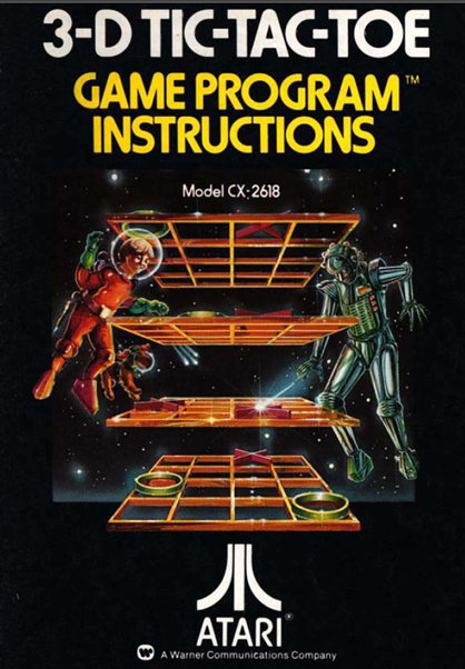
SPACETACTOEOHMYGOD!
Sign up to the GamesRadar+ Newsletter
Weekly digests, tales from the communities you love, and more
Lesson 13: It isn't

CATEGORIES
Associate Editor, Digital at PC Gamer

