25 Moments Where 3D Makes the Film Better
Take a trip through the third dimension...
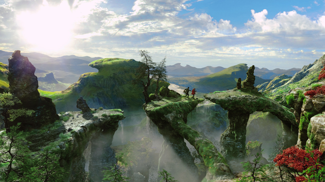
Oz the Great & Powerful (2013)
The 2D Version: In Sam Raimi’s quasi-prequel to both the classic Wizard of Oz film and Frank L. Baum’s books, con-man circus magician James Franco befriends a monkey (again) and takes up his destiny as the man behind the curtain.
Why The 3D Version Is Better: Raimi’s first effort in 3D throws in hands grasping at you, spikes shooting through the screen and water being spat out, but the moment where Oz plunges off the side of a waterfall makes you genuinely feel like you’re going with him.
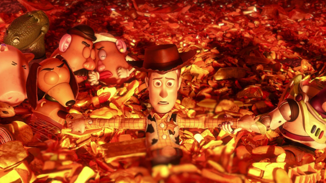
Toy Story 3 (2010)
The 2D Version: Pixar’s conclusion to their Toy Story trilogy changed up the writing and directing team but kept up the quality, with added themes of growing up.
No mention of what the toys were forced to witness in a teenage Andy’s room though.
Why The 3D Version Is Better: Toys are 3D tactile objects to be played with, and Toy Story 3D made us believe we were seeing genuine toys come to life giving the dramatic incinerator sequence an incredible emotional impact.
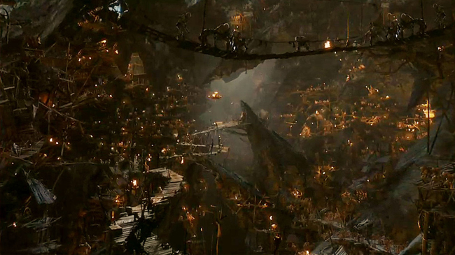
The Hobbit: An Unexpected Journey (2012)
The 2D Version: Peter Jackson’s return to Middle-Earth was either masterful or an overlong bore-a-thon, depending on who you spoke to. It also caused a stir with its pioneering use of controversial 48 fps High Frame Rate technology.
Why The 3D Version Is Better: One thing HFR did do was make 3D smooth and seamlessly integrated with the film.
Gone was the jerkiness and headaches that you can get and instead a lush enveloping world was created – none more so than the sweeping shots of Goblin Town.
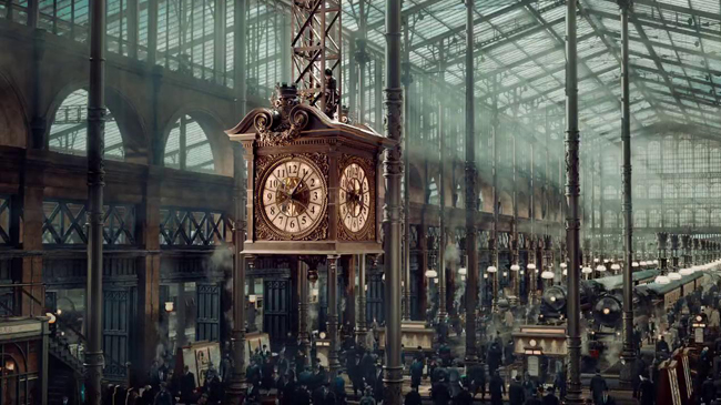
Hugo (2011)
The 2D Version: Martin Scorsese showed he could do children’s adventure films just as well as he could do mad bastards killing each other.
A love letter to the history of film is also a drama about the power of dreaming big.
Why The 3D Version Is Better: Scorsese enhances even the most ordinary scenes with 3D.
Witness the opening shot of the Paris train station - the dust and smoke of the trains literally drift out of the screen at you.
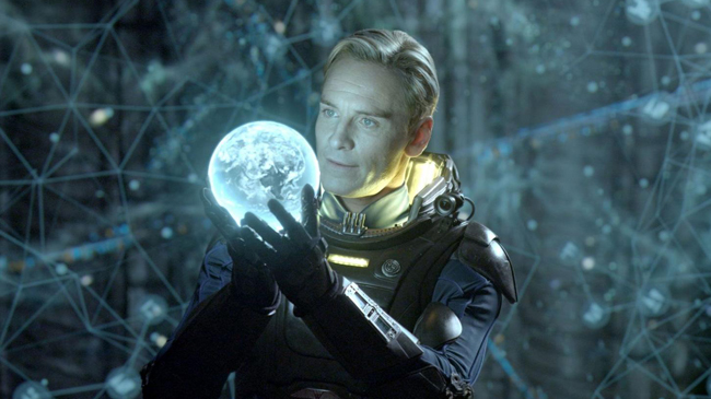
Prometheus (2012)
The 2D Version: Ridley Scott’s not quite but sort of prequel to Alien divided audiences with its use of magic space flute, but still looked absolutely amazing – the monsters at the end were actually painted models enhanced via CGI.
Why the 3D Version Is Better: David discovers the star map room. The incredible depth of field clearly puts you in the map and brings the alien technology to eerie life.
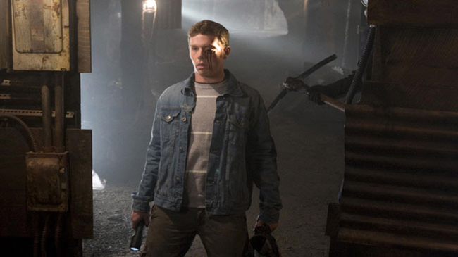
My Bloody Valentine (2009)
The 2D Version: This 2009 remake of the 1981 slasher cult classic is an often very silly unabashed retro gore fest, and marked Supernatural star Jensen Ackles' first major leading film role.
Why The 3D Version Is Better: Fully embracing 3D with ‘amazing’ scenes such a bloody stump being waved in front of you, and a totally gratuitous and hilarious sex scene, it’s the gouged eyeball flying at you which lets you know that 3D can be incredibly fun when used right.
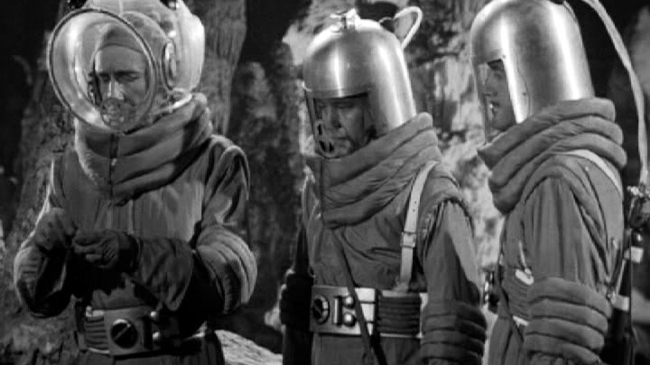
Cat-Women of the Moon (1953)
The 2D Version: Cat-Women of the Moon is more than just a great title. Arguably the first film to use the ‘male astronauts encounter nubile alien women’ trope, it’s cheesy fun harking back to cinema’s pulpy beginnings.
Why The 3D Version Is Better: Cat-Women of the Moon becomes beautifully eerie when viewed in its original polarised 3D – perfectly captured in the moment the astronauts encounter giant spiders living in moon caves (obvs).
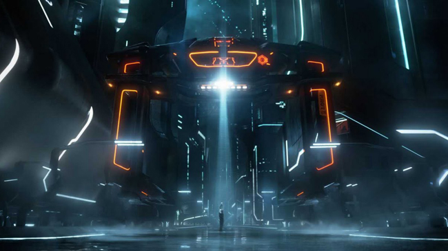
Tron: Legacy (2010)
The 2D Version: The sequel to the 80s cult classic may have disappointed Tron geeks (and y’know, everybody else), but there’s no doubting the incredible visuals created by CGI wizard Joseph Kosinski, previously responsible for the classic Gears Of War Mad World commercial.
Why The 3D Version Is Better: The Wizard of Oz style moment the film transforms into stunning 3D before our very eyes as Sam enters the Grid shows off how 3D can be utilised to add another layer to a film.
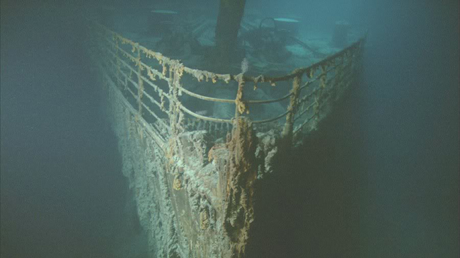
Ghosts of the Abyss (2003)
The 2D Version: The king of the world and Bill Paxton dive to the bottom of the ocean on their week off to see the wreck of the doomed liner, and undertake the most detailed exploration ever made of it.
Why The 3D Version Is Better: Cameron’s test run with his new 3D technology, the key moment here is the discovery of the passenger’s personal items, with the extra dimension bringing home the human nature of the tragedy in a way never seen before.
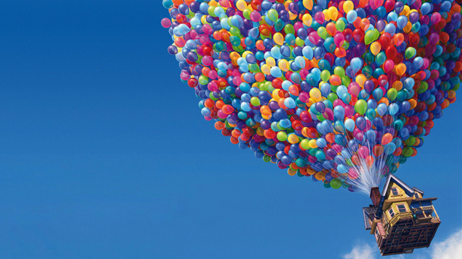
Up (2009)
The 2D Version: Pixar’s heartbreaking adventure about grumpy but loveable old man Carl (based in part on Spencer Tracy) escaping in a balloon house to South America is the animation studio’s last truly great original film.
Why The 3D Version Is Better: Trust Pixar to show everyone else how to do it properly in their first foray into 3D. The scene of the house taking off showcases 3D to sublime effect, both literally and metaphorically demonstrating Carl’s release.
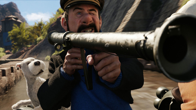
The Adventures of Tintin: The Secret of the Unicorn (2011)
The 2D Version: The team-up of talents that were Steven Spielberg, Peter Jackson, Edgar Wright, Joe Cornish and Steven Moffat produced an exciting film debut for Belgium’s most famous son, although the mo-cap slightly gave Tintin the dead eyes of a shark.
Why The 3D Version Is Better: Spielberg puts the camera in places he could never physically go in real life, and the 3D only enhances this. The climatic harbour chase literally puts you in amongst the action and actively dodging the debris.
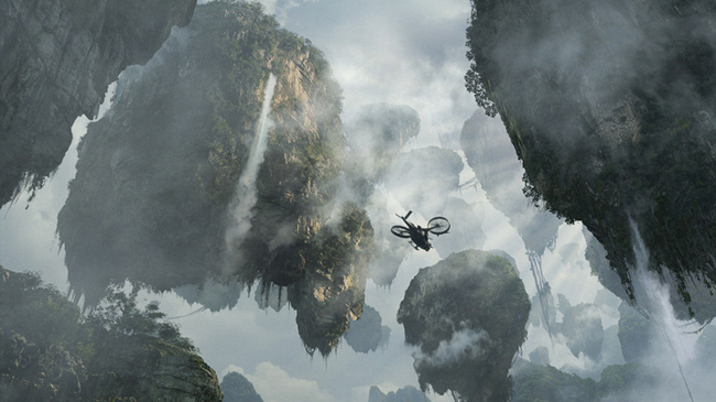
Avatar (2009)
The 2D Version: Part interstellar war epic, part FernGully remake, Avatar is a lush visual feast for the eyes no matter how you watch it, and a welcome return from James Cameron’s 12-year documentary-making hiatus, during which he decided to invent an entirely new 3D technology. As you do.
Why The 3D Version Is Better: The reveal of the floating mountains is a jaw-dropping moment which blurs the boundaries between simply observing a film and feeling like you’re part of it.
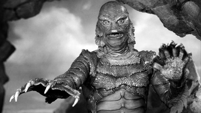
Creature From the Black Lagoon (1954)
The 2D Version: Created by Disney animator Millicent Patrick, this classic Universal monster is actually a misunderstood noble beast, but still gets killed by us savages.
Why The 3D Version Is Better: An early 3D effort, the jagged Gill-Man owes his very existence to the need to create an iconic monster which would literally stand out from the screen; shown in the moment he reaches out his webbed claw to grab the audience.
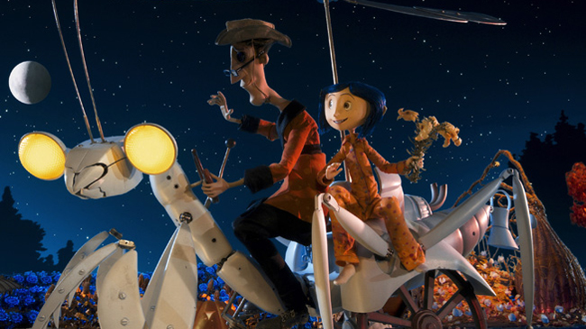
Coraline (2009)
The 2D Version: Henry Selick’s stop-motion adaptation of Neil Gaiman’s dark children’s fantasy is beautiful, and took over 450 people to craft it – using the sci-fi tech of 3D printing too.
Why The 3D Version Is Better: Coraline’s ride with her Other-Father through the garden on a praying mantis shaped tractor shows the depth and artistry of the stop-motion world.
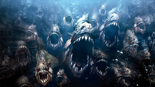
Piranha 3D (2010)
The 2D version: Well the title of the film doesn’t really work when viewed in 2D, but it’s still dumb fun. Riffing extensively off Jaws , the film gains extra marks for its Richard Dreyfuss cameo.
Why The 3D Version Is Better: Well you hardly put 3D in the title of your movie unless you’re confident of delivering the goods (including a penis-eating piranha), and has a final shock of a (spoiler) human sized piranha leap out of the water and almost into the audience.
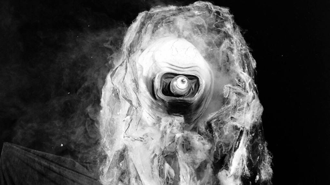
It Came From Outer Space (1953)
The 2D Version: It Came From Outer Space is now regarded as something of a classic of the genre despite being panned on release. Not quite the Blade Runner of its day, Ray Bradbury’s involvement in writing it certainly helps things.
Why The 3D version Is Better: Universal’s first ever 3D movie promised to have ‘fantastic sights leap at you’ on the poster.
The reveal of the aliens as a jelly-like life-form is weird and unexpected, especially in the polarized format.
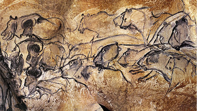
Cave of Forgotten Dreams (2010)
The 2D Version: Batshit hero Werner Herzog goes underground to the Chauvet caves in France, and then decides to mix up images of 32,000 year old cave paintings with clips of a dancing Fred Astaire. Not sure why. But we like it.
Why The 3D Version Is Better: Initially resistant to shooting in 3D, Herzog conjures something truly magical.
The 3D makes the cave paintings look like they’re almost moving upon their first reveal.
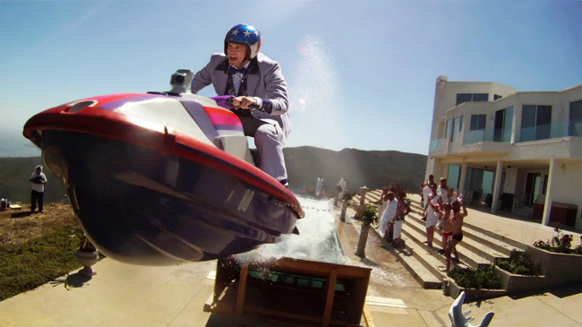
Jackass 3 (2010)
The 2D Version: Sticking to the old adage, ‘if it aint broke don’t fix it’, Jackass 3 is another dose of comical violent slapstick from the boys, and utilises 1000 fps Phantom cameras to create a memorable slow-motion opening sequence.
Why The 3D Version Is Better: This Jackass is bringing the stunts to you directly, and the moment Johnny Knoxville flies at you on a jet ski will have you ducking in your seat.
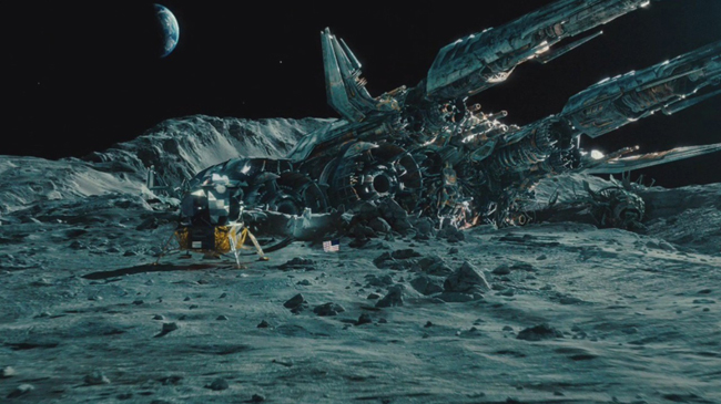
Transformers: Dark of the Moon (2011)
The 2D Version: Slightly better (maybe) than the similarly overblown Revenge of the Fallen, Dark of the Moon mixed the usual massive action set-pieces with recycled footage from The Island.
Why The 3D Is Better: 3D Bayhem! Convinced by James Cameron to make the switch, watch Neil Armstrong make a giant leap for mankind into a crashed Autobot spaceship, where the 3D truly reveals the sheer scale of the Transformers compared to us.
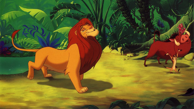
The Lion King (1994)
The 2D Version: It’s the Return Of The King but set in the African plains, with orphaned lion Simba looking to reclaim his throne. Also with less flaming eye of Sauron. In fact it’s not like Return Of The King at all.
Why The 3D Version Is Better: It may be heresy to say it, but the Lion King benefitted from its 3D post-conversion. Particularly during Hakuna Matata, the 3D reveals a depth to the animation not appreciated in flatter formats.
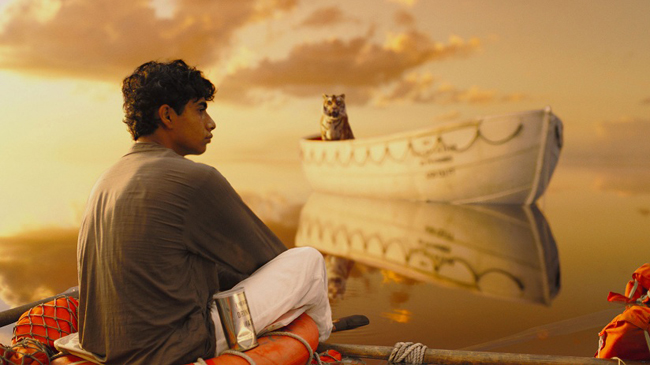
Life of Pi (2012)
The 2D Version: Ang Lee’s masterful and Oscar winning adaptation teamed him up with experienced Tron: Legacy cinematographer Claudio Miranda, and let him work with more tameable CG creatures than Hulk .
Why The 3D Version Is Better: Lee turns 3D technology into a versatile creative tool. The kaleidoscope of images as Pi muses into the ocean about the meaning of life puts you directly inside his imagination.
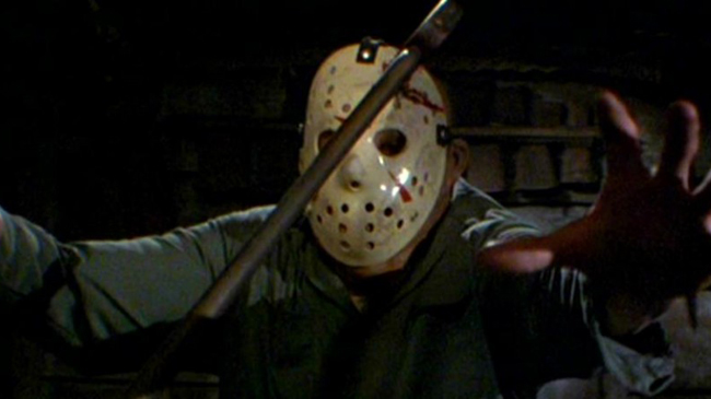
Friday the 13th Part III (1982)
The 2D Version: The third part of the classic horror franchise gave us the iconic Jason hockey mask, as well an attempt to end the series definitively. But as we all know, you can never kill Jason.
Why The 3D Version Is Better: Friday the 13th has always been best at teasing the audience – with the 3D shots of popcorn exploding not only looking great but building tension superbly.
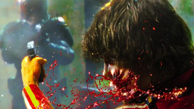
Dredd (2012)
The 2D Version: Playing like a love-child of RoboCop and The Raid , Dredd was an action-filled blast which may or not have been ghost directed by screen-writer Alex Garland, depending on which stories you listen to.
Why The 3D Version Is Better: It’s the judicious (boom boom) use of slow-mo in several sequences that stands out – especially with the junkies cracking open the slo-mo drug and getting their brains blasted out for their trouble.
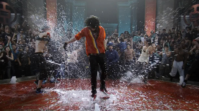
Step Up 3 (2010)
The 2D Version: The third film in the mighty (so-so) Step Up franchise may lack Channing Tatum, but gains Rick Malambri – well known for his role as ‘clerk’ in Surrogates. Still, it’s harmless and even enjoyable fun.
Why The 3D Version Is Better: The 3D puts the movie on another level as the close-up kinetic action of the final dance-off at the World Jam seemingly jumps off the screen and into the room with you, almost making you want to dance too.
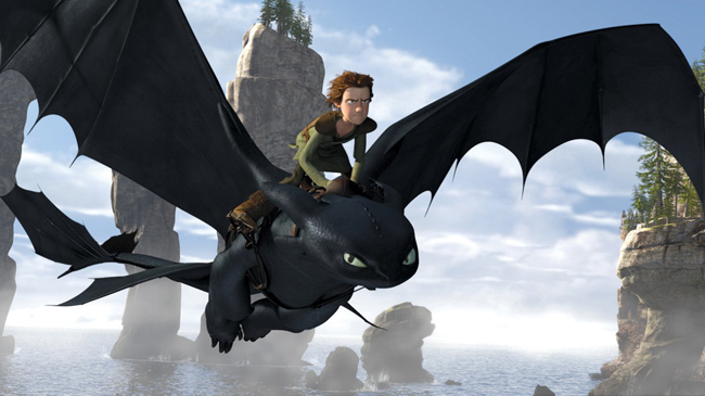
How To Train Your Dragon (2010)
The 2D Version: Doing away with its usual reliance on A-list voice casting and pop-culture gags, Dreamworks Animation proved it could handle spectacle and story as well as Pixar. Soaring landscapes that - with the help of Coen Brothers' cinematographer Roger Deakins - look better than the real thing.
Why The 3D Version Is Better: The moment where our hero Hiccup finally rides Toothless the dragon, cementing their new bond. 3D puts you right into the action, enveloping you in the exhilarating ride.
