30 Coolest '80s Horror Movie Logos
Talk about style...
The Fog (1980)

The Movie: John Carpenter's watery ghost story, in which sea-faring zombies roll into a tiny coastal town (along with a discombobulating fog) to bother Jamie Lee Curtis, Tom Atkins and Adrienne Barbeau.
The Cool Logo: Shaky lettering that starts off small but grows in size, so that by the time we get to the 'G', it's looming right in our faces.
Why We Love It: It's as spooky as the film. Usually, the word 'fog' doesn't exactly instil fear and cold sweats, but this logo makes it look like the most terrifying word ever created.
An American In Werewolf (1981)
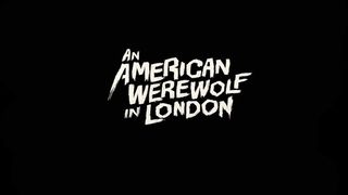
The Movie: Tongue-in-cheek horror flick from director John Landis following an American backpacker whose friend is mauled to death in the countryside. It's not long before said backpacker starts having a few hairy problems of his own.
The Cool Logo: It's masculine and choppy, and sort of recalls some of the old Hammer horror logos.
Why We Love It: Sometimes simply does it, and that's certainly true of this one. You don't need to do fancy things with the word 'werewolf' to make it scary.
Prom Night (1980)
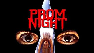
The Movie: Jamie Lee Curtis keeps on doing the scream queen thing when she and her friends are targeted at their high school prom by a bloodthirsty, revenge-fuelled killer. Cue lots of brilliant '80s disco dance scenes…
The Cool Logo: A fun play on high school letter jackets that lets us know everything there is to know about the film - it's set on prom night and there will be carnage.
Why We Love It: It's bold and efficient - and there's some awesome dripping blood.
Mother's Day (1980)
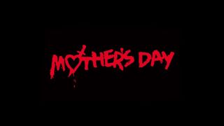
The Movie: When friends Abbey (Nancy Hendrickson), Jackie (Deborah Luce), and Trina (Tiana Pierce) head to the woods for a holiday, they're kidnapped by a group of insane punks…
The Cool Logo: The 'o' in 'mother' has been turned into a heart with a dagger struck through it, suggesting that this mother's day is going to be something of a gory affair…
Why We Love It: Who doesn't love dripping blood in a logo? This one goes one step further by making it look like the entire logo was painted in blood…
Image Source: Annyas.com
Happy Birthday To Me (1981)
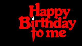
The Movie: Queen bitch Virginia Wainwright (Melissa Sue Anderson) is looking forward to her 18th birthday, but then her friends start getting killed. She keeps suffering from black-outs - could she be the culprit?
The Cool Logo: Not the kind of thing you'd normally see on a greetings card - this one's dark and sinister, usually appearing on a poster with a guy who's being killed by a kebab…
Why We Love It: It's the little touches that make it - the 'I' that's turned into a candle; the 't' that's become a knife. Brilliant.
Aliens (1986)
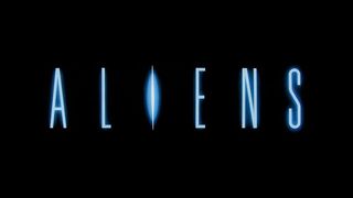
The Movie: Ellen Ripley (Sigourney Weaver) finds herself blasted back into space and going up against even more xenomorph nasties - and the Alien Queen. Director James Cameron knows how to put her through her paces…
The Cool Logo: The font's as spindly as the xenomorphs themselves - and the 'I' is gleaming ominously for added chill factor.
Why We Love It: Not only is it super-iconic, it also set the logo for the entire franchise - across books, games and comics, this is the one that stuck.
Sign up for the Total Film Newsletter
Bringing all the latest movie news, features, and reviews to your inbox
Evil Dead 2 (1987)
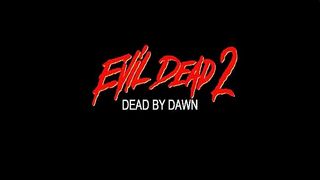
The Movie: Ash (Bruce Campbell) is back in this sorta-sequel/remake of the original Evil Dead. Ash is back in a cabin in the woods, and this time he replaces his possessed hand with a chainsaw. Groovy.
The Cool Logo: If the logo for the first film was rebellious and chunky, this goes in the complete opposite direction, opting for elegant simplicity.
Why We Love It: It looks like something drew it with a bloody finger...
Night Of The Creeps (1986)
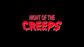
The Movie: Brilliant B-horror monster movie with a twist of slasher madness. When alien brain parasites threaten to take over a college campus, all that stands in their way is geeky student Chris (Jason Lively).
The Cool Logo : Naturally, emphasis is placed on the 'creeps' portion of the title, with that word given a gooey, wibbly edge.
Why We Love It : It's a throwback to '50s monster movies, much like the film itself.
The Lost Boys (1987)
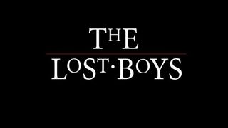
The Movie: Sam (Corey Haim) and his moody teenage brother move to a new town, only to discover that it's also home to vampires. Enter Sam's new friends Edgar (Corey Feldman) and Alan Frog (Jamison Newlander).
The Cool Logo: The title's in gothic lettering, with the addition of a line and a dot for stylistic purposes.
Why We Love It: Vampire stories are often imbued with an element of elegance, and that's certainly true of this logo.
It's refreshing that the designer chose not to go all-out '80s punk rock on it - that would certainly have fitted in with the film, but would probably have cheapened the poster.
The Burning (1981)
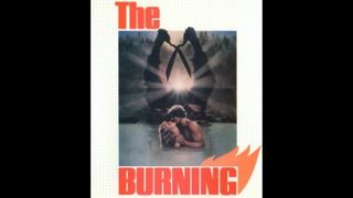
The Movie: A camp-set slasher in the grand tradition of camp-set slashers. When a former summer camp caretaker is involved in a prank gone awry, he returns with a giant pair of garden shears to take his revenge.
The Cool Logo: Really simple, but really effective - particularly because of the addition of the flame motif in the top right corner.
Why We Love It: It's proof that not all horror logos need to feature dripping blood and crazy lettering. This is simple and smart with a hint of menace.
Josh Winning has worn a lot of hats over the years. Contributing Editor at Total Film, writer for SFX, and senior film writer at the Radio Times. Josh has also penned a novel about mysteries and monsters, is the co-host of a movie podcast, and has a library of pretty phenomenal stories from visiting some of the biggest TV and film sets in the world. He would also like you to know that he "lives for cat videos..." Don't we all, Josh. Don't we all.
