30 Coolest '80s Horror Movie Logos
Talk about style...
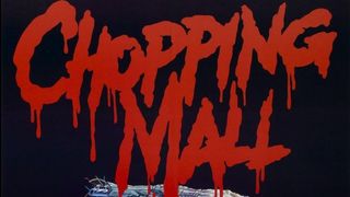
Chopping Mall (1986)
The Movie: One of the weirdest slasher movies to come out of the '80s. Eight teens are trapped in a shopping mall - main problem is that it's protected by three security robots that will kill anything that moves.
The Cool Logo: Just what you'd expect from a slasher movie logo. Gooey and brilliant.
Why We Love It: The letters of the title all drip blood, as if somebody's repainted the mall's sign - perhaps a killer robot did it.
Basket Case (1982)
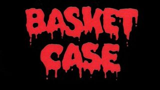
The Movie: Cult classic from director Frank Henenlotter. Kevin Van Hentenryck plays Duane, whose psychotic Siamese twin brother lives in a basket.
The Cool Logo: Gloopy, engorged and unapologetically B-horror.
Why We Love It: The film's seriously dated (and pretty crap, despite a brilliant premise), but the logo's still fantastic - surely the bloodiest on this list, in fact.
Friday The 13th (1980)
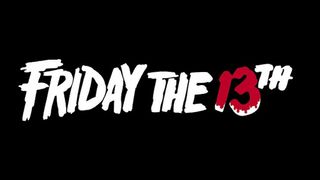
The Movie: A group of counsellors head to Camp Crystal Lake, unaware that its nickname is Camp Blood, because people always end up dying there. "It's got a death curse," announces Crazy Ralph…
The Cool Logo: Different to the in-film, glass-smashing logo created for director Sean Cunningham by a New York agency, it's smart and efficient, sort of resembling broken bits of wood. Or a camp sign.
Why We Love It: There have been numerous different Friday The 13th logos over the years, but this one's still the best and most recognisable.
The Shining (1980)
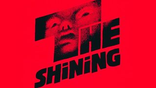
The Movie: Jack (Jack Nicholson) and his family head to the Overlook Hotel for the winter when Jack gets a job as the establishment's off-season caretaker. But soon he starts seeing things that aren't altogether nice…
The Cool Logo: Created by design guru Saul Bass, it's back to front ('Shining' is smaller than 'The'), giving the whole thing a brilliantly off-kilter look.
Why We Love It: What is that thing? An alien? A death mask? SOMETHING ELSE? Bass' elegant design effortlessly gives us the willies.
The Thing (1982)

The Movie: A remake of the classic horror, this time with horror maestro John Carpenter calling the shots and Kurt Russell battling the thing from outer space.
The Cool Logo: Weathered-looking, slightly out of control, like it was torn out of a piece of cloth.
Why We Love It: Though it's awesome by itself, the way it cracks through the screen as beams of ominous light in the film itself is gloriously spooky.
Fright Night (1985)
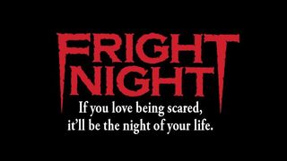
The Movie : Convinced that his next-door neighbour Jerry (Chris Sarandon) is a vampire, young Charley (William Ragsdale) goes to horror TV presenter Peter Vincent (Roddy McDowall) for help.
The Cool Logo: It's a logo with fangs! FANGS!
Why We Love It: We just can't get over how cool the fangs are. In fact, this is a horror logo that's so cool that they didn't even bother updating it for the Colin Farrell-led remake. A true definition of timeless.
Poltergeist (1982)
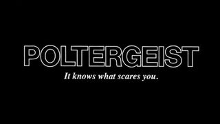
The Movie: Tobe Hooper's domestic scare flick. The Freeling family are haunted by strange forces in their new home - and then young Carol-Anne (Heather O'Rourke) goes missing…
The Cool Logo: Basic but impactful. It's pretty much Arial Helvetica with a white border, but boy does it work.
Why We Love It: This was a very modern sort of horror movie. The teens take a backseat in favour of a convincing family unit facing unimaginable horror - and the logo reflects that maturity.
Sign up for the Total Film Newsletter
Bringing all the latest movie news, features, and reviews to your inbox
The Howling (1981)
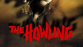
The Movie: A television reporter traumatised by an encounter with a serial killer heads to a remote counselling community - only to discover that things aren't exactly all that safe there, either.
The Cool Logo: A scratchy number that damn near looks like a howl in type form.
Why We Love It : It's shaky and sinister, and actually convinces us that 'howling' can be something pretty damn scary.
Berserker (1987)
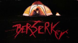
The Movie: College students (ain't it always college students?) go camping in Rainbow Valley, only to discover that the Nordic legend of a flesh-eating 'Berserker' could actually be true…
The Cool Logo: You want berserk? You got it - whoever designed this logo went a bit crazy when they were finished and scrawled all over it.
Why We Love It: It effortlessly captures the torrid nature of the film - and we love that it looks like whoever made it tried to scratch the design out completely. A true berserker is never happy.
The Evil Dead (1981)
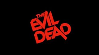
The Movie : One of the first examples of 'cabin in the woods' horror. Ash (Bruce Campbell) and his buddies head to an isolated cabin, only to find themselves the target of, well, evil…
The Cool Logo: So good that they barely changed it for this year's remake, it's a crafty ensemble in which letters hide behind one another and the 'v' and the 'a' are out of control…
Why We Love It: It's rebellious, playful and just really, really cool. There's something to be said for something just being cool…
Image Source: Annyas.com
Josh Winning has worn a lot of hats over the years. Contributing Editor at Total Film, writer for SFX, and senior film writer at the Radio Times. Josh has also penned a novel about mysteries and monsters, is the co-host of a movie podcast, and has a library of pretty phenomenal stories from visiting some of the biggest TV and film sets in the world. He would also like you to know that he "lives for cat videos..." Don't we all, Josh. Don't we all.
