30 Greatest Hand Drawn Movie Posters
A golden age of movie art...
Super 8 (2011)
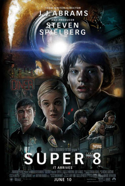
The Poster: A wonderfully retro teaser poster for Spielberg and Abrams’ upcoming mystery movie. Marvellous stuff.
Why So Great? It harks back to other classic Spielberg posters, notably those created by legendary artist Drew Struzan (more on him later). Managing to pack all the excitement and spookiness of the trailer into a series of overlapping images, it’s a masterclass in appetite whetting!
If It Had Been Badly Photoshopped: We’d have the Cloverfield monster clumsily superimposed against a ‘50s backdrop.
School Spirit (1985)
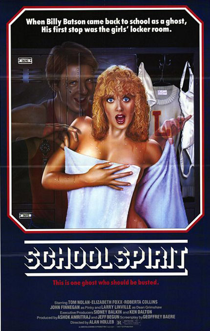
The Poster: A gloriously trashy one sheet for shonky ‘80s comedy School Spirit . If the idea of a lascivious ghost has you in stitches, this is the film for you!
Why So Great? Obviously, this isn’t in here on artistic merit (the poodle-haired lady is frankly terrifying) but rather for its brazen awfulness. When a film outlines its hero as a leering sex-pest, then slaps him on the poster doing the dirty, you know you’re in for something special.
If It Had Been Badly Photoshopped: It might actually look like a real movie, rather than a sketch from Saturday Night Live . Or even 30 Rock …
Lesbian Vampire Killers (2009)
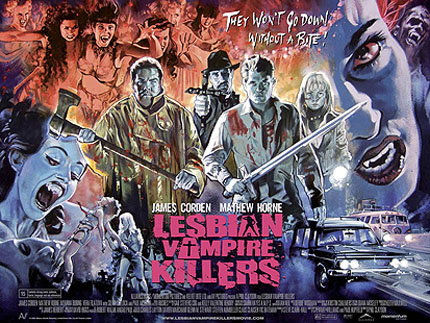
The Poster: A surprisingly excellent poster for an unsurprisingly awful film, you’d have more fun staring at this for ninety minutes then you would watching the movie.
Why So Great? Springing from the twisted imagination of legendary horror artist Graham Humphreys, the kinetic artwork suggests a cross between From Dusk ‘Til Dawn and True Blood . When in reality, we were presented with a mash-up of Carry On Screaming and On The Buses .
If It Had Been Badly Photoshopped: They might have been able to edit out a couple of James Corden’s chins.
Away We Go (2009)
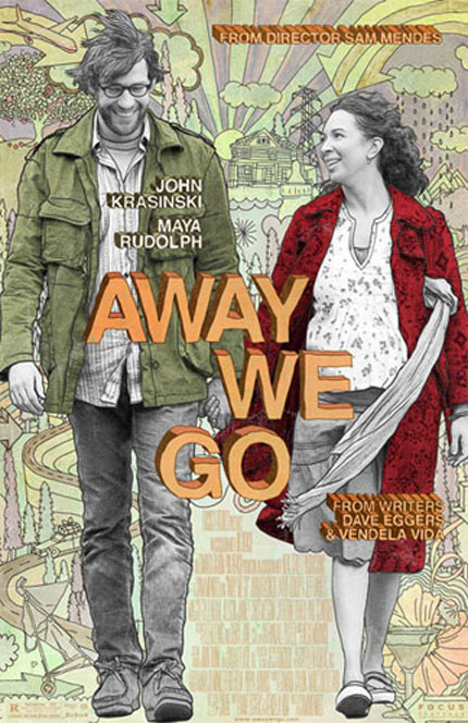
The Poster: An ever-so-indie design to match Sam Mendes’ ever-so-indie romance.
Why So Great? Okay, so it might be a little self-conscious, and sails dangerously close to being “kooky”, but nevertheless, we love the cartoon-like aesthetic on display here.
If It Had Been Badly Photoshopped: It might have got a release at a multiplex, rather than sloping round a collection of achingly hip arthouse screens.
Mallrats (1985)
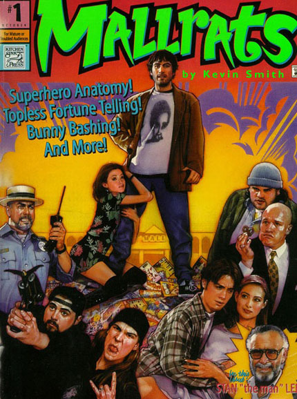
The Poster: Kevin Smith’s much-maligned slacker movie gets an ace comic-book-style poster from legendary artist Drew Struzan.
Why So Great? It fits nicely with the film’s cartoonish sensibilities, and even features an illustrated version of Stan Lee. We also like the R certificate stating the film is only suitable for “mature or troubled audiences”.
If It Had Been Badly Photoshopped: It might have done better at the box-office. Or at least that’s what Kevin Smith would have you believe, having suggested the culty artwork was one of the main reasons the film flopped!
Aladdin (1992)
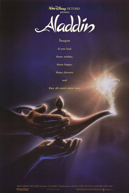
The Poster: John Alvin’s minimalist teaser for Disney’s Aladdin , just one of many iconic images the illustrator would provide for the Mouse House.
Why So Great? It sums up the innate sense of wonder of the film’s premise, working in tandem with the irresistible tagline to build anticipation for the finished article. In this case, less is very much more.
If It Had Been Badly Photoshopped: It would be a low-point in studio stupidity. Why would you ever photoshop an animated film?
The Blob (1958)
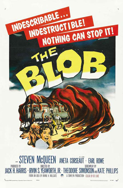
The Poster: A seminal piece of B-Movie bluster, as an unseen Steve McQueen prepares to do battle with a giant, man-eating jelly. As you do.
Why So Great? It’s wonderfully simple, showing the titular mass of amorphous goo devouring a diner whole. It tells you everything you need to know about the film with marvellous economy!
If It Had Been Badly Photoshopped: There’s a risk it might have looked a bit silly. As it is, it remains pleasingly kitsch.
Sign up for the Total Film Newsletter
Bringing all the latest movie news, features, and reviews to your inbox
Watchmen (2009)
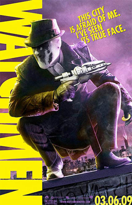
The Poster: One of a series of individual character posters trailing Zack Snyder’s superhero epic, this time featuring the psychotic Rorschach.
Why So Great? It’s a bang-on rendition of the character, building confidence in the beholder that the film will at least have the comic-book’s design ethic down pat. And whether or not you liked the film, you have to concede it looked good…
If It Had Been Badly Photoshopped: We would have seen the same degree of outrage that met the recent X-Men: First Class posters. Although those really were dreadful…
Fright Night (1985)
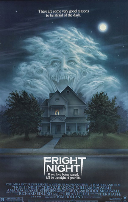
The Poster: The ‘80s vampire flick gets some suitably OTT poster art.
Why So Great? It’s unmistakeably ‘80s, but despite the slightly schlocky design, there’s something very creepy about the isolated house, the hideous grin and the lone figure at the window.
If It Had Been Badly Photoshopped: You’d have the 2011 version, which isn’t nearly as effective.
Arachnophobia (1990)
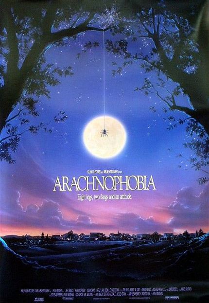
The Poster: A distinctly eerie promo for the eight-legged horror flick.
Why So Great? John Alvin manages to wring an abundance of dread out of one tiny spider, illuminating it in the light of a vast moon, with the sleepy township providing a distinctly vulnerable looking backdrop.
If It Had Been Badly Photoshopped: Swarms of CGI spiders wouldn’t be half as menacing. Probably…
George was once GamesRadar's resident movie news person, based out of London. He understands that all men must die, but he'd rather not think about it. But now he's working at Stylist Magazine.

