30 Greatest Hand Drawn Movie Posters
A golden age of movie art...
Blade Runner (1982)
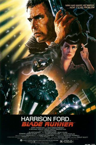
The Poster: John Alvin’s renowned artwork for Ridley Scott’s sci-fi classic.
Why So Great? Drew Struzan’s update was great, but this has to be the most iconic piece of Blade Runner imagery going. Managing to combine the sensibilities of science fiction and film noir is no easy feat, but Alvin pulls it off with aplomb!
If It Had Been Badly Photoshopped: We’ll be sure to find out when the upcoming reboot arrives. Urgh…
Escape From New York (1981)
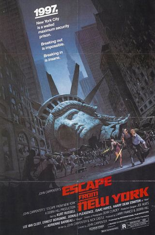
The Poster: The iconic severed-head artwork to accompany Kurt Russell’s action spectacular.
Why So Great? The ruined Statue Of Liberty is such an arresting image, it’s impossible not to be intrigued by the film. See Cloverfield for further details.
If It Had Been Badly Photoshopped: It would end up looking like the sort of poorly-constructed, anti-American collage you might see on a right-on teenager’s bedroom wall. Instead, it just looks badass.
Jaws (1975)
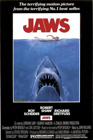
The Poster: Da-da. Da-da, da-da. Ah, you know the drill.
Why So Great? Not only is this one of the most recognisable images in cinema history, it remains bloody terrifying to this day. The scale of the shark in relation to the swimmer is the key here…
If It Had Been Badly Photoshopped: The illustrated shark is a far more convincing proposition than the real thing. Hand drawn is definitely the way to go here.
Back To The Future Part II (1989)
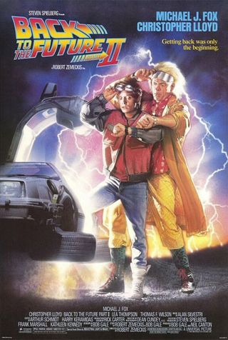
The Poster: Drew Struzan adapts his original artwork for the time-travelling sequel.
Why So Great? The original Back To The Future poster is unquestionably the most iconic, but we love the way Struzan tinkers with it second time around. Placing the Doc behind Marty as a visual cue is a great idea, and works equally well for part three. That instalment loses marks however for the inclusion of the teeth-gratingly irritating Mary Steenburgen.
If It Had Been Badly Photoshopped: Photoshopping the Doc into a regular image never disappoints. See here for details.
The Thing (1982)
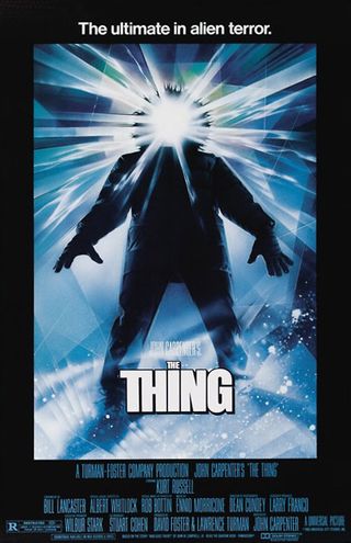
The Poster: Another Struzan submission, this time for one of the most recognisable horror posters of the ‘80s.
Why So Great? A departure from Struzan’s signature style, this disconcerting image captures the essence of the film’s body-shock horror. Sinister stuff.
If It Had Been Badly Photoshopped: The spider head might look spectacular on film, but crudely daubed on a movie poster? Not so much.
The Little Mermaid (1989)
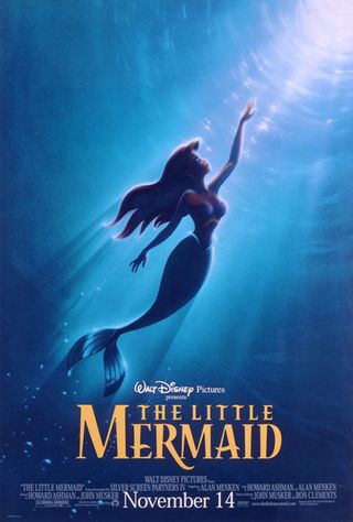
The Poster: Another Disney classic from John Alvin, this time of flame-haired mermaid Ariel.
Why So Great? It’s just beautiful, isn’t it? From the dreamy blue of the ocean, to the enticing glow of the world above, it’s a truly magical image. Plus Ariel is a bit of a looker, isn’t she?
If It Had Been Badly Photoshopped? We can imagine a nightmarish rush-job in which Daryl Hannah from Splash is ported over and given a red rinse.
Star Wars (1977)
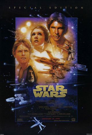
The Poster: Drew Struzan spruces up the Star Wars artwork for the film’s 1997 re-release.
Why So Great? Struzan’s signature style epitomises the trilogy’s blend of frantic action and well drawn (excuse the pun) characterisation. All three of his re-release posters are great, but we like the one for A New Hope the best, if only for the prominence of Harrison Ford. Nobody draws him better!
If It Had Been Badly Photoshopped: Jar-Jar might inexplicably have found his way in there. And nobody would have wanted that.
Sign up for the Total Film Newsletter
Bringing all the latest movie news, features, and reviews to your inbox
E.T.: The Extra-Terrestrial (1982)
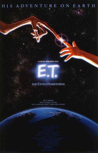
The Poster: John Alvin’s famous representation of inter-special bonding!
Why So Great? Sensibly keeping E.T. himself under wraps, the finger to finger embrace is a masterstroke, cleverly riffing on Michelangelo’s The Creation Of Adam. How many movie posters reference the Renaissance?
If It Had Been Badly Photoshopped: We would have been treated to something a little closer to Mac And Me .
Metropolis (1927)
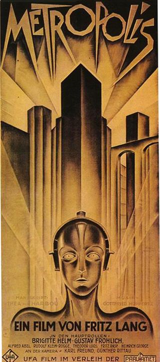
The Poster: German artist Heinz Schulz-Neudamm supplies Fritz Lang’s Metropolis with a poster that is arguably more famous than the film itself.
Why So Great? The angular, geometric design is impossibly cool whilst the sepia-toning is just lovely. Less a poster and more a work of art!
If It Had Been Badly Photoshopped: There is no room for screenshots in this one. Trying to crowbar some real footage in would shatter the illusion somewhat…
Raiders Of The Lost Ark (1981)
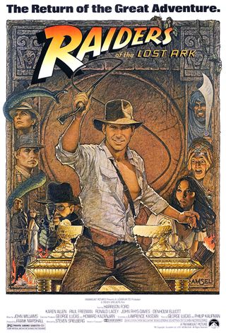
The Poster: Richard Amsel's celebrated poster, designed to tie-in with the film’s re-release in 1982.
Why So Great? It’s the archetypal adventure poster, with Indy at his swashbuckling best, and all of the film’s key players squeezed in on the margins. Even the luckless swordsman makes an appearance!
If It Had Been Badly Photoshopped: We would have liked to have seen an alternative print, complete with melting Nazi faces. It still wouldn’t have been a patch on this one though. A truly brilliant poster.
George was once GamesRadar's resident movie news person, based out of London. He understands that all men must die, but he'd rather not think about it. But now he's working at Stylist Magazine.

