40 Worst Movie Posters Ever
They don’t want you to see their movie…
One Crazy Summer (1986)
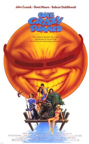
Why So Bad? As far as we can tell, One Crazy Summer is about a massive killer orange (no, a COOL massive killer orange, note the shades) who hunts lobster catchers. And really enjoys it.
Worst Detail: Is that the blind dude from Star Trek dressed up as a citrus fruit?
Sex And The City 2 (2010)
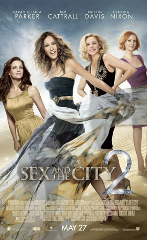
Why So Bad? The Airbrush bods at Warner Bros freshen up the sexy quartet with a nip here and a brush there. The result? Four leads who barely resemble human beings.
Worst Detail: Kim Cattrall doesn’t even look like Kim Cattrall. In fact, she looks more like the mannequin in Mannequin than herself.
Body Rock (1984)
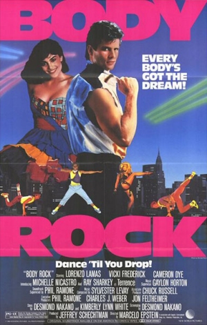
Why So Bad? This month’s Drive may be getting its ‘80s motifs all kinds of crazycool right, but here’s an example of how to get them wrong. Pink font. Big hair. Stupid clothes. Wrong, wrong, wrong.
Worst Detail: Um, all of it. We really can’t pick just one thing.
The Green Mile (1999)
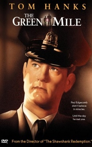
Why So Bad? Here, it had been four years since Tom Hanks first played Woody in Toy Story , but he’s obviously taken the Pixar film to heart – here he looks more wooden than Pinocchio.
Worst Detail: Easily the creepy sheen of Hanks’ skin – it’s like House Of Wax only scarier.
Black Frankenstein (1973)
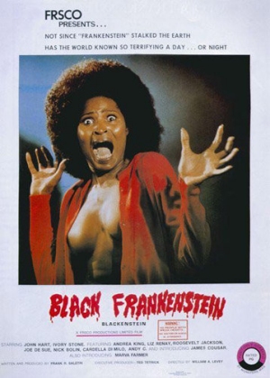
Why So Bad? We’d love to have been in the marketing boardroom when this poster was dreamed up. “We need tits! But not too much tits! And a woman screaming! And an amazing hairdo!” This is the inevitable result.
Worst Detail : The expression of fake, OTT terror. Must’ve been a fun day at the studio.
Beastly (2011)
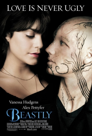
Why So Bad? It’s an update of Beauty And The Beast with a ridiculously twee tagline and some clear Twihard-baiting imagery. We just coughed up a little bit of sick.
Worst Detail: Uh, the whole point of this film is that Alex Pettyfer looks absolutely horrific. So why have they Photoshopped his scars and tattoos? D’oh!
Raiders Of The Lost Ark (1981)
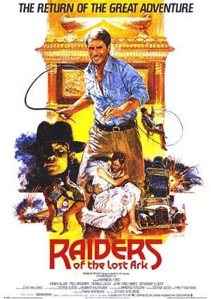
Why So Bad? Wait a minute, we don’t remember Indy wearing a natty blue shirt and chinos like that – and definitely not while wielding a whip. This is madness!
Worst Detail: Where’s Indy’s iconic hat and coat? Remove this imposter at once!
Sign up for the Total Film Newsletter
Bringing all the latest movie news, features, and reviews to your inbox
Venus (2006)
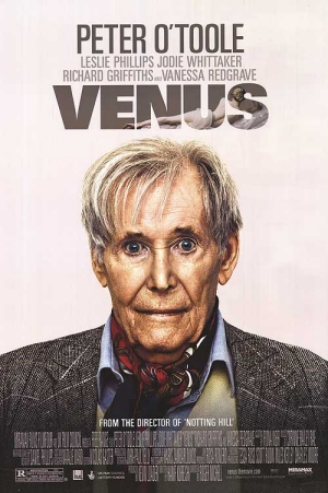
Why So Bad? Want to make sure absolutely nobody goes to see your movie when it’s released in cinemas? Plonk a seemingly drugged-up Peter O’Toole on your poster. Easy.
Worst Detail: Mad eyes and a horrible neck scarf make O’Toole look like some sort of OAP serial killer…
Teen Wolf (1985)
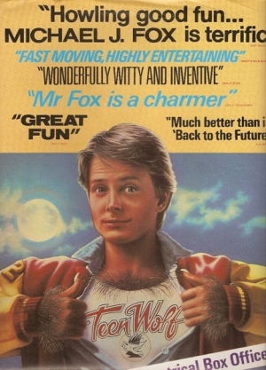
Why So Bad? Those of us old enough remember this through rose-tinted glasses, but there’s no denying its awfulness. What’s up with the Superman reference?
Worst Detail: Michael J Fox cartoonised! Truly the thing of nightmares.
Corky Romano (2001)
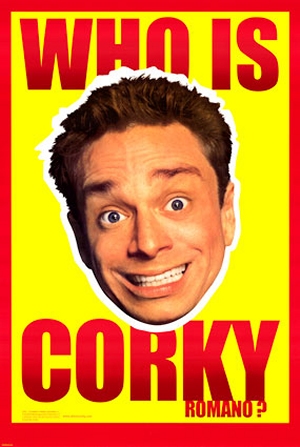
Why So Bad? It hurts our eyes! Brighter than bright colours AND mad-staring eyes? We need our sunglasses for this one.
Worst Detail: We don’t know who Corky Romano is, and we don’t care. Stupid poster.
The Total Film team are made up of the finest minds in all of film journalism. They are: Editor Jane Crowther, Deputy Editor Matt Maytum, Reviews Ed Matthew Leyland, News Editor Jordan Farley, and Online Editor Emily Murray. Expect exclusive news, reviews, features, and more from the team behind the smarter movie magazine.
