40 Worst Movie Posters Ever
They don’t want you to see their movie…
Superbabies: Baby Geniuses 2 (2004)
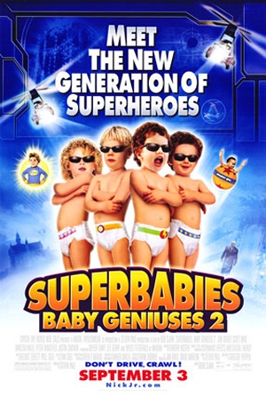
Why So Bad? Too many things wrong with this one to possibly relate here. Suffice to say it has babies wearing shades (always a fashion no-no).
Worst Detail: ‘Don’t drive, crawl!’ What kind of tagline is that? It seems to be encouraging underage drinking…
Hercules (1970)
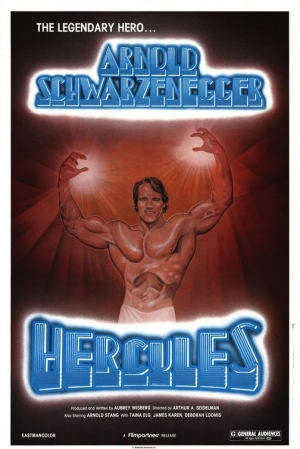
Why So Bad? The manbeast (or, according to this poster, ‘legendary hero’) that is Arnold Schwarzenegger arrives in Hollywood, except now he’s calling himself Hercules…
Worst Detail: The poster confirms what we’ve always suspected – Arnie is in fact carved out of wood.
Big Mommas House 2 (2006)
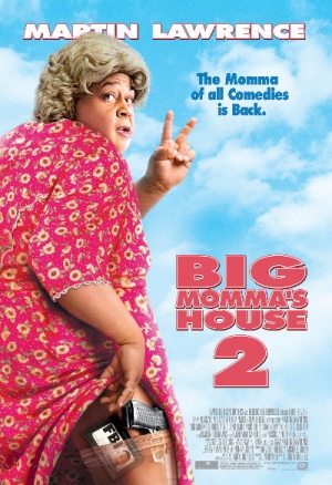
Why So Bad? Any poster that has Martin Lawrence revealing a stocking-clad leg is one that we don’t ever need to see.
Worst Detail: The crevice between the leg and the hiked-up dress. Shudder.
Outrageous! (1977)
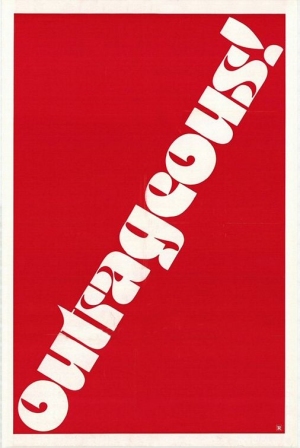
Why So Bad? It takes minimalism to a whole new level. In fact, is this even a film poster? Or just a self-reflexive statement?
Worst Detail: The fact that there are no details. No cast list, tagline or image. Truly outrageous.
Alice (1990)
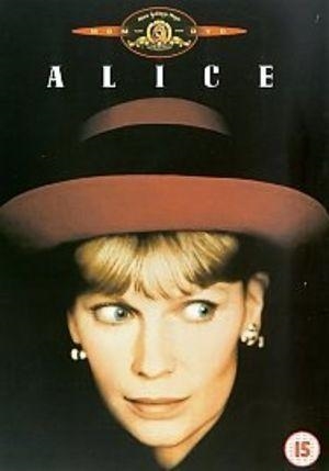
Why So Bad? It’s a poster that only gives us two pieces of information. It’s called Alice . And there’s a woman wearing a red hat in it. If you want to know it’s directed by Woody Allen, you’ll have to go see the film to find out.
Worst Detail: The mad eyes are back again. What is it with movie posters and wild eyes? At least she’s not looking at us…
Superman III (1983)
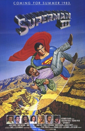
Why So Bad? You know your franchise is losing its legs when you have your bold, charismatic hero swooping through the air carrying a gurning Richard Pryor.
Worst Detail: That’d be Richard. What is he even doing in this movie?
Kazaam (1996)
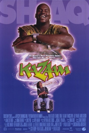
Why So Bad? Terrible sport-aping tagline heralds basketballer Shaquille O’Neal’s arrival in the cineplexes. He looks happy about it. Everybody else runs screaming.
Worst Detail: The kid's haircut. Even from this distance you can tell he's going to be annoying.
Sign up for the Total Film Newsletter
Bringing all the latest movie news, features, and reviews to your inbox
Teen Wolf Too (1987)
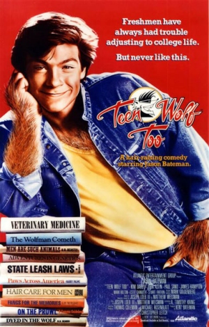
Why So Bad? The only thing worse than the poster for the first Teen Wolf ? The poster for the second one, replete with a hairy Jason Bateman doing his best cheesy grin.
Worst Detail: The nod-wink-aren’t-we-clever book references. Pull the other one.
Whats The Worst That Could Happen? (2001)
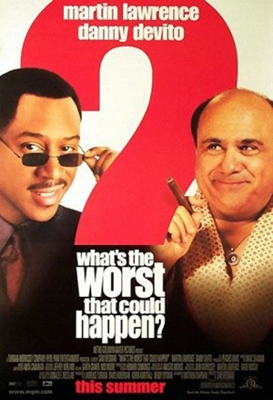
Why So Bad? Oh dear, Martin Lawrence again. He may have dropped the drag for this one, but the outcome is just as bad – even Danny DeVito’s smug, knowing smirk can’t save it.
Worst Detail: The film’s title, which is something of a self-fulfilling prophecy.
Fired Up! (2009)
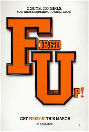
Why So Bad? A terrible poster for a terrible film that blatantly screams “FU!” at its audience. Talk about defecating where you eat.
Worst Detail: Another lack of details – the poster for Fired Up almost matches the Outrageous poster for failing entirely to inform its audience. Small wonder it sank like a stone at the box office.
The Total Film team are made up of the finest minds in all of film journalism. They are: Editor Jane Crowther, Deputy Editor Matt Maytum, Reviews Ed Matthew Leyland, News Editor Jordan Farley, and Online Editor Emily Murray. Expect exclusive news, reviews, features, and more from the team behind the smarter movie magazine.
