40 Worst Movie Posters Ever
They don’t want you to see their movie…
The Ugly Truth (2009)
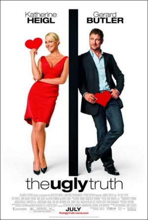
Why So Bad? Somebody’s been watching Blind Date repeats. We can’t help but side with Mila Kunis in Friends With Benefits – screw you Katherine Heigl!
Worst Detail: The truth really is ugly, just like the whole of this poster.
Chapter 27 (2007)
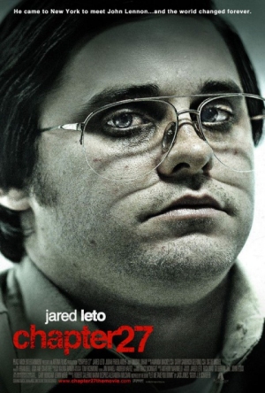
Why So Bad? Jared Leto pulls a Christian Bale-style chameleon act and piles on the weight for this historical drama. We wouldn’t recognise him if his name wasn’t on the poster.
Worst Detail: Know your audience. Leto’s fans don’t want to see him tubby. Which means this poster is a total duff when it comes to its primary goal – getting bums in seats.
Killers (2010)
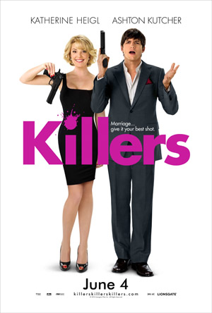
Why So Bad? Ah, don’t you just love a visual cliché? See, men love guns, but women just haven’t got a clue what to do with them! Hee-hee. Haha. Not.
Worst Detail: Are we the only ones that want to wipe that stupid look off Heigl’s face?
Bangkok Dangerous (2008)
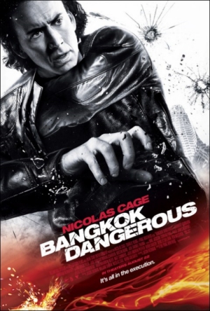
Why So Bad? It’s the jewel in the crown of years worth of horrific Nic Cage posters. Here, some Photoshopper obviously developed a conscience and decided to remove a gun from Cage’s hand.
Worst Detail: Just what is Cage doing with his left arm? That angle seems to defy the laws of nature.
The Last Song (2010)
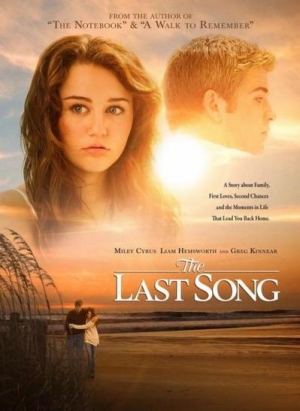
Why So Bad? Miley Cyrus looks like she just climbed through her window after a night of hard partying, only to get caught by her parents. Cue puppy-dog eyes and weird pouting.
Worst Detail: Poor Liam Hemsworth obviously isn’t famous enough to warrant much prominence on the poster, instead getting relegated to a half-blurred-out background presence.
Whatever Works (2009)
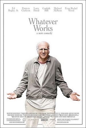
Why So Bad? Larry David shrugs, as if he’s just been snapped after a take that went wrong on Woody Allen’s dramedy. Which of course makes it perfect for the poster...
Worst Detail: “What exactly am I doing on this poster?” David seems to be asking us. Yes, David, what are you doing? It almost looks like he’s cupping two invisible men…
Rhinestone (1984)
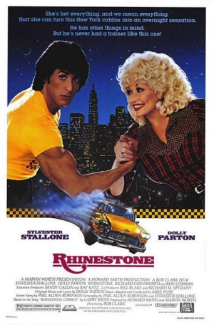
Why So Bad? Sly’s got his guns out, but Dolly has the power of peroxide on her side.
Worst Detail: These two have clearly never met before in their lives, making this an ancient example of bad Photoshopping – before anybody had ever heard of Photoshop.
Sign up for the Total Film Newsletter
Bringing all the latest movie news, features, and reviews to your inbox
The Hottie & The Nottie (2008)
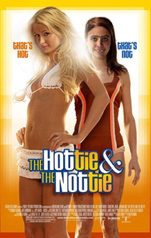
Why So Bad? It’s as subtle as Paris Hilton’s obvious cash-grabbing antics.
Worst Detail: It seizes on Hilton’s execrable catchphrase “That’s hot!” and funnels it into a movie project, where it’ll be preserved forever. The word ‘misguided’ just isn’t strong enough.
Dharti Sheran Di (1973)
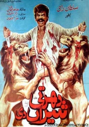
Why So Bad? Sultan Rahi goes mental and stabs some big cats in the head as they claw at him. Clearly it’s a demonstration of godly powers. It actually makes us feel a bit sick.
Worst Detail: That’s going right against pretty much every animal cruelty law going, right? Poor little lions.
Inseminoid (1981)
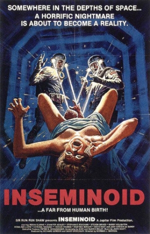
Why So Bad? Spacemen! Fighting a newborn alien thing! A brilliantly trashy poster to match that brilliantly trashy title.
Worst Detail: The fact that this poster decides to sexualise our screaming mother (note the breasts) is most troubling indeed.
The Total Film team are made up of the finest minds in all of film journalism. They are: Editor Jane Crowther, Deputy Editor Matt Maytum, Reviews Ed Matthew Leyland, News Editor Jordan Farley, and Online Editor Emily Murray. Expect exclusive news, reviews, features, and more from the team behind the smarter movie magazine.

