5 things Kingdoms of Amalur does better than Skyrim
Sometimes the student becomes the master
3. Loot
Skyrim: Loot eventually became “the heavy stuff that you’d need to find ten different merchants to buy so that you could buy more potions.” You’d occasionally find better items, but it wasn’t that common, and they were usually only slightly better than what you had, adding one or two more fire damage over your old sword.

Above: We'll admit that one item in particular was really awesome
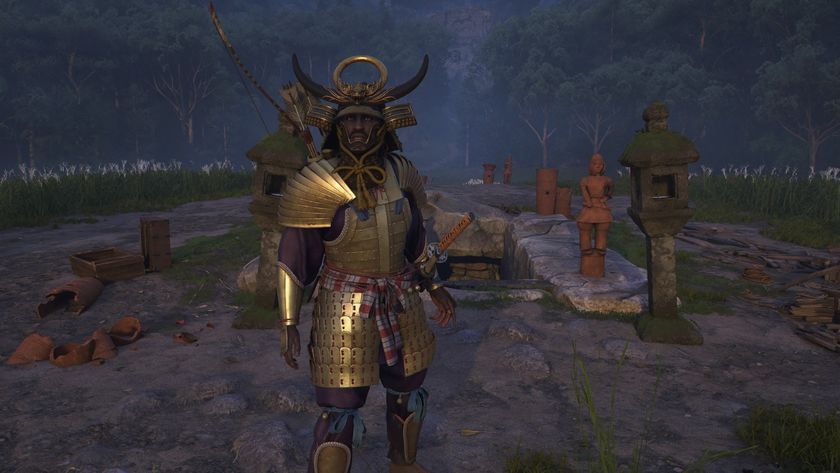
Amalur: It’s more akin to a traditional loot-fest game, with enemy’s corpses exploding with rewards and chests hidden around every bend. There are still plenty of trashy items to be found, but the good items usually come with a wider variety of stats, making different swords, bows, helmets, and boots feel… different. There are also more classifications of items, including Set Items that will reward you for collecting multiples of the same set.
4. Combat
Skyrim: Combat in The Elder Scrolls is usually clunky, and Skyrim’s is no different. Using a melee weapon is slow and draining, and ranged attacks are sometimes imprecise. The magic system isn’t terrible, but digging through menus to access spells is a UI nightmare. Plus, the best part of any combat situations is using your fus ro dah and knocking people down.
Above: Amalur's combat makes Skyrim's look downright dull
Amalur: The third-person action is fast, and more reminiscent of God of War or Zelda than anything else. Amalur rewards players for mixing up different combat types, and though it might seem run of the mill, it’s still somewhat deeper than expected. The blocking system is timing-based, and puts an emphasis on moving around the battlefield and countering attacks instead of just mashing buttons. It’s more rewarding, more complex, and just more fun, with the ability to chain together different attacks to create long, fast, fluid sequences.
5. User interface
Skyrim: The UI in Skyrim felt like an amalgamation of several ideas that didn’t work all that well together. Leveling up had the player looking to the stars, using the map was a chore, and finding certain items requires you to dig through dozens of inventory screens. It wasn’t uncommon to need to pause the game several times each battle to find the right weapon to use or potion to drink.
Sign up to the GamesRadar+ Newsletter
Weekly digests, tales from the communities you love, and more

Above: UI is boring to look at, so here's a guy killing a thing with a sword instead
Amalur: While far from perfect, Amalur’s UI is significantly better than Skyrim’s. Everything works together cohesively, and it all feels like part of the same game. Everything can be found in the same menu, and sorting through the inventory is much easier thanks to collapsible screens that made finding items simple. Even the quickslot feature is nicer, mapping things to a radial wheel instead of a long, encumbering list for faster access.
Hollander Cooper was the Lead Features Editor of GamesRadar+ between 2011 and 2014. After that lengthy stint managing GR's editorial calendar he moved behind the curtain and into the video game industry itself, working as social media manager for EA and as a communications lead at Riot Games. Hollander is currently stationed at Apple as an organic social lead for the App Store and Apple Arcade.


