50 Greatest Bond Posters
Double-OMG!
From Russia With Love (US Poster #2)
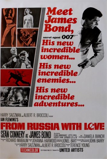
The Poster: A dramatic and stylish one-sheet that pinches brazen scarlet from its Russian setting and uses it as a colour scheme.
Nicest Detail: It’s simple, clean and uncluttered. Just like Bond himself.
GoldenEye (British Quad)
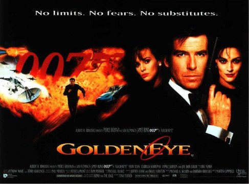
The Poster: No swan-diving here, but that doesn’t stop this very modern one-sheet keeping the drama coming in the form of Bond running away from a massive explosion.
Nicest Detail: It looks like Brosnan is caressing his cheek with his gun. Easy there fella.
From Russia With Love (Italian Poster)
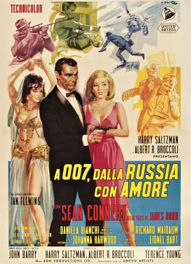
The Poster: An action-packed poster that isn’t afraid to play up the drama of From Russia With Love . Well, this is from Italy, of course.
Nicest Detail: It’s got to be the belly dancing…
For Your Eyes Only (US Poster)
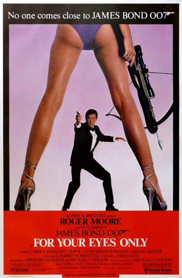
The Poster: Roger Moore takes on a giant woman with a crossbow. And aims his gun at somebody else entirely. Just who is he aiming at?
Nicest Detail: The high heels and the bum-crack-hugging lycra add a definite touch of class, don’t you think?
The Spy Who Loved Me (US Poster)
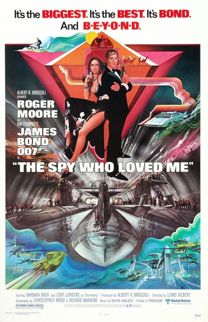
The Poster: Super-colourful without being overtly camp, there are some nice flourishes here, from the water-skier in the top left to the underwater base on the bottom right.
Nicest Detail: The Q Branch Lotus Esprit submarine, naturally.
Never Say Never Again (US Poster)
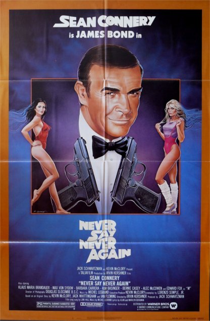
The Poster: It’s all about slightly off mirror imaging, as two Bond girls lean against the frames of a Sean Connery shot. Meanwhile, the font is very Finding Nemo -esque.
Nicest Detail: The guns create the lapels of Bond’s suit. We always knew he was a stylish sort of gent.
Skyfall (US Poster)
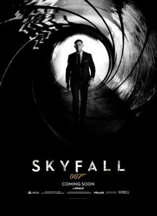
The Poster: Bond marches down an alleyway that echoes the look of the opening shootout sequence that appears on all Bond films.
Nicest Detail: It’s noirish and sumptuous with that essential Craig-era grit.
Sign up for the Total Film Newsletter
Bringing all the latest movie news, features, and reviews to your inbox
Octopussy (British Quad)
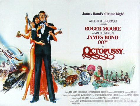
The Poster: Frosty white and erring on the surreal side, we get Roger Moore’s Bond being man-handled by a deadly, multi-handed assassin. Meanwhile, there is also a tiger.
Nicest Detail: The flirty typeface is all sorts of fun, with the ‘O’ transformed into an octopus-like creation.
The World Is Not Enough (US Poster)
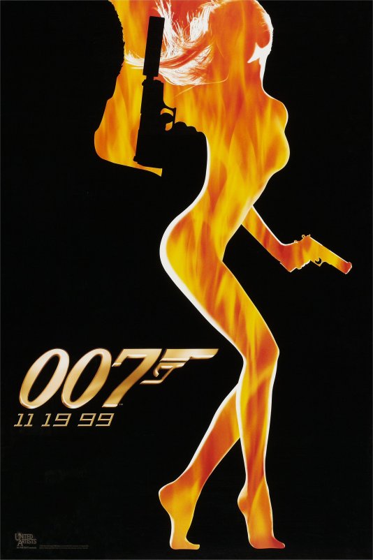
The Poster: Sort of like a screen grab from a Bond film’s opening credits, this is all about the fiery outline of a beautiful young woman.
Nicest Detail: Bond’s arm and gun merges with the curve of the model’s back. Sensual.
Dr No (Italian Poster)
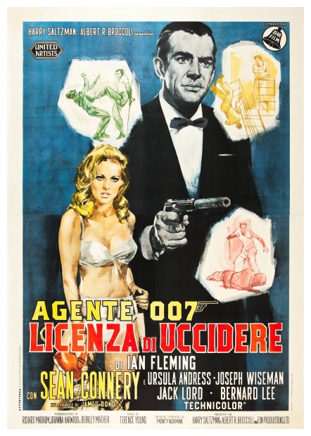
The Poster: The Italian poster for Dr No (which gives the title as License To Kill , for some reason), with fantastic artwork by Averardo Cirello.
Nicest Detail: The rough-and-tumble, sketched-out action bubbles. Plus, of course, Ursula Andress in a bikini.
Josh Winning has worn a lot of hats over the years. Contributing Editor at Total Film, writer for SFX, and senior film writer at the Radio Times. Josh has also penned a novel about mysteries and monsters, is the co-host of a movie podcast, and has a library of pretty phenomenal stories from visiting some of the biggest TV and film sets in the world. He would also like you to know that he "lives for cat videos..." Don't we all, Josh. Don't we all.
