50 Worst 2012 Movie Posters
Woeful one-sheets
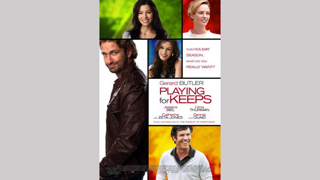
Playing For Keeps
The Poster: All the film’s key players, superimposed over some jarringly colourful backdrops. You can feel the cutesiness coming a mile off…
Worst Detail: Gerard Butlers smirk / mullet combo. Whatever would Leonidas say?
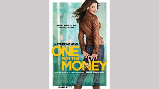
One For The Money
The Poster: Katherine Heigl desperately tries to grin her way through another absolute stinker. It’s a bit uncomfortable to watch, actually…
Worst Detail: That tagline. “She’s looking for a few not-so-good men”. Urgh.
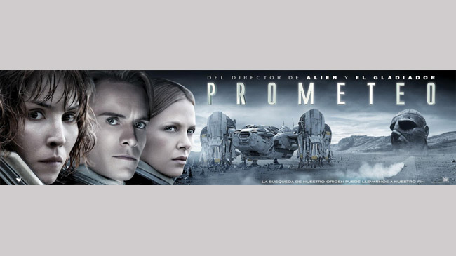
Prometheus
The Poster: A Spanish banner for Prometheus , in which three of the protagonists appear with weirdly smooth faces. Airbrush overload…
Worst Detail: We know Fassbender is playing an android, but this looks a little too artificial, even for a robot.
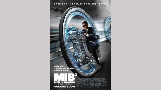
Men In Black 3
The Poster: It’s incredibly difficult to take this one seriously, as Will Smith’s dopey grin can attest to. Silly.
Worst Detail: Smith’s grin. Too cheesy by half.
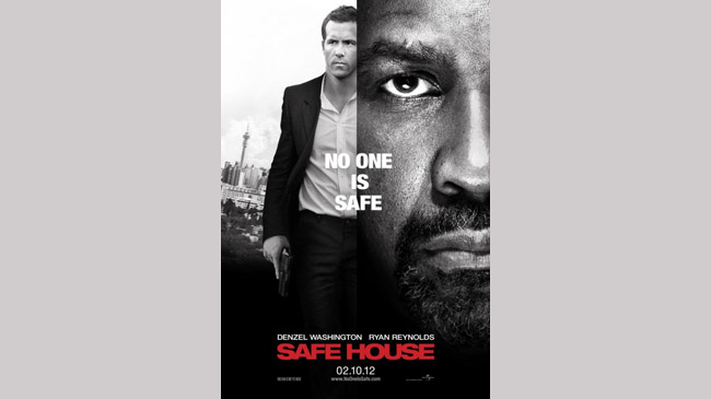
Safe House
The Poster: A mean, moody and monochrome mash-up of hunky Ryan Reynolds and angry Denzel Washington.
Grrr.
Worst Detail: The fact that Washington’s face is the same size as the whole of Ryan Reynolds.
It’s a weirdly distracting effect.
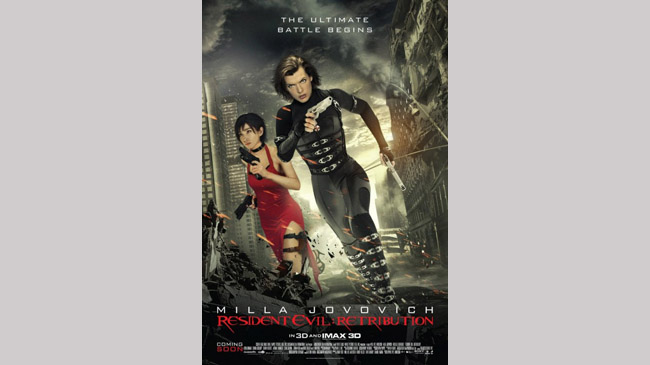
Resident Evil: Retribution
The Poster: A weird hybrid of animation and photography combining in distinctly unsatisfactory fashion. Boo!
Worst Detail: The shonky wreckage effects grafted on to the bottom of the poster.
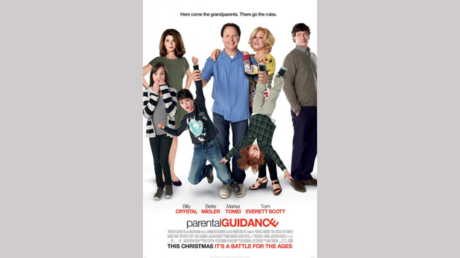
Parental Guidance
The Poster: A desperately try-hard poster that positively screams “ZANY”! Somebody make it go away.
Worst Detail: Billy Crystal’s bizarre hairline.
Not a good look.
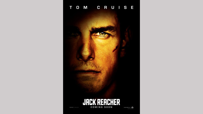
Jack Reacher
The Poster: It’s Tom Cruise, playing Jack Reacher! What’s the film about? Who cares! Just look at old Tom…
Worst Detail: There’s just something incredibly lazy about the whole affair. All it is, is Tom Cruise’s face.
And whilst we absolutely love Tom... Not exactly creative, is it?
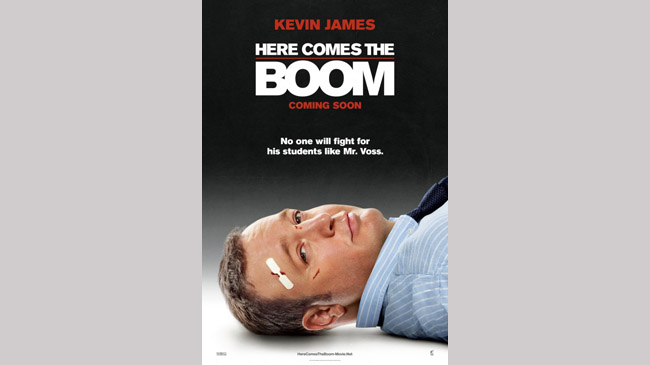
Here Comes The Boom
The Poster: On the one hand it’s great to see Kevin James lying flat on his back haven taken a bit of a pasting.
On the other hand, it’s still Kevin James.
Worst Detail: The fact he still looks impossibly smug, despite those war wounds.
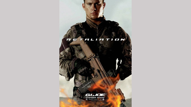
G.I. Joe: Retaliation
The Poster: Channing Tatum aims for “steel” and winds up at “boredom”.
Can’t say we blame him.
Worst Detail: Those laughably poor flame effects at the bottom of the poster!
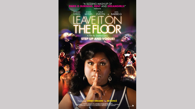
Leave It On The Floor
The Poster: Ooh, you can just smell the attitude, can’t you?
And it smells bad…
Worst Detail: If our leading lady strained any harder for “sassy” she’d likely suffer an aneurism.
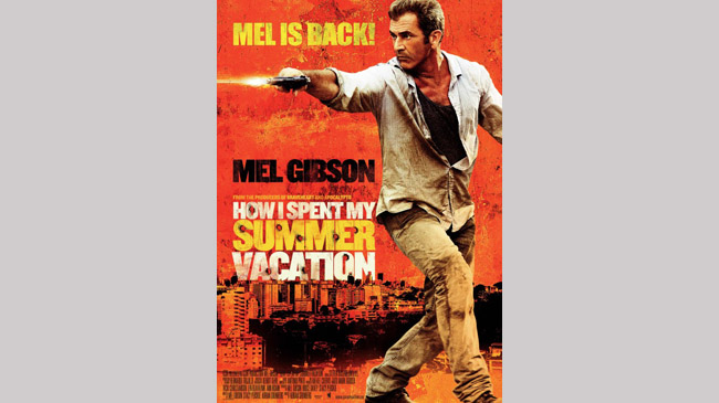
How I Spent My Summer Vacation
The Poster: Fans of drunken, slurring controversy rejoice, because Mel is back! Woooo!
Worst Detail: Mel’s bizarre expression, couple with the way he’s holding his gun.
It’s like a child playing at being an action man.
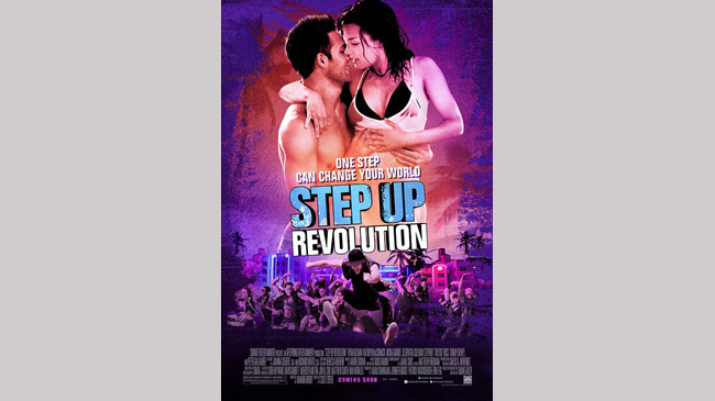
Step Up Revolution
The Poster: Mmm… purple, pink and blue. Looks like a student’s toilet bowl after a night on the alcopops.
Worst Detail: The whole thing, thanks to the aforemtioned colour-scheme.
It’s giving us a headache.
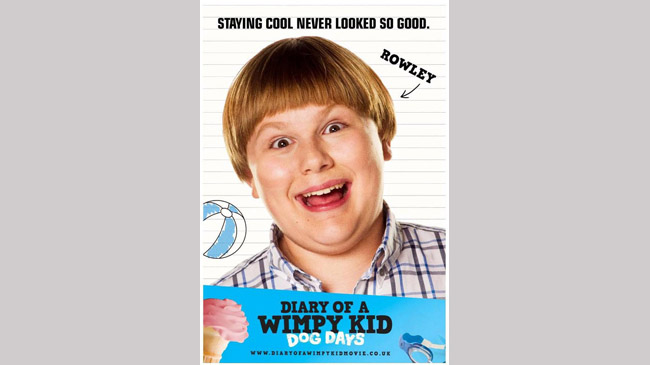
Diary Of A Wimpy Kid: Dog Days
The Poster: A cruelly close-up shot of a particularly rotund child, sporting the kind of expression seen on maniacs before they turn the gun on themselves.
Worst Detail: Double-chin or precision bowl-cut.
Take your pick.
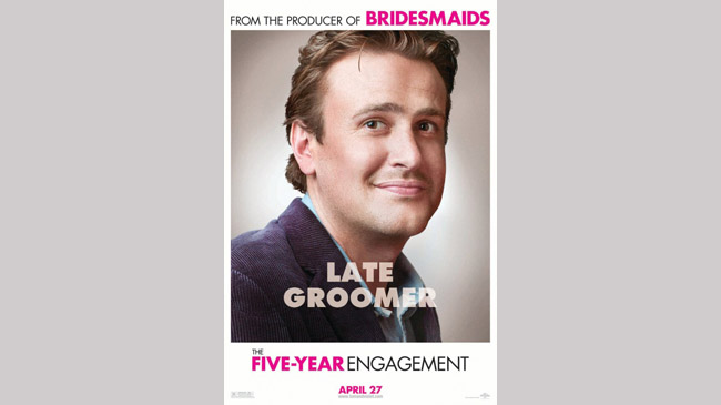
The Five Year Engagement
The Poster: A soft-focus close-up of Jason Segel, sporting one of Hollywood’s most shit-eating grins.
Worst Detail: That terrible attempt at a pun, “late groomer”.
Awful.
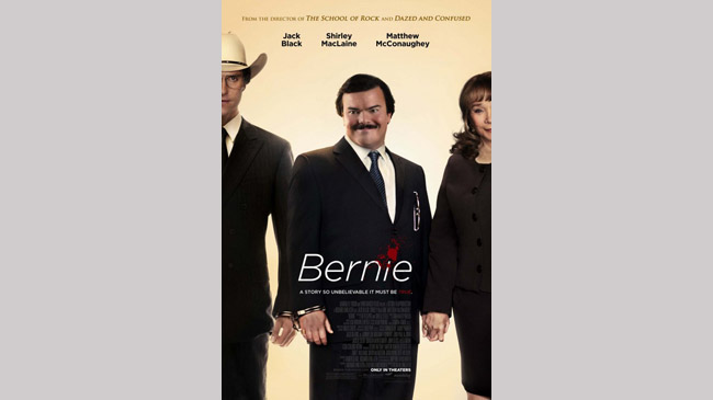
Bernie
The Poster: The poster for Jack Black’s black comedy looks remarkably like a low-rent rip-off of the promo material for Dexter .
Pity the film doesn’t hit the same level of quality…
Worst Detail: That blank white background.
Put some effort in!
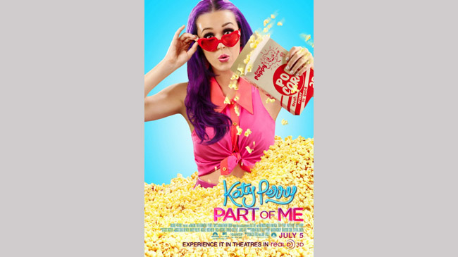
Katy Perry: Part Of Me
The Poster: It’s good old KP, looking here as though a rainbow has vomited all over her.
Tone it down, eh Kate?
Worst Detail: Why is she wasting all that popcorn?
Why is she buried in it at all?
Why?
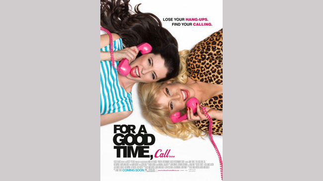
For A Good Time Call
The Poster: Pink lipstick, pink telephones, leapord-print… it’s like a sixteen-year-old’s bedroom. Yuck.
Worst Detail: Those matching grins.
We get it, the film is going to be “a riot”.
Give it a rest.
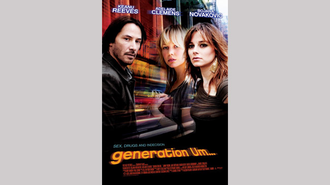
Generation Um
The Poster: Godawful title, with a godawful poster to match.
That’s synergy.
Worst Detail: Keanu’s hair.
Have a word with yourself, old boy…
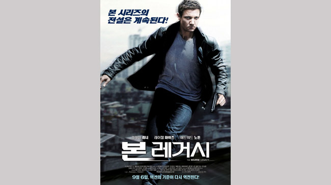
The Bourne Legacy
The Poster: Jeremy Renner looks decidedly unusual in this Japanese poster for his first Bourne outing.
Worst Detail: His eyes! He looks dead behind them…
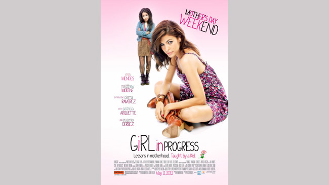
Girl In Progress
The Poster: Mother and daughter, but which one is behaving like a teenager?
It’s the mother! Who knew!
Worst Detail: Eva Mendes’ eyes seem to have gone a bit wonky here.
And there’s way too much pink.
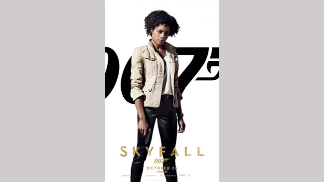
Skyfall
The Poster: James Bond screams excitement, glamour and intrigue.
This profoundly uninteresting one-sheet does not.
Worst Detail: Naomie Harris’ Eve may be likeable, but she’s not the most exciting character.
Nor is that white background helping her cause…
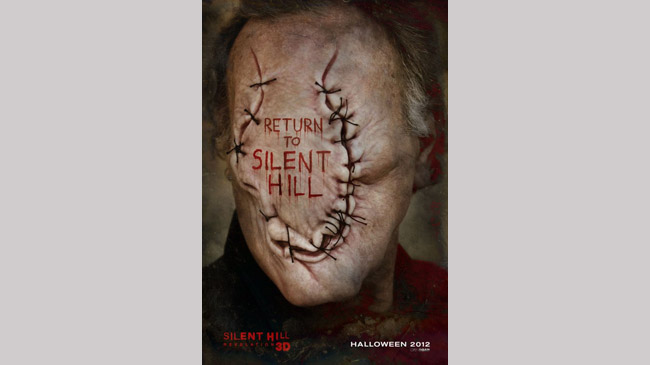
Silent Hill Revelation 3D
The Poster: The frankly disgusting image of a man whose face is one big stitch.
Lovely.
Worst Detail: We’re all for creepy posters but this is just grotesque.
Down with this sort of thing.
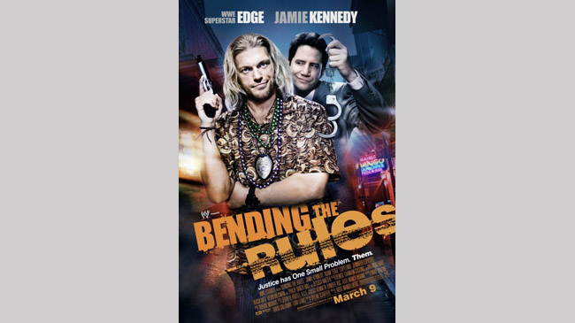
Bending The Rules
The Poster: One from the WWE Films in which recently-retired grappler, Edge, teams up with yesterday’s man, Jamie Kennedy.
A recipe for laughs, if ever we heard one.
Worst Detail: Their matching “what’s with this guy?” smirks.
Either that, or Edge’s shirt…
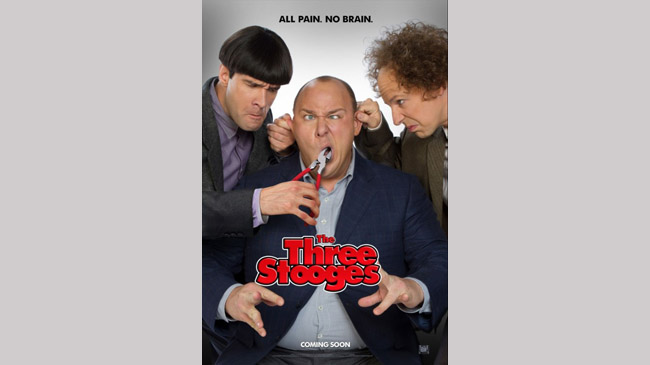
The Three Stooges
The Poster: If you can look at this without wanting to bury your fist through the screen, you’re doing better than we are.
Worst Detail: “All pain. No brain.”
Yeah it rhymes, but if the tagline is going to be that tenuous, why bother with one at all?
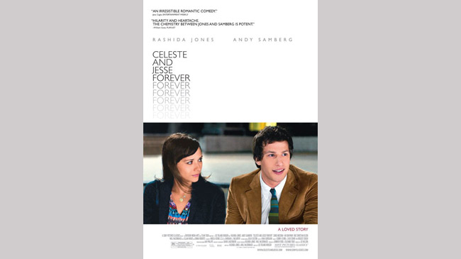
Celeste And Jesse Forever
The Poster: A weirdly formal poster for what is a bright and breezy rom-com.
Odd.
Worst Detail: The expanse of white.
Way, way too much!
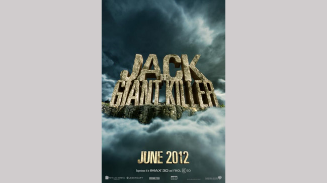
Jack The Giant Killer
The Poster: Yep, that’s the title all right.
Okay, move along… nothing to see here.
Worst Detail: The total absence of any kind of detail whatsoever.
Why even bother releasing this?
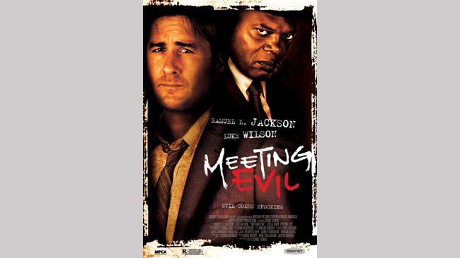
Meeting Evil
The Poster: Sam Jackson waits patiently for the next Tarantino movie to roll around.
No wonder he looks grumpy…
Worst Detail: Luke Wilson’s bizarrely bloated face.
We’re not entirely convinced it corresponds to his body.
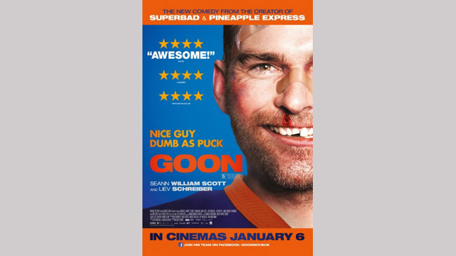
Goon
The Poster: A nicely icky close-up of a battered and bruised Seann William Scott, sadly let down by…
Worst Detail: That punchline. “Dumb as puck”? Get out.
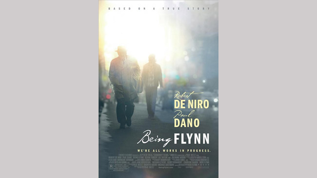
Being Flynn
The Poster: A one-sheet that does little to explain what the film is, let alone sell it.
Two indistinct men walking through a sun-dappled street? Sign us up.
Worst Detail: The fact that their faces aren’t exposed.
At least show us De Niro!
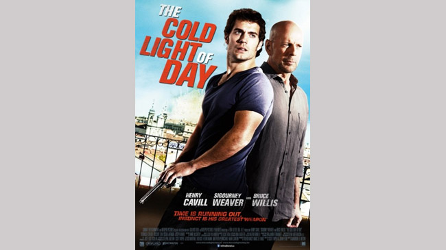
The Cold Light Of Day
The Poster: Henry Cavill and Bruce Willis look moody against the jarring backdrop of a bright blue sky.
Fun in the sun!
Worst Detail: The sunlight bouncing of Bruce’s glistening pate.
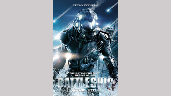
Battleship
The Poster: Battleship blows any sense of surprise or mystery out of the water by slapping one of its extra-terrestrial antagonists on the front of a poster.
Worst Detail: The alien’s entire design is pretty uninspiring. If that’s the big bad, we’re not sure we’re bothered, really…
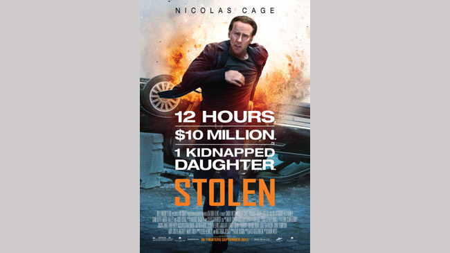
Stolen
The Poster: Ah, the annual Nic Cage entry. A reliably crap poster, featuring Cage’s reliably crap hair.
Worst Detail: Cage’s expression. Part blind rage, part “dashing for the toilet”.
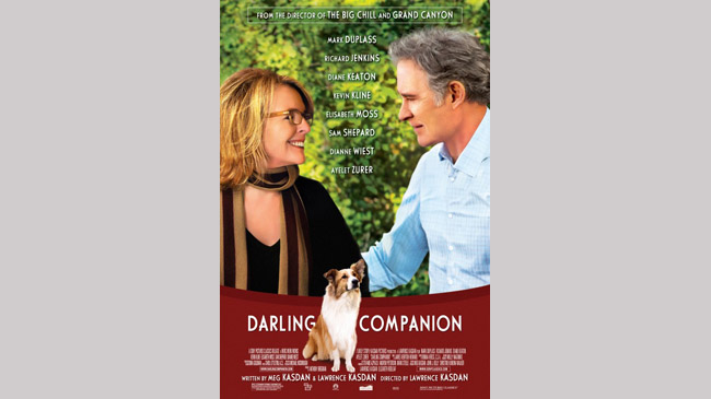
Darling Companion
The Poster: Kevin Kline, Diane Keaton, a loveable pooch and some ropey photoshopping.
What could be more charming?
Worst Detail: The placement of the dog, so it’s slightly encroaching upon the first word of the title.
Irritating.
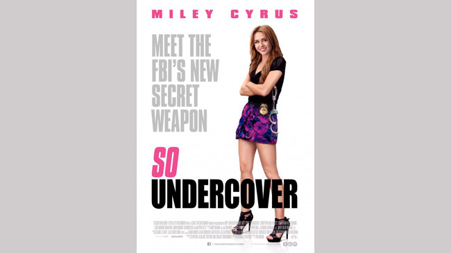
So Undercover
The Poster: It might not have much to work with given the premise and the horrific title, but still… could it not have been a little less irritating?
Worst Detail: Miley Cyrus and her cheery chipmunk grin. Urgh.
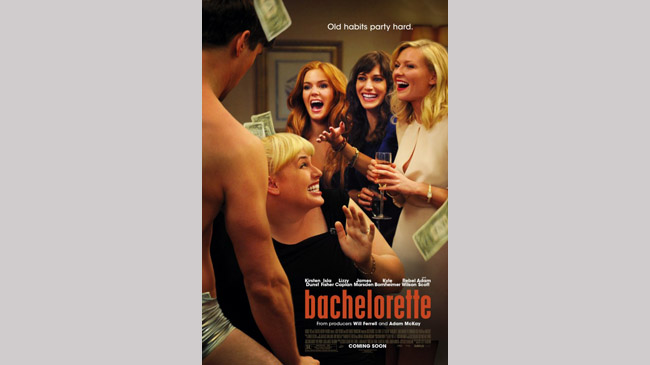
Bachelorette
The Poster: Another shoddy photoshop job, with none of the four female leads looking as if they’re in the same room…
Worst Detail: Isla Fisher seems to have been airbrushed to within an inch of her life!
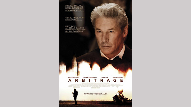
Arbitrage
The Poster: Obscure title?
Meet utterly bland poster.
Congratulations… you’ve told your audience precisely nothing!
Worst Detail: The crushing boredom of the entire affair.
Even Gere looks glazed over.
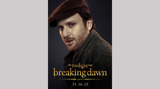
Breaking Dawn pt. 2 #1
The Poster: One of the many, many character posters released for the series closer.
Seriously, does this guy warrant his own poster?
Worst Detail: Those red eyes look frankly risible.
They match his cap though!
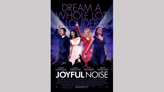
Joyful Noise
The Poster: This is the post X-Factor world, where a phrase like “dream a whole lot louder” makes perfect sense.
God help us.
Worst Detail: The appalling photoshopping job done on the four leads.
Cardboard cut-outs ahoy!
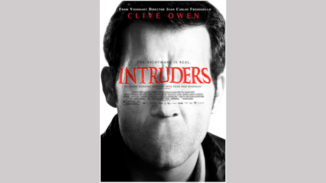
Intruders
The Poster: We presume this is meant to be the villainous Hollow Face, but it looks remarkably like a badly photoshopped Clive Owen…
Worst Detail: That missing mouth really looks like a cut and paste job.
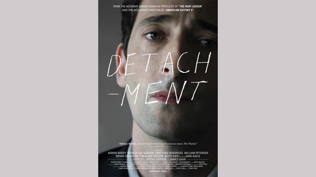
Detachment
The Poster: Don’t get us wrong, we love Adrien Brody, but this… it’s too much.
Worst Detail: Hyphenating the title… not pleasing on the eye.
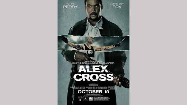
Alex Cross
The Poster: Hero and villain are juxtaposed, as glaring Tyler Perry competes for attention with a sinewy Matthew Fox.
Worst Detail: The fact that Fox’s character is ripping through the image of Perry.
It looks a complete mess!
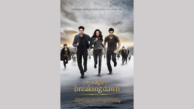
Breaking Dawn pt. 2 #2
The Poster: The most awkward portrayal of people running, ever captured on a movie poster?
It may well be.
Worst Detail: The fellow on the left doesn’t seem to have the first idea how running should look.
Pick your arms up, man!
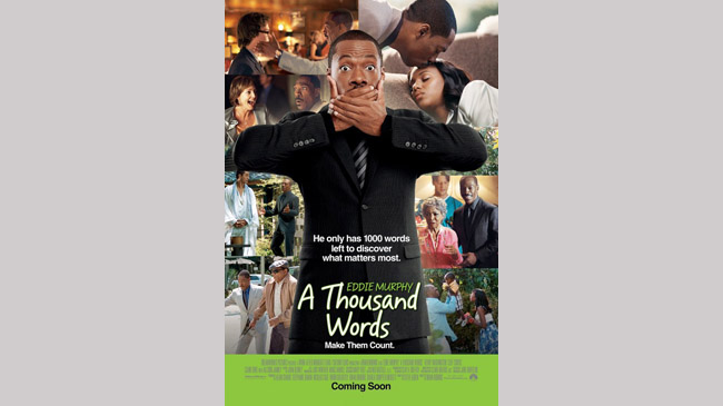
A Thousand Words
The Poster: Eddie Murphy appears in front of a “greatest hits” selection of scenes from the film.
Looks like something you’d find arranged on a twelve-year-old’s notice board.
Worst Detail: Murphy clinging on to that old dear who looks distressed by the whole affair.
At least he isn’t playing her.
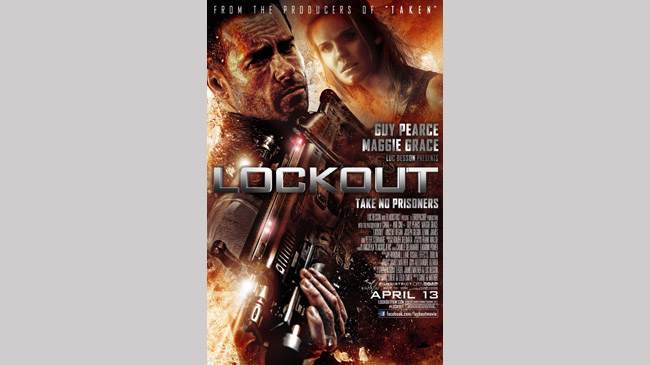
Lockout
The Poster: We’re all for a cheesy, direct-to-video poster for a b-movie such as this one, but what on earth is Guy Pearce doing with that gun?
Worst Detail: Look at the positioning of Pearce’s hand in comparison to his torso!
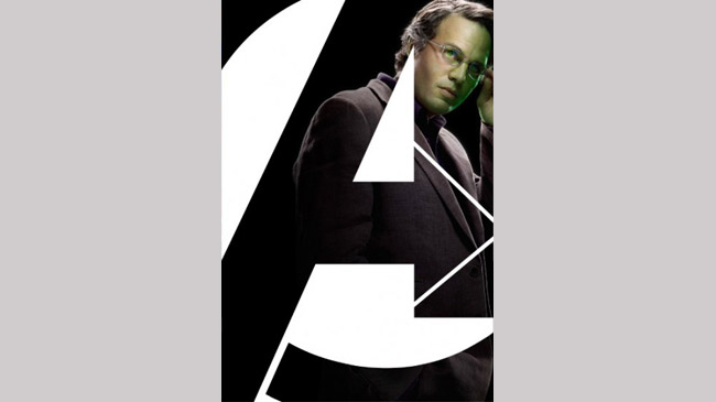
The Avengers
The Poster: An extremely shoddy effort for one of the biggest movies of the year, this looks like something the intern knocked together in about five minutes.
Worst Detail: The fact that Mark Ruffalo looks barely recognisable.
What’s wrong with his face?
Good job Avengers Assemble had roughly a million other brilliant posters to promote it.
If it had just been this one, we'd have thought it was a film about an angry teacher suffering from seasickness.
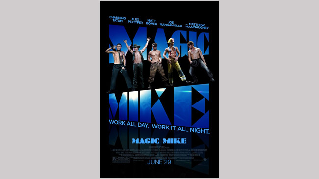
Magic Mike
The Poster: No matter how glistening those pecs are, there’s no getting away from the atrocious photoshop work on display here.
Worst Detail: Matthew McConaughey looks the most cardboard here, but it’s a very close call…
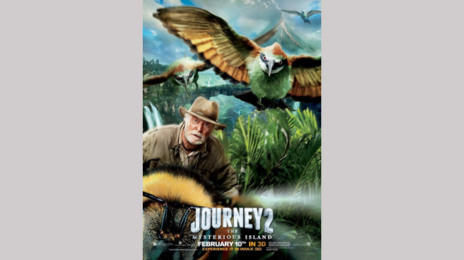
Journey 2: The Mysterious Island
The Poster: Yes, that’s Sir Michael Caine riding on the back of gigantic bumblebee. And what of it?
Worst Detail: It’s not very dignified, is it? And those owls look like extras from Birdemic …
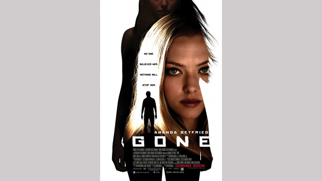
Gone
The Poster: A three-layered melange of silhouettes and Amanda Seyfried that looks amateurish at best.
Can’t even imagine this one sounded good at the planning stage…
Worst Detail: Having Seyfried’s face crowbarred into the shape of a lock of hair. Why?
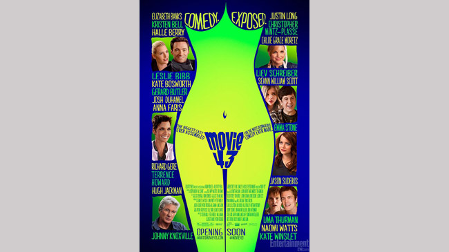
Movie 43
The Poster: A horribly lurid teaser for a comedy that boasts “the biggest cast ever assembled”. Lemon and lime colour-scheme? No thanks.
Worst Detail: The layout fail that appears to bill Richard Gere as Johnny Knoxville.

George was once GamesRadar's resident movie news person, based out of London. He understands that all men must die, but he'd rather not think about it. But now he's working at Stylist Magazine.
