7 Horror Movie Posters That Lied
Gore-filled one-sheet fibbers…
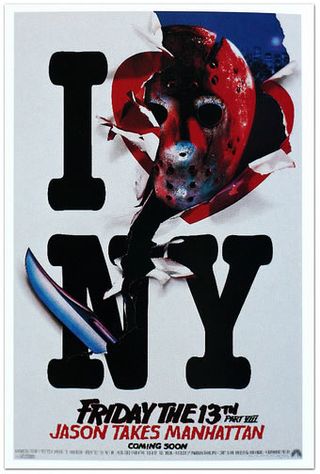
Jason Takes Manhattan (1989)
The Movie: Jason Vorhees gets on a boat to New York to kill teenagers in a different state.
Despite the fact he’s supposed to hate water.
It’s a stupid premise that inspired a frankly brilliant – if untruthful – poster.
How The Poster Lied: At no point in Friday The 13th Part VIII does Jason Voorhees decide to give up gutting teenagers, deciding that he’s got a grudge against city adverts instead.
Why We Forgive It: Because it’s awesome.
From the way Jason’s head replaces the heart to the (possibly accidentally ironic) way Jason’s cutting through the N for New (Jason must hate new stuff, or he wouldn’t be returning for a seventh sequel), it’s the sort of poster you’d be proud to hang on your wall.
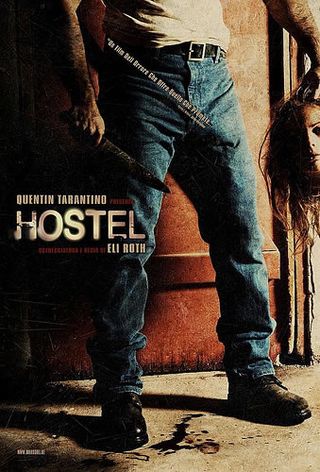
Hostel (2005)
The Movie: A bunch of American boys go on a Euro-trip, offend the locals, get sent to a torture dungeon where rich folk get their kill kicks.
How The Poster Lied: Well, for a start, only blokes cark it in Hostel, the ladies are reserved for horny teenage boy bait to take them into the torture trap.
They only appear as victims in Part II.
And we certainly don’t remember a scene where a girl gets beheaded in either film.
Why We Forgive It: If this was a poster for a generic slasher flick, it would get us through the door, even if the tagline is positioned to draw attention to the killer’s, er, package. It’s like an arrow, for goodness sake.
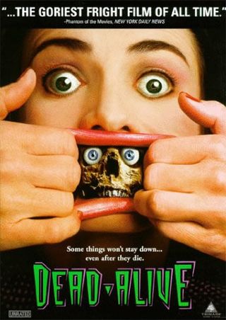
Dead Alive (1992)
The Movie: You’ll probably know this one as Braindead, Peter Jackson’s schlocky zombie flick.
It’s packed with undead monkeys, lawnmower killings and giant monster mothers…
How The Poster Lied: …But there isn’t a bit where a woman tears open her mouth to reveal a tiny skeleton. It simply does not happen.
Why We Forgive It: Because it sort of reminds us of the zombie skeleton canisters from Return Of The Living Dead, and if that was the intention, then bravo.
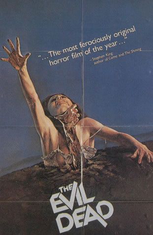
The Evil Dead (1981)
The Movie: Sam Raimi’s low-budget cult classic.
It’s a shame Raimi didn’t build on the underground success of this one.
That kid had promise.
How The Poster Lied: We’ve seen Evil Dead approximately eighty thousand times, and we still can’t recall a scene where a hand pulls a woman underground as she reaches for something on the top shelf.
Why We Forgive It: It’s instantly iconic, if a little illogical.
Was she already half-buried in the dirt? If not, how did the hand reach her neck? Still, it's brilliant, isn’t it?
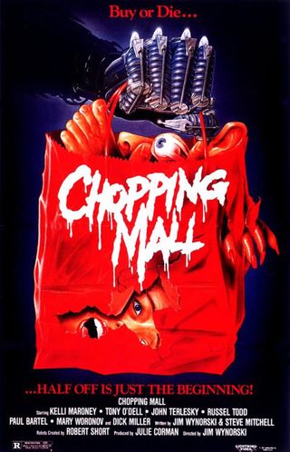
Chopping Mall (1986)
The Movie: A gang of rowdy teenagers break into their local mall for a late-night party, but they didn’t bargain on the shopping centre having a psychotic security system…
How The Poster Lied: Brace yourself for some seriously bad news.
At no point in this movie does a cyborg boldly hold aloft a shopping bag full of body-parts.
That fact is probably the great tragedy of our lifetimes
Why We Forgive It: The film might be rubbish, but how can you hate a poster for a film called Chopping Mall with the tagline ‘Half Off Is Just The Beginning?’
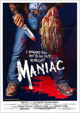
Maniac (1980)
The Movie: Following the life and times of a serial killer named Frank who gets his kicks out of scalping folk. Maniac is a tour-de-force of tack.
How The Poster Lied: This is the poster that Hostel played homage to with its own one-sheet fib.
This one’s a little more truthful – it’s just way too generic to do justice to this truly bizarre flick.
Because it makes you think you’re in for a normal murder movie, when that’s the last thing Maniac is...
Why We Forgive It: Because, frankly, if it told the truth, it would feature Frank having sex with a mannequin that has a bloody scalped wig plopped on its bonce so that Frank can pretend it’s his mother.
And no-one wants to see that.
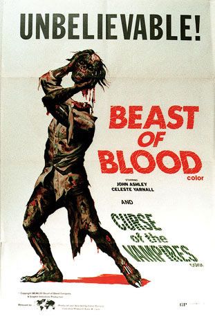
Beast Of Blood (1971)
The Movie: A mad scientist with an eye-patch who communicates entirely via amateurish dubbing is experimenting on decapitated heads. That can’t end well.
How The Poster Lied: The Beast Of Blood does put his own head on In one scene, but he’s wearing hospital gear, not the cool rags he’s got on in this poster.
And the scene uses choppy editing to disguise the moment where head meets body. It’s certainly not as showy as the poster suggests.
Why We Forgive It: Because, like every other poster on this list, it’s brilliantly designed.
And we’re pretty sure it’s responsible for every single cent of the box office takings. You would be too if you ever sat through the three-minute trailer.
Sam Ashurst is a London-based film maker, journalist, and podcast host. He's the director of Frankenstein's Creature, A Little More Flesh + A Little More Flesh 2, and co-hosts the Arrow Podcast. His words have appeared on HuffPost, MSN, The Independent, Yahoo, Cosmopolitan, and many more, as well as of course for us here at GamesRadar+.
Most Popular


