Best & Worst: Movie Posters Of 2013
The divine and the dastardly

Worst: A Madea Christmas
Nothing short of terrifying.
For the poster of his quote-unquote comedy, Tyler Perry is transformed into a cross-dressing nutcracker, which is the thing of Christmas nightmare. Seriously, we’re scared to go to sleep tonight.
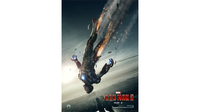
Best: Iron Man 3
Superior in every way to later posters that merely arranged the characters in a moody tableaux (pure laziness in motion, especially considering it’s near identical to a similar Thor: The Dark World poster).
This is dramatic and dangerous, hinting at the desperate stakes inherent to Iron Man’s potentially final solo outing.
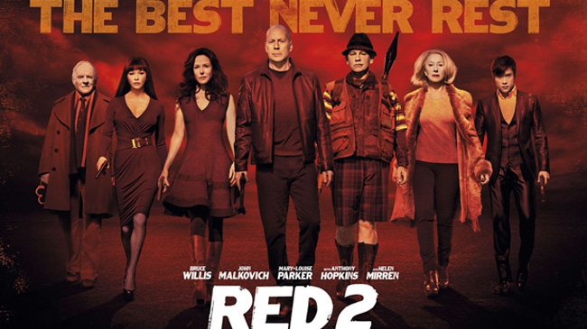
Worst: RED 2
If the whole point of the RED films is that OAP action is cool, why the heck have of all of its main players been airbrushed?
Helen Mirren in particular is rocking the wind tunnel look, and Catherine Zeta-Jones is almost unrecognisable.
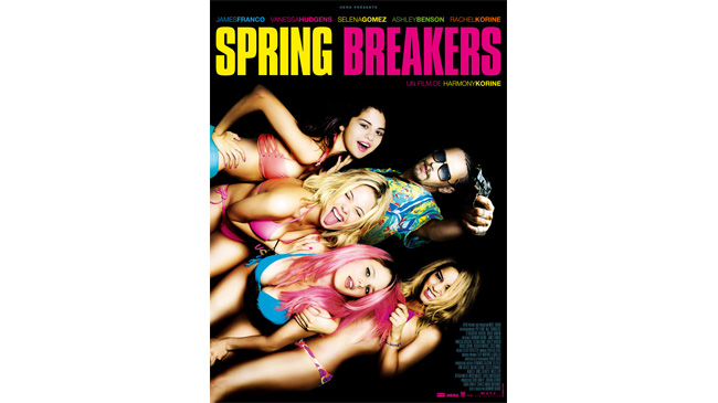
Best: Spring Breakers
True, James Franco’s been airbrushed to hell (and back), and there’s something slightly uncomfortable in the apparent exploitation of these bikini-wearing babes.
There’s no denying, though, that this ad campaign was both eye-catching, enticing and massively memorable. Say what you will about the film and its themes, but aesthetically, it’s a special kind of OTT candy-cane brilliant.
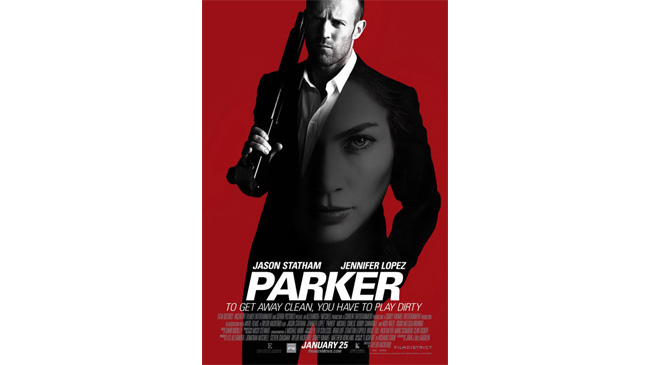
Worst: Parker
Clearly learning nothing from the dreadful X-Men: First Class posters , this ill-advised one-sheet plasters J-Lo’s face onto Jason Statham’s black suit.
It looks like the Stath’s trying to set a new fashion trend in face-emblazoned suits, and sort of undermines the entire thing.
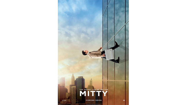
Best: The Secret Life Of Walter Mitty
Ben Stiller’s latest movie is one of those genre-defying oddities that we love, and the poster makes no bones about the fact that Walter Mitty is almost impossible to pigeon hole.
It’s an enigma in itself, showing Stiller walking up the side of a building. Is he a superhero? Is this Inception 2 ? Is he daydreaming? We’ll have to watch the movie to find out…
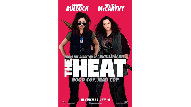
Worst: The Heat
Melissa McCarthy's totally unrecognisable in this one-sheet, which sort of defeats the point of putting her on the poster in the first place – surely Fox wanted to capitalise on her soaring profile?
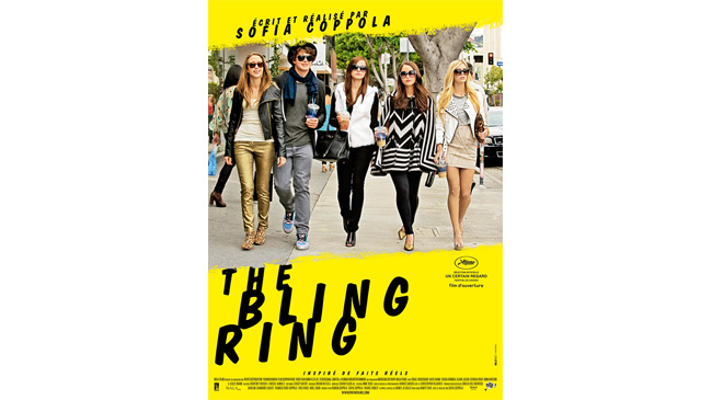
Best: The Bling Ring
So rebellious and in-yer-face garish (just check out that vibrant yellow) that it’s almost as if the thieving teens at the centre of Sofia Coppola’s film created this.
It’s got attitude in spades.
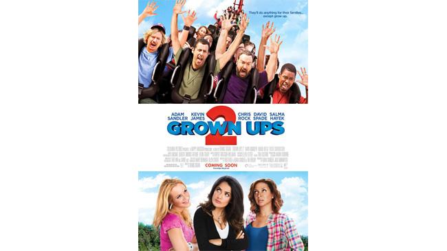
Worst: Grown Ups 2
It’s Grown Ups 2 , so of course it’s going to be rubbish, but the unapologetic sexism in this ad is what really grates.
According to the Sandler universe, all men are adorably fun-loving vagabonds, while their Barbie doll other halves are eye-rolling kill joys. This is 2013, right? Good, just checking.
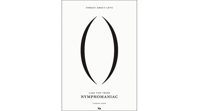
Best: Nymphomaniac
Lars von Trier finds a way of being utterly filthy while only using two brackets. This echoes the artwork for Teeth , which is always something to celebrate.
It’s basically a giant emoticon, which we love.
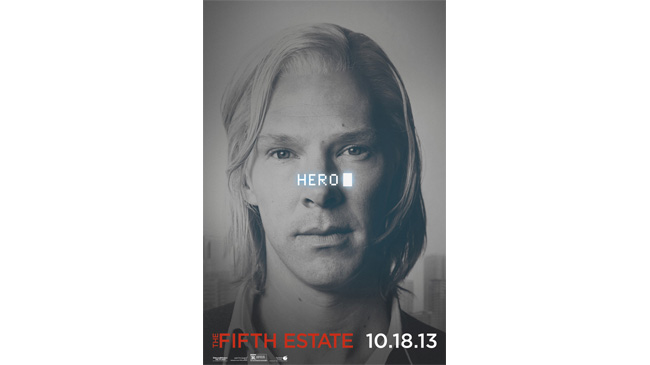
Worst: The Fifth Estate
It’s just sort of awkward, this one, isn’t it?
Though you’d think you couldn’t go wrong with a poster that features Benedict Cumberbatch and not a lot besides, the placing of the ‘hero’ text is just really odd. Yes, it’s part of a character series, but no, it doesn’t work.
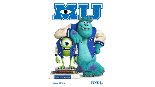
Best: Monsters University
Sometimes, simplicity does it, and that’s definitely the case in this colourful, furry poster.
All we need to know about Monsters University to be interested in it is that it stars Sully and Mike, which is why they’re the only ones on this promo. Both monsters are also totally in character – Mike’s tiny and has an ill-fitting jacket, while Sully’s a fuzzy jock.
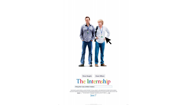
Worst: The Internship
Far from a movie poster, this one’s mostly uncomfortable because it just seems to be an ad for Google.
Only an ad for Google starring Vince Vaughn and Owen Wilson. Sure, the search fields are fun, but, really, there’s a limit…
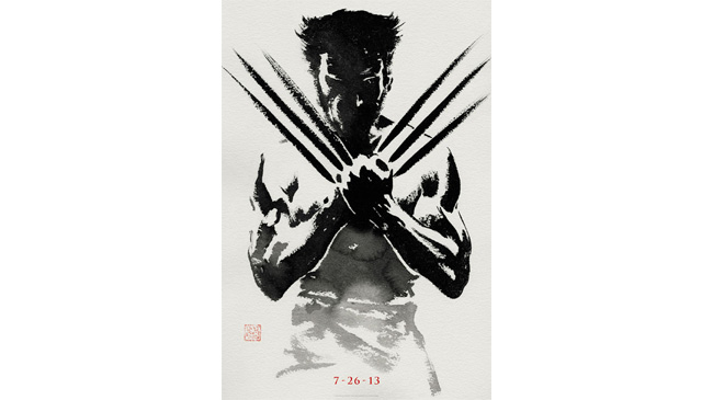
Best: The Wolverine
Another recognisable movie character... The razor-knuckled mutant is so recognisable that all we need is a semi-silhouette to figure out who this is.
The Japanese painting look-a-like captures both Wolvie’s raw energy and the film’s Eastern setting perfectly. This is film posters as art.
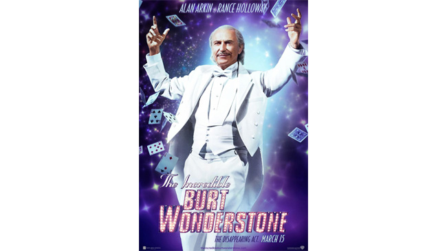
Worst: The Incredible Burt Wonderstone
Poor old Alan Arkin. Though he’s one of Hollywood’s finest actors, he’s been put through a spectacularly embarrassing magician-isation process for this character one-sheet.
It looks like he’s wearing an Alan Arkin mask, such is the extent of the Photoshopping.
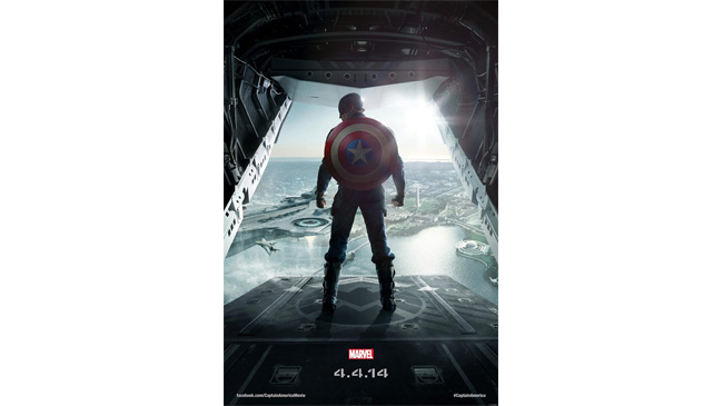
Best: Captain America: The Winter Soldier
The best example of a 2013 poster trend – that of a heroic figure standing silhouetted with his back to the audience (see also forebears The Dark Knight and Inception ).
This gets top marks for the details – the epic sense of scope in that Helicarrier backdrop and just the sheer awesomeness that is Captain America’s shield. Plus, of course, the S.H.I.E.L.D. emblem he’s stood on.
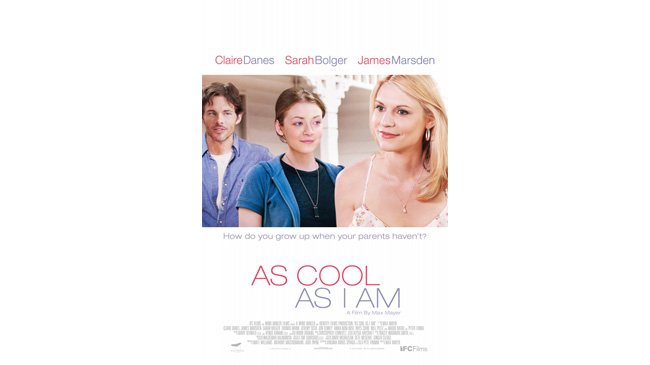
Worst: As Cool As I Am
BLAND.
Despite what the title says, this one definitely isn’t cool – though Claire Danes looks pretty lovely, it’s a case of Photoshopped lollypop heads where James Marsden and Sarah Bolger are concerned. Moving on quickly…
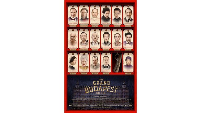
Best: The Grand Budapest Hotel
When you’ve assembled a cast as impressive as the one Wes Anderson has for The Grand Budapest Hotel , you really want to show them off, which this one-sheet does with serious style.
Plastering illustrations of the likes of Ralph Fiennes, Bill Murray and Adrien Brody onto door-hangers, it’s on-theme and hella classy.
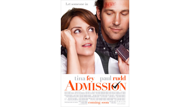
Worst: Admission
It’s a testament to how bad this poster is that, despite featuring awesome individuals Tina Fey and Paul Rudd, it still makes us wince.
There should be a cross in that ‘o’ instead of a tick, thank you very much.
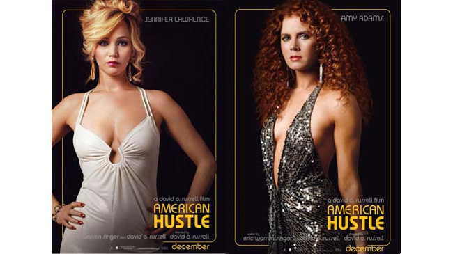
Best: American Hustle
Going full-on period, the one-sheets for David O Russell’s new film are all about glamour. And cleavage. Lots and lots of cleavage.
Which isn’t the only reason they rock. With those killer locks (and frocks), Jennifer Lawrence and Amy Adams bring ‘80s diva glamour to life with serious A-list style.
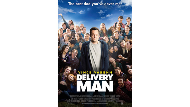
Worst: Delivery Man
Basically, if you’re not a fan of Vince Vaughn, this poster doesn’t cater for you - he’s just sort of right there in the middle, pretty much apologising for his presence.
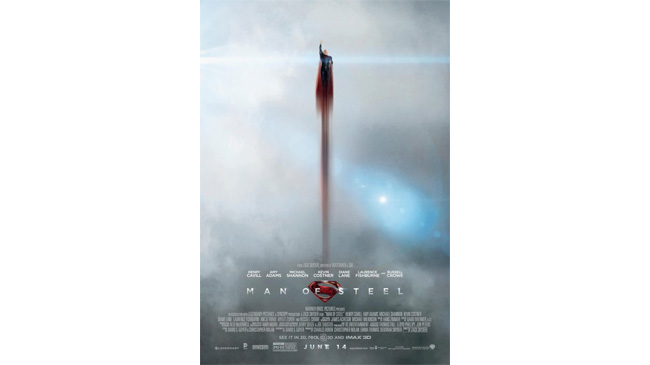
Best: Man Of Steel
When Zack Snyder’s Superman reboot flies, it soars, and that’s true of the posters as well.
The Man Of Steel poster campaign was brilliant (we could have used any of them in this list, really), but this one stands out for its drama, memorable imagery and sky-high cool factor.
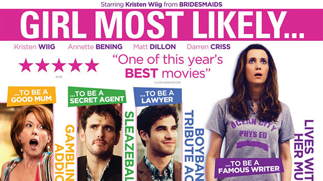
Worst: Girl Most Likely
Even Kristen Wiig looks completely bemused by this Photoshop creation – it’s almost as if she’s glimpsed the poster and been rendered slack-jawed in response.
Annette Bening and Matt Dillon are right there with her expressing their shock and confusion, as well they should.
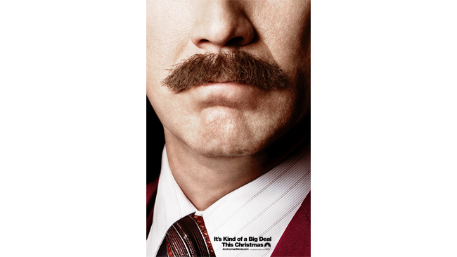
Best: Anchorman 2: The Legend Continues
Paramount know that nobody in the movies has a 'tache like that (well, apart from Tom Selleck maybe), which is why they shoved that fastidiously-cultivated lip-caterpillar front and centre on this sequel’s one-sheet.
News flash – it works.
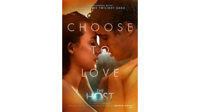
Worst: The Host
Straying into upsetting, porn-like, hot-n-heavy territory, this one-sheet for the very-not-porn-y The Host seems to think it's advertising a completely different film.
The 'Choose To Love' tag is also pretty vomit-inducing, especially when it accompanies a couple who appear to be having a spot of shower fun-time.
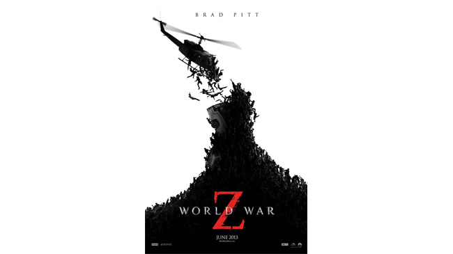
Best: World War Z
Recreates a scene from the film that’s both memorable and jaw-dropping, which is why it makes for one hell of an effective one-sheet.
Hinting that this is far from the tired zombie flick you might expect, we get the ant-swarm flesh-munchers uniting to bring down a HELICOPTER. And just like that, we were sold on this book adap.
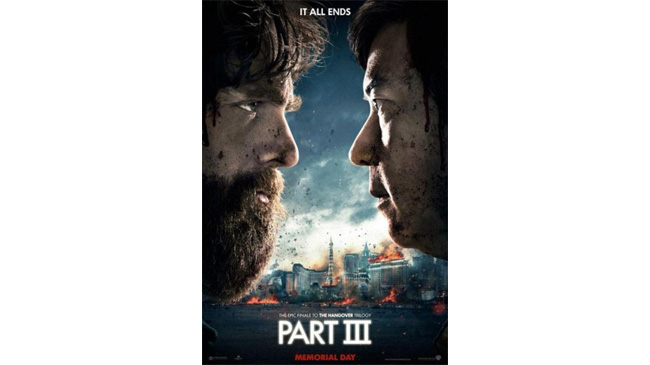
Worst: The Hangover Part III
When the Muppets released their movie-lampooning spoof trailers in 2011, they were awesome.
When Zack Galifianakis rolled out a similar idea in a Harry Potter- lampooning one sheet for Hangover 3 , it felt dog tired and, pivotally, not even remotely funny. Sort of like the film itself.
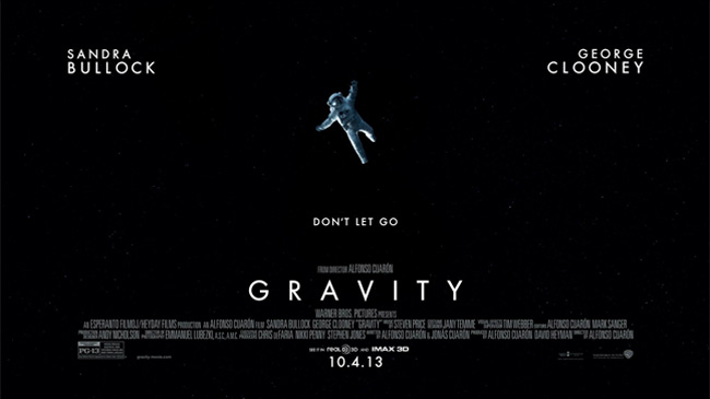
Best: Gravity
Pick any of the Gravity one-sheets, and they’d deserve a place on this list – from the close-up of Sandra Bullock’s hyperventilating scientist, to the more action-oriented one-sheets featuring space explosions.
This one is particularly effective because it’s all about space – and how totally helpless Bullock’s character is in the film. A brave one-sheet, too, considering it doesn’t feature the audience-attracting faces of either of the stars.
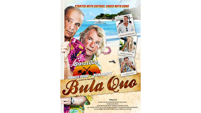
Worst: Bula Quo
Our dads love Status Quo (and, alright, so do we, though not the Argos version of ‘Whatever You Want’), but there’s little to love about the poster for their first movie.
It looks like one of the band members has had a go at Photoshop in their spare time and rustled up this dated, cartoon-y travesty. Oh Quo…
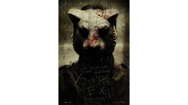
Best: Youre Next
A violent threat in poster form, as a terrifying, blood-splattered fellow in a mask stares right into your soul.
His scratched message (‘You’re Next’) is both warning and film title, perfectly tapping into the film’s tongue-in-cheek (but nonetheless terrifying) spirit.
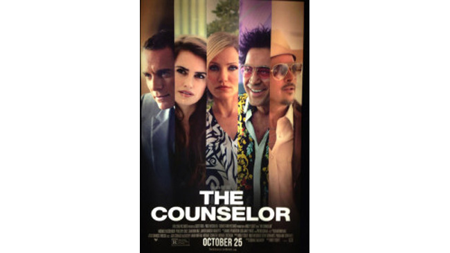
Worst: The Counsellor
For a film as stylish as Ridley Scott’s, this poster feels nothing less than a marketing department betrayal.
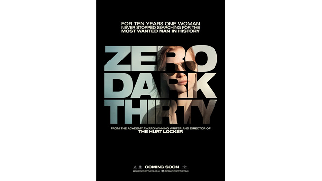
Best: Zero Dark Thirty
Bold and simplistic for a film that definitely is the former and definitely isn’t the latter.
Jessica Chastain rocks the shades in a poster that doesn’t give too much away, but doesn’t need to – especially with that Hurt Locker credit under the title.
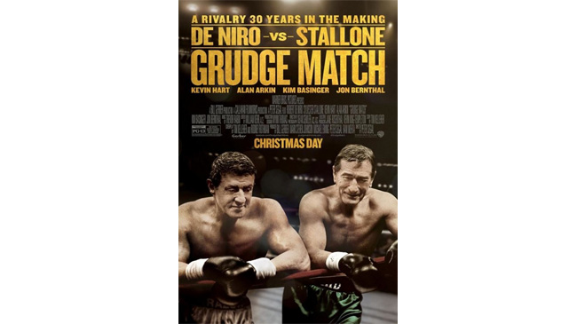
Worst: Grudge Match
Stallone and De Niro may well be laughing, but the joke's on them both with this poster.
There have been many posters that have committed heinous crimes against Photoshopping, but this is one of the worst, plastering its stars heads on clearly stand-in bodies.
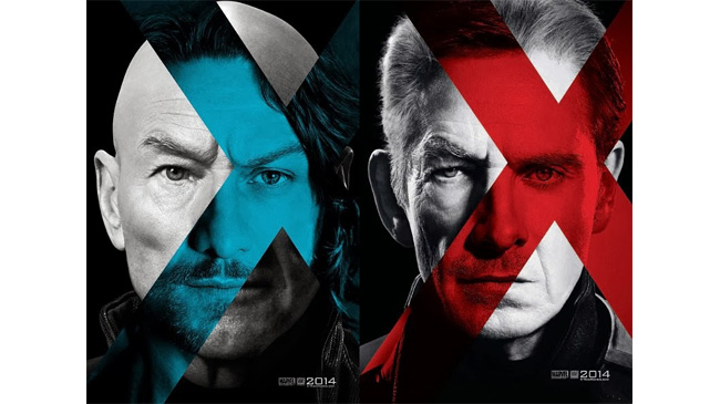
Best: X-Men Days Of Future Past
Having learnt from the dodgy X-Men: First Class c haracter series back in 2011, the one-sheets for this follow-up are nifty in concept and execution, mashing together the faces of Patrick Stewart/James McAvoy and Ian McKellen/Michael Fassbender.
It works brilliantly. Even if Professor X does sort of look like Emperor Ming…
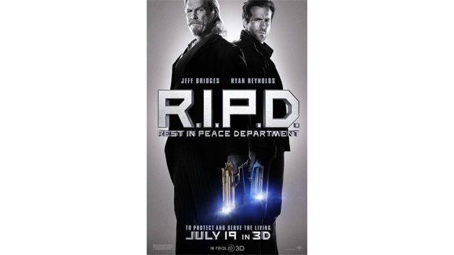
Worst: R.I.P.D.
Jeff Bridges and Ryan Reynolds are huge stars. But stand them back to back against a glowing silver back-drop and they’re, well, sort of dull.
Even the futuristic guns can’t boost this dull one-sheet, which looks like it wanted to be a Men In Black throwback, but fails spectacularly. Small wonder nobody went to see it.
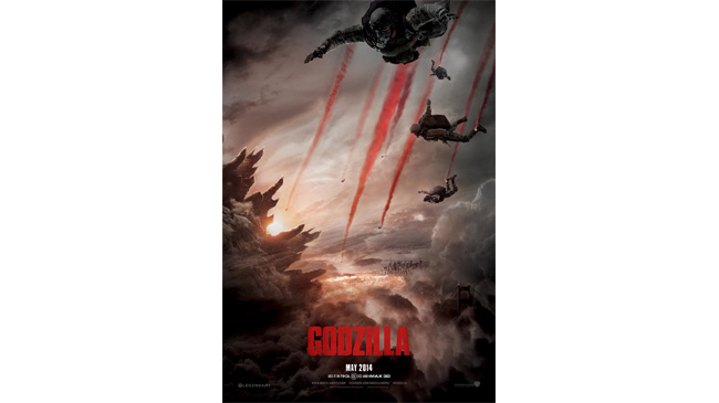
Best: Godzilla
The gorgeous trailer had us weeping for Gareth Edwards’ amazing-looking monster reboot, and this poster cannily recreates one of the stand-out moments from that trailer as soldiers sky-dive, trailing red smoke behind them as they embark on a mission to take down the titular lizard.
May 2014 can’t come quickly enough.
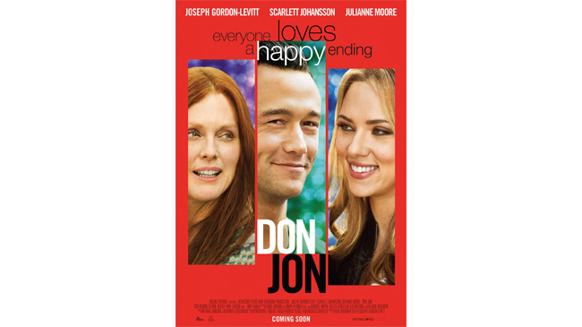
Worst: Don Jon
Brilliant film, terrible poster. Failing entirely to capitalise on the sexy subject matter at the heart of JGL’s directorial debut, it’s almost as if this one-sheet is purposefully trying NOT to be sexy.
Which is probably the point, but… what a missed opportunity. A screen grab from one of the film’s atmospheric nightclub scenes would have worked much better.
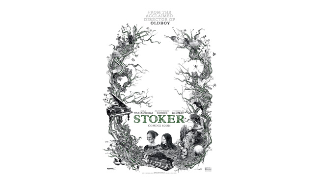
Best: Stoker
Hand-drawn, equal parts beautiful and creepy, this is vaguely Burton-esque, with its coffins and insect-y plant-life.
A little treasure trove of elements from the film, we could stare and dissect this for hours.
Josh Winning has worn a lot of hats over the years. Contributing Editor at Total Film, writer for SFX, and senior film writer at the Radio Times. Josh has also penned a novel about mysteries and monsters, is the co-host of a movie podcast, and has a library of pretty phenomenal stories from visiting some of the biggest TV and film sets in the world. He would also like you to know that he "lives for cat videos..." Don't we all, Josh. Don't we all.
Bringing all the latest movie news, features, and reviews to your inbox
You are now subscribed
Your newsletter sign-up was successful
Join the club
Get full access to premium articles, exclusive features and a growing list of member rewards.
 Join The Community


