BioShock - designer interview
Irrational Games on its 360 and PC depth-charge
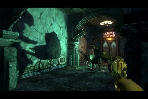
One of the most staggering elements of BioShock is the city, Rapture itself...
McDonagh: Yeah. I remember one of the key moments for Ken and the creative team; the game went through lots of different stylistic iterations and started out very different from how it is now.
There was a key moment where we realized that when you put something in a dark, sinister environment, bizarrely and counter-intuitively it loses some of its power. Because if you're in a cellar, you're expecting it to be a little bit scary and immediately you've got your guard up.
What we found is, if you put something horrifying next to something beautiful, it's very powerful. There's something very unsettling about it. I remember one of the great inspirations was when one the creative team watched The Shining again, which I think is one of the scariest films I've ever seen.
There's the brilliant bit where Jack Nicholson goes down into the ballroom and he meets the ghost of this bartender, and there's all these ghosts of people dancing. It's all art deco, this beautiful luminous green environment and it's absolutely terrifying, sinister and unsettling.

We thought wouldn't it be cool, rather than regurgitating yet another dark, gritty science fiction vision of the future, wouldn't it be cool if we did something that looked like this. That looked like New York, took all the best bits of art deco and made it very sinister. Did it work?
We think so.
McDonagh: The hardest thing to describe is the vibe, and that's what I think has really surprised people; that atmosphere of the game. I just don't think people expected it because it is incredibly tense and unsettling. I can sit and talk about it, but until you play it it doesn't mean anything.
Sign up to the GamesRadar+ Newsletter
Weekly digests, tales from the communities you love, and more


