Why you can trust GamesRadar+
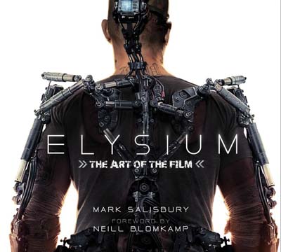
As I’ve said before it’s always difficult to review a book like this. You get the same approach in every book of this type; casting, costume choices, locations and so on. It’s not a bad thing, God knows I’ve been reading these things avidly since I could shave, but it means that reviewing them can be a little tricky.
This book actually makes things noticeably easier by talking about the process of designing the movie’s worlds and, crucially, one man’s role within that. Syd Mead is one of the greatest designers in modern movie history, a man whose work has been featured in everything from Star Trek: The Motion Picture to Blade Runner and mecha design. Mead’s insight and style has been stamped all over both the fictional future and the actual present. His work is astonishing, and some of the book’s most interesting sections concern his recruitment onto Elysium. Blomkamp’s astonishment that he could now legitimately recruit one of his idols is very sweet and it’s a credit to Mead, now in his ’70s that he not only keeps up with the industry but knew and was impressed by Blomkamp’s work.
His work here, largely on the Stanford Torus-design of Elysium itself is amazing, filled with the clean lines and elegance he’s justifiably known for. There’s some interesting insights into the station’s internal design, too.
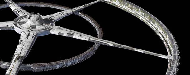
The book really highlights the way the two worlds of the movie collide. Elysium is vast, squeaky clean, beautiful and just a little tacky (after all, just because you’re a billionaire who can afford to live off Earth that doesn’t mean you have taste). In contrast, Earth is a barren favela; a wasteland crammed full of people, tattoos, gang tags and repurposed decades-old cars and weapons. The class war element of the movie is encoded into it on a near cellular level and that’s there on every single page. The book walks you through the design of Max, the robots that run his world, his work place, his exo frame, the horrifying surgery he undergoes and the weapons and vehicles he uses to get to Elysium. Each is dirty, old, battered and the best possible option. If Elysium is heaven, then Earth is clearly hell.
Seeing the two design philosophies and locations collide in the movie is heady enough on the page. It’s like cyberpunk and Kubrickian futurism got blind drunk and did frantic, sweaty things to each other on the set of the latest Mad Max movie. If a tenth of the feverish energy involved in designing the movie is on screen, then we should be in for a very fun experience. As it stands, the book is a beautifully designed look at the fractious world behind the movie and how it was built. Blomkamp, Mead and the other designers have created the most beautiful ugly world I’ve seen in a long time. Hopefully the movie set there will be as much fun as the world clearly was to design.
Alasdair Stuart
