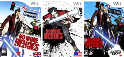
Box Art: Lost in Translation
US, UK and Japan packshots side-by-side-by-side
No More Heroes
A lot of thought went into accommodating Suda 51's no-holds-barred Wii actioner to the West, including protecting the UK from the horrible red blood of the US version. But that's another matter. In short: US box good, Japan box rubbish screenshots, PAL box rubbish Photoshop skills.
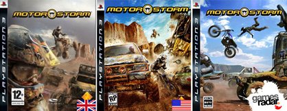
Motorstorm
We wish we were clever enough to figure out the ideas behind each region's unique Motorstorm box. Do Japanese punters prefer big jumps to big crashes? Does Germany get off on biker helmets? We'll ask Sony the next time it's in the office.
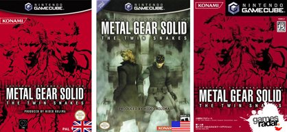
Metal Gear Solid: The Twin Snakes
This happened quite a bit with American GameCube covers, but we couldn't possibly tell you why. Japan and Europe get awesome Metal Gear Solid artwork, while North Americans can base their buying decisions on what looks like a shitty screenshot. That one's going to the back of the games shelf. Thank God it's called Metal Solid Solid though...
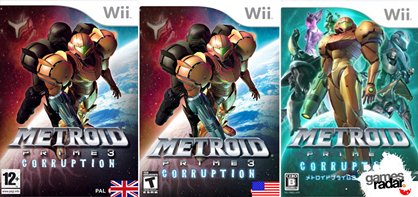
Metroid Prime 3: Corruption
The office is split on this one (some more than others). Is Japan's colourful display of Samus and her bounty hunter friends gorgeous, or childhood-destroying? And how many times can Nintendo possibly get Samus onto the Western cover?
Kirby Squeak Squad
Kirby is a legend of box art translation history: in EVERY game he's ever starred in, the Japanese get to see his happy, smiling face donned on their game box, while Nintendo of America decides to make him a miserable, angry git for the West. Cheer up, mate.

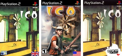
Ico
Easily the WORST case of tinkering with box art EVER is Sony's beautiful Ico. For some strange, baffling reason, Sony Computer Entertainment America decided to take the artwork for one of its most artistically brilliant games ever, and replace it with a PSOne FMV of a 12-year-old with a stick. What ON EARTH happened, marketing? There are no words...
Sign up to the GamesRadar+ Newsletter
Weekly digests, tales from the communities you love, and more
Mar 11, 2008
