There's something about mixing the outside with the inside. The wild with the ordered. The natural with the artificial. As a qualified landscape designer, I understand the approaches professional place-makers can take toward blending the two. If successfully implemented, the results can create distinct spaces that range from the aesthetically-striking to those that contribute beyond that. Whether you realise it or not, this is endemic to video game environmental design, too.
Places in games can be made extra special, and more impactful, when adopting this approach – particularly when exterior and interior designs bleed into one another. Interior settings can be enhanced by introducing isolated but visually breathtaking areas of earthly outdoor landscapes, creating curiosity and intrigue, while simultaneously leading to contrasts in aesthetics, changes to gameplay, story dualities, and narrative shifts.
Mass Effect: The Citadel
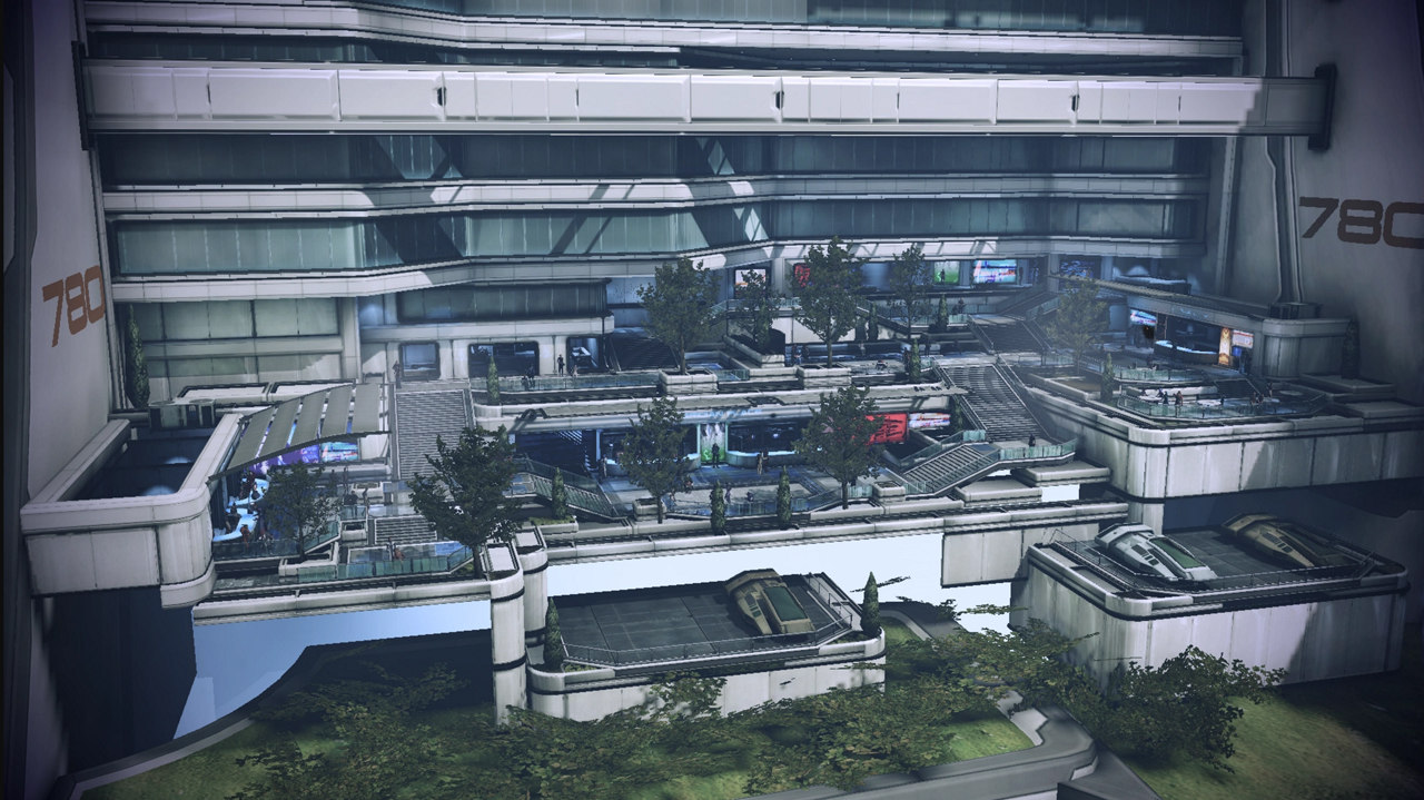
Mass Effect's Citadel harnesses the power of exterior landscapes within interior design through landscape architecture. Its focus is on the aesthetic and design implementation of merging the two, and the effects are majestic: a futuristic aesthetic that is simultaneously relatable. It grounds an alien setting in recognisable design principles, giving The Citadel an almost tangible quality. Its success in blending environments lies in its user experience-led design. Merging active areas like recreation and retail informs spatially efficient design, that can then be enhanced with exterior landscape elements, such as lush and purposeful planting, focal points and features, and expansive vistas.
This gives The Citadel a functional, pristine appeal. It may have been easier to impose a totally clean and clinical aesthetic finish to these areas, but it would make spaces unwelcoming and hard; softening them with landscape makes them palatable, but also more attractive and engaging. This reflects real-world approaches to social and active spaces, as we are more likely to sit next to greenery or beside a water feature, or walk alongside lush and tactile plants. Elsewhere, the UX design continues to be enhanced by exterior landscape features: plants of differing heights exaggerate stairways, imposing specimens frame entrances, and species of different looks and textures offer tactile forms of stimulation.
The Citadel's design is intended to evoke a sense of utopianism by blending nature and architecture perfectly. That's significant because, on the face of it, The Citadel is an alien concept. We may be used to spaceships, but not inhabited space stations that have their own gravitational fields, functioning economies, and populations, and so the implementation of Earthly landscape features enables us to relate to an otherwise alien environment. This relationship between land and space, mixed with familiarity and function grounds the Citadel to us as the players, but also to the characters we experience it through. The spatial composition and layout is proportional and functional to our character and the inhabitants, while the features, use of soft and hard, and arrangement and order of the design are familiar.
Fallout 4: The Institute
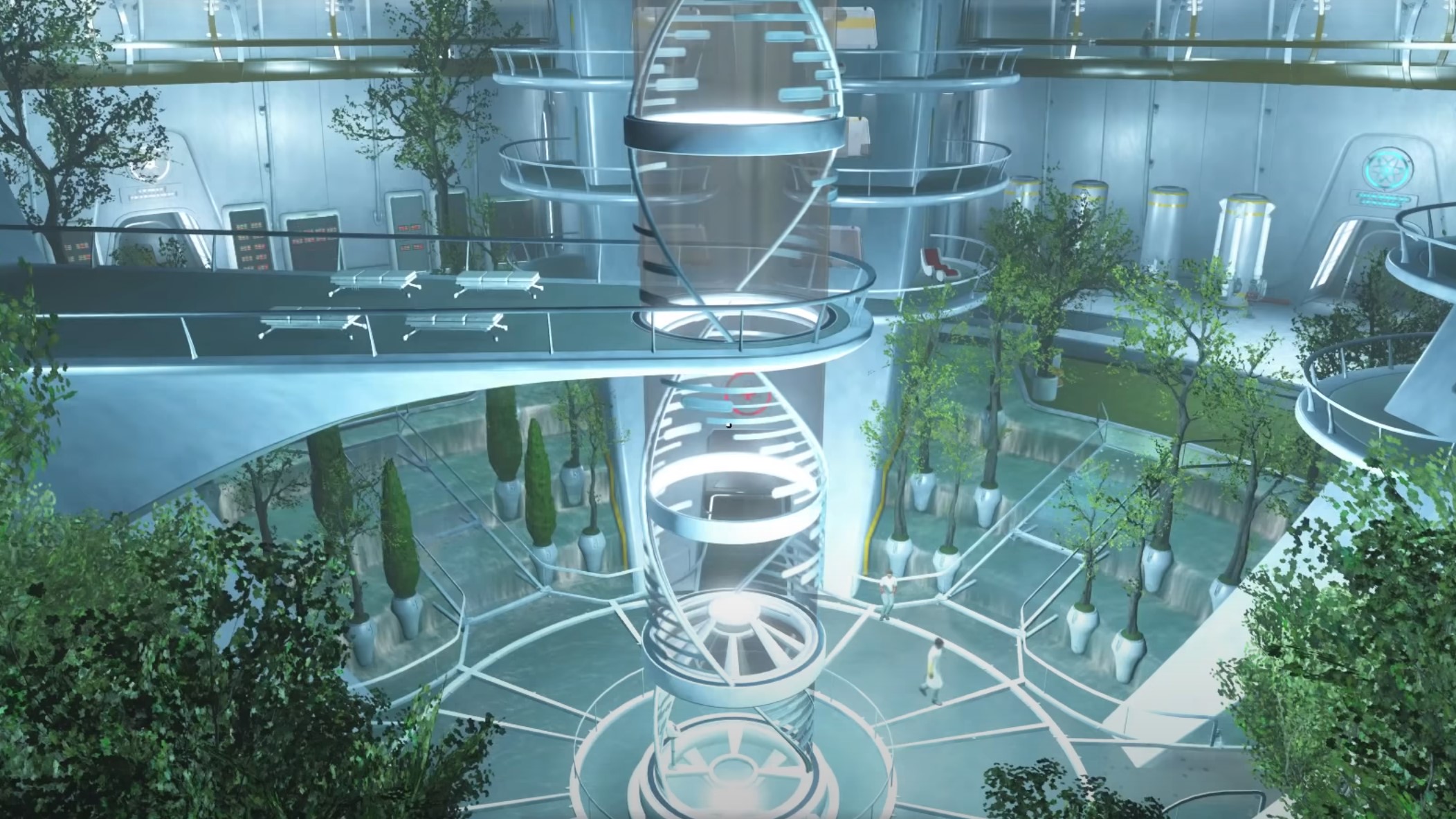
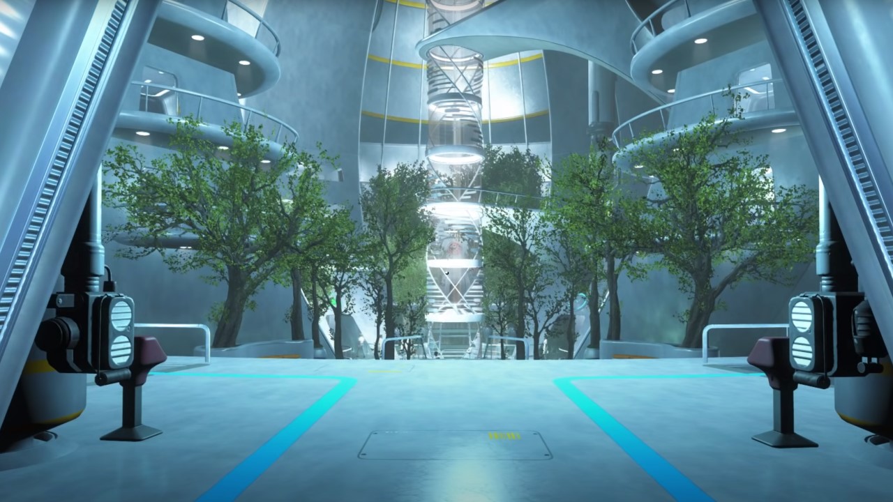
There is a similar approach of using the aesthetic to achieve a majestic, utopian feel in The Institute in Fallout 4, though the purposes of its exterior landscaping go further than just prettifying the environment. Like The Citadel, there's clearly an atmosphere of high-mindedness to The Institute, which aims for a new world rebuilding after a nuclear holocaust. Aesthetically, the clean and sterile architecture is, in a way, otherworldly, but varied use of exterior landscaping completes a cohesive and orderly environment design. There is a limited attempt to reduce the impact of the hard materials through the introduction of plants, and the greenery doesn't soften edges by draping over ledges or by smothering hard walls.
While not softening the hard materials in such an attractive way, the exterior landscaping makes the areas of The Institute more welcoming and approachable by dampening the clinical appearance aesthetically. Impressive and thriving trees flank doorways and upright structures, while others rise up through stairwells, with lawned areas providing soft and attractive natural carpets. The overall effect is there, albeit executed in a very controlled and orderly manner.
Sign up to the GamesRadar+ Newsletter
Weekly digests, tales from the communities you love, and more
"The effectiveness of the Arboretum's exterior-meets-interior design is definitely strong in the aesthetic but it also transcends that."
This greatly assists in the implementation of a design where everything is in order. A similar demonstration of man's control over nature through design was embodied in Renaissance landscaping. Society's upper echelons created overtly ordered garden designs as a way of expressing power and wealth, and that same sense of social dominance is reflected in The Institute's structure, which conveys a desire for a controlled regeneration of humankind.
The concepts of control and order within The Institute also represent Fallout 4's wider themes of contrasts. This is an area far removed from the post-apocalyptic terrestrial world above: the latter is a devastated, broken land of greys and browns, while the former is a brand new, clean world of bright, sweeping materials.
The area's introduction late into Fallout 4's story exaggerates the difference between the worlds even further. Up until The Institute, players will only be used to the landscape character of post-apocalyptic Massachusetts, so this is an environmental surprise late on in Fallout 4's larger journey. This too is mirrored in the real world: a modern design principle would be to have a neat layout nearer the house that becomes looser and more organic further, almost merging with the wider landscape beyond, instigating a similar sense of change, and contrast between nature and order.
Prey: The Arboretum
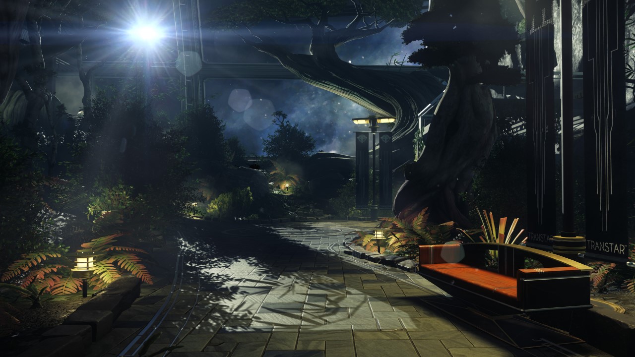
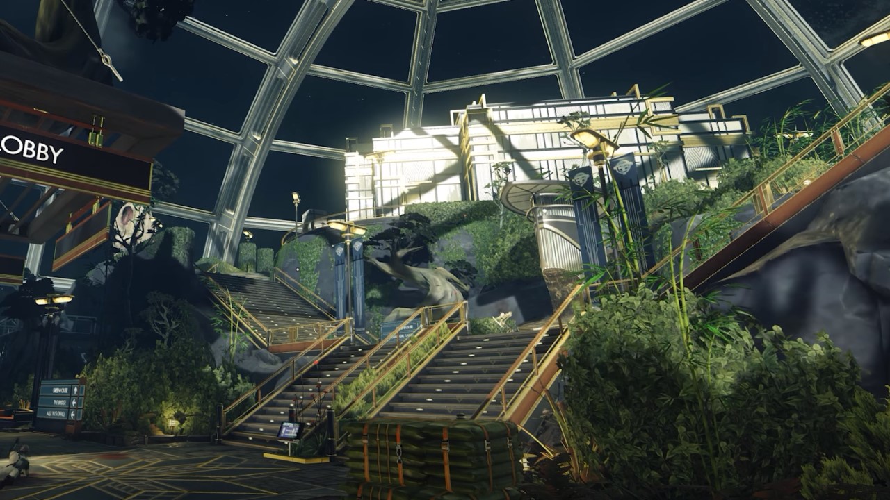
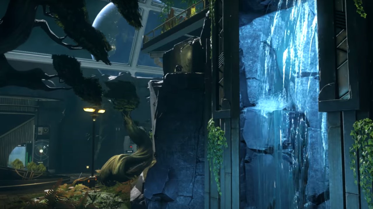
It's no accident that there's a shift in the narrative of Prey with the introduction of the Arboretum. An earthly hub, grounded and believable - yet curious - complete with a strong sense of place, that alters momentum. Located at the top of Talos I, the Arboretum is artificial yet natural, manicured yet organic, and displays the wonderfully powerful and intriguing contrasts and dualities that typify the design throughout Talos I. It is an enormous, landscape-based sigh of relief; plants as far as the eye can see are a welcome change from the dominant man-made materials prevalent elsewhere on the station. The dualities extend throughout the Arboretum literally, but also on a broader level. It is artificial yet natural in its design and features, consisting of organic and manmade, functional in its purpose to provide oxygen and opportunities for experimentation, but also relaxed in its plethora of recreational facilities.
Such contrasts in the conversation between exterior landscapes and interior design approaches work so well here because of the design, layout, and aesthetic of the shimmering 'Neo Deco' spaceship. This style feels and looks quite familiar throughout Morgan's journey and exploration. Indeed, because it has its roots in the real world: Arkane reimagined what Art Deco would have been like had it witnessed a resurgence in the 1960s, with its strong, primitive geometric forms (often streamlined and accentuated) being influenced by the approaches in modern American architecture of the mid-20th century - a movement where interior design very much informs the exterior.
Combining this with the organic forms, soft vegetation, and landscape character in the Arboretum heightens the duality between organic and artificial, alien and familiar, and the straightforward and the mysterious. This combination is intentional and creates the out of place yet luxurious atmosphere that's present throughout the station. This has precedence in real-world landscape design. For example, take organic-formed trees or water features ascending and descending a building's stairwells. Or perhaps in gardens where bold contrasts in planting style create a strange but successful tension. All such approaches lead to quirky changes of pace and aesthetics in design, raising an eyebrow as well as having a strong visual impact.
"There is plenty to see and enjoy in games where outside meets inside"
The botanical flavour of the Arboretum strikes an eerily familiar setting, but one that offers atmospherically-different locations for key plot points and events. This design approach has been described by Arkane itself in Prey's official art book: "For the mood, we aimed for an eerie ambiance. To achieve this we tried to emphasize contrasts: the Deco versus the organic, the luxury versus the utility, the sunlight filtered through the bizarre trees found all around. All of the contrasts play against each other for an unnerving and unique mood." The effectiveness of the Arboretum's exterior-meets-interior design is definitely strong in the aesthetic but it also transcends that. Using an earthy-feeling design, enhanced by elaborate contrasts and dualities, grounds a familiar-looking place in an alien environment, and maintains an eerie mood.
There is plenty to see and enjoy in games where outside meets inside; certainly more than meets the eye. These design approaches of mixing exterior landscapes with interior environments overlap with real-world approaches to blend the two, and to have a range of impacts in games.
From purely aesthetic to narrative-enhancing; from place-making, to contrast-enhancing, these are memorable spaces and levels that have distinct atmospheres, narrative impacts, and interesting spatial compositions. It does seem that developers, if the context is right, like to embrace merging the outside with the inside - as real-life designers do - and these nods surprise and delight us, but also highlight the very real human trait for bringing the outside in.
Rob is the Deputy Editor of sister site, TechRadar Gaming, and has been in the games and tech industry for years. Prior to a recent stint as Gaming Editor at WePC, Rob was the Commissioning Editor for Hardware at GamesRadar+, and was on the hardware team for more than four years, since its inception in late 2018. He is also a writer on games and has had work published over the last six years or so at the likes of Eurogamer, RPS, PCGN, and more. He is also a qualified landscape and garden designer, so does that in his spare time, while he is also an expert on the virtual landscapes and environments of games and loves to write about them too, including in an upcoming book on the topic!

