Civilization V offers its lovely world to be ravaged in our hands-on
Never before have colonization, expansion, and conquest been so inviting
We’ve learned details of Sid Meier’s Civilization V before, but this is the first time we’ve been able to sit down and actually play the game. And play we did, for three hours non-stop (we couldn’t resist taking turns even between bites of lunch). The Civ series embodies those games that takes time and compress it, causing hours to pass by in seemingly minutes like some experiment on the effects of relativity on space-time. Despite being turn-based, it feels fast paced, and never more so than with the fifth full installment in the series.

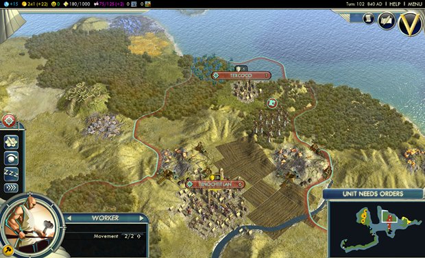
Civ IV did what any good sequel does – expand every aspect the audience loves, bringing a deeper, richer experience. Along with that, though, it also managed to fall into a trap that many sequels stumble upon – becoming bloated. You might not think of Civ IV as bloated, and we didn’t either – that is, until we played Civ V. See, Civ V has done wonders to sweep away the clutter. The interface is much cleaner, simpler, and easier to understand. Yet it doesn’t take anything away from the player. We didn’t miss any of the HUD elements that disappeared between Civ IV and V. We didn’t miss the extra layers of menus that didn’t need to be there.
Not only does the cleaner look of the game make it more of a pleasure to play for the experienced Civ strategist, but it also will potentially bring in new players who might have found all of the icons and windows intimidating. Still, don’t mistake any of this as a dumbing-down – the game has actually gotten more complex, more realistic, and exudes more personality.

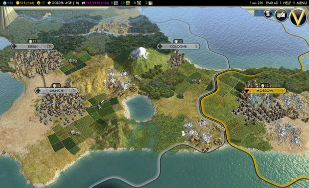
Above: The actual conflicts between historical nations is almost never realistic, but then that's part of the fun of the Civ series - pitting unusual leaders and cultures against each other
The map itself, with its new hex-based grid, is both more natural-looking and riper with opportunities for sculpting the shape of your empire and advancingits armies. One critical removal of a feature – and an absolutely positive change at that – is the lack of unit stacking. No more can a player pile up his army onto one super tile and become a steamroller. Not only was this mechanic unrealistic, but it actually made combat simplistic and less interesting. Now, with a combination of the hex grid andtiles being only able tohold oneunit at a time, the battles look like real wars, with far more tactics available.
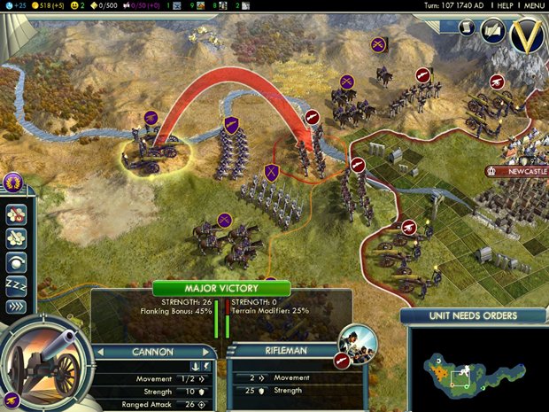
Add in ranged units that can lob projectiles over other friendly units and you have exciting, screen-spanning battle lines and shell-bombardments. In one battle we controlled, we spread our infantry across a snaking front line of hexes, with cannon units bringing up the rear. With the enemy cavalry cut off and half surrounded on a hill (which would ordinarily give him a huge advantage), we deployed our cannon safely separated from direct attack and proceeded to shell our enemy into crumpled, screaming death.

Above: Like this
Sign up to the GamesRadar+ Newsletter
Weekly digests, tales from the communities you love, and more


