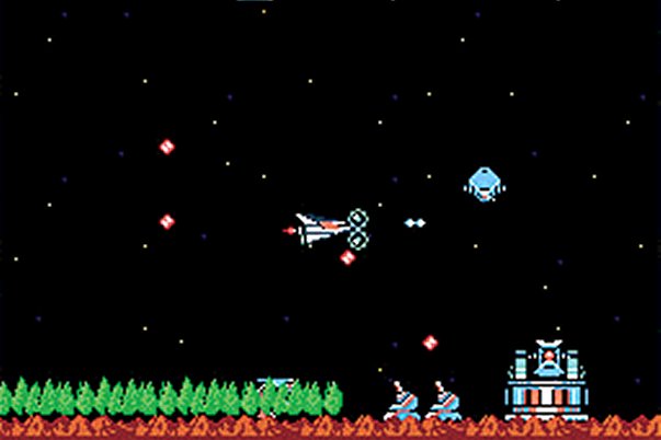
But primary colours weren't always such a taboo in games. In fact, for the longest time, they were the lifeblood of the medium. Back in the early '80s, for example, when a Donkey Kong arcade cabinet had less RAM than a packet of Ritz crackers, strong use of bright, bold colours was the only way you could accurately portray a scene, such as a monkey chucking barrels down a slanted construction site. Though the colour scheme was totally unrealistic (the ladders were sky blue, and the barrels a putrid orangey-yellow, Nintendo could not afford to make this a concern. With only eight colours to choose from, they couldn't mess around shading in DK's armpits seven shades of brown; the emphasis had to be on delivering crisp, logical feedback to the player.

And, of course, considering how many committee-designed "edgy" characters have tried and failed to take Mario's mustache as a mantle over the years, there's a certain irony to the fact that the former "Jumpman" was designed purely with technical desperation in mind. But far from creating a barrier between the player and the game world, the rudimentary graphics spiked the imagination. Although our avatar looked no more distinguished than a jumble of shapes, our minds were able to fill in the blanks.
Sign up to the GamesRadar+ Newsletter
Weekly digests, tales from the communities you love, and more


