A complete history of Castlevania box art
Castle + Dracula + Whip = Box Art
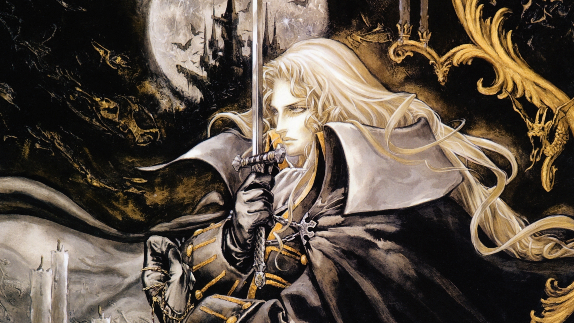
For more than 25 years, Castlevania has been the world's premier Dracula-focused digital media. And while the series changed hands from Japanese to European developers a few years ago, Castlevania's overall focus hasn't veered from Konami's original intent: whipping the living hell out of Halloween decorations come to life. Its a story written across dozens of game cases.
To date, more than 25 games have pitted their heroes against the dark forces of Dracula, and in that time, Castlevania's tone has changed from a slightly silly tour of Universal movie monsters to something a little more serious. With Castlevania: Lords of Shadow 2 about to rise from the crypt, there's never been a better time to tour the many, many variations of guys posing with whips in front of spooky backdrops. And its best to start at the beginning...
Castlevania | 1986
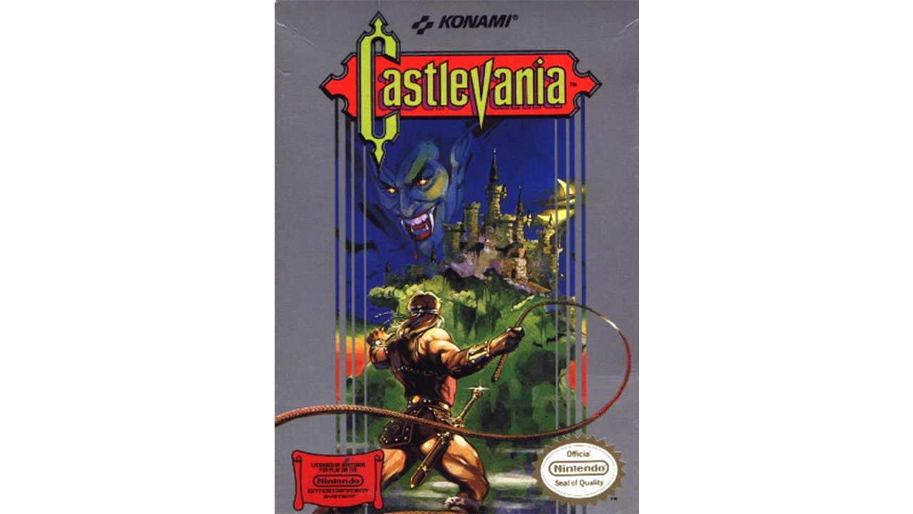
While it might look a little silly today, the Frank Frazetta-inspired box art from the first Castlevania eschews the standard cute and cuddly NES aesthetic for something a little more dramatic. The blood dripping from Draculas mouth is particularly edgy for NES cover art. Over time, the Belmonts would get a lot less beefy than this depiction of Simon, obviously inspired by the then-recent Conan the Barbarian movie starring a certain future (and now former) California governor.
Castlevania II: Simon's Quest | 1988
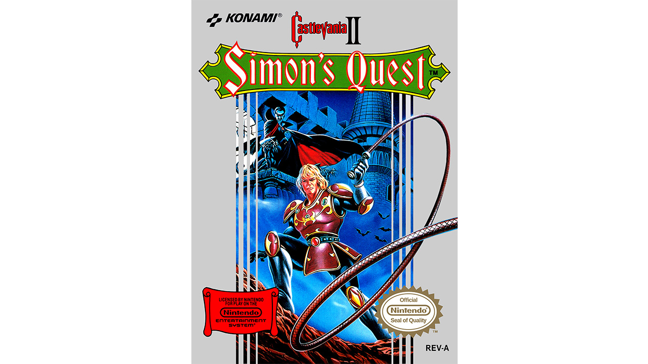
Konami's silver-bordered box art continues with the NES sequel, but not even visual branding can rein in the fury of Simon's whip. And it could be that vampire's curse at work, but Simon has definitely slimmed down for the sequel, which tasks him with the much darker quest of finding Dracula's various body parts. Thankfully, he wouldn't look so much like '70s heartthrob Leif Garrett in future depictions.
Castlevania III: Dracula's Curse | 1990
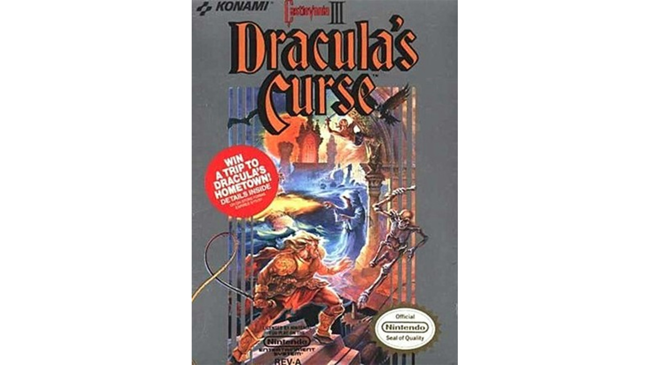
Simon Belmont's predecessor Trevor cuts a more Fabio-ish figure in the third--and finest--installment in the NES trilogy, though it should be noted that floating, red orbs branded with sweepstakes information arent featured too heavily into the actual game. But all of Trevor's Castlevania III companions make an appearance on the box, even if it's hard to tell if Alucard is the bat in the upper-left corner or the guy peeking out from behind the chance to win a trip to Transylvania.
Super Castlevania IV | 1991
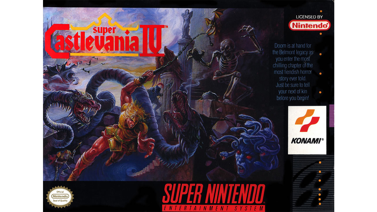
Before reboots became a standard tradition for any series getting long in the tooth, Super Castlevania IV promised to be a bigger and bolder take on the original, which may explain why the monster-to-hero ratio is so unfairly balanced against Simon. Due to the limits of 2D artwork, notably absent is the player's greatest foe: motion sickness from the levels with the spinning, Mode 7-powered rooms. With any console war, the queasy are always the first casualties.
Dracula X: Rondo of Blood/Castlevania: The Dracula X Chronicles | 1993/2007
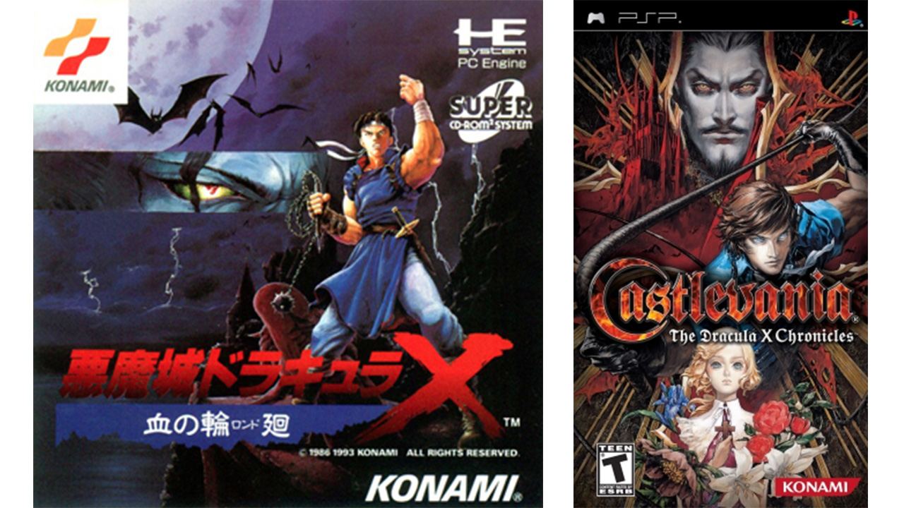
With his jet-black hair and white headband flapping dramatically in the breeze, Richter Belmont looks a lot more like your traditional Japanese hero than the Conan-inspired Belmonts of the past. But when it came time to bring this obscure PC Engine title to a much wider audience via the PSP (discounting the compromised SNES version which shared the same cover art), artist Ayami Kojima stepped in and gave Rondo of Blood's characters a look more in line with Symphony of the Night and later games.
Sign up to the GamesRadar+ Newsletter
Weekly digests, tales from the communities you love, and more
Castlevania: The Adventure/Castlevania II: Belmont's Revenge | 1989/1991
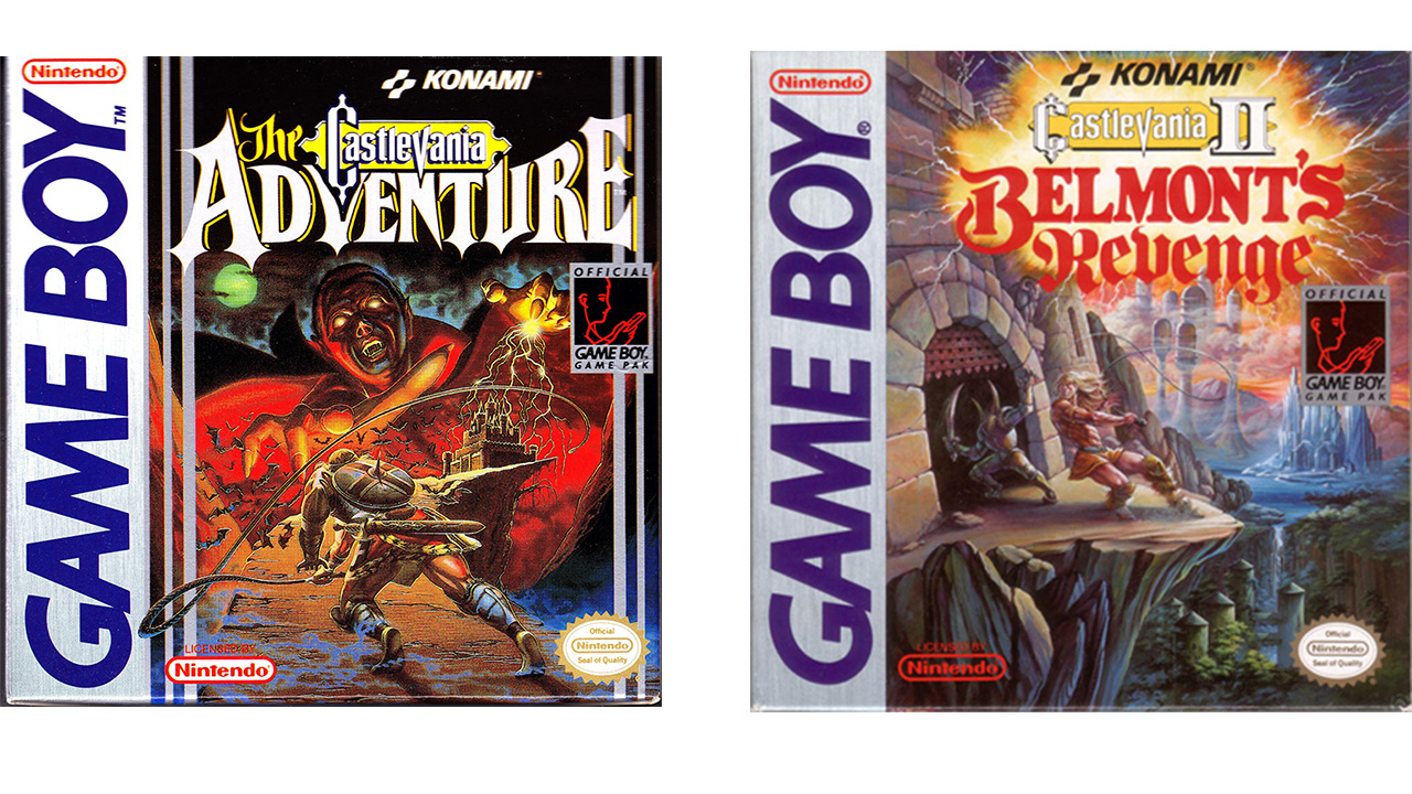
It didn't take long for Castlevania to wind up on Nintendo's insanely popular Game Boy handheld, and the packaging of Castlevania: The Adventure promises an outing just as spooky as its console betters with its depiction of Dracula pointing at prospective players like some kind of Satanic Uncle Sam. The art for Belmont's Revenge lacks the grandeur of The Adventure, though, mostly because Christopher Belmont looks like hes stumbling out the wrong door, only to have some helpful knight behind him shout, "Hey, man! Party's in here!"
Castlevania Legends | 1998
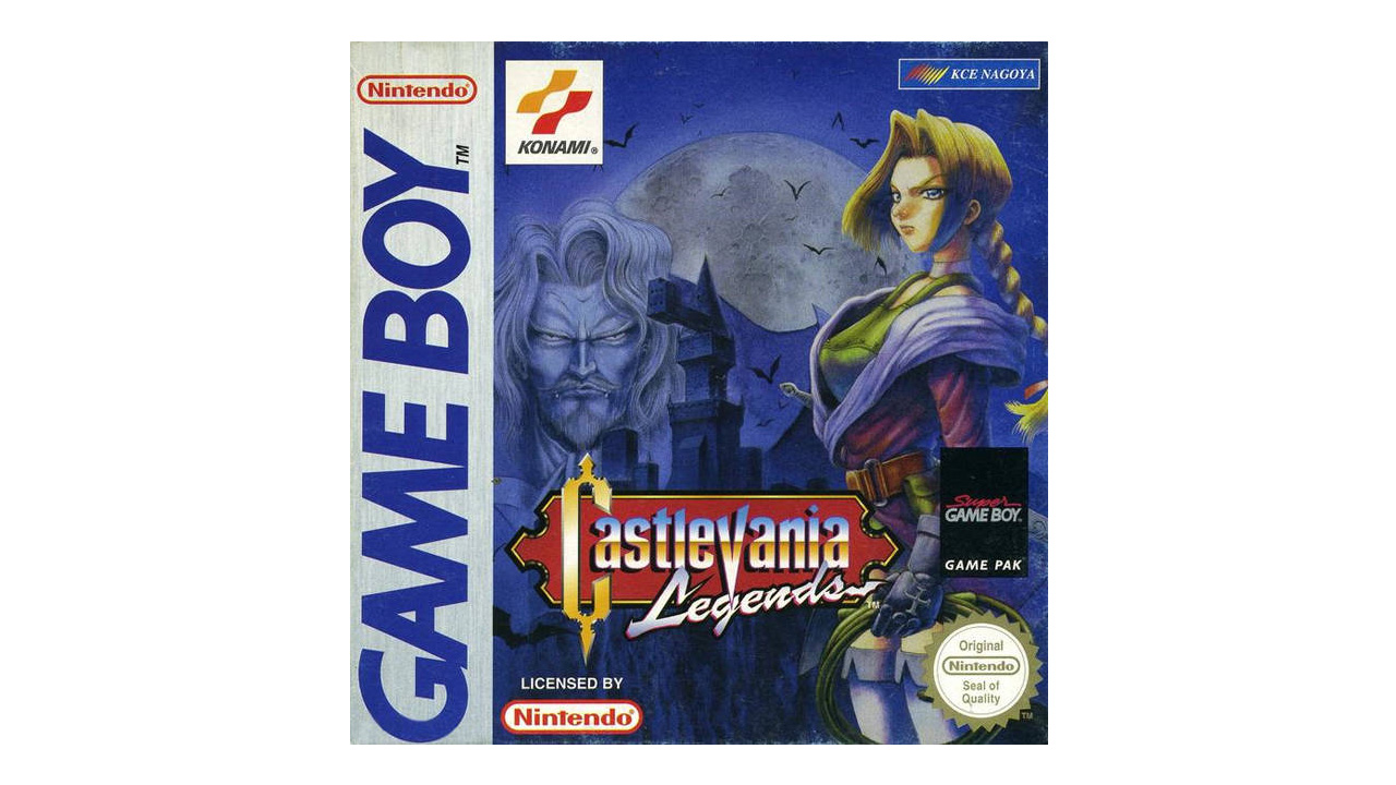
Yes, that's another Castlevania Game Boy game. From 1998--a year after Symphony of the Night! Despite the Super Game Boy features it boasts, former Castlevania series boss Koji Igarashi disowned Legends for its lack of respect for continuity. But, even disregarding that, the bland anime designs on the cover turns the bombast of your typical Castlevania cover art into something closer to Yu-Gi-Oh. This fate would befall Castlevania a second time, though not until much later.
Castlevania: Bloodlines | 1994
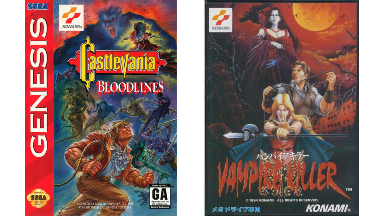
With his ruffled pirate shirt and sensible slacks, Bloodlines protagonist John Morris doesn't really look like he's cut out for a Castlevania game. And while Dracula generally looms menacingly in the background of most Castlevania cover art, here, he's reduced to an ill-defined smear of colored pencils. The Japanese artwork might not be as well-composed as you'd expect from the series, but its blood-red sky and generally more ominous nature is a huge improvement from the American version's pastel hues.
Castlevania: Symphony of the Night | 1997
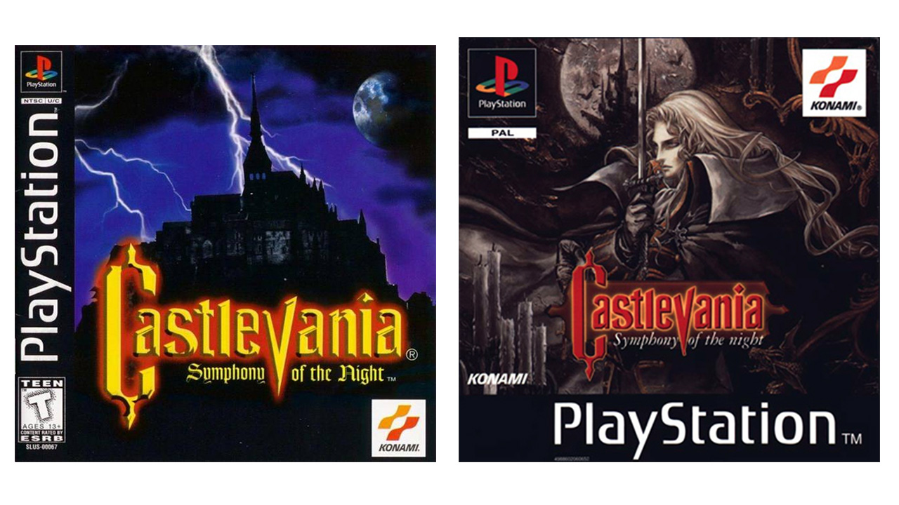
Castlevania's popularity initially peaked in the early '90s, so Konami's US branch played it awfully safe with their release of Symphony of the Night. "Castlevania? Put a castle on there! Practically sells itself." Needless to say, gamers were robbed of seeing Ayami Kojima's amazing depiction of Dracula, though in those oh-so-edgy late '90s, its easy to see why Konami went with an alternate design. Had they kept the cover art as-is, they'd no doubt have a lot of unenlightened consumers asking "Who's that lady with the sword?"
