A complete history of Castlevania box art
Castlevania 64/Castlevania: Legacy of Darkness | 1998/1999
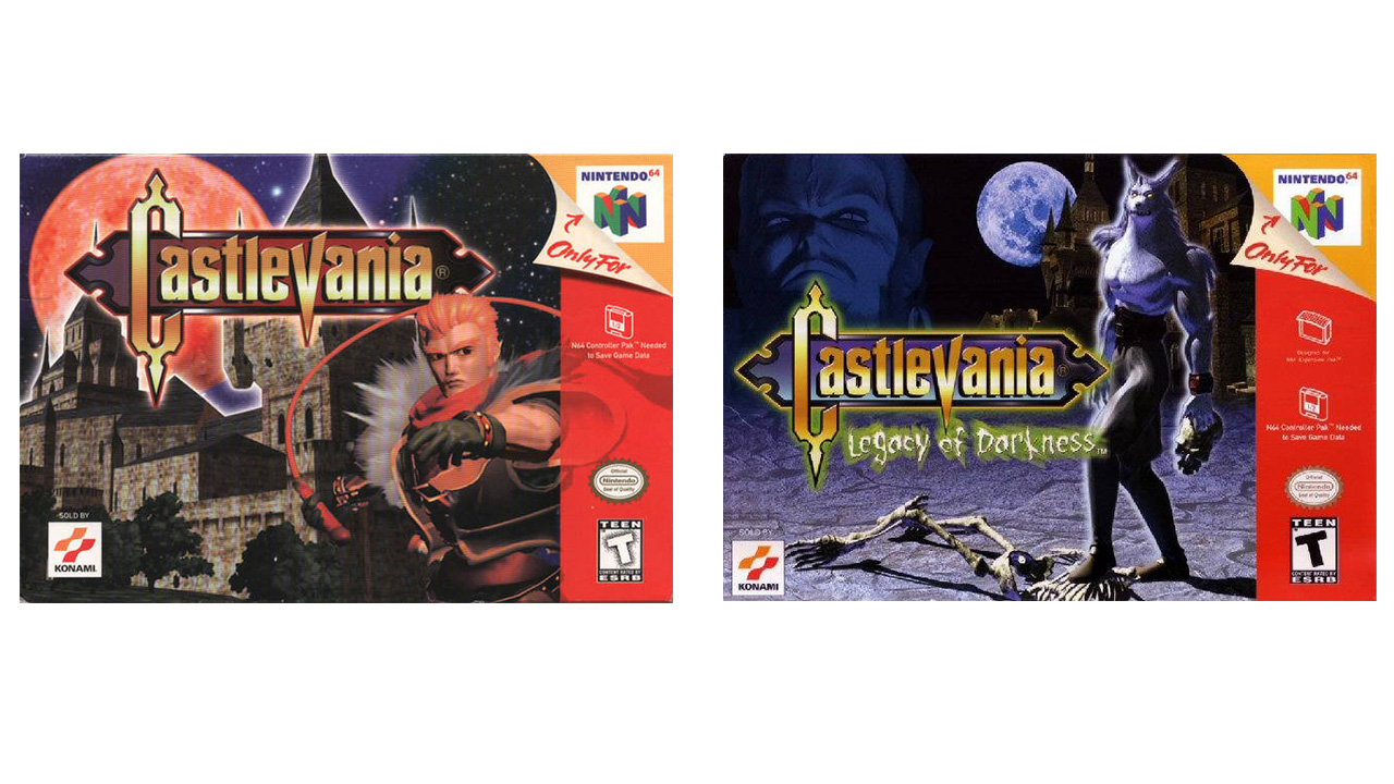
At one unfortunate point in history, 2D gaming was thought to be a thing of the past. So even though it looked objectively worse than the glorious hand-drawn stuff that came before it, we had to suffer through roughly a decade of crudely rendered 3D character art so consumers could be reassured that, yes, they were buying one of those newfangled, polygonal games. Poor Reinhardt Schneider on the left seems to be disgusted by his own existence, and wolfy and his skeleton friend on the right look like they barely escaped from Killer Instinct.
Castlevania: Circle of the Moon/Harmony of Dissonance | 2001/2002
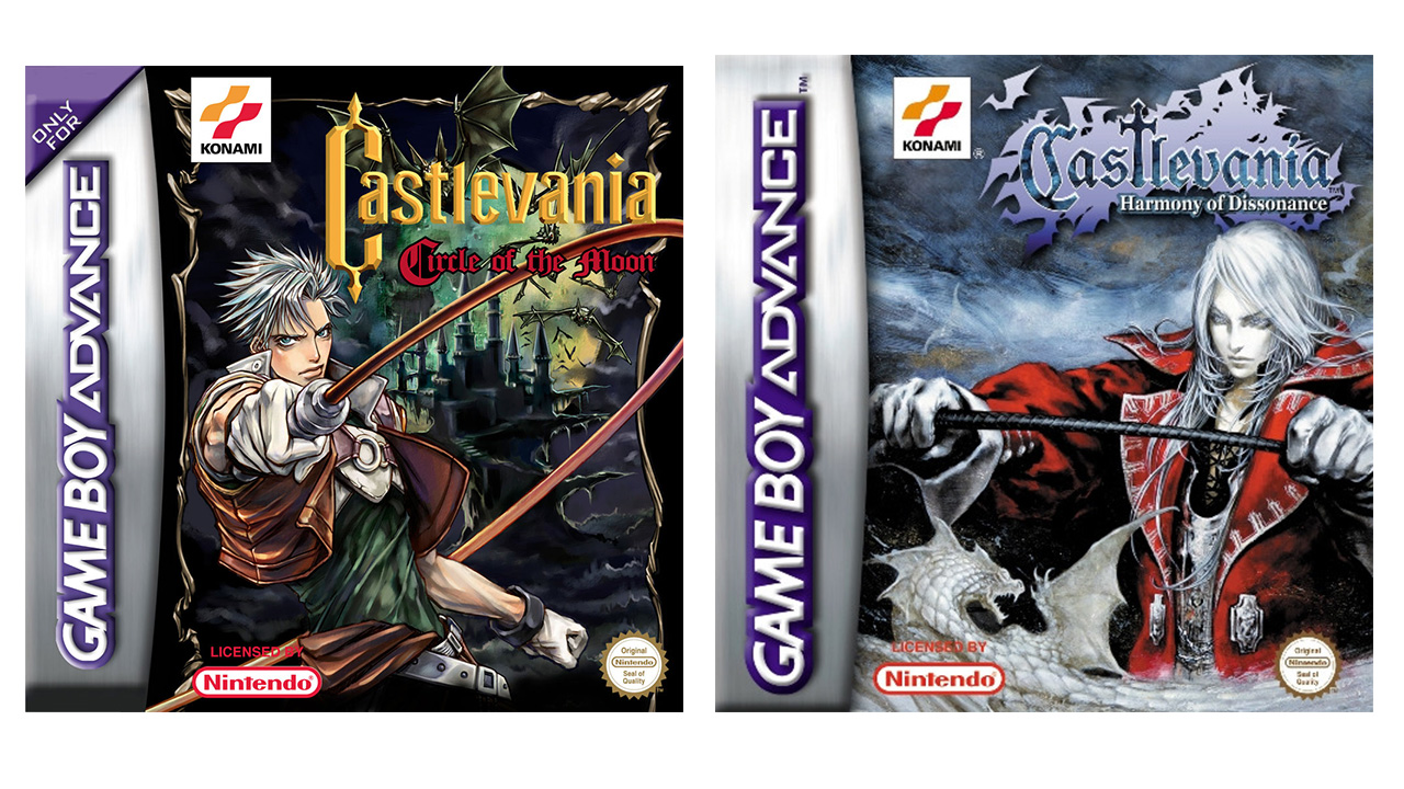
With the first two Castlevania Game Boy Advance games, the cover art's prevailing theme seems to be "look at my whip." Circle of the Moon's Nathan Graves seems to be showing off his weapon's flexibility, while Harmony of Dissonance's Juste Belmont is clearly expressing that just because he looks undead, it doesn't mean his whip hand isn't fierce.
Castlevania: Aria of Sorrow/Dawn of Sorrow | 2003/2005
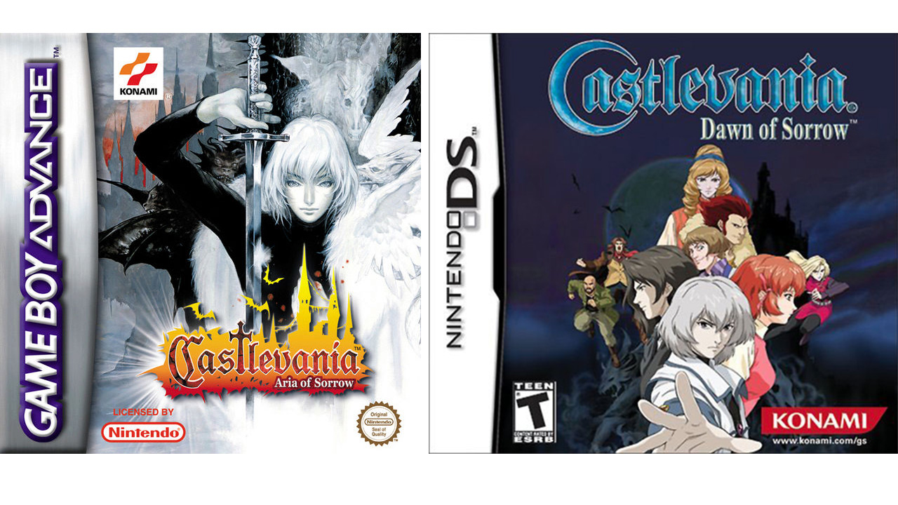
For a brief period of time, Konami didn't shy away from putting Ayami Kojima's atypical (for America, anyway) depictions of Castlevania protagonists on the games' US box art. Dawn of Sorrow disrupted this short trend by exchanging her unique, ethereal designs for something more akin to a cheap-o Saturday morning anime.
Castlevania: Portrait of Ruin/Order of Ecclesia | 2006/2008
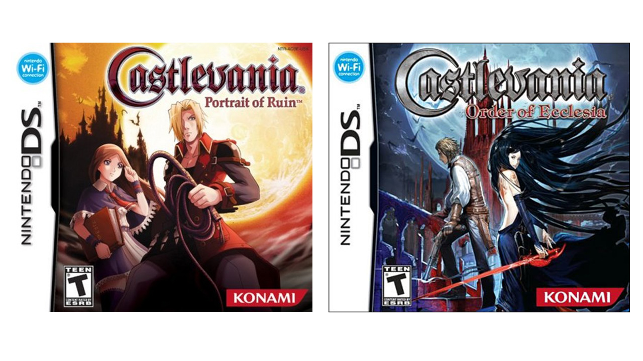
The kid-friendly designs return once again for Portrait of Ruin, though they've been given a bit more definition this time around thanks to the moon (apparently) exploding behind them. But for its last hurrah on the DS, Castlevania once again returns to a much more familiar style, though it's a bit more marketable than Ayami Kojima's work.
Castlevania: Lament of Innocence/Curse of Darkness | 2003/2005
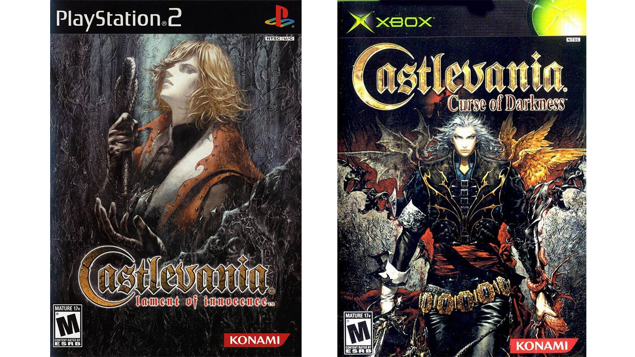
Castlevanias PS2/Xbox adventures arent as strong as the portable entries of the same era, but the cover art for these two games at least tried to live up to one Castlevania standard: evocative Ayami Kojima depictions of the main character. Lament of Innocence's Leon Belmont strikes a more pained and brooding pose, while Curse of Darkness' Hector goes for something a little more proactive--wouldnt you do the same in those tight, leather pants?
Castlevania: Lords of Shadow | 2010
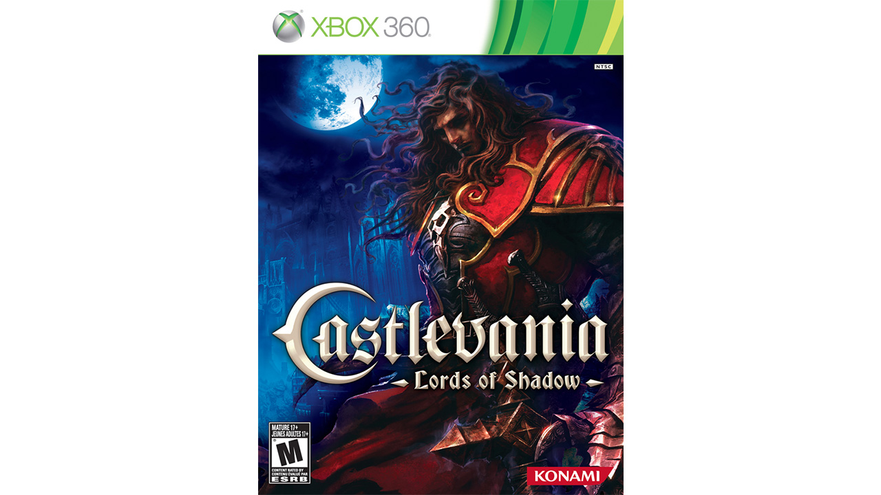
Lords of Shadow might have tried to distance itself from Castlevania games of the past, but its cover art would be right at home with the many prior installments. Whoever tried to ape Ayami did a pretty good job, even if Gabriel Belmont seems a little too beefy after more than a decade of whisper-thin protagonists.
Castlevania: Lords of Shadow - Mirror of Fate | 2013
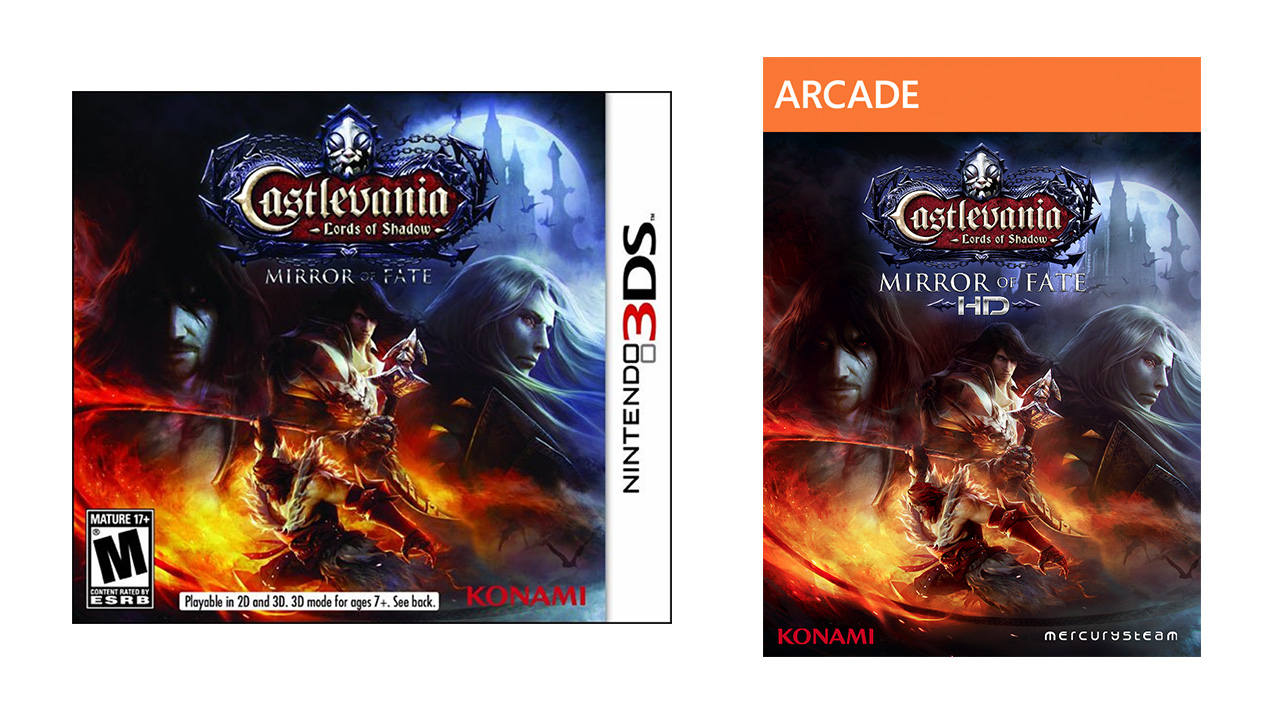
The titular castle stands out a bit more on Mirror of Fate's box art, proving, ultimately, Castlevania is a game about castles. Unfortunately, Alucard doesn't look nearly as fancy as he did on the cover of Symphony of the Night, which clearly indicates MercurySteam doesn't fully understand his character.
Sign up to the GamesRadar+ Newsletter
Weekly digests, tales from the communities you love, and more
Castlevania: Lords of Shadow 2 | 2014
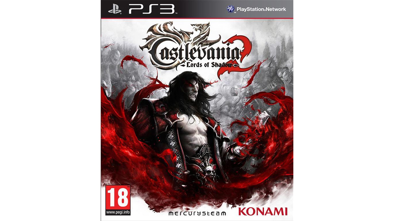
Even though his depiction has suffered from constant Bela Lugosi impressions and number-fixated muppets, with Lords of Shadow 2, MercurySteam is trying to restore Dracula's reputation as a stone-cold badass--even if he was more of an old creep in the original novel. The art here seems to be going for a mix of Eastern and Western sensibilities; Drac's shiftlessness may say "I'm brazenly sexy," but that WWE-style belt wrapped around his waist shows he's still capable of summoning crotch-level torrents of blood at a moment's notice.
Whipped into shape
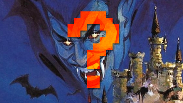
Like an immortal vampire, Castelvania has changed with the times but still kept its core qualities intact. Will future entries keep the same whips and fangs motif, or could they change to fit the next hot new trends in box art? Share your thoughts (and your personal favorite covers) in the comments below!
And if you're looking for more Vania, check out Castlevania: Lords of Shadow 2 review and Castlevania graphics then and now.
