A complete history of Yoshi box art
Saddle Up!
While Yoshi as we know him first arrived with the 1990 Japanese release of Super Mario World, Nintendo visionary Shigeru Miyamoto wanted Mario to have a dinosaur buddy back when the original Super Mario Bros. shipped in 1985. 8-bit tech didn't have the chops to render this concept convincingly, so, five years later, Mario's 16-bit debut finally saw Yoshi brought to life. And the persistent green dino has been ubiquitous ever since.
It's been nearly 25 years since he first hit the scene, and while Yoshi has had his share of flops, he remains a star worthy of his own franchise (on top of still appearing in most proper Mario games). Yoshi's New Island for 3DS brings the character back to his platforming roots, so it's the perfect time to look back on the lengthy--often experimental--history of the long-tongued beast. And what better way to judge his years as a star than by examining his box art?
Super Mario World | 1991
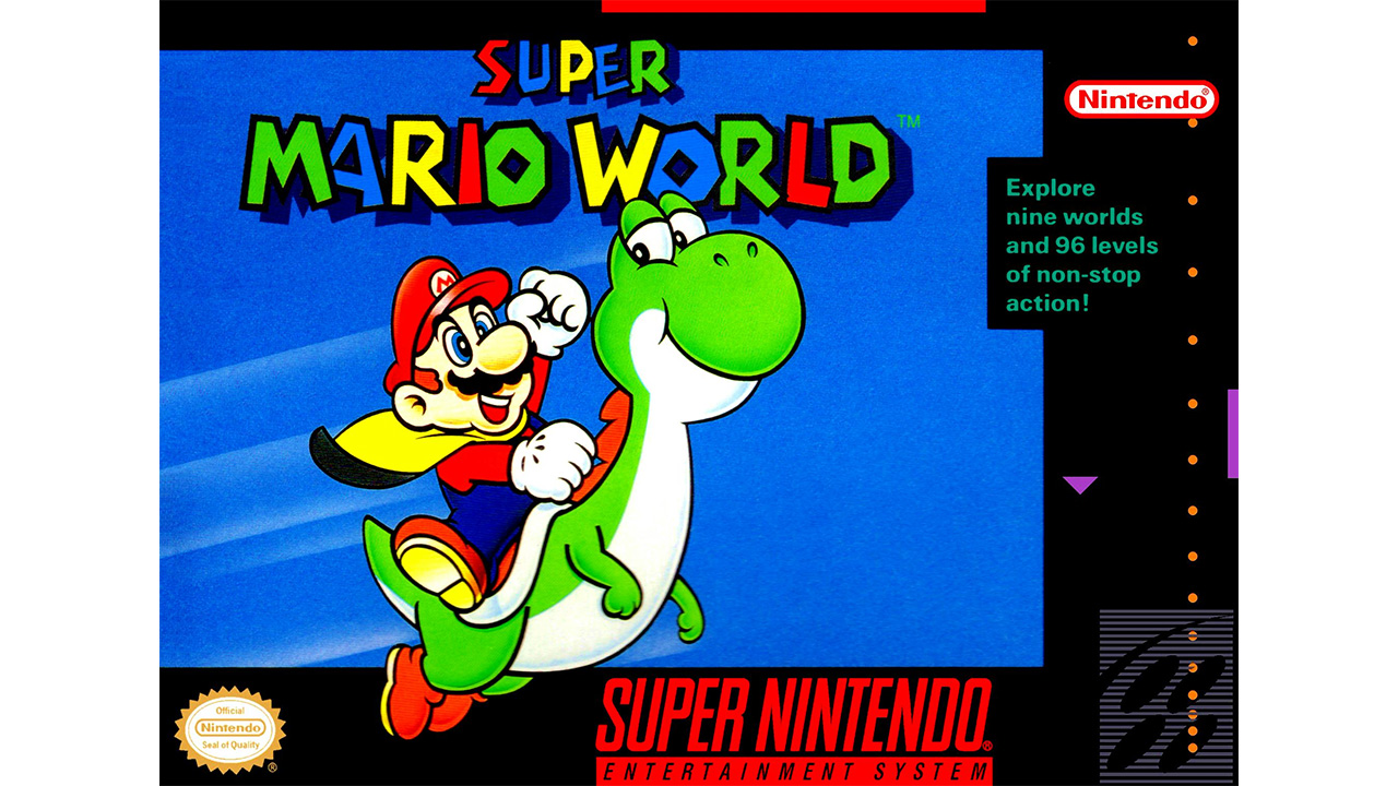
Yes, Super Mario World's box art isn't very exciting--it didn't have to be. Because most people got their hands on the game due to its status as a system pack-in (remember those?), Nintendo could have stuck a poorly-xeroxed iguana underneath the title and called it a day. But, like Super Mario Bros. 3 box art--which featured Raccoon Mario taking flight against a bright yellow background--Super Mario World's does an excellent job of showcasing the game's two major editions: the cape, and, of course, Yoshi. The dinos knowing, consumer-directed look seems to indicate "Even I know this game is awesome." On a minor note, you should appreciate Yoshi's tiny dino-arms; he won't have those for too much longer.
Yoshi | 1991
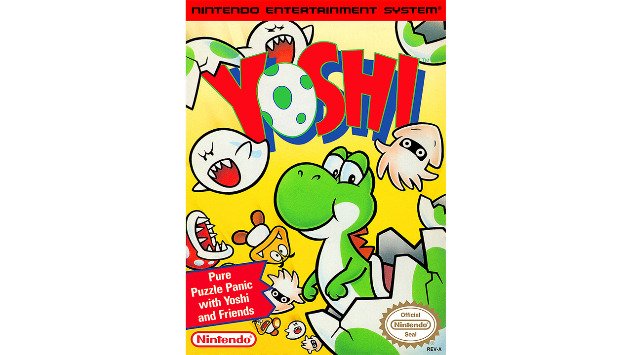
The Tetris-mania of the late '80s hadn't faded quite yet, and Nintendo couldn't stop thinking of ways to capitalize on the deceptively simple puzzle game which sold millions upon millions of Game Boys. First came Dr. Mario, which begat Yoshi, a title developed by Game Freak in their pre-Pokemon days. As evidenced by his sleepy-eyed look on the cover, Yoshi doesn't really do all that much in his self-titled game. Mario is the one thats tasked with sandwiching enemies between the top and bottom halves of a spotted eggshell. Oddly enough, the game (originally called Yoshi's Egg for the Japanese release) was rebranded Mario & Yoshi for its European launch. Perhaps the dinosaur wasnt as popular in the EU back then.
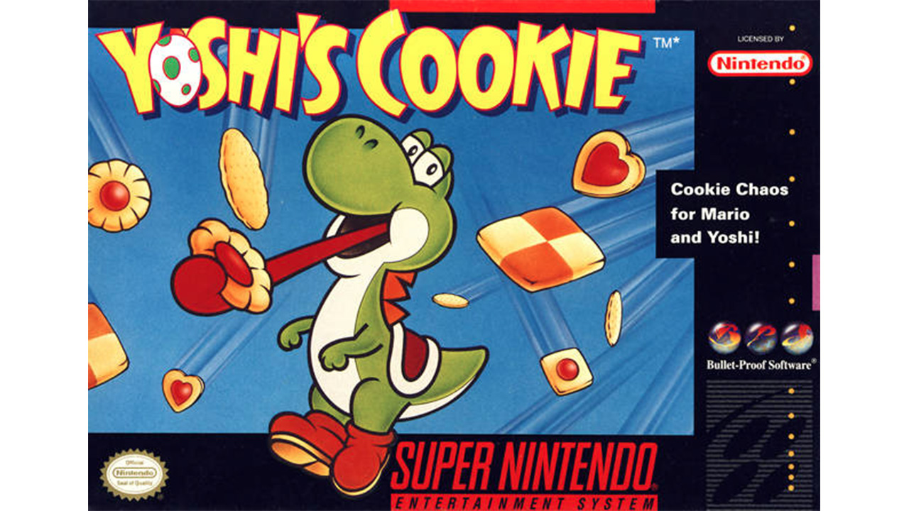
Yoshi's Cookie | 1992
Nintendo couldn't stick the landing with Yoshi, so the following year brought us Yoshi's Cookie--developed by the folks who gave us the Game Boy's version of Tetris. With that kind of pedigree, it's no surprise that Yoshi's Cookie is a damn good puzzle game, even if the box art doesn't quite communicate this information. If anything, Nintendo tried to copy what they did with Super Mario World's box art, which probably stood as a wise decision with that game only being released one year prior to Yoshi's Cookie in the United States. Some people might have been disappointed that the title didn't feature colorful cookies being flung at a hungry Yoshi from all angles, but most walked away from Yoshi's Cookie happy to see a puzzle game that didn't rely entirely on carefully dropping various objects into a large rectangle.
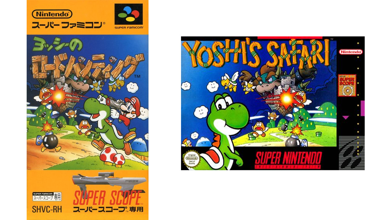
Yoshi's Safari | 1993
Nintendo needed some star power to sell its light gun add-on, the Super Scope, and a rail-based shooter starring Yoshi must have seemed like a good idea at the time. But if the plan was to sell it as a Mario game, the plumber is notably missing from the cover. Given the games almost constant first person view of Yoshis head, it makes some sense, but apparently that fireball hitting Bowser shot out of the side of Yoshi's head. Looking back now, there may have been a bigger conspiracy at play. The Japanese box art depicts Mario blasting enemies out of the sky with a Super Scope, which might have been a bit too violent for a company still trying to hold onto its squeaky-clean image in the wake of the Mortal Kombat controversy.
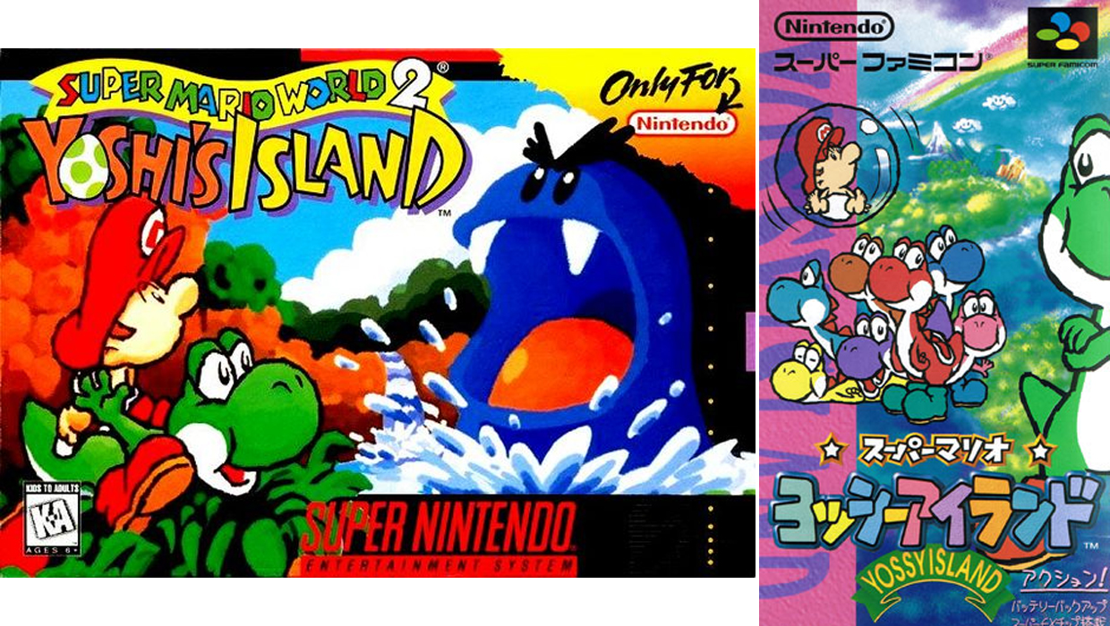
Super Mario World 2: Yoshi's Island | 1995
Yoshi's Island received the "Super Mario World 2" subtitle outside of Japan, though the game breaks away from its predecessor a bit, but Yoshis Island almost as incredible. One of the most impressive elements of Yoshi's Island can be found in its bold, expressive art style, which the box art didn't even try to disguise, even though pre-rendered graphics were the new hotness. The Japanese box played that up even more, and included an avante garde half-profile of the protagonist. Yoshi takes a more autonomous role in his first solo platformer, so his body got redesigned for the sake of versatility. Gone are Yoshi's stubby dino-claws; with his means of attack changing to chucking eggs at enemies, he's been given human-style arms and hands. He'd still retain his signature, synthesized VEEP-VOOMP noise, though, but that wouldn't last long...
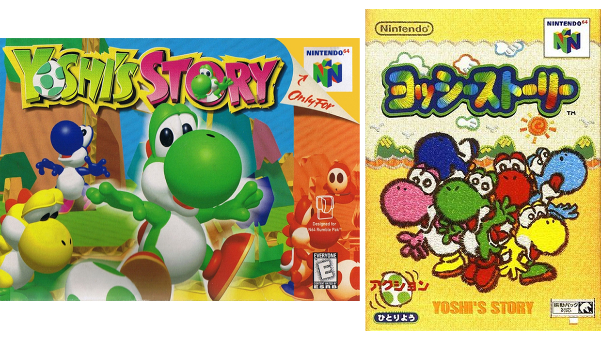
Yoshi's Story | 1998
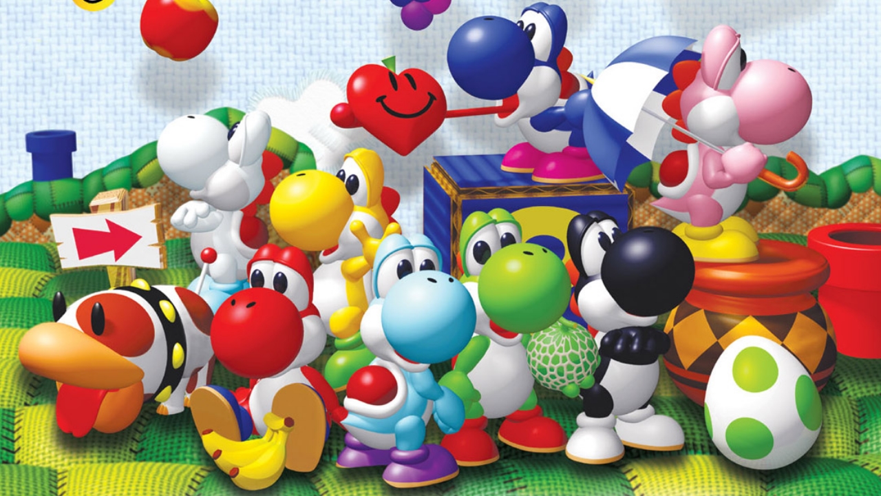
Nintendo chose to keep Yoshi's Island 2D and pixelated, but the follow-up embraces the once flashy fad of pre-rendered graphics. To be fair, Yoshi's Story went for a handmade style that Kirby's Epic Yarn would later use, but the N64's weak 2D capabilities turned these good intentions into an ugly reality. The round, soft, colorful, and slightly creepy box art (what the heck is going on with Blue Yoshi in the back?) indicates the child friendliness of Yoshi's Story, which stands in sharp contrast to the hardcore platforming of his previous game. The Japanese box art is a bit different than that, with a flat, arts and crafts style that detailed what the graphics perhaps should have looked like. At least both boxes were quiet, a big difference from Yoshi in-game, where the dino annoyingly babbles in his new baby voice throughout.
Yoshi Topsy-Turvy | 2005
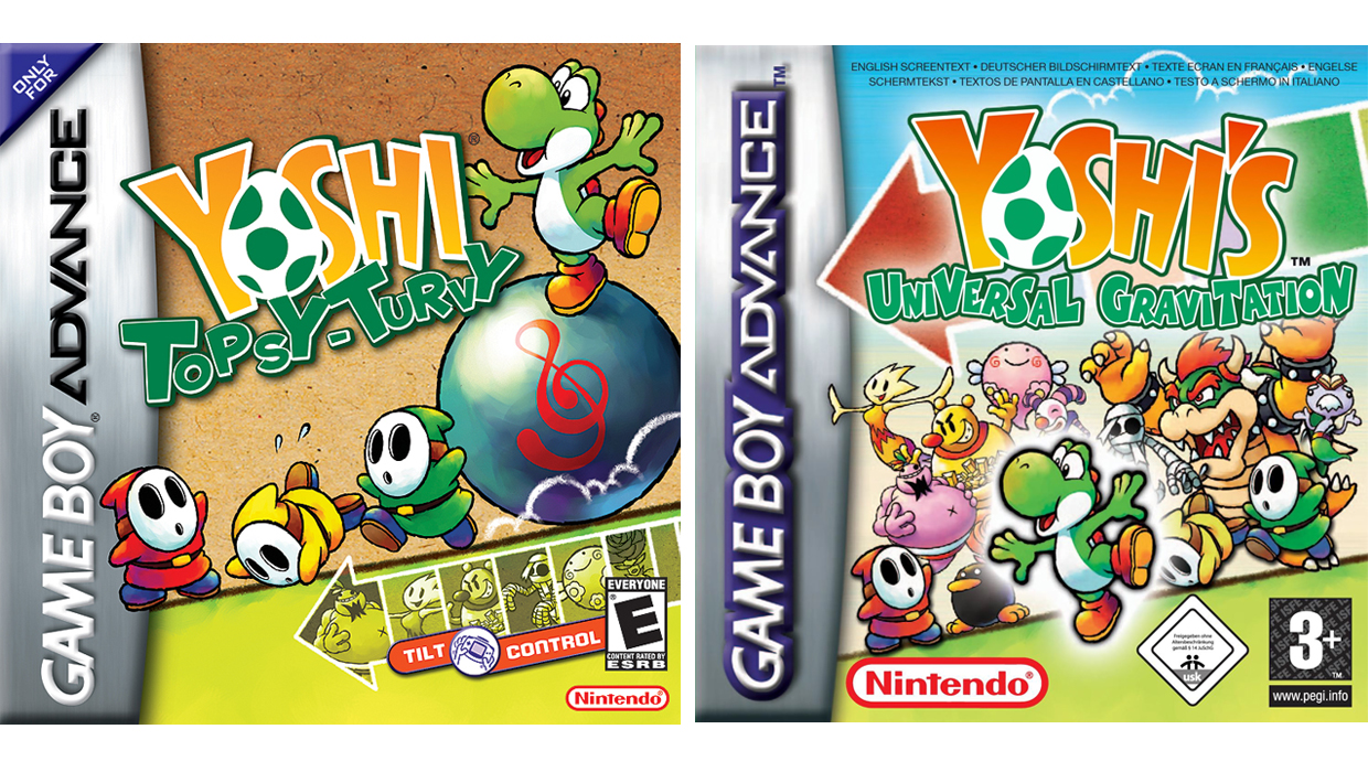
Yoshi didnt headline his own game again for seven years following Yoshi's Story's lukewarm reception, eventually re-emerging as a weird experiment that uses the same tech as WarioWare: Twisted. Topsy-Turvy combines awkward platforming, garish graphics, and obnoxious tilt-controls, which made Yoshis return to the limelight much less exciting than it shouldve been. The box art isn't shy about promoting Topsy-Turvy's main gimmick, even if most of us had upgraded to the harder-to-tilt Game Boy Advance SP by 2005. In an odd move, the EU and Australian editions went by Yoshis Universal Gravitation and focused more on Yoshis array of enemies than the ball-rolling thats central to gameplay.
Yoshi Touch & Go | 2005
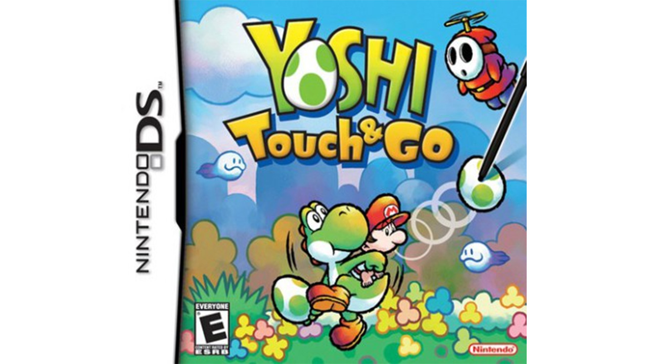
"Touch & Go" might be a clever way to indicate the touchscreen-focused action of this game, but it also gave reviewers at the time a perfect phrase to describe this early DS title's quality. As with Topsy-Turvy, the gimmick is highly visible on the box art: here, a phantom stylus creeps in from the side, indicating that this was one of those fancy touchin' games--that may sound like a pretty average gimmick, but the iPhone wouldn't be out for a couple more years. Eerily enough, Touch & Go feels like a shallow mobile game you'd drop 99 cents on and delete after a few days, so if Nintendo ever decides to head down that path, it already has the perfect game to port.
Yoshi's Island DS | 2006
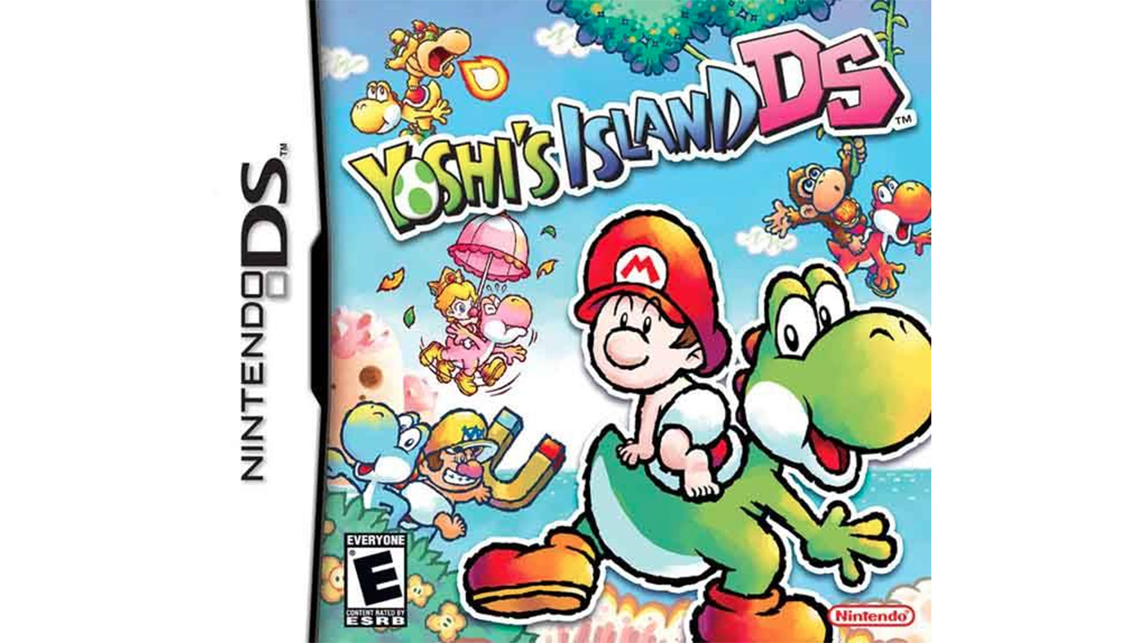
The box art for Yoshi's Island DS really goes out of its way to show off how it's different from the original--you probably couldn't squeeze another baby (and their specific ability) into that image if you tried. Sadly, this effort to give Yoshi's Island a proper sequel turned into what usually happens when you try to cram more babies into places they don't belong: pure chaos. A bit hyperbolic, maybe, but asking a developer like Artoon, a team previously responsible for the Xbox's would-be mascot Blinx, to make a sequel to the iconic SNES original is a tall order. The game also came at a time when Nintendo was a bit baby crazy with this, Mario & Luigi: Partners in Time, and Mario Kart: Double Dash!! all hitting stores in rapid succession. Thankfully, its biological clock eventually stopped ticking so loudly.
Super Mario Galaxy 2 | 2010
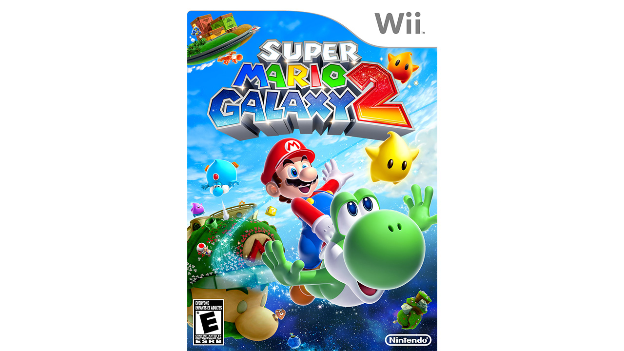
With the shame of three sub-par games bearing his name, Yoshi once again went into hiding from the box art of everything but Mario spin-offs. That sabbatical ended with Super Mario Galaxy 2 in 2010 with Nintendo's famous green dinosaur front-and-center on the cover. Its as if the company is making the statement "Yoshi's back! And maybe he won't suck this time!" Seeing as Yoshi barely made a cameo in the previous Galaxy, it's clear that Nintendo was getting a little gun-shy about Yoshi saturation. These days, he's even missing from recent games like Super Mario 3D World, which shows that his owners are getting more conservative in their use of the green guy.
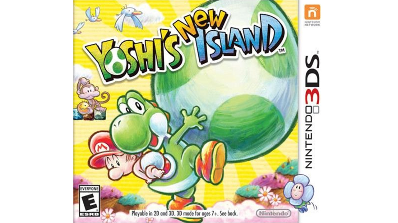
Yoshi's New Island | 2014
Just as the box art for the original Yoshi's Island depicts one of his gargantuan enemies, the latest follow-up also focuses on a similarly oversized element: his new mega-eggs, which serve as the one of the more noteworthy additions. Even though nearly two decades have passed, its hard not to get a little excited at the promise of Yoshi escorting Baby Mario through another game. All in all, this is an inoffensive piece of box art, discounting the deceptive placement of "New." It makes you question if it's supposed to go before "Yoshi's" or "Island"--a problem made doubly confusing given how similar it looks to past entries, making you wonder just how New it can be.
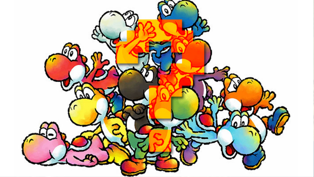
Is that a saddle or a shell?
Surprised to see just how many games Yoshi has starred in? Do you miss his more prehistoric look from his earliest releases? Have a favorite Yoshi color? Tell us all about it in the comments!
And if you're looking for more box art, check out a complete history of Pokemon box art and a complete history of Castlevania box art.

 Join The Community


