Dance Central 3: Parties, Menus, and Time Travel
The low-down on Kinect's ultimate dancing franchise
Matt Boch, Project Lead on Dance Central 3, talks to GamesRadar about the challenges Harmonix faced throughout the entire series, and how that learning contributed to their creation of the forthcoming booty-shaker.
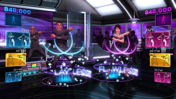
You guys created the Kinect-based dancing experience with Dance Central 1, and refined it further with Dance Central 2. What needed to be improved for Dance Central 3?
With Dance Central 1, we wanted to create the ultimate full-body dancing experience, and there were huge amounts of foundation laying we had to do to make that possible. With Dance Central 2, our big focus was on multiplayer and creating new experiences you could share with friends via our Dance Battle mode. We went about making DLC for Dance Central 2, and the thing that was always next... we really saw two opportunities to do big things with Dance Central 3.
One was the creation of a full-fledged story mode. We had done a lightweight story mode with Dance Central 2, but we really wanted to jump in and go whole hog on a full on campaign experience in a Kinect game, which we really hadn’t seen someone do, and we wanted to wrap that into dance culture and dance history. We also started going after huge dance crazes from the past; things like the Hustle, the Electric Slide, and more contemporary things like "Teach Me How to Boogie". We thought it’d be a great way to incorporate our intentions for a story mode and to teach people real famous choreography by creating a time travel story mode - we can get a bit more into that later.
The other thing we tried to go after was party accessibility. We saw a lot of people playing Dance Central 1 and 2 at parties in a multiplayer context, but a lot of our menu systems - and even just the general difficulty of the game - wasn’t always the perfect thing for the complete newcomer to Kinect or Dance Central. The menu system still reviewed very positively - it’s always an odd thing having your menu system reviewed - but there was still something of a learning curve. So with Dance Central 3 we created two new party modes: Party Time and Crew Throwdown. In Party Time, we have very simplified gesture navigation: you swipe with your right arm to select a song, swipe with your left to change modes, and high-five to start playing. Similarly, in the Crew Challenge mode, which is more of a Mario Party kind of mode, two teams of one to four players go up against each other and try to find who is the best crew. In that experience we’ve also simplified things through automatic song selection and simplified gestures.
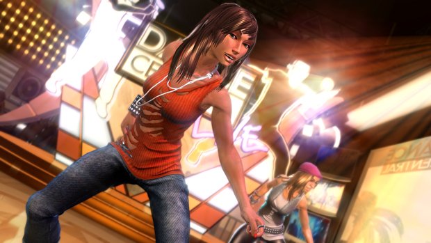
In addition to those party modes, we’ve introduced three new ways to play, and across the entire experience we’ve introduced a new difficulty called Beginner. In party mode, you’re going to have a special function - if you’re playing on Easy, the game can drop you down dynamically to Beginner if the choreography is a bit more difficult and you’re not doing so well. We always make sure you’re having a great time doing moves that are suited to your skill level and familiarity with the game. That Beginner difficulty fixes a long-standing problem we’ve had in the Dance Central games: everyone points people to the first couple of songs when they’re going to play for the first time. We wanted to allow every single song in the entire back catalogue to be fully playable by anyone at a party, so we created the Beginner difficulty to meet that aim.
On top of that, we have three new ways to play: one is called Make Your Move, which brings a more creative angle into the gameplay experience; something that we felt was missing from the previous Dance Central games. We’re actually doing dynamic flashcard generation, dynamic detection, creation - you basically go back and forth and you’re creating moves with your friend, like a game of the basketball game HORSE. You do a move, your friend has to copy it, they do a move, you have to copy it, and we sequence all of that into a little routine that you’ve made. It’s a blast - it brings the creativity and fun of dance to a very different level. We also have a new mode called Keep the Beat, where we’ve developed a brand new type of detection that can tell whether your moves are in time with the music. It’ll reward you for dancing in time, and you have to switch moves pretty often because if you get a string of moves to the beat, you’ll enter a state where it can be stolen from - if the other player copies what you’re doing, they’ll get a whole bunch of points. It’s a more freestyle experience, it encourages the type of dancing people do out at clubs in the real world, and that’s a type of dancing we hadn’t really gone into in the world of Dance Central, and it’s another type of accessible experience where you’re determining the difficulty of the moves you’re doing. And then we have another mode called Strike a Pose, where you’re in a frenetic battle with your friends to capture as many poses as you possibly can before the time runs out.
Sign up to the GamesRadar+ Newsletter
Weekly digests, tales from the communities you love, and more
We wanted to allow every single song in the entire back catalogue to be fully playable by anyone at a party
So with all the modes and the wrappers around them, we’ve really created a much more accessible, much more party-friendly Dance Central experience. In addition, we’ve also been able to take advantage of the Xbox SmartGlass app to make it even better. In Party Time, you can be changing the difficulty of your party, turning on and off modes, creating a playlist, restricting the party to particular playlists - you can be controlling the party without interrupting the action. I can see my friend stepping up, and he really can’t play on Hard, so I’ll restrict the difficulty to Easy and we’ll go from there. Or, people are playing this horrible song I don’t like, so I’m going to restrict the party to this playlist of these songs that I do like. So those are the big initiatives that we focused on, and that we saw as ways to improve on the Dance Central experience.
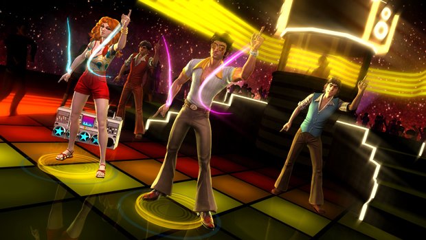
You mentioned the challenges of creating an intuitive interface. With Kinect essentially giving you a blank canvas, with no set rules for how to make a things intuitive and accessible, how do you guys approach such a task?
With the original Dance Central we spent almost as much time developing our menu system as we did developing any other part of the game. It was a huge and important initiative - we tried everything we could possibly think of. Once we settled on something we thought was pretty decent, we put it in front of a bunch of people - very young kids, children of people who were on the development team, friends of ours, and so forth. We saw how people reacted to it, saw what their expectations were, and saw what pieces of information didn’t work, or were lacking or missing. One thing we landed on was this notion that people are generally impatient. We tried a bunch of paradigms that were more along the lines of a hover-and-hold kind of gesture, but we felt like a good interface shouldn’t keep us waiting. So when we developed the swipe gesture, we felt really good about that, because it made the act of selection a movement in and of itself, which is a great fit for a dance game. And also, it never leaves you with a feeling of “I’m waiting for this action to happen when I’ve already made my selection.”
We spent almost as much time developing our menu system as we did developing any other part of the game
I think the difficulty, as we’ve iterated through it through the three Dance Central games, is how do we allow that interface to grow and change within the game. That’s always been a bit of a challenge, because there’s some core issues with the way the body is restricted and the way that Kinect works that give us some design constraints - ones we’ve ultimately made for ourselves. As you point out, we were given a blank canvas, but we still need to meet expectations to some extent. So we know the swipe gesture is a pretty fun and intuitive gesture, and when you see people doing it, you can pick up on it very quickly.
I would say, ultimately, the word “intuitive” is a bit of a misnomer when it comes to making things that are brand new. Something you’ve never seen before is basically impossible to intuit, but you want the lowest acquisition time possible - how quickly will someone learn this? I think the challenges there centre around putting the right cues on the screen, and making it obvious, when someone else does it, how you can step up and do the same thing. So with our party UI, we got rid of the necessity of vertical accuracy. You’re not moving your hand up and down to do the swipe gesture. As long as you see someone doing a swipe gesture of any kind, and you’ve picked up at least that part of the experience, no matter how tipsy or intoxicated you might be, you can do a swipe and there’s no “missed” swipe in Party Time.
(continued on page two)

