The secret sauce behind Destiny 2’s brilliance? Menus, maps and inventory management
In praise of Destiny 2’s user interface, a dazzling blend of style and smarts
There’s a lot to love about Destiny 2. GR+'s resident expert Dave Houghton has already established this in his *chef's kiss* of a Destiny 2 review. The galvanic gunplay is phenomenal, the sweeping story is riveting, and that music, my goodness, the music… it’s flawless.
Destiny 2 has a secret weapon, though, one that you probably haven’t really thought about until now, despite its tremendous impact upon the experience overall. It’s actually my favourite thing about the game, certainly one of the best of its kind that I’ve ever seen, and it also happens to be the first thing you’ll notice whenever you log online. Destiny 2’s user interface, from its menus to its maps, are a work of art.
The phrase ‘user interface’ does, admittedly, sound quite boring. It sounds like the sort of thing your internet provider might start banging on about when you ring them up to fix the WiFi. But, dare to take a deeper look beyond the bland phonology of that jargon, and you can taste the secret sauce that can make or break a game’s entertainment value.
A strong, effective menu is one which doesn’t hinder a game’s flow, but tactfully supplements it, allowing the player to immediately achieve their desired outcomes without even having to think about it. In this way, we might say that the best thing a menu can do is feel like a natural organ of the game itself, rather than a cumbersome meta-game appendage. Navigating an in-game menu should be as instinctively easy for the player as hitting the jump button.
Think back to The Elder Scrolls 4: Oblivion, and its grainy, grating menus, where attempting to perform anything within its labyrinthian design was both a hassle and an eyesore. Bethesda must have eventually come around to the same conclusion, because its next Elder Scrolls game, Skyrim, was a complete 180 from what had come before, boasting crisp, clean menus designed to bring much needed clarity to an epic and elaborate RPG experience. It wasn’t without its creative flairs (the perks menu was quite literally set amongst the stars), but these were merely the artistic grace notes to a user interface that rightly prioritised form over theatrics.
Which leads me back to Destiny 2. While Bungie had already nailed down the nuts and bolts of its user interface with the original Destiny, it's the sequel which represents the best iteration of that concept yet. Firstly, let’s talk visuals. It’s gorgeous. Subtly animated pastel-like portraits decorate the background of your class skill trees, delicate pattern work adorns the very wallpaper of the login screen, and the science of symmetry is applied masterfully on every page, in a direct appeal to the natural persuasions of the human eye.
What’s key here, though, is that the sumptuous beauty of Destiny 2’s menus, as lavish as they are, never gets in the way of the economy of its design, nor does it impede player navigation.The world map, for example, is a stunning marriage of both creativity and clarity. I could stare and soak in every pixel of that constellation of stars and planets for hours but, more importantly, I can also easily understand where I’m able to go, what I can do, and how I can get there.
Sign up to the GamesRadar+ Newsletter
Weekly digests, tales from the communities you love, and more
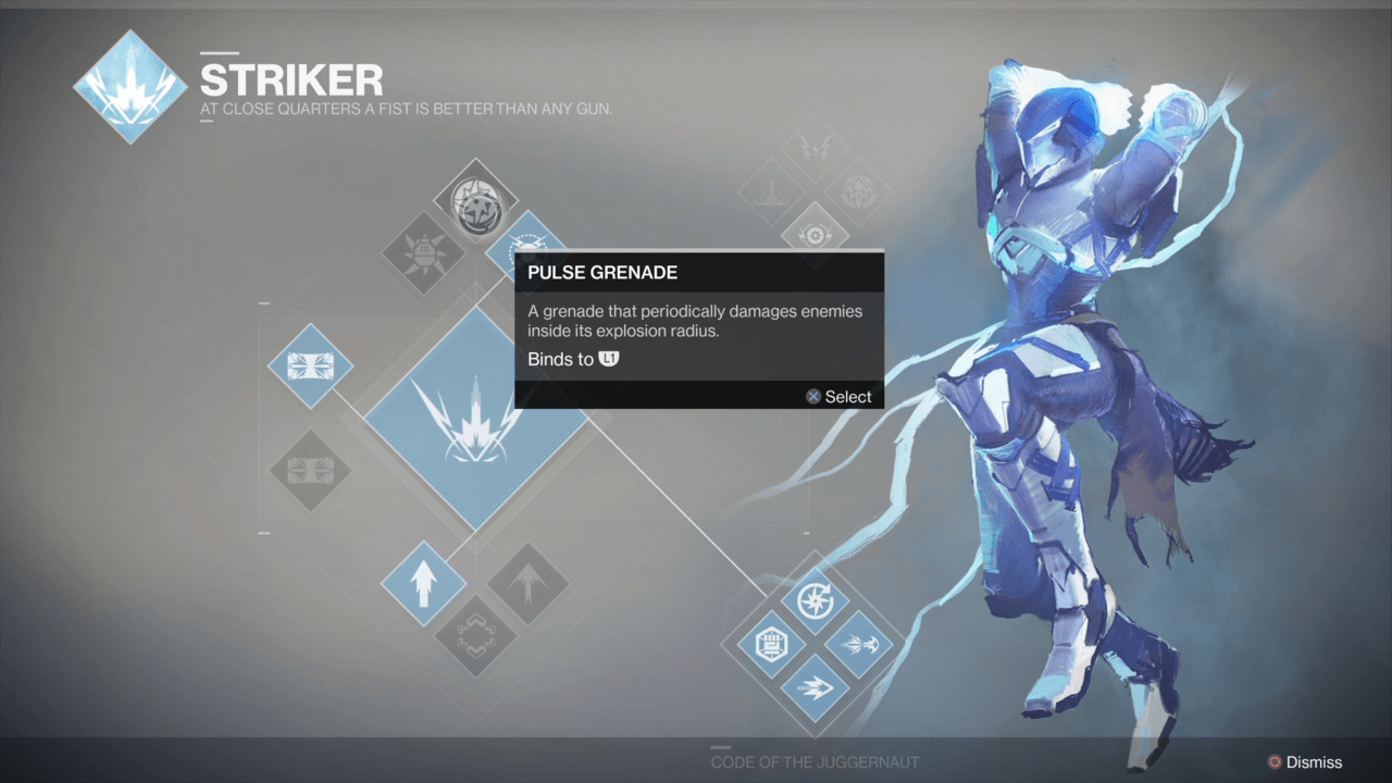
Bungie’s decision to give players a cursor as their primary means of menu navigation was also a genius move. For starters, it immediately makes the experience feel unique compared to other games of its kind (although I’m sure this won’t be the case for PC players once the game releases for that platform next month).
You’re not scrolling up or down a range of options listed in ascending order of importance by the developers, but freely guiding the analogue stick to whichever button takes your fancy. People often speak highly of experiences which award a great degree of freedom to the player; I’ve never felt so liberated by a video game menu in my entire life.
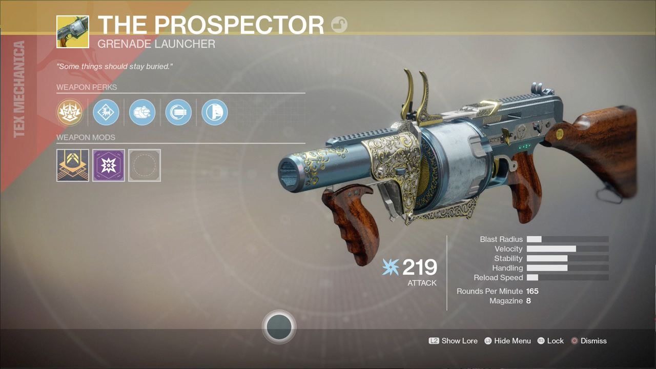
The cursor also works perfectly in tandem with Destiny 2’s character menu, another screen which exemplifies the poetry of the game’s interface. RPGs and MMOs have often struggled to figure out a way of streamlining inventory management into a simplified process, a task which requires boiling down a complex swathe of systems into one visually comprehensible package. It’s not easy, and even otherwise stellar games like The Witcher 3 and The Legend of Zelda: Breath of the Wild have struggled in this area. Destiny 2, on the other hand, sits alongside the few other notables like World of Warcraft and Deus Ex as a game that gets inventory right.
Open up your character menu in Destiny 2 and, as if by magic, you can almost instantly attain a basic understanding of everything on show. If there’s any icon that seems unclear to you, it’s probable that your hand will naturally gravitate the cursor towards it, at which point clearly laid out information will pop up to offer an explanation. The delicate choreography of the arrangement, with weapons on the left and armour on the right, all of whom are tucked away in neatly packed squares, only works to amplify this accessibility.
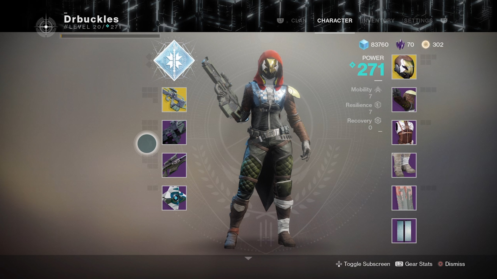
Not everything’s perfect, though. Scroll towards your inventory of shaders, mods, and other miscellaneous items, and things being to get more convoluted, but this speaks to a wider problem with Destiny 2 itself - one related to character customization and end-game content for self-expression. Luckily, you don’t need to deal with this aspect of the inventory all too often, as you’ll instead spend most of your time in the game’s glorious main character screen.
On the whole, though, Destiny 2’s interface is a beautifully designed set of systems that enriches and improves the game’s quality of life massively. Imagine how much more painful the high level grind could be if you spent even more precious time locked away in a menu, sorting out item space and figuring out which knick knack goes where. I think Bungie must have known that it had to perfect this aspect of Destiny 2, to ensure that the experience could remain as pure and airtight as possible. As far as I’m concerned, the designers have knocked it out of the park.
I'm GamesRadar's Features Writer, which makes me responsible for gracing the internet with as many of my words as possible, including reviews, previews, interviews, and more. Lucky internet!

