Embarrassing game magazine covers
A horrifyingly preserved look back at gaming's most regrettable hype! This could get ugly...
Speaking of accurately representing a game, sometimes the worst thing you can do on a magazine cover is… accurately represent the game! Today, mags know better than to even show off any actual gameplay on the cover, usually settling for a promising piece of art, or a custom drawn graphic image. But if you can believe it, there was a time when polygons were so new they were actually worth getting excited over, if only to prove a game didn’t have 2D sprites.
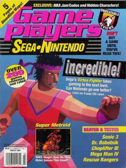
Above: Akira Yuki’s single rectangular pectoral? INCREDIBLE!
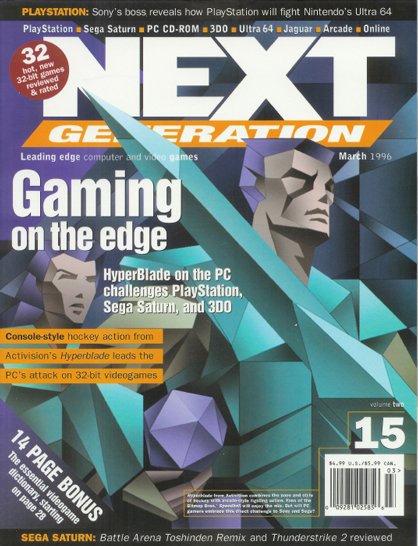
Above: Even images of HyperBlade cut deep
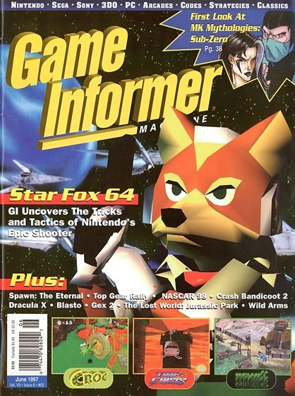
Above: A transition period for Fox McCloud
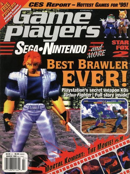
Above: This could be Toshinden. Hard to say, we don’t normally sit this close to the TV
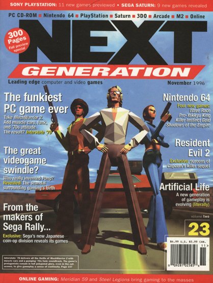
Above: For Interstate ’77, mouths were planned
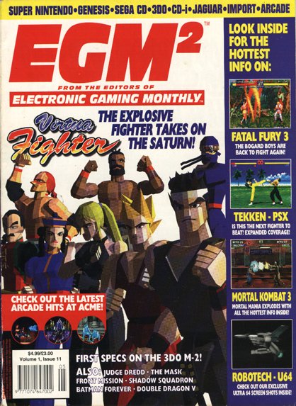
Above: How to date your magazine: Polygons? Check. Virtua Fighter? Check. Cost cutting resolution from a dot-matrix printer? HELLA CHECK!
Sign up to the GamesRadar+ Newsletter
Weekly digests, tales from the communities you love, and more
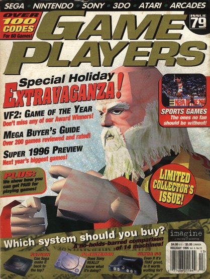
Above: Of all the characters to move magazines, why not the elderly, jagged drunk, Shun Di?!
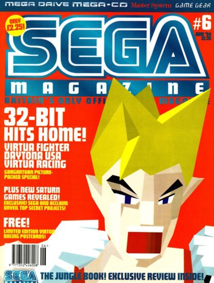
Above: Okay, let’s move on from the Virtua Figther…
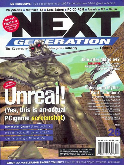
Above: In case you were confused: Yes, this is an actual PC screenshot. Sword embedded in square fists and all!
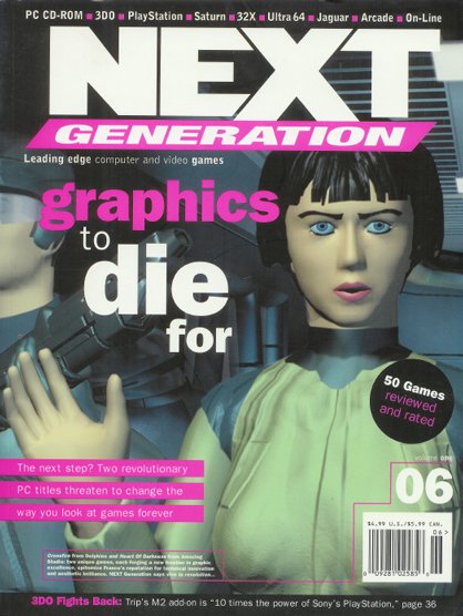
Above: And when Next Gen wasn’t getting excited about polygons, it was willing to commit suicide over digital sex dolls

