Every Final Fantasy cover ranked from worst to best
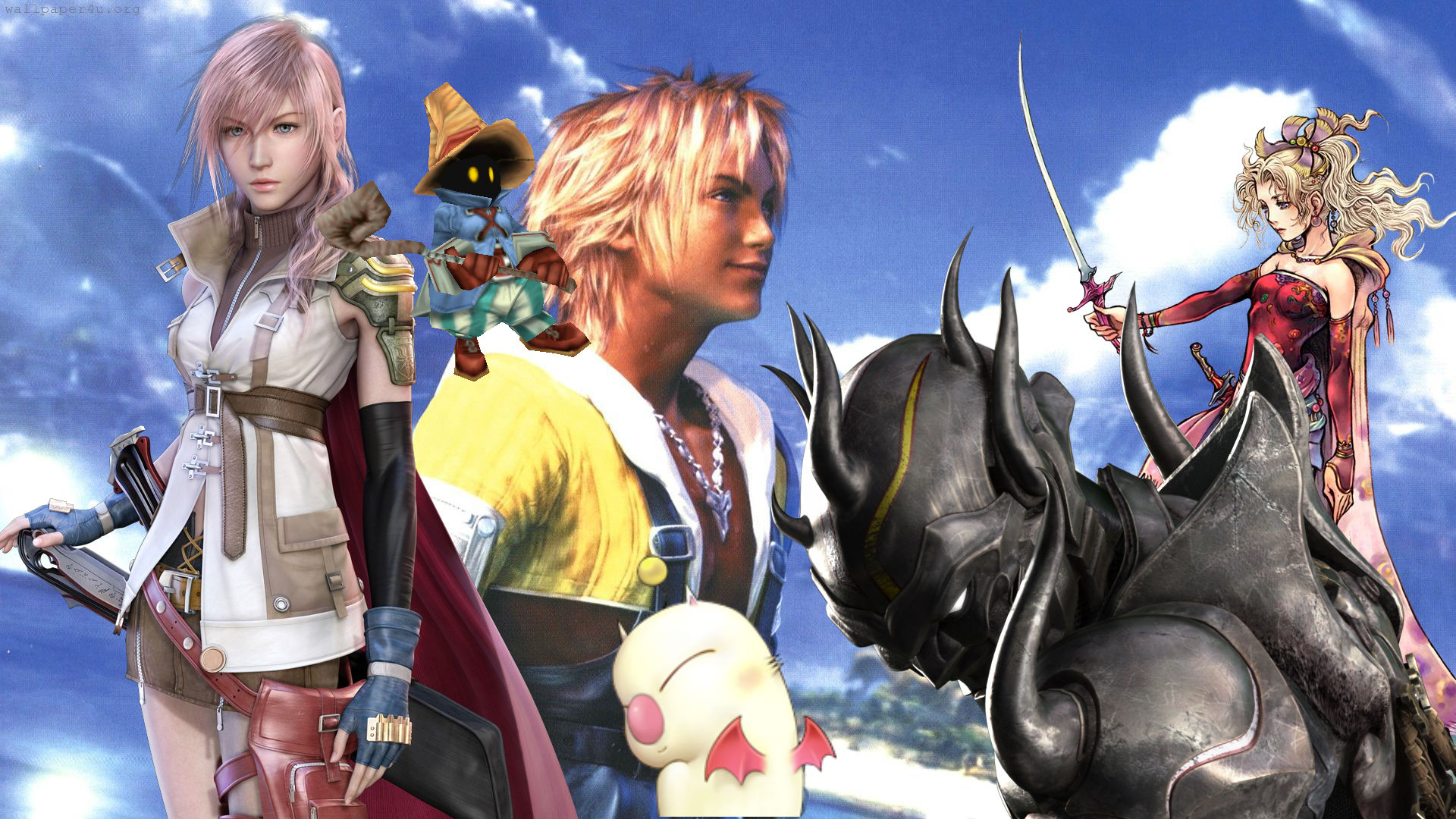
Final Fantasy evokes powerful emotions; longing, adventurous optimism, ridiculous good humor, and awe are natural byproducts of wandering through the series’ strange worlds. That human tapestry ain’t exactly easy to encapsulate in a single image, though. How the hell do you translate a spectrum of experience that includes somber reflections on the meaning of life with riding a giant bird off a mountain into a single piece of cover art? The answer is: you can’t. Square-Enix keeps on trying anyway. Sometimes they even come close! Other times… woof. Here, then, are all of the main Final Fantasy game covers ranked from worst to best.
Note: These are the covers for each numbered title as they appeared in the West with the correct name. It’s a little confusing. Final Fantasy 6, for example, was first released outside of Japan as Final Fantasy 3. We’re going with examples where the game showed up under its real title. Which is good, because that SNES cover is a travesty.
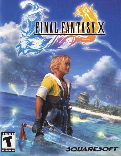
Final Fantasy 10
Congratulations, Final Fantasy 10: you are the worst advertisement for a tanning salon I have ever seen. What am I supposed to get out of this? Is this game about the lead singer of a Sugar Ray cover band who’s had so many strawberry daiquiris that he forgot to take off his clothes before going swimming? This doesn’t say I’m about to go on a mind bending adventure where sorcerers and athletes fall in love while fighting monsters. It says I’m in hell and hell is MTV Spring Break in 2002 forever.
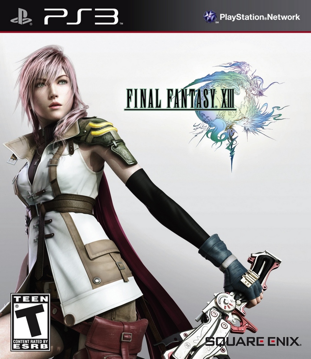
Final Fantasy 13
Full disclosure: I love Final Fantasy 13 and its divisive star Lightning. Monumental pacing problems and irritating characters aside (Snow and Serah are the worst CW show I’ve ever endured), the world of Gran Pulse and Cocoon is fascinatingly bizarre and Lightning’s emotionally distant struggle to understand it is endearing as a result. None of that magical weirdness is present in this cover for what appears to be an ad for the opening of an inconveniently remote Ikea in Hokkaido. It’s not even the finished ad, just some placeholder nonsense before theY show the attractive warrior selecting her Skruvsta chair.
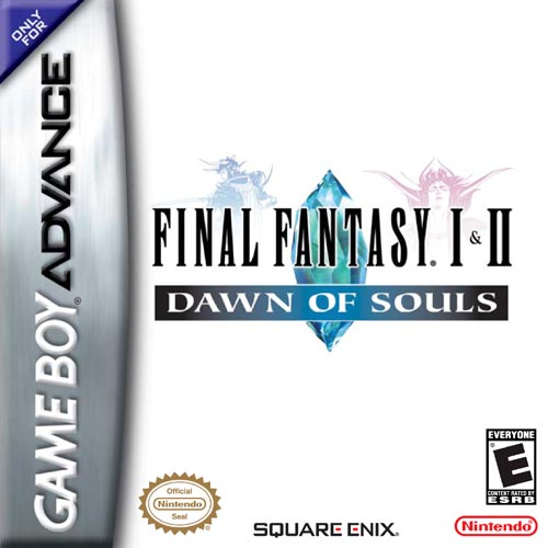
Final Fantasy 2
Sparse austerity is a motif that really works for Final Fantasy covers as you’ll see later in this list. For Final Fantasy 2’s first appearance outside of Japan, this is not the case. Look at this MS Paint nonsense. It’s bad enough that when this game finally escaped Japan it lost its righteous psychedelia by way of Tolkien art, but this barebones effort isn’t even up to the standard of the cancelled NES version. At least we finally got to play its broken, confusing battle system.
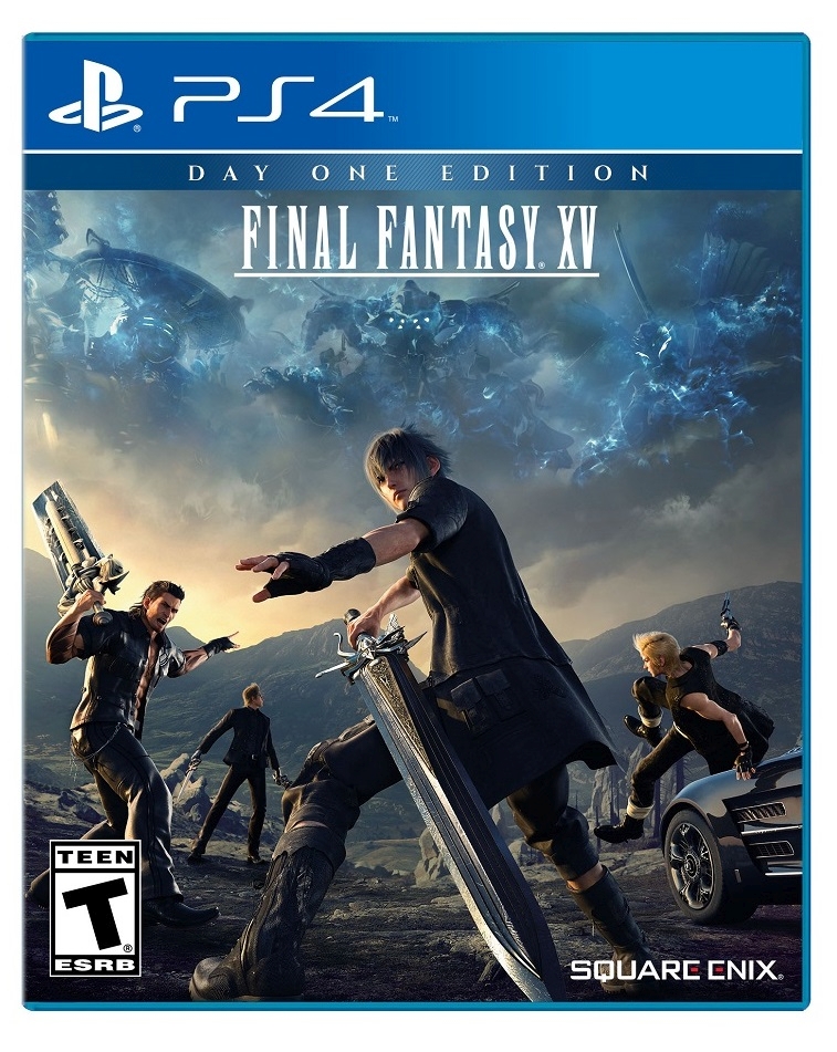
Final Fantasy 15
Ten years we waited for Final Fantasy 15. Ten years of rumors, speculation, and obsession over brief trailers for a game that started as a PlayStation 3 exclusive named Final Fantasy Versus 13. When it finally re-emerged as Final Fantasy 15 at E3 2013, we saw a trailer depicting a stunning fantasy world mixing hypermodern urban life with fantastic depictions of wildlife and magic. All of that culminated in this cover, a discarded poster for a male beauty pageant hosted by a Nick Lachey-less 98 Degrees and sponsored by L’Oreal. Where is the blonde guy even going? Everyone has to order you online, Final Fantasy 15, because they’ll be mortified buying you at a store.
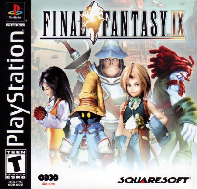
Final Fantasy 9
In terms of cast lovability, Final Fantasy 9 ranks high in the series pantheon. There isn’t a dud among them. Zidane’s a classic lead, Vivi is the first personality behind the iconic black mage design, and Freya is almost Jim Hensonian in her warm mix of animal and human characteristics. Lumping them all together like this on the cover, though, captures none of the whimsy in their adventure. They look like a brochure for an online college where cosplay is a major. Sign up today and you too can learn to make Amarant wigs!
Sign up to the GamesRadar+ Newsletter
Weekly digests, tales from the communities you love, and more
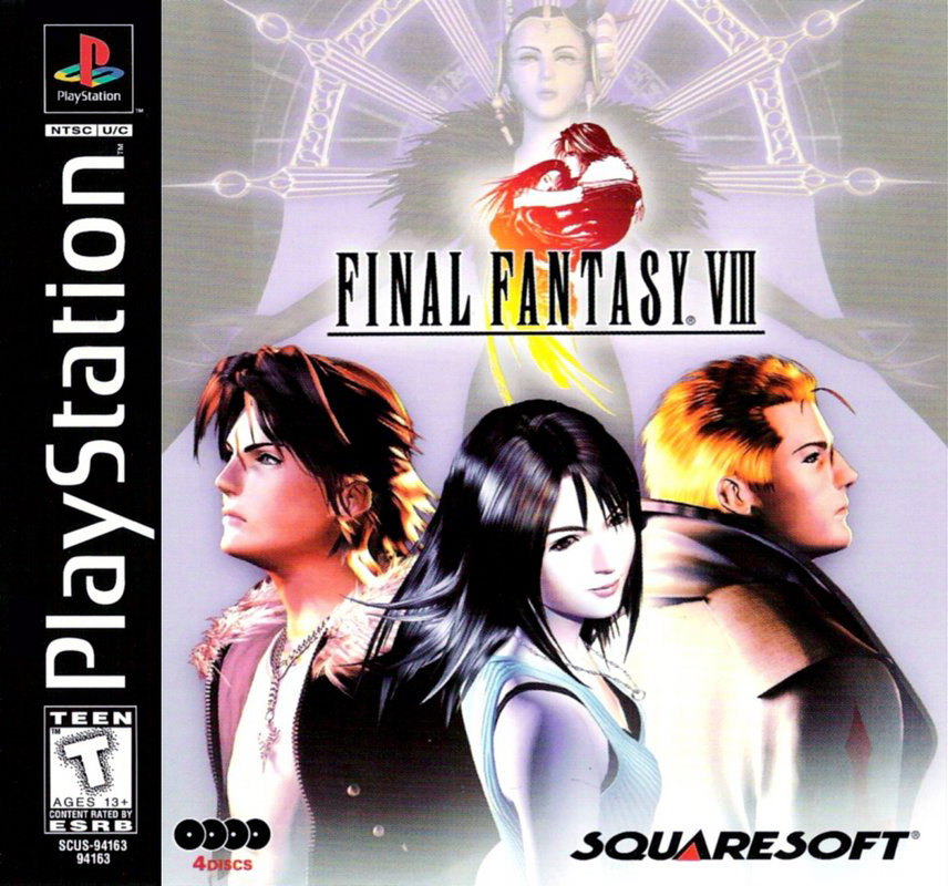
Final Fantasy 8
Another example of how Final Fantasy would have been better served by sticking to its original cover art. Final Fantasy 8 is a very, very strange story about a witch from the future trying to take over the world by compressing the past and the future into a single time. And teenagers falling in love. Right. Chew on that. Rather than sticking with elegant simplicity, we get an 8th grader’s attempt at sexy stoicism. Ease down on the lavender and we’ll all get through this, kid.
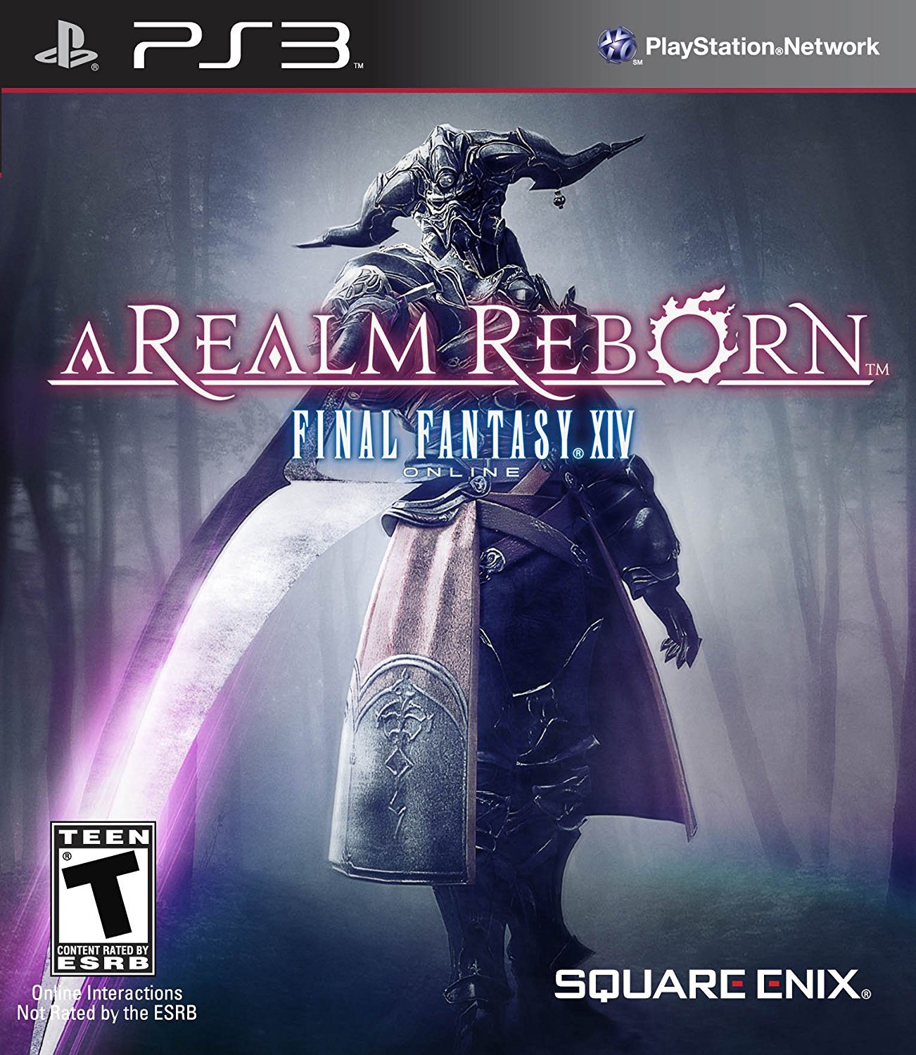
Final Fantasy 14
Things are starting to improve, but not by much with Final Fantasy 14: A Realm Reborn. (We’re going with A Realm Reborn rather than the original Final Fantasy 14 because, much like Square-Enix and its shareholders, we’re trying to forget it ever happened.) On the bright side, the Final Fantasy Judge is a remarkable piece of character design which is striking on its own even if it doesn’t evoke the broad swath of experiences in this MMO. On the other side, Cool Guy With Sword is a pretty generic video game cover theme.
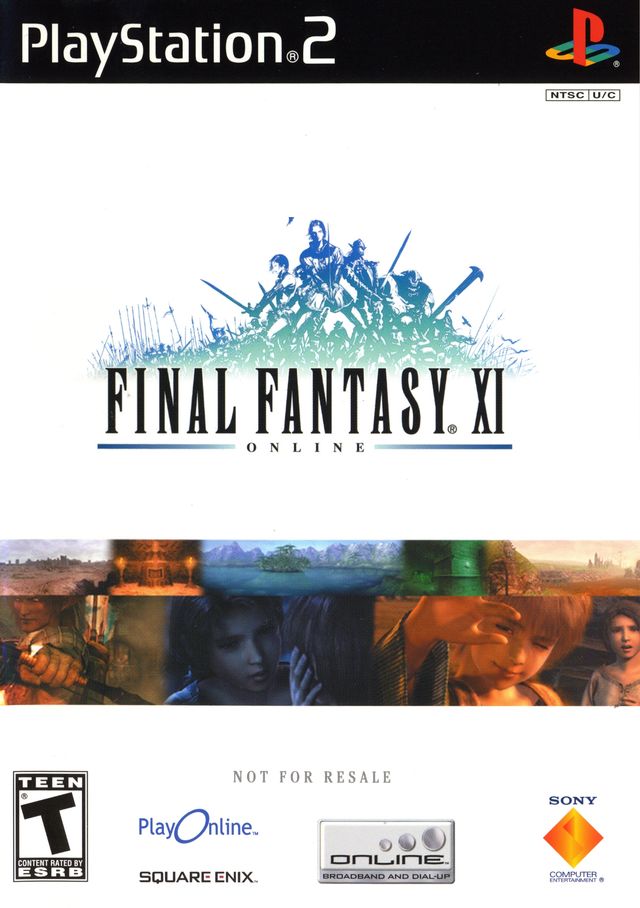
Final Fantasy 11
The original Final Fantasy MMO definitely did a better job at capturing the spirit of the series. The plain white background with concept artist Yoshitaka Amano’s logo depicting a united, ephemeral band of adventurers is stirring. The bizarre amalgam of cutscene screenshots and logos beneath it undercut any sense of budding majesty, though. All these years later, the cover is as much a monument to hilariously named internet services like PlayOnline as it as a work of art.
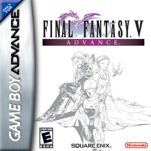
Final Fantasy 5
Now we come to the good stuff. Final Fantasy 5, another early entry that waited until the Game Boy Advance to come west, benefits from a cover that’s far more romantic than the game itself. This is, after all, a game about a guy named Buttz whose best friend is a giant chicken and your mission is to fight random battle after random battle so he can slowly learn barely distinguishable jobs. Amano’s delicate characters on the cover, though, hint at a wispy world where even dudes named Buttz can be heartthrobs.
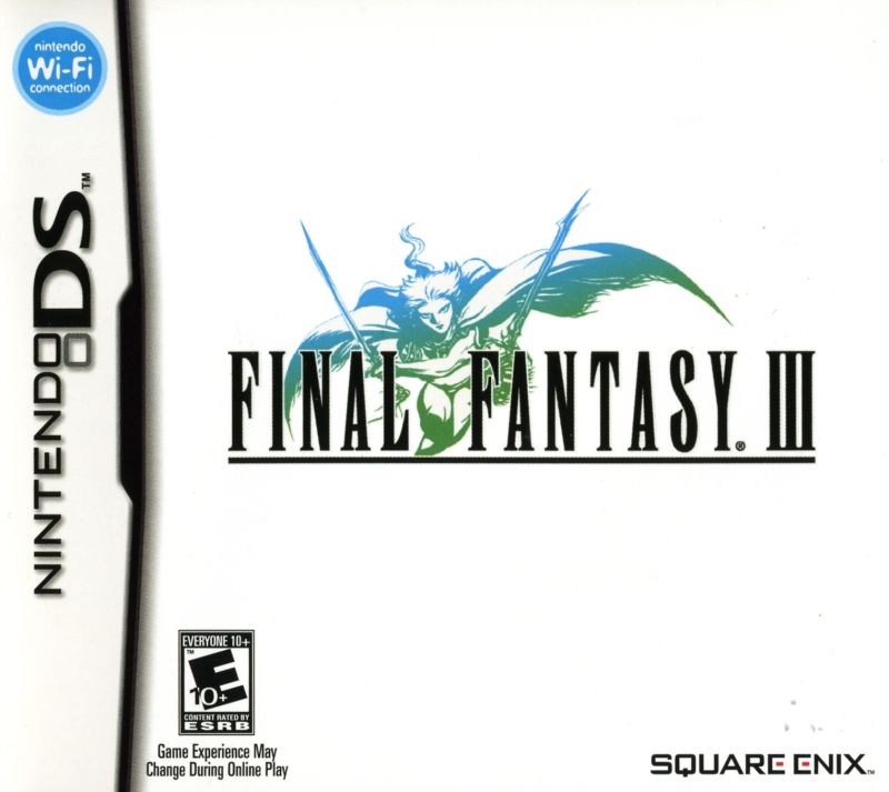
Final Fantasy 3
What Final Fantasy 2 got so wrong, Final Fantasy 3 gets very right. Plain, graceful, and breathtaking, the Final Fantasy 3 cover for Nintendo DS is nearly perfect. The gorgeous logo captures how basic the game itself is. The original version on NES marked the first appearance of the Job System, where you train up characters in different vocations that can change as you go. That’s pretty much all there is to it. From a story perspective, it’s even straightforward good-versus-evil stuff than the first game. Beautiful and simple.
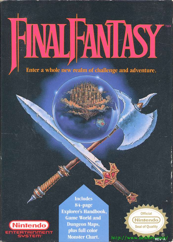
Final Fantasy
When Final Fantasy came out in 1990, the world still hadn’t gotten on board with JRPGs. Role-playing adventures were still largely stuck in 1970s Dungeons and Dragons mode, which is no bad thing. Everyone likes burly men and women wearing fur thongs in muddy landscapes. This cover graces up against that sort of Monster Guide territory with its big medieval weapons and crystal balls thing, but there’s a subtle quality to it that still feels distinctly Final Fantasy. It remains iconic even as the series’ more gossamer characteristics have come to the fore.
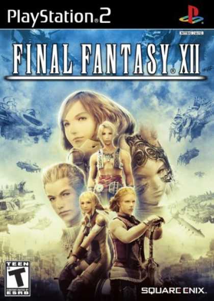
Final Fantasy 12
One of the primary criticisms leveled against Final Fantasy 12 by haters is that “it’s just weird Star Wars.” Is it really a criticism when the game clearly knows that it’s just riffing on the plot of the 1977 space opera? Even the cover apes the classic movie posters of Drew Struzan, combining the game’s cast and its ethereal world design into a pyramid like collage of romantic imagery. In the same way Sturzan arranged George Lucas characters to maximum effect, Final Fantasy 12’s cover pulls you into its Star Wars But Super Manga Sexy world. Just look at that sepia toned Balthier and Fran and tell me you don’t want to know about the hottest version of Han Solo and Chewbacca ever.
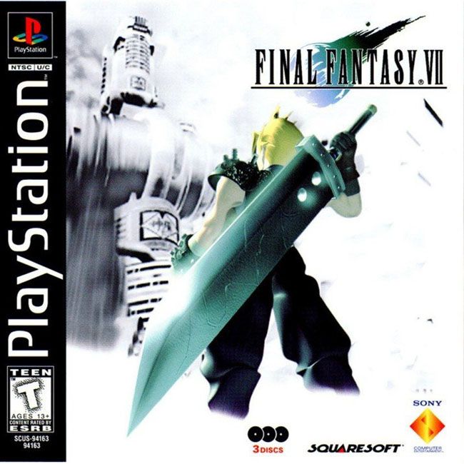
Final Fantasy 7
With the exception of the occasionally mangled English script, Square got everything right about Final Fantasy 7’s release in the West. Decades later, it’s still the nucleus of RPG fandom around the world because of its batshit story, iconic characters, amazing music, and sumptuous art. The American cover is arguably the best version, a ghostly but still vivid rendering of Cloud Strife as he stares up at the Shinra mako reactor, a classical depiction of resistance against corrupted power. It nails both the game’s nature as a technological showcase and as an environmentally conscious science fiction romance.
Final Fantasy 4
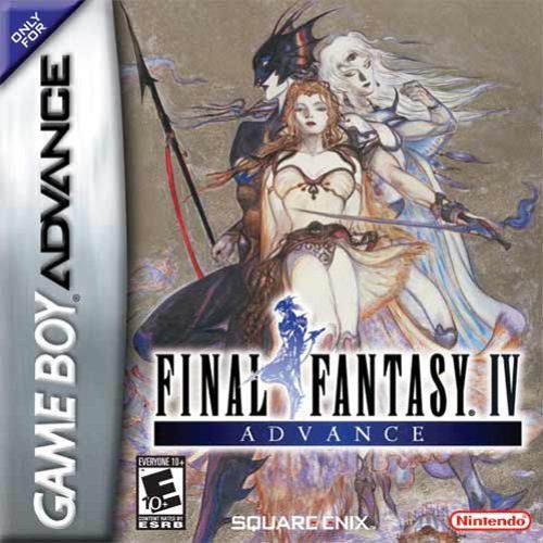
The first time around in the West, Final Fantasy 4 was called Final Fantasy 2, its difficulty was halved, and most of its characters lost their specialized abilities in an attempt to make the game more accessible. It also got a cover that was just a logo against an angry red background. Not bad, but it doesn’t exactly embody a story where the hero has to literally fight the evil in his soul before flying a dwarven spaceship to the freaking moon. Many years later, Final Fantasy 4 made it to the US in an unedited, expanded form called Final Fantasy 4 Advance and it brought with it not just the sketched figure work of Yoshitaka Amano but a full, brand new painting. The thick color, angular bodies, and otherworldly faces capture everything about Final Fantasy 4 that’s kept people playing it for a quarter of a century.
Final Fantasy 6
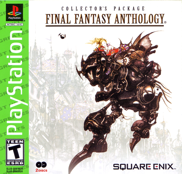
So that Final Fantasy 3 SNES art we linked to above is pretty terrible. Our own Connor Sheridan described it as the crappy art on the side of a county fair haunted house. When it returned to the West appropriately named Final Fantasy 6 as part of the Final Fantasy Anthology, that mistake was remedied, and how. While Yoshitaka Amano’s logos and characters have appeared on other covers, Final Fantasy 6 marks the first time that one of his concept art landscapes made it to the cover as well. This portrait of Terra atop her Magitek armor before one of the game’s impossible cities actually manages to encapsulate everything Final Fantasy is at its best, an expert blend of sci-fi, fantasy, romance, and something wholly unique and strange that belongs just to this series. It’s sexy and strong, familiar and distant, all at the same time.

