Hands-on with Sonic Generations on 3DS reveals 1991 Green Hill Act 1 layout... in 3D
Thought this looked familiar...
So as you start off, you get the Motobug and Buzz-Bomber, before jumping up to that ledge to collect the 10 Ring item box. There's the run down to the loop, the jumping fish and that famous S-bend tunnel that throws you skywards to collect all the rings floating in the air.
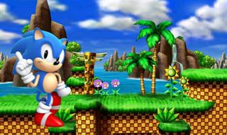
Above: The choice screen between classic and modern Sonic has an illustration to (probably)avoid confusion
But while the layout is the same, the gameplay is very different. Sonic's movement is completely new, even in this Classic mode. Inertia is different, he doesn't roll into the sky off that ramp, instead opening up and running through the air (making him vulnerable to those Buzz-Bombers).
The look and sound, however, is exquisite. Whether in 3D or not, the colours and animation make for a jubilant experience, while the classic Green Hill music plays along in the background. It is a trifle odd to be able to rev up and spin dash around the level, although the idea here is that 'classic Sonic' is the same as '16-bit Sonic', so it's basically a best-of package of all his best bits from that era. Works for me.
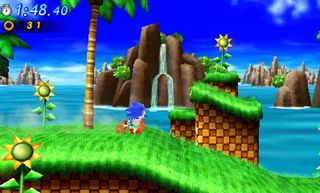
Above: There may be some new 3D scenery, but the level1 layout for Classic Sonic is identical to Sonic 1
But don't think the whole game is an exact retread of old classics. Modern Sonic's version of the level is different, playing much more like Sonic the Hedgehog 4: Episode 1 than anything else. The homing attack is in, as is the Rush-style dash button. Rail grinding also makes an apperance and there are even over-the-shoulder sections, as the camera moves to give you a slightly better view of what's ahead of you.
It isn't full into-the-screen and it does look a little basic compared even to Gamecube-era Sonic graphics, but it's certainly enjoyable and I ended the demo with a 'wow – that was great'.
Sign up to the GamesRadar+ Newsletter
Weekly digests, tales from the communities you love, and more
We meet again, Mr Robotnik
But that wasn't everything. The demo also contained a boss level, apparently separate from the main game. This was almost a straight re-run of the Robotnik boss from the end of Sonic 3, with the spikes on the top and the two arms that grab the platform underneath the Death Egg as it climbs into the sky. It's good to have the classic grey flashes over the mechanical hull as you land a hit and the battle plays out as though it were 2D.
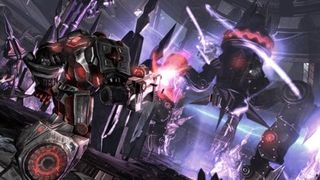
Above: Chunky 'classic' Sonic looks great on 3DS. Can we keep him? Huh, huh? Can we?
In fact, that's probably the best thing that I noticed about the game as it stands. For all the fancy 3D effects and polygonal rework of the original game, it all plays like a 2D Sonic game. Perhaps the movement is a little too far removed from the originals, but I think by now everyone has given up hoping for a return to those physics. What there is, though, is slick, pretty and, above all else, just a joy to play.
20July, 2011
Justin was a GamesRadar staffer for 10 years but is now a freelancer, musician and videographer. He's big on retro, Sega and racing games (especially retro Sega racing games) and currently also writes for Play Magazine, Traxion.gg, PC Gamer and TopTenReviews, as well as running his own YouTube channel. Having learned to love all platforms equally after Sega left the hardware industry (sniff), his favourite games include Christmas NiGHTS into Dreams, Zelda BotW, Sea of Thieves, Sega Rally Championship and Treasure Island Dizzy.
Most Popular


