Here's what the Nintendo Switch menus look like in light and dark mode
Nintendo Switch has a more minimalist user interface than either Wii U or 3DS, and it looks like it has some slick customizable themes as well. Indie publisher Nicalis tweeted an up-close image of the system's main menu, and though it's since deleted that tweet, NeoGAF users quickly picked it up. Here's the full picture:
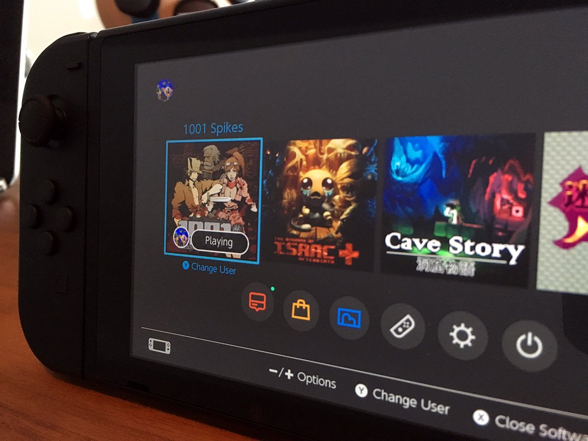
The interface puts games front and center, with big art-backed tiles for all available games. There's a row of non-game apps and settings below, including what appears to be a Notifications feed, an eShop button, and er… a virtual Valentine's Day card? Probably something about favorites.
Try not to fixate on those magnificent all-black Joy-Cons, they seem to be exclusive to developer units (the two consumer models come with either grey or neon blue and red Joy-Cons). I can't imagine that classy dark theme is exclusive to devkits, though. You can see its lighter counterpart here, as shown in a Nintendo Treehouse video.
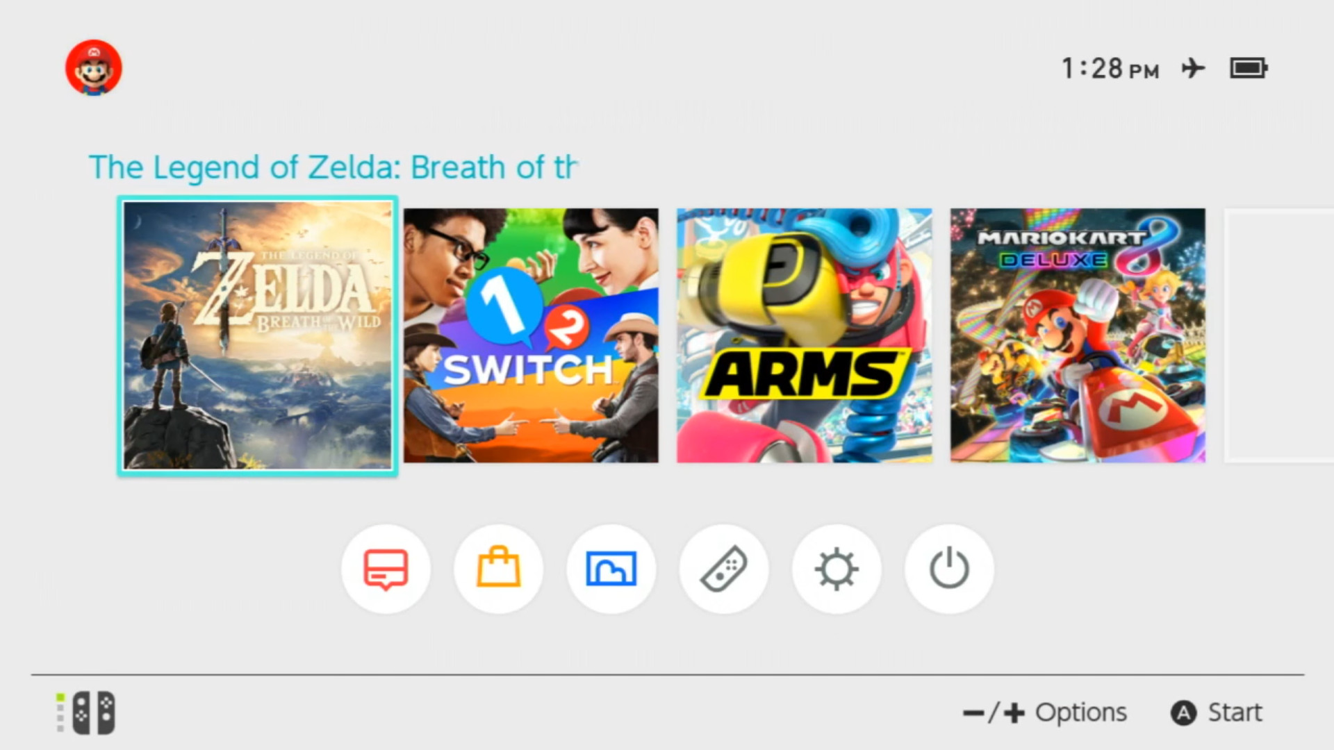
Yep, I think I'll go with the dark theme, at least for starters. Nintendo 3DS does a brisk business in selling premium themes and I'd be surprised if Nintendo doesn't give Switch owners the same opportunity at some point down the line.
Seen something newsworthy? Tell us!
Sign up to the GamesRadar+ Newsletter
Weekly digests, tales from the communities you love, and more
I got a BA in journalism from Central Michigan University - though the best education I received there was from CM Life, its student-run newspaper. Long before that, I started pursuing my degree in video games by bugging my older brother to let me play Zelda on the Super Nintendo. I've previously been a news intern for GameSpot, a news writer for CVG, and now I'm a staff writer here at GamesRadar.

