History of Grand Theft Auto box art
Look at all of the boxes inside of boxes
Boxes in boxes in boxes in boxes
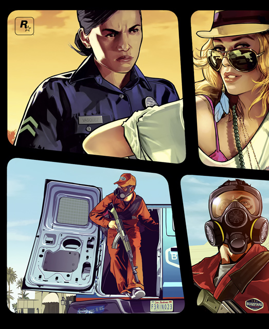
GTA 5's box art is currently being painted onto a wall in New York City, because that's how big of a deal it is. Seriously. Now, it's officially out, ready for your eyes to pour over it while you wait anxiously for the game's September 27 release. But before you start picking out your favorite parts of the upcoming game's box art, let's take a trip down memory lane--and run over a bunch of pedestrians in the meantime.
When did Rockstar adopt the "boxes of people inside of the box art" thing? What did the original game's cover look like? How terrible was Take-Two's old logo (see: very terrible)? The answers await...
Grand Theft Auto (1997)
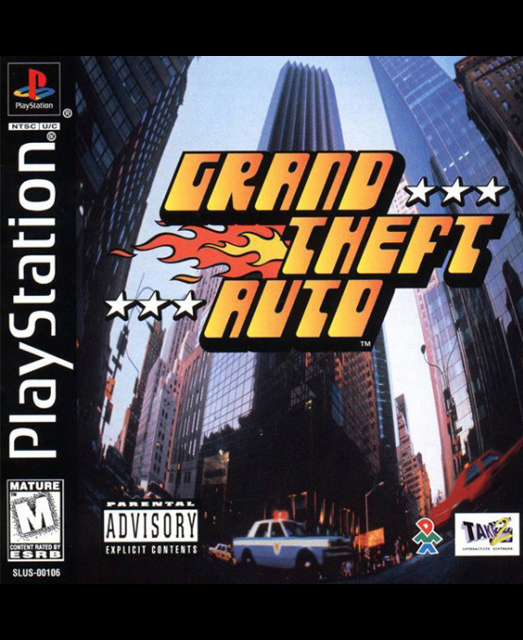
Ah, the game that started it all. It has stars on it, the logo is on fire, and there's a Parental Advisory Warning so you know it's serious.
Grand Theft Auto: London, 1969 (1999)
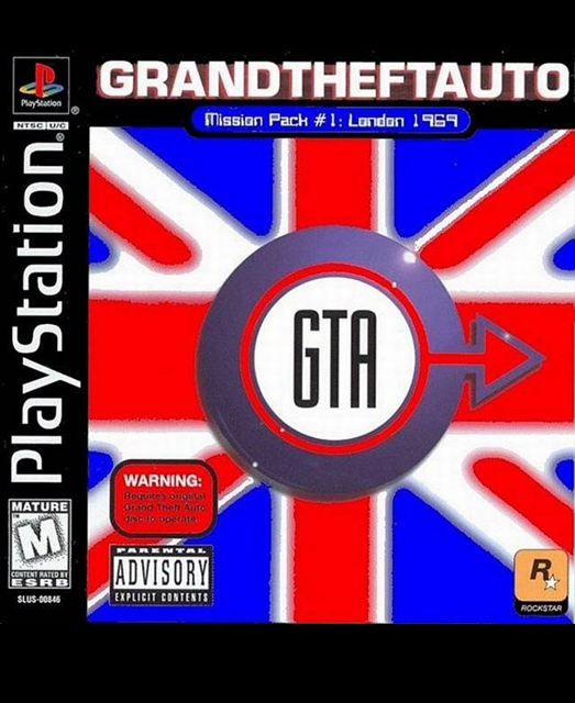
This expansion to GTA has a British flag, a "male" symbol, and came out two years after Austin Powers. We'll let you draw your own conclusions.
Grand Theft Auto 2 (1999)
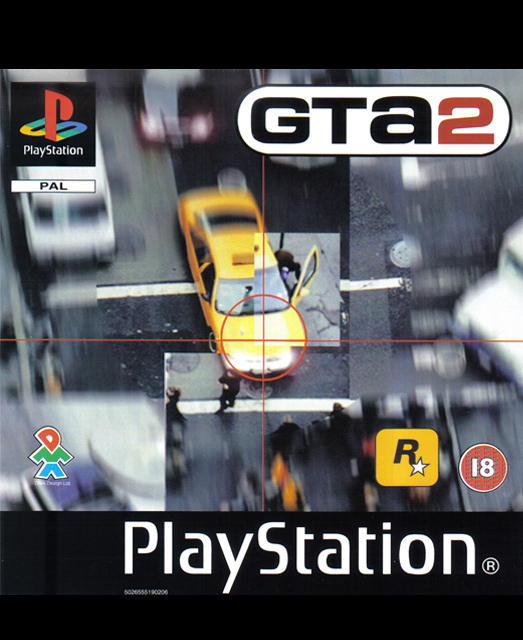
Realistically, this box art is actually more honest to the game's content. The top-down view is conveyed, as is the fact that you'll murder people. You'll also notice a possible precursor in the compartmentalization of images, courtesy of well-placed blur and ratched-up light saturation.
Grand Theft Auto III (2001)
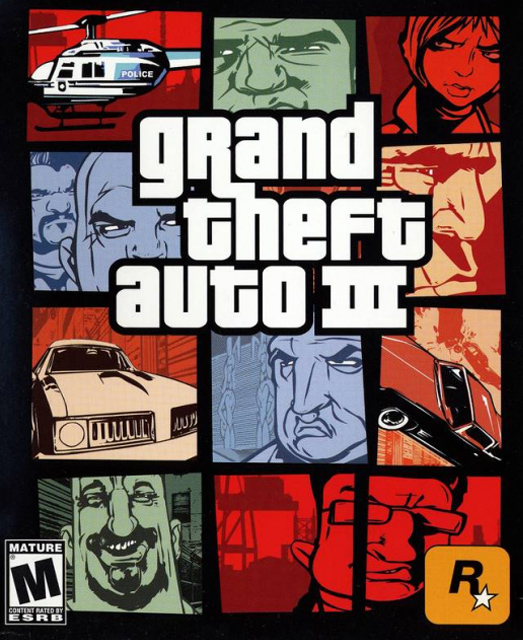
Ah, there we go. This is when GTA became GTA--you have the classic boxed style, the roman numerals, and the knowledge that you're in for one hell of a crime spree.
Grand Theft Auto: Vice City (2002)
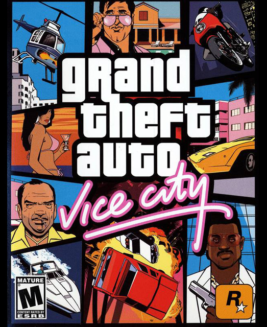
Vice City came a mere one year after GTA III's release, bucking the numeric trend and further stylizing the box art. Note the colored panels are gone, and the spots themselves are more angular.
Sign up to the GamesRadar+ Newsletter
Weekly digests, tales from the communities you love, and more
Grand Theft Auto: San Andreas (2004)
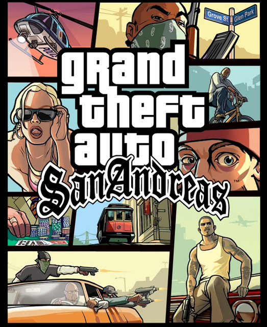
Two years later we got Grand Theft Auto: San Andreas, jettisoning the east coast for the largest open world the series had seen. The cover is more in line with the recent releases, too, showing the evolution of Rockstar's art style.
Grand Theft Auto: Liberty City Stories (2005)
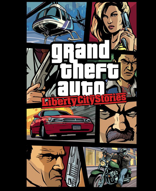
Liberty City Stories continued the trend, with more angry faces than any GTA box art had ever seen.
Grand Theft Auto: Vice City Stories (2006)
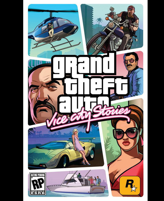
It was followed by another "Stories" sequel, with less angry faces and more oceans. Though the Stories games were, essentially, spin-offs, the box art still screamed that this was a big Grand Theft Auto game.
Grand Theft Auto IV (2008)
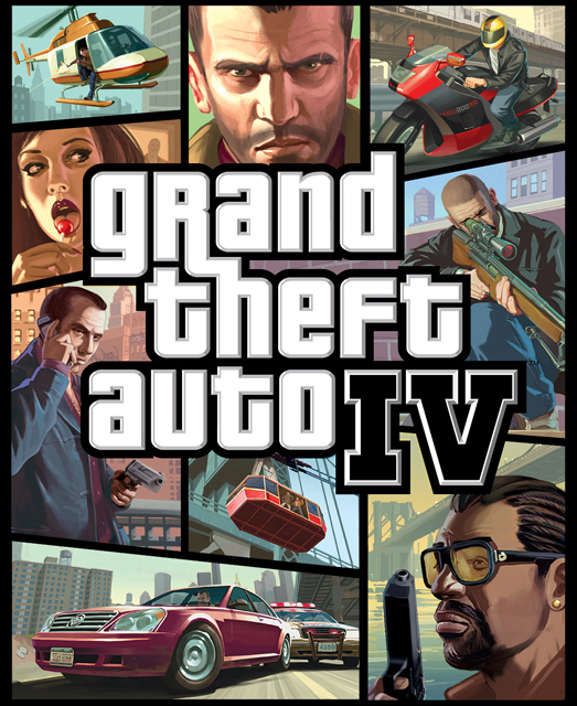
Rockstar made a big deal about GTA IV's box art, and for good reason--it was arguably the most stylish one yet. We never did meet that girl with the lollipop, though...
Grand Theft Auto: Chinatown Wars (2009)
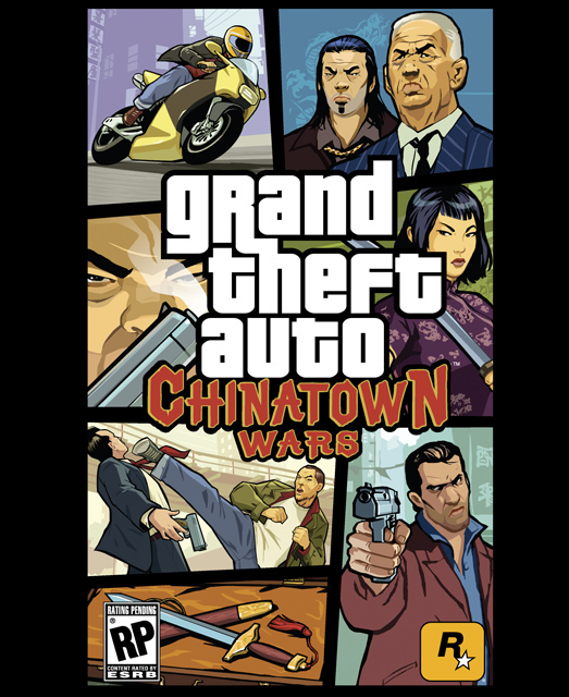
Remember when the DS got its own Grand Theft Auto? We do, because it was great--and it was just as great when it was brought over to the PSP. One thing the PSP version has that the DS version didn't, though? Vertical box art. There was much more room for people pulling swords out with that shape.
Grand Theft Auto: Episodes from Liberty City (2010)

Rockstar came out swinging with GTA IV's DLC, releasing two massive expansions that totally changed the game. When they merged them onto one disk the result was great, and it made for... interesting box art. That's what happens when you have a package that's technically about grungy bikers and flamboyant playboys.
Grand Theft Auto V (2013)
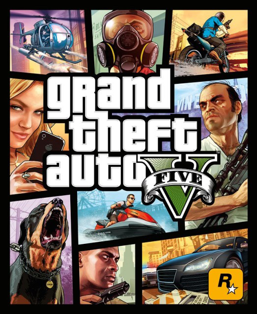
All roads lead to Grand Theft Auto V. There's a sexy lady on the side, a helicopter above her, a motorcycle beside it, and all manner of people we can't wait to meet (and likely kill). It looks just like every other Grand Theft Auto box art--and that's why we love it.
What's your favorite?

Grand Theft Auto has created an interesting brand with its box art--one that's now totally recognizable to gamers all around the world. Which is your favorite box art? Are there any you remember getting especially excited about? Let us know!
And if you're looking for more, check out history of Pokemon box art and history of Resident Evil box art.
Hollander Cooper was the Lead Features Editor of GamesRadar+ between 2011 and 2014. After that lengthy stint managing GR's editorial calendar he moved behind the curtain and into the video game industry itself, working as social media manager for EA and as a communications lead at Riot Games. Hollander is currently stationed at Apple as an organic social lead for the App Store and Apple Arcade.

