A complete history of Pokemon box art
We peruse the covers of the Pokémon series
Pokmon Gold and Silver | 1999
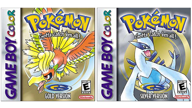
The first full-blown new games in the main series since Red/Blue/Green maintain the same box art style established by the originals with a consistent and simple logo/slogan/monster composition. Ken Sugimori sticks with the same water colour treatment of the cover creatures Ho-Oh (Gold) and Lugia (Silver).
Pokmon Puzzle Challenge | 2000
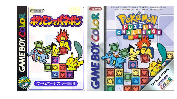
Thanks to the super cutesy-looking pokmon, both versions of this cover are pretty adorable, but the combination of uncluttered white background and sunset gradient bubble font logo make the Japanese box art more of an eye-pleaser.
Pokmon Puzzle League | 2000
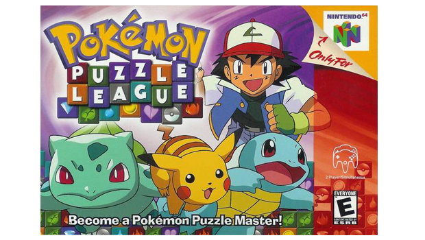
Given the insane level of its popularity, its pretty amazing that this is the only game based on the Pokmon anime. This box-art also marks the first time a human--plucky pokmon trainer Ash Ketchum--appears on the cover. And we have to wait another three years before it happens again on the cover of can you remember?
Pokmon Crystal | 2000
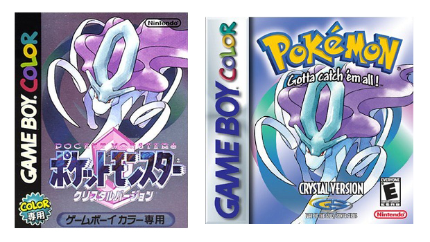
Legendary pokmon Suicune is given the cover treatment for this updated version of Gold and Silver. A great pokmon for sure, but this Sugimori art of Suicune is particularly subdued. It certainly doesnt project the same sort of character or expression as the preceding box art mascots. With all the indistinct lines and shapes its hard to find a focus and--as a result--struggles to stand out.
This box art is also notable for being the last to feature the Gotta catch em all! tagline before it was quietly taken out of service. The reason for its removal has never been confirmed by Game Freak or Nintendo. One theory suggests the slogan was being used increasingly in a negative context by critics highlighting the addictive, profit-driven qualities of the franchise and the pressure it put on parents with demanding Pokmon playing children.
Pokmon Stadium 2 | 2000
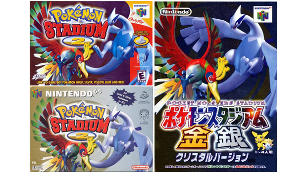
Gold and Silver cover pokmon Ho-Oh and Lugia are both wonderfully curvy here. They fit together snugly, which makes for a lovely, easy-on-the-eye composition. Ho-Oh is particularly striking - its regal, grandly coloured feather configuration and outstretched talons a contrasting mix of beauty and ferocious beast (with a look in its eye that suggests it wouldnt hesitate to disembowel any pokmon you might care to put in front of it).
Pokmon Card GB2: Here Comes Team GR! | 2001
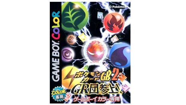
Ew. The cover for the Japan-only sequel to the Pokmon Trading Card Game is an uninspired conglomeration of various objects caught in a swirling maelstrom of static electricity. Its not particularly nice to look at. However, we do like the name of the game. Because Team GR.
Sign up to the GamesRadar+ Newsletter
Weekly digests, tales from the communities you love, and more
Pokmon Ruby and Sapphire | 2001
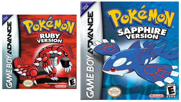
The first entries to the core series since the Gotta catch em all! slogan was jettisoned. As you can see, the space below the logo is now occupied with the respective version titles. This becomes the established layout style for all future Pokmon titles in the main series.
New third generation legendary pokmon Groudon (Ruby) and Kyogre (Sapphire) appear on the covers. In terms of Sugimoris design, the creatures look distinctly less organic than previous box mascots both have an unnatural, biomechanical quality about them. The box-art also marks a stylistic change, with the light watercolour techniques replaced with heavy lines and bold colours.
Pokmon Channel | 2003
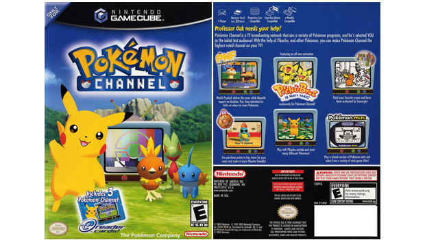
The Ruby and Sapphire starter pokmon (Torchic, Treecko and Mudkip) seen here with the ever chirpy Pikachu have to be the most ugly character models to appear on any Pokmon box art. They appear to have been rendered in 1985. And why is the TV outside? It makes no sense. Amazingly, art overlord Ken Sugimori is credited as supervisor on Pokmon Channel, so he must have thought it was passable.
At least the next box art does a much better job with Torchic, Treecko and Mudkip...
Pokmon Pinball: Ruby & Sapphire | 2003
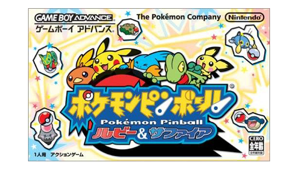
The Japanese box art is such a thing of beauty we thought it deserved a slide all to itself. It possibly fails to make it instantly obvious the pokmon are riding a Pok Ball--which has presumably just been fired with spring-loaded momentum--and are all desperately hanging on for their little lives. But what the image lacks in kinetic energy it more than makes up for with sheer adorability. The expressions on their stylised faces are a collective picture of rollercoaster joy/terror.
Pokmon Colosseum | 2003
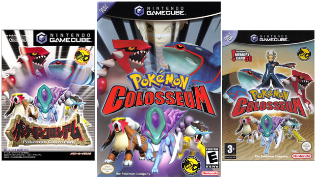
Remember way back at Pokmon Puzzle League we said it would be awhile before another human character made it on to a box art. Well here it is. Three years after Ash Ketchums one and only cover appearance, Colosseum protagonist Wes stars on the US and UK boxes (although hes completely absent from the Japanese version). This isnt the start of a trend though and its another three years before another pokmon trainer is drafted in for cover duties.
GamesRadar+ was first founded in 1999, and since then has been dedicated to delivering video game-related news, reviews, previews, features, and more. Since late 2014, the website has been the online home of Total Film, SFX, Edge, and PLAY magazines, with comics site Newsarama joining the fold in 2020. Our aim as the global GamesRadar Staff team is to take you closer to the games, movies, TV shows, and comics that you love. We want to upgrade your downtime, and help you make the most of your time, money, and skills. We always aim to entertain, inform, and inspire through our mix of content - which includes news, reviews, features, tips, buying guides, and videos.
