A complete history of Pokemon box art
Pokmon FireRed and LeafGreen | 2004
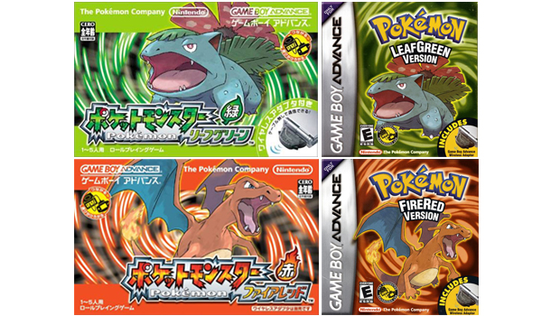
An updated, fully tweaked remix of the original game gets an updated, fully tweaked remix of the original box art, with Charizard and Venusaur looking like evolved, more confident versions of how they appeared on those first Japanese covers nearly 10 years before.
Interestingly, its the previously Japan-only Green version which accompanies Red. A trademark filing for Pokmon WaterBlue Version suggests its release was at one point considered, but for whatever reason it never materialised. Poor old Blastoise.
Pokmon Emerald | 2004
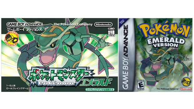
The admittedly excessive rectangular dimensionality of the larger Japanese Game Boy Advance packaging provides a far superior canvas for this artwork. Serpent-styled cover pokmon Rayquaza perfectly occupies the space, managing to fill it without making it feel cramped. And the all-green colour scheme works an absolute treat too, with the sunrise strip background keeping the overall tone light and airy.
Pokmon Dash | 2004
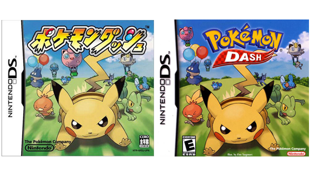
Nice sense of speed and forward momentum achieved with the blur effect on the ground. Its easy to imagine the picture in motion. The oddly smug and/or evil expression of Pikachu is softened with the priceless look of eyes-squeezed-shut determination on Torchics face. The Jigglypuff hot air balloon is possibly the best thing to appear on any of the Pokmon box art so far.
Pokmon XD: Gale of Darkness | 2005
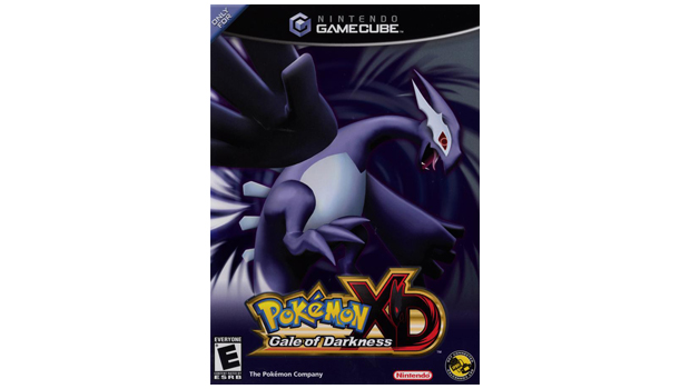
Remember when games went all dark and moody? Yes. This was then, which might explain why its the darkest and moodiest Pokmon box art of the whole lot. Another explanation might be because the game is called Gale of Darkness, a title which evokes images something exactly like the box art. Also, the games title in Japan is Pokmon XD: Whirlwind of Darkness, Dark Lugia, so the art is actually a very literal visual translation of that. Glad we cleared that up.
Pokmon Trozei! | 2005
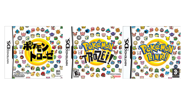
Circularity is a theme here, and the Pokmon Link! cover (which is what the game is called in non-English European versions) does it best. The arrangement of the rounded disembodied pokmon heads is a more effective continuation and spreading out of the shape defined by the central target, thanks entirely to the Link! part of the logo being contained within the target perimeter and consequently being non-interruptive of the outermost circumference. Besides, its hard to go drastically wrong with a pattern consisting of round disembodied pokmon heads.
Pokmon Mystery Dungeon: Blue Rescue Team and Red Rescue Team | 2005
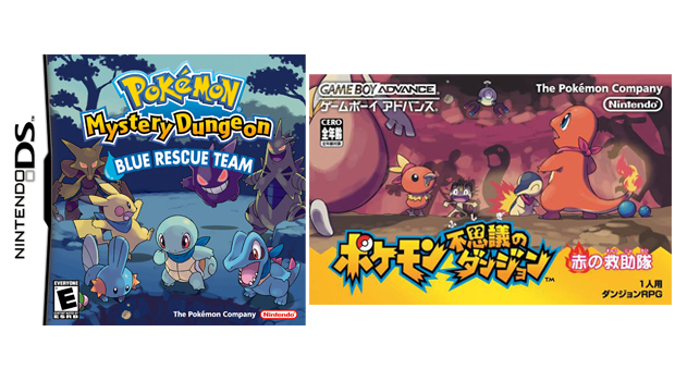
The first of the Mystery Dungeon games introduces us to its own playful box art style which--unlike the game--is hard not to love. Again, the Japanese Game Boy Advance version benefits from the bigger canvas, but its also a more interesting image, which is slightly sinister (looming shadows) and slightly funny (Meowths face) all at the same time. The Blue version carries the same themes, but the sinister/funny aspects arent executed as effectively. Also, neckerchiefs.
Weekly digests, tales from the communities you love, and more
Pokmon Ranger | 2006
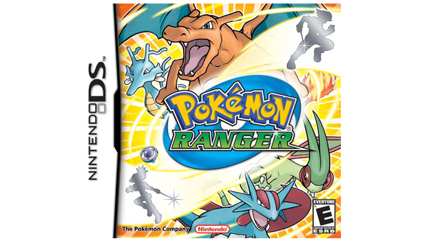
Desperately bright and busy but lacking a cohesive togetherness. Also, the pokmon art falls a fair way short of Sugimoris standards, with Charizard, Flygon and Salamence all looking a bit goofy. But never mind, this Pokmon cover is notable for being the first to feature a female human character. Its just a silhouette, but its a start. Progress and all that.
Pokmon Diamond and Pearl | 2006
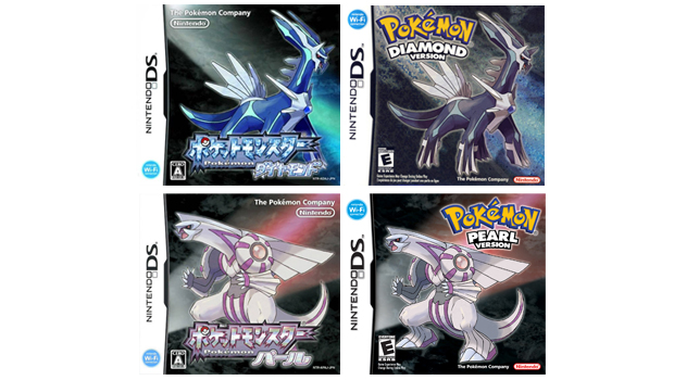
Dialga (Diamond) and Palkia (Pearl) are the box art faces of the fourth--and arguably least popular--generation of pokmon. The Sugimori designed creatures here are more concerned with shape and form, as opposed to any engaging expression of personality or character. And Palkia isnt even a particularly pleasing shape to look at.
Pokmon Battle Revolution | 2006
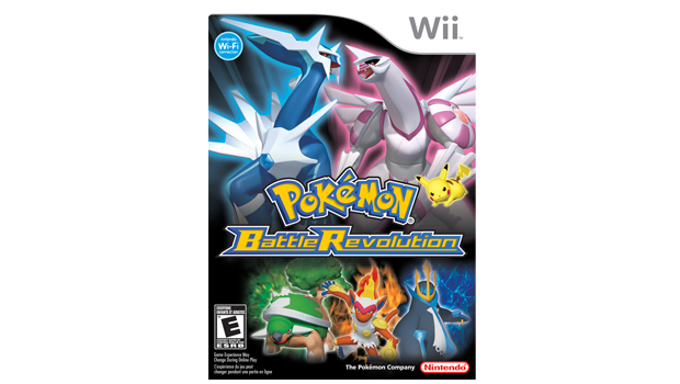
The severely wiener-necked Dialga and Palkia look particularly smooth and shiny and--as this is the first Pokmon title for the Wii--appropriately in-keeping with Nintendos clean and clinical Wii design philosophy. A particularly grumpy-looking Pikachu is joined by Diamond and Pearls starting pokmon in their final evolutionary forms (Torterra, Infernape, Empoleon), but its a hotchpotch of elements with no real cohesion between them all.
Notice how fontographically similar the R in Revolution is to the one used in the Pokmon Ranger logo.
Pokmon Mystery Dungeon: Explorers of Time and Explorers of Darkness | 2007
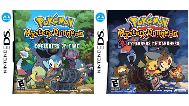
Continuing the discovery/danger theme of the first Mystery Dungeon release, these are happy-looking, colourful, delightfully stylised box arts starring an appealing group of pokmon. Its a bit of a shame Arbok and Gabite are obscured by the respective logos, but its not enough to spoil the overall image. Also, Piplup is wearing a bow tie.
GamesRadar+ was first founded in 1999, and since then has been dedicated to delivering video game-related news, reviews, previews, features, and more. Since late 2014, the website has been the online home of Total Film, SFX, Edge, and PLAY magazines, with comics site Newsarama joining the fold in 2020. Our aim as the global GamesRadar Staff team is to take you closer to the games, movies, TV shows, and comics that you love. We want to upgrade your downtime, and help you make the most of your time, money, and skills. We always aim to entertain, inform, and inspire through our mix of content - which includes news, reviews, features, tips, buying guides, and videos.
