A complete history of Pokemon box art
We peruse the covers of the Pokémon series
Pokmon Ranger: Shadows of Almia | 2008
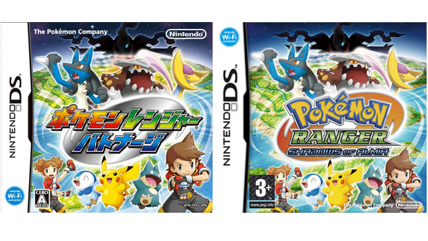
Finally, an actual, non-silhouetted female trainer makes it on to a Pokmon box art. And a lovely box art it is too. A busy but balanced composition, theres plenty to catch the eye, like the insanely happy trio of Piplup, Pikachu and Munchlax at the bottom there. They so happy.
The original Japanese cover features a steely swirl behind the logo, but this is changed to red for the US/UK versions. Its a fairly inconspicuous cosmetic change, but the Pok Ball red feels a more natural fit.
Pokmon Platinum | 2008
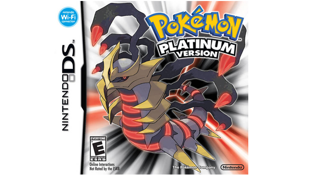
Given the inherently creepy-crawly nature of Giratina (which makes its in-game Origin Forme debut in Pokmon Platinum) its surprising this cover isnt instinctively repellent to look at. But the tricky colour combination is well-balanced and the one-point perspective lends an effective sense of depth which ensures Giratina stands out against the background.
Pokmon Mystery Dungeon: Explorers of Sky | 2009
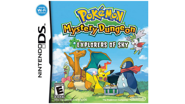
Not as striking or as charming or as mischievous as the previous Mystery Dungeon covers. We appreciate its called Explorers of Sky, but theres probably a bit too much sky happening here. But its hard to be too down on blue sky. Its blue sky. Nobody hates blue sky. It represents so much about life that is good. Also, Charizard has a bag. We never had Charizard pegged as much of an accessorizer. But there you go. Under a blue sky life is full of surprises.
Pokmon HeartGold and SoulSilver | 2009
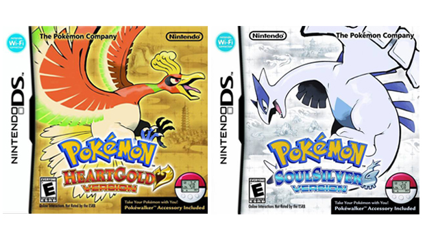
Their first appearance on a cover together since Pokmon Stadium 2, Ho-Oh and Lugia appear to be battling each other when the boxes are placed side-by-side like this. Its nice to see Sugimori return to the more traditional pokmon designs theres more energy and personality about them. This is also the first time a more stylised approach to the Version typography is applied.
As opposed to the regular plastic slim-line DS game cases, the HeartGold and SoulSilver boxes were made of cardboard and deep enough to accommodate the bundled in Pokwalker pedometer.
PokPark Wii: Pikachus Adventure | 2009
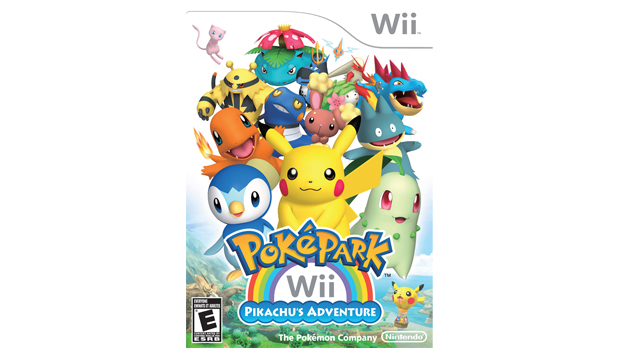
This is a cover of two halves. The bottom 50% is thoughtfully composed the logos nice and colourful, theres an aesthetic compatibility between Piplup, Pikachu and Chikorita, and the hazy landscape with the Pikachu hot air balloon drifting above it is tantalisingly picturesque. But the uppermost 50% is a chaotic, random mess that spoils the fine work of the bottom 50%. Damn that uppermost 50%.
Sign up to the GamesRadar+ Newsletter
Weekly digests, tales from the communities you love, and more
Despite appearing on half of all the box arts in the Pokmon series so far, this is only the third time the word Pikachu has been a part of the title.
Pokmon Ranger: Guardian Signs | 2010
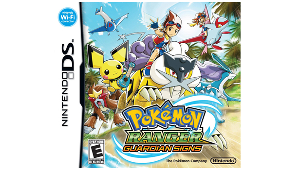
Easily the best Ranger spin-off box art yet. Its bright and full of energy and Pichu has a ukulele. Theres also a welcome return for the sparkle on the Ranger logo, which was mysteriously missing from the previous games cover. A sparkling logo is crucial for a game like this. Its a basic rule of design.
Pokmon Black and White | 2010
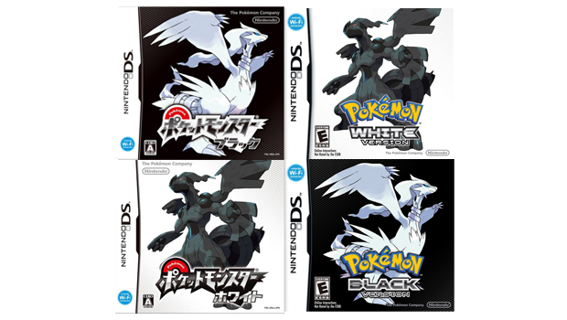
As well as being a cultural signifier representing extreme spectrum opposites--good/bad, life/death, light/heavy, day/night--both white and black represent an absence of colour rather than colour itself. That stark, polarising achromatic contrast is put to good use on this box art to striking effect.
The new fifth generation pokmon Reshiram (Black Version) and Zekrom (White) break with series tradition by being the exact polar opposites to the colour version they represent i.e. Reshiram is white yet represents Black and Zekrom is black yet represents white.
The Version logo follows HeartGold/SoulSilvers lead with a stylised font, but its also the first time the typography hasnt followed the curvature of the Pokmon logo.
Learn with Pokmon Typing Adventure | 2011
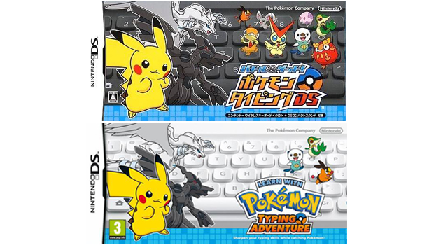
Only available in Japan and Europe, this is quite the curio. The black keyboard certainly provides a stronger background, but with all the eye-catching elements jostling for attention in the foreground, its possibly a little too discrete.
The European cover clearly wants the keyboard to be noticed, so the image has been zoomed out, the Pikachu Reshiram, and Zekrom on the left have been made smaller, and the number of pokmon on the right has been reduced to three.
It does work and the keyboard is a more dominant focus of the image. But does more keyboard and less Darumaka actually make for a better box art? We would say absolutely not.
Pokmon Rumble Blast | 2011
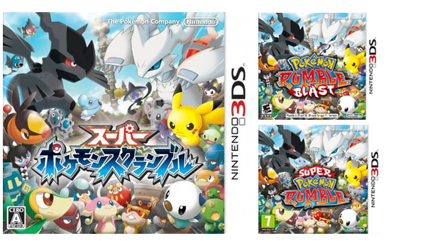
The first and (at the time of writing) only 3DS Pokmon game, this image beautifully conveys the Rumble aspect of the title, with the gathered, stern-faced pokmon looking as though theyre ready for it to kick off big time into an almighty cloud-dust brawl, although Darumaka and Audino look completely oblivious and deliriously happy at the bottom there. A lively box art bursting with colour and personality.
PokPark 2: Wonders Beyond | 2011
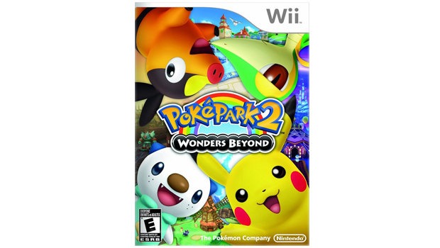
A much better effort than its predecessor, which was a mixed bag of two halves, this uses Pikachu and Black and White starters Tepig, Snivy, and Oshawott to divide the cover into quadrants. It lacks depth, but the pokmon are nice and big and happy, which is entirely consistent with the wonderfully cheery rainbow logo.
GamesRadar+ was first founded in 1999, and since then has been dedicated to delivering video game-related news, reviews, previews, features, and more. Since late 2014, the website has been the online home of Total Film, SFX, Edge, and PLAY magazines, with comics site Newsarama joining the fold in 2020. Our aim as the global GamesRadar Staff team is to take you closer to the games, movies, TV shows, and comics that you love. We want to upgrade your downtime, and help you make the most of your time, money, and skills. We always aim to entertain, inform, and inspire through our mix of content - which includes news, reviews, features, tips, buying guides, and videos.
