Interview: Neil Roberts
None
SFX talks to the Warhammer wizard and bookjacket illustrator about sci-fi art
SFX What's the secret of a great SF or fantasy book cover?
Neil Roberts Great art.
For me, the secret is in making an image that sells the book as well as being a piece of art in itself. You look at those classic artists, Frank Frazetta, John C Berkey, Josh Kirby, Chris Achilleos - all their work looks as good without the titles as they do with. Now, I’m most certainly not placing myself amongst those artists yet, but if that’s what the greats did, why not aim high and emulate the best?
Visually, I’m a real action fan from Flash Gordon , Dan Dare , Aliens to Gladiator and Indiana Jones . The kind of books I read, music I listen to and films I watch are all action packed. Other people can do contemplative and restrained better than me, but personally, “more is always more”. I think it’s important to stress that a good cover is good regardless of whether it’s an oil, watercolour or digital piece.
A friend of mine (on the retail side) once told me that you should “never judge a book by its cover, but you can certainly sell one with a good one”. I think that’ll always be the case, even with digital books.
Sign up to the SFX Newsletter
Get sneak previews, exclusive competitions and details of special events each month!
SFX Do you have to read a book and go through it with a fine-tooth comb before you begin work, or do you work up an image from the barest brief?
NR In the case of the Horus Heresy books, I’m given a brief from The Black Library, some reference notes and a deadline. And that’s it.
From there I produce three thumbnails for approval, Black Library choose their favourite and I go ahead and produce the final artwork.
Over the years, Black Library and I have built up a good working relationship, they know what I can produce in the time we have and I (usually) know what they want. One of the major points I have to keep in check is that the Warhammer universe is owned by Games Workshop and therefore has certain restrictions on how far I can go when “making stuff up”.
That’s a major part of IP based work, that you have to be aware of the clients’ license. Also, audiences can spot anything fudged from a mile off, just look at the more peripheral Star Wars or Aliens stuff, it always looks unconvincing.
I’m always conscious that I have to respect the property, but that needs to be balanced with the desire to be imaginative and artistic. It’s seems blindingly obvious, but that balance needs to be constantly maintained, if only to keep the client happy.
Remember, the Client is King.
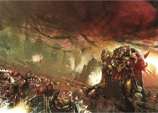
SFX How much input does the author get into what's on the cover? Do you get to meet them?
NR The author has as much input as they feel necessary, in some cases they have definite ideas as to what they want, in others they do the words and I do the pictures. I’ve always assumed the brief I’m sent is the author’s synopsis, so they have a say almost immediately. Sometimes at the end, the author might want a helmet changed here, or a banner changed there. But usually things go off fine.
I remember one case where I’d produced the artwork to the brief and once I’d submitted it, the author realised the scene on the cover never actually appeared in the book – so a dream sequence was added to tie it all together. Those sorts of moments are nice when the cover informs the story, as opposed to the other way round. It was a nice example of how flexible the process can be.
Those of us who work for Black Library often get to meet each other at the Black Library Live! And Games Day events a couple of times a year. We get to chat, hang out, talk about how projects are going – it’s a really pleasant (and unique) opportunity for the creators to get together and, in some cases, plan the future of certain series. For better or worse, with the likes of Twitter and Facebook, we’re all connected virtually as well, so there’s always that element of being in constant contact and sharing thoughts, ideas and personal jibes!
SFX What appeals to you particularly about the visuals of the Warhammer and WH40K universes?
NR Grit.
The Warhammer 40,000 universe has the grittiest of any sci-fi setting. It can be grim, gritty and downright disturbing, and that’s at best.
The first Warhammer image I ever saw was the John Sibbick cover to the Warhammer 40,000: Rogue Trader rulebook. I saw it in Beatties Toy Shop in Milton Keynes when I was staying at my Grandparents. I remember obsessing over the art, reading it from cover to cover and back again. It felt familiar, comfortable, bleak and scary. It still gives me goosebumps if I Iook at it today. It’s one of the most truly stunning pieces of SF art.
The mud. The blood. The drifting smoke. The shadowy enemy. The futile heroism.
It was like a still from the best film I’ve never seen.
The Warhammer universe has evolved much over the years. It’s like a wonderfully deep and strange sand pit that authors, artists and gamers can play in. It has the used universe of Star Wars , the fantasy of Lord Of The Rings and the battlegrounds straight from Platoon . What’s not to like?
SFX How many iterations might a cover go through before you consider it finished?
NR We usually get the cover design nailed at the thumbnail stage. Any variations from that are usually minimal, like adding a few aircraft to fill dead space or an explosion to link visual elements.
Basically the approved thumbnail is my bible for the duration of the piece. If I feel I’m deviating from the original idea, I can go back to the sketch and keep myself on target. It’s saved my sanity many times when I’ve gone too far down the wrong path.
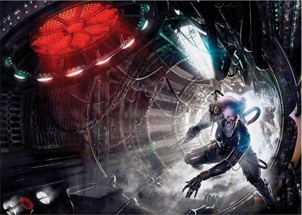
SFX Working to a style guide (the specifics of the Warhammer universe, character uniforms and so on) must be quite tough sometimes - do you and the artists feel constrained by the dictates of Games Workshop? How much flexibility do you have?
NR For me, the main appeal is the actually open nature of the universe. Of course there are certain restrictions – the look of Space Marines, design of spacecraft. But beyond all that lie entire galaxies of possibilities, where all types of humanity, planets and colours exist. In some respects, the danger is getting lost in the universe. Personally, I feel those Warhammer icons anchor the artwork, as if all the hard stuff in designing this fantastical has been done for you. And anyway, Space Marines, Eldar, Tyranids and the Imperial Guard are so cool; I defy anyone to get bored drawing them.
There is always that fine balance to draw something cool and making sure you don’t stray too far from existing IP – from big things like tanks down to grenades and swords. In many ways it’s a lot easier than making stuff up – because all the toys are ready for you to play with, I just have to make them look good – which suits me.
SFX Considering they very often become bestsellers, how much do you think the Warhammer and WH40K books get the credit they deserve from the reading public?
NR Well, the best credit we can get is people buying, reading and enjoying the books. Enough people are doing so now, that we made it onto the New York Times Bestseller list with Graham McNeills’ recent A Thousand Son ” which was almost unthinkable when we started working on the books. So the more people read them the better. Plus, it’ll keep me in good work.
What I’ve always liked about WH40K is the almost underground nature of it, it’s like a movement that millions of people are into, yet no one talks about it. So if it wants to stay an underground multi-million making hobby, then more power to it! That’s what I’ve always enjoyed about the hobby – even now I meet other parents who, when I say what I draw, remember that they too used to collect and play the games.
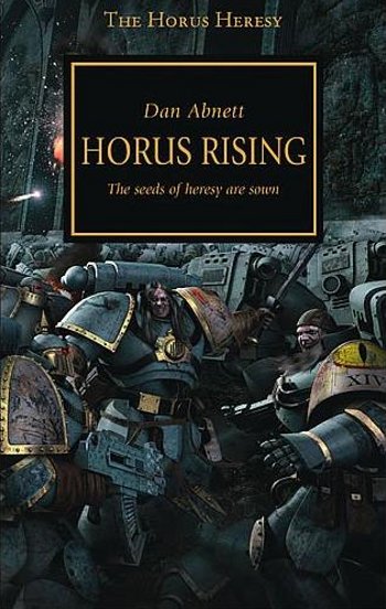
SFX Do you have a favourite cover that you've done? What makes it special?
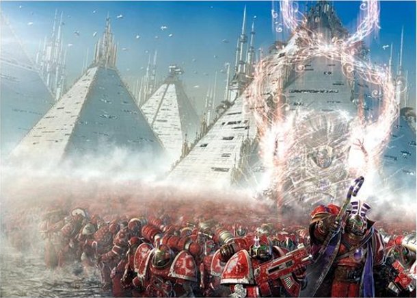
NR My favourite cover is the first Heresy cover Horus Rising.
To infer a more secular, pre-Chaos universe I didn’t use any crazy sci-fi colour palettes and kept everything as realistic as possible. It had to look hyper-realistic – again, like a scene from a film. I tried to keep the armour recognisably Warhammer. Although based on 30K reference, the suits of armour you see on these covers will be the same basic chassis of their 40K future selves. I was trying to add layer upon layer of meaning, yet still make it a cool, action packed illustration.
That was my third cover for Black Library and I was aiming for a LotR prequel/ John Sibbick feeling. I listened to a lot of Hans Zimmer and Muse to get me in the mood. By the end of it, I could almost hear the clanking of metal plates and battle cries. I really gave that image everything. That image, personally speaking, was a deal breaker – I wanted to produce a piece that would be as definitive as possible to the Heresy era. If I could do that, I could do anything.
A lot of people have said to me that they have been really inspired by that image, which is everything I’d hoped for. If I can inspire at least one person, as I was inspired by the John Sibbick piece, then I’ve achieved a lifelong dream.
SFX What advice would you give to any new illustrators starting out and wanting to make a break into the worlds of comic or sci-fi art?
NR Be good, be fast and be on time.
Being freelance is all about relationships with your editor, agents, writers and publishers – sticking to those three initial points should get you work… and regular work at that! Be passionate and knowledgeable about your chosen area of expertise. Don’t exist in a vacuum – not literally of course, that’d kill you – but be aware of all types of art, design, writers, music and films. Inspiration can (and will) come from anywhere.
Be a good artist – and be honest with yourself about it. If you think you can do better, then do better. To be successful you have to be a good draughtsman with good anatomy, composition and painting skills. An expensive brush or 3D computer program will not make you better. Always strive to be the best artist you can be.
Enjoy it, as you don’t have enough time to suffer for your art as a freelancer, make the most of those deadlines – at the end of it, you’ll have some awesome pieces for your portfolio.
And they might secure you more work as well. So it’s a win/win situation!
Ultimately, as a commercial artist – we’re paid to sell a product using our imagery. It may sound a bit mercenary by reducing it to that, but as an artist producing these works, it feels like anything but a job. I’ve always wanted to spend all day drawing robots, space princesses and explosions. And now I get to do just that!

I'm the Deputy Editor at Total Film magazine, overseeing the features section of every issue where you can read exclusive, in-depth interviews and see first-look images from the biggest films. I was previously the News Editor at sci-fi, fantasy and horror movie bible SFX. You'll find my name on news, reviews, and features covering every type of movie, from the latest French arthouse release to the biggest Hollywood blockbuster. My work has also featured in Official PlayStation Magazine and Edge.
