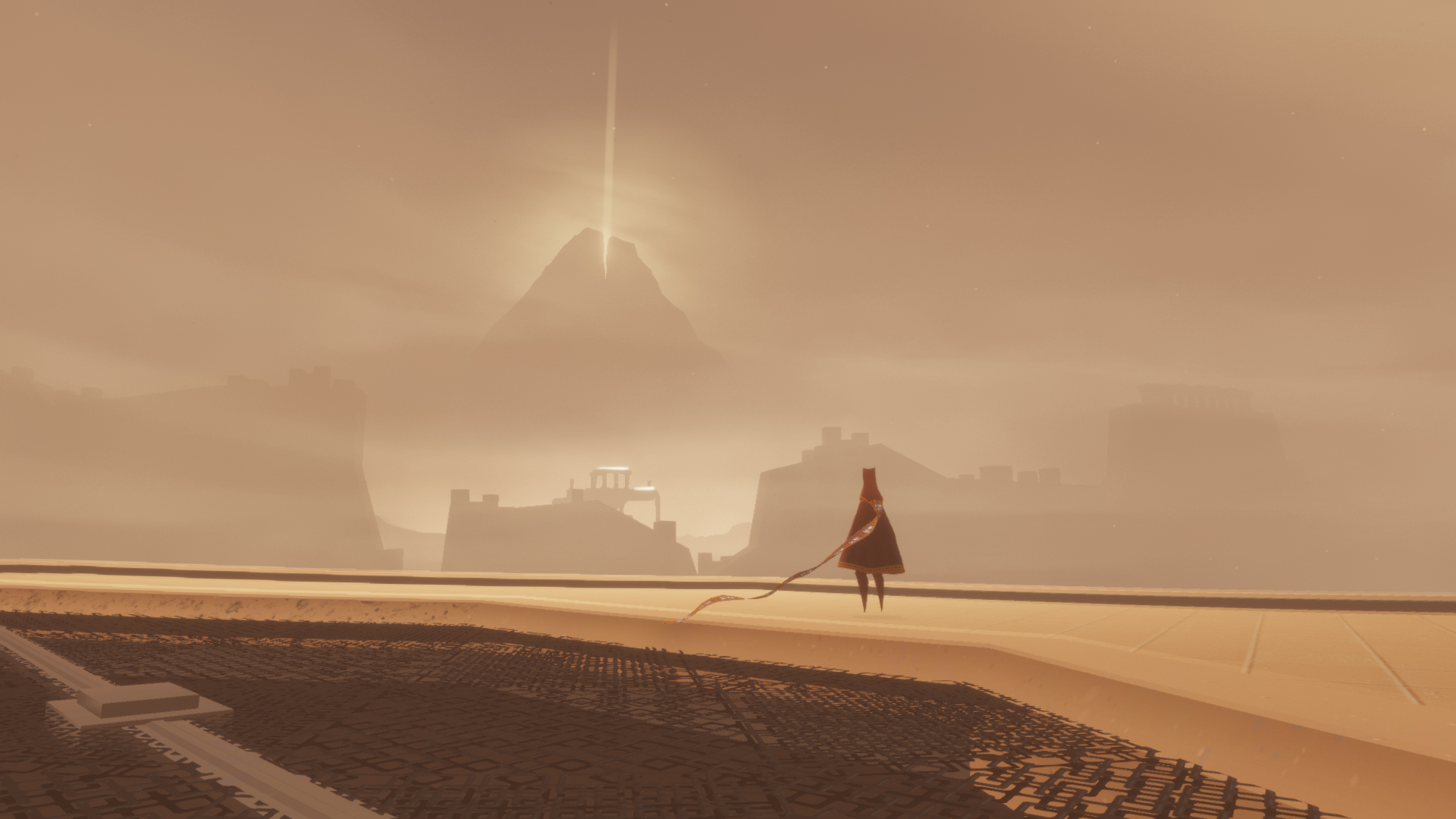
Journey developer reveals how the iconic cape was created in 10th anniversary thread
To celebrate ten years of Journey, its art director is taking fans behind the scenes

Journey art director Matt Nava shared a series of concept art and other tidbits from throughout the game's history, just in time for the game's 10th anniversary.
Nava posted a lengthy Twitter thread jam-packed with commentary and imagery comparing "early dev images" and "how things shipped." Interestingly enough, Nava shared a few different iterations of the playable character clad in the iconic cape we know and love today, demonstrating how it came to life.
"Every character here was playable at one point in an early version of the game," Nava wrote. "I went from humanoid to very detailed, and back to minimal as possible. Each iteration was an important step in finding the final design."
Every character here was playable at one point in an early version of the game. I went from humanoid to very detailed, and back to as minimal as possible. Each iteration was an important step in finding the final design. #Journey pic.twitter.com/i8D8m2jL7UMarch 13, 2022
After working to get the character's cape just right, Nava noted how he saved brighter blue skies for the end of the game as a "reward", instead using a green sky in an earlier scene to temper that excitement.
Here's the desert scene vs a painting and 3D prototype I made. I wanted to save bright blue skies for the ending of the game as a reward, so I put a green sky in this earlier scene. #Journey pic.twitter.com/MO9CkMrSzvMarch 13, 2022
Additionally, Nava revealed how the surfing level looked behind the scenes in the game's editor. He called it one of the "most complex levels to build," which seems quite obvious based onthe intricacies in the image shared from the editor.
Here is how the surfing level looked in our editor. This was one of the most complex levels to build. I spent so much time tweaking the angle, position, and shape of every ramp and gully. #Journey pic.twitter.com/ydreHsr4voMarch 13, 2022
Nava also revealed Journey's "scary" underground area with a look at the original 3D mockup and concept he created for it. Journey almost snagged a Teen rating because some reviewers believed it contained blood effects, which was not the case (it was meant to be cloth), but the team altered the particle colors to be less red to go for an E rating.
The scary underground area vs the 3D mockup and concept I made for it. This scene almost got the game a Teen rating because reviewers thought there were blood effects. We changed the color of some particles to be less red to get an E rating. It was supposed to be cloth! #Journey pic.twitter.com/Ni9g9s1rgfMarch 13, 2022
Finally, Nava discussed the final moment of the game versus a concept he created years prior.
Sign up to the GamesRadar+ Newsletter
Weekly digests, tales from the communities you love, and more
"At the time, I didn't know what the ending would really be," he wrote. "I remember the moment at the end when we got the timing just right for this. It made the game!"
Final moment of the game vs a concept I created during one of the very first days of dev, years before. At the time, I didn't know what the ending would really be. I remember the moment right at the end when we got the timing just right for this. It made the game! #Journey pic.twitter.com/bj5HsGbst5March 13, 2022
Nava's thread is full of additional insights into how Journey came to be. It remains a massively popular adventure game for players of all stripes, and this tenth anniversary input makes it feel all the more magical.
Be sure to check out our full Journey review if you still haven't given it a whirl.


