GamesRadar+ Verdict
The Loupedeck Live S is a helpful little desktop sidekick for creatives and streamers, with bright touchscreen inputs and plenty of flexibility in its combination of buttons and dials. While the software takes some practice, there's a solid range of native integrations to see you through a range of workflows.
Pros
- +
Bright, crisp touchscreens
- +
Mixture of dials and buttons offers great flexibility
- +
Strong native integrations including the Adobe Suite
- +
Small form factor
Cons
- -
Underwhelming stand
- -
Touchscreen buttons won’t suit everyone
- -
Software takes some getting used to
Why you can trust GamesRadar+
Macro pad challenger brand Loupedeck are back with a new addition to their range. Two years on from the launch of the Loupedeck Live, the Finnish brand has shrunk things down to introduce the Loupedeck Live S.
Born on the back of a £150,000 crowdfunding campaign, the S variant of Loupedeck’s macro pad retains all of the potential of the original Live in a new, slimmed down package. The smaller unit comes with a smaller price tag too, but does this $189/£179 pad size up to the competition and how does it stack up in a streaming for gamers setup?
| Programmable buttons | 19 |
| Dials | 2 |
| Connection | USB-C to USB-A |
| Dimensions | 150 × 85,5 × 30 mm |
| Weight | 168g |
Design
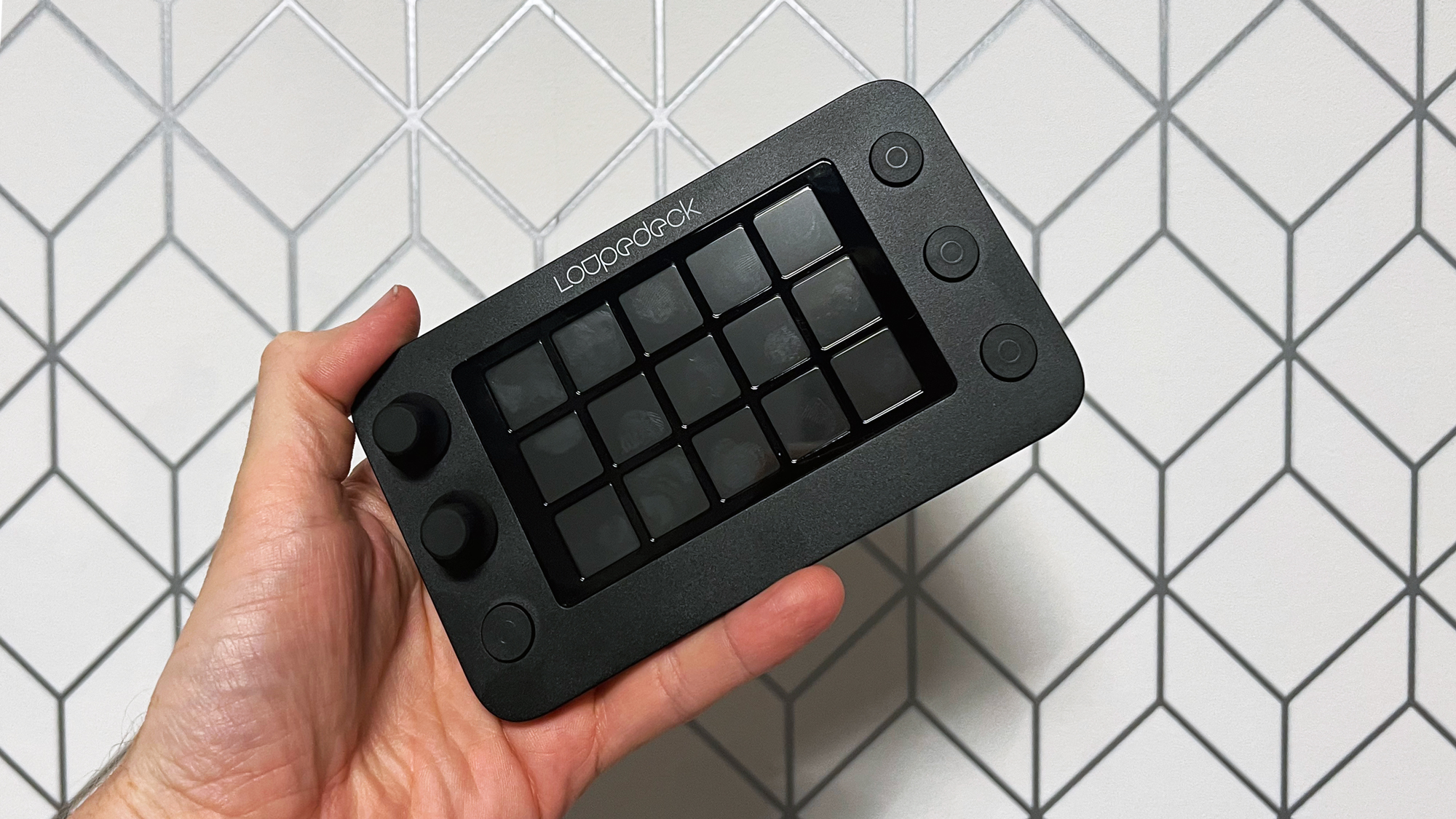
There’s a familiar feeling to the Loupedeck Live S, particularly for anyone who spent time with the original. Despite the new form factor, a lot of the original elements of the Live remain and you’d be forgiven for mistaking the two at a quick glance. The Live S retains the same width and thickness of its predecessor but loses just over a centimetre top to bottom. It’s not a huge amount on paper, but it makes a surprising difference in reality and the whole unit feels notably smaller on your desk. Across the board metal has been replaced by plastic which is a shame, but probably a fair tradeoff for the new lower price.
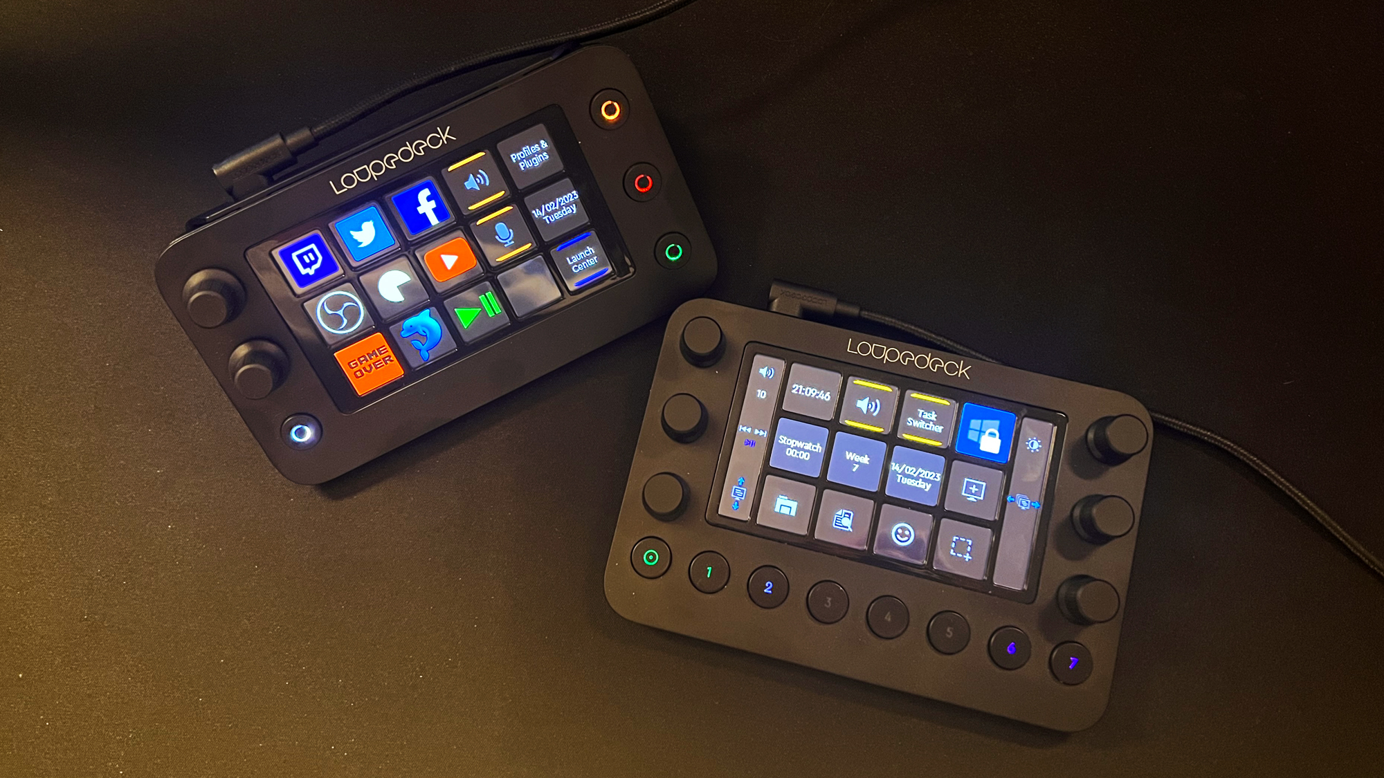
A majority of the input options have carried over too. The round physical buttons are the same size as before, but we’re down to half the amount and the backlit numbers have been replaced with circles. Each button features a pleasantly tactile click and a new grippier texture on top.
The small improvements carry over to the dials too but here the change is far more impactful. Like with the faceplate, the metal is gone in favour of a rubberised finish and it makes a world of difference for the better. Where with the original Loupedeck Live your fingers could slip across the smooth metal surface of a dial without spinning it, the new finish on the Loupedeck Live S means everything sticks confidently even with a minimum of pressure. There’s just two dials this time around but honestly I didn’t miss the other four. Even if I had six simultaneous uses for the dials, Loupedeck’s software makes it easy enough to change dial actions on the fly.
While the total size of the touchscreen grid has remained virtually the same, the Loupedeck Live S introduces a refreshed layout. The grid is now 15 buttons, up from 12, and comes at the expense of the two side strips that worked in tandem with the dials. Thankfully Loupedeck have a clever solution on the software side, any movement on the dial temporarily takes over the adjacent square to show you what you’re changing or you can sacrifice these squares to display the data permanently. Well played, Loupedeck.
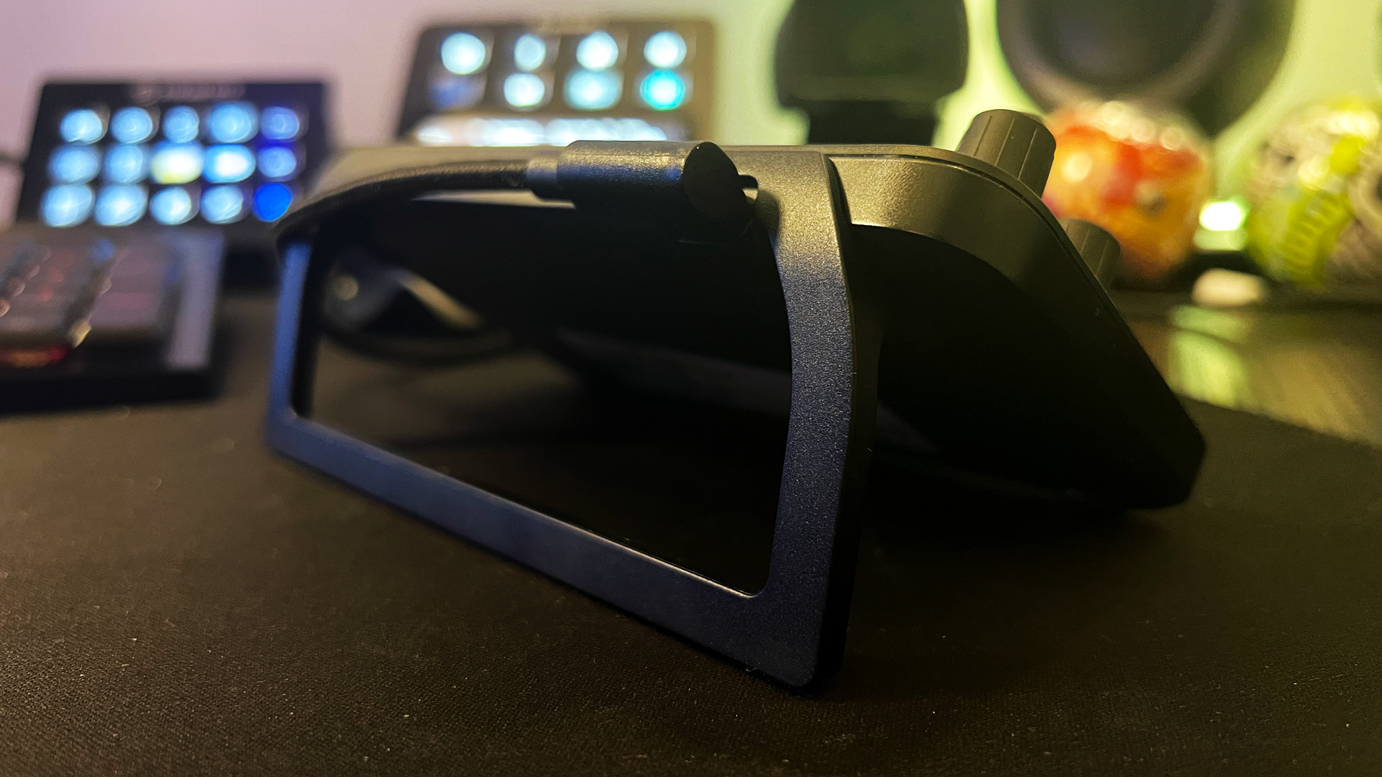
The detachable stand is a little flimsy for my liking but it’s an improvement from the one included with the Live. Yes it does the job, but it doesn’t match the quality of the rest of the offering and I lived in constant fear of snapping it when clipping or unclipping it. The included USB-C cable has grown to 2m rather than the paltry 1m offering of the Live. It’s still a quality braided cable and the included USB-C to USB-A adapter is a nice touch.
Features and Performance
The Loupedeck Live S is more of an evolution than a revolution and the hands-on experience reflects that. As someone who’s used an Elgato Stream Deck consistently for the past six years and spent plenty of time with the Loupedeck Live, I find using a macro pad like this to be pretty second nature. That said however, the Loupedeck offers some unique considerations when it comes to building it into a workflow.
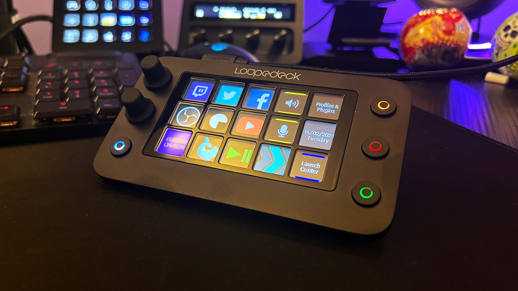
The grid of the Live S retains the crisp, bright touchscreens of the original Loupedeck Live and I was impressed at how vibrant the colours were when I applied a few icon packs from the marketplace. The haptic feedback has been refined and is a far more pleasant buzz than before and the duration can now be configured which I appreciated as well. However it’s still just not that easy to notice the vibration unless you actively hold your finger on the button. This is the downside of a touchscreen over a physical button and while I don’t have a better solution (sorry Loupedeck R&D Team), the haptics end up being more of an audio cue. It’s a subtle cue at that so I did tend to second guess if I’d triggered what I intended.
Loupedeck’s software offers plenty of choice when it comes to setting up and customising your Live S with a growing marketplace of plugins and integrations. It’s not as refined or easy to use as Elgato’s software, but it gets the job done without too much fuss. The interface can be a little daunting at first but the Loupedeck comes with some pre-installed profiles with more presets available in the marketplace so you’ve always got a starting point to work from.
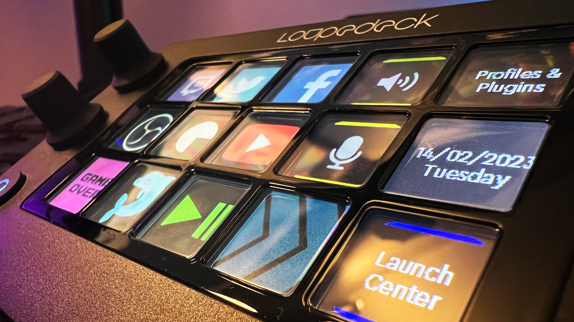
Native Adobe Creative Suite apps are still the highlight here and coupled with a dynamic mode that switches the active set of actions based on whichever app you’re in, the Loupedeck Live S becomes a seamless extension of your mouse and keyboard, great for those who struggle with remembering Photoshops million and one shortcuts. I did notice there’s now paid marketplace content alongside free items, something you don’t find with the Elgato store which is all inclusive. It’ll be interesting to see what plugins remain free to access and what gets paywalled, as that could be a slippery slope for the ecosystem as a whole.
Through my testing I found the Loupedeck Live S more helpful as an offline productivity tool than as a live stream sidekick. The touchscreen grid just doesn’t lend itself as well to quickly jumping for a clip or mute button in the same way a physical button like you find on a Stream Deck does. It’s too easy to accidentally miss the target and fire off the wrong action. That said, for slower paced livestreamers looking for simple scene switching the Loupedeck Live S will do a great job, it’s all a matter of personal taste.
Should you buy the Loupedeck Live S?
The Loupedeck Live S builds on the solid foundation laid down by the original Loupedeck Live and has been refined into a helpful little desk companion. Build quality is still strong and incremental improvements in other areas like the haptic feedback show the brand is continuing to head in the right direction.
At $189/£179 it’s a smaller, cheaper option than the Elgato Stream Deck+ and has plenty to offer creatives, coders and streamers alike.
How we tested the Loupedeck Live S
I swapped out my Elgato Stream Deck and tried to replicate my normal workflows using the Loupedeck Live S instead. This included controlling my Twitch stream through OBS as well as some offline tasks like quality of life controls in Windows and shortcuts in Photoshop and Premiere Pro.
We're also rounding up all the best webcams and the best microphones for streaming as well. For more streaming gadgets, check out the best ring lights and the best green screens for that professional finish.
Alex is a streamer who has been creating gaming content for over a decade, streaming on Twitch regularly across the last five years. With a degree in film and a background in sports media, you'll find him jumping between 60,000 seat stadiums and his Animal Crossing island (where he's growing pears, in case you were wondering).
