Marvel vs Capcom 3's art style: Disappointing?
The game's clearly awesome, but something doesn't quite sit right
The characters seem too hardened. There's no softness to Amaterasu, who has always been apowerful yet gentle character. The vacant look in the eyes, the snarling mouth... it's just too cold.
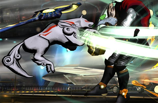
Above: If Kratos were a dog, he'd look like this. Ammy, where are you?
Likewise with characters like Felicia. We know her as the cute, playful little minx from the Darkstalkers series.Now she's got realistic thigh proportions, she just looks... well, like a cosplay girl who realises she's bared just a bit too much flesh but is trying not to let on:
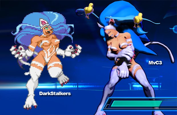
Above: Felicia now looks cold, naked and not at all like the bundle of fun we're used to seeing in her 2D games
Then there's the muscular style of all the characters. Flat blocks of colour seem to make up pectoral muscles, brows seem unnecessarily furrowed... it's almost like it's 2004 again and everyone's been given an angsty new persona. There's so much darkness and shadow. Granted, the detail level is absolutely phenomenal, but the overall effect while things are moving is of dark and anger, not the bold, colourful explosion Marvel vs Capcom 2 always was. Look at this for colour:
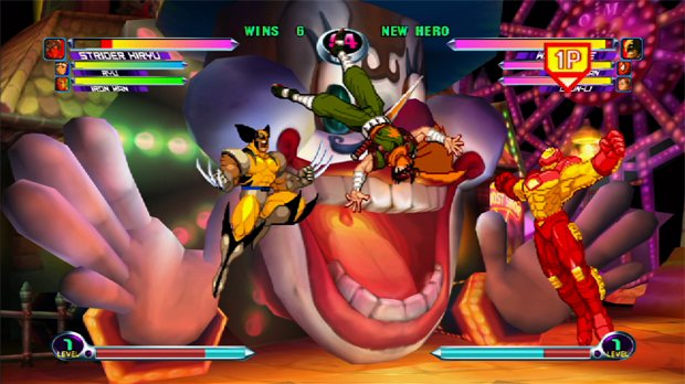
Above: That's more like it - Marvel vs Capcom 2 in all its glory
And compare it to the duller style of the new game:
Sign up to the GamesRadar+ Newsletter
Weekly digests, tales from the communities you love, and more
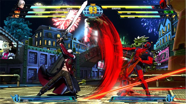
Above: Despite the fireworks (literally), MvC3 looks starkcompared to the gorgeous colour blends of MvC2
The bottom line is that, impressive though it is, it's notas gloriously ebullient as MvC2. And when MvC2 still looks flippin' spectacular 10 years on, it seems a bit odd that so little of its DNAhas beenretained.
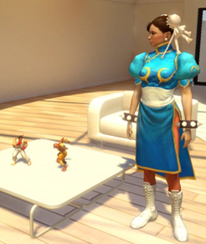
Above: Clearly the new Chun Li looks incredible - that's not in dispute. But she's nothing like her old self
All of this is purely cosmetic, of course. And if you'restudying the graphics while you play, you're playing it wrong.If the gamecaptures the chaotic feel of its predecessor but maintain's SFIV's glorious current-gen gloss, it will be one of the greatest games ever made. But that nagging feeling remains that, after all this time waiting for a third entry in the MvC series, Capcom's art team could have been a little more faithful to it.
Do you agree? Or do you think the game actually has a better style now? Let us know in the comments.
30Jul, 2010
Justin was a GamesRadar staffer for 10 years but is now a freelancer, musician and videographer. He's big on retro, Sega and racing games (especially retro Sega racing games) and currently also writes for Play Magazine, Traxion.gg, PC Gamer and TopTenReviews, as well as running his own YouTube channel. Having learned to love all platforms equally after Sega left the hardware industry (sniff), his favourite games include Christmas NiGHTS into Dreams, Zelda BotW, Sea of Thieves, Sega Rally Championship and Treasure Island Dizzy.
