The most overused art styles in all of video games
You look familiar...
In video games, anything is possible. Anything can be created, anything can exist. When you're designing a game, you're dealing with the very building blocks of a virtual reality, so whatever you make can look, sound and function in any damn way your endless imagination likes. So why do so many games look exactly the same as other games?
I'm not talking about the sort of identikit, dusty, brown military shooters that everyone scoffs at before buying 80 million copies of each November. That's just a matter of genre and setting. No, I'm talking about games that actively ape distinctive styles of representation from other games, making both the original game and themselves immediately less unique in the process. Sometimes it's a handful of games faddishly lifting the look of a popular hit. Sometimes it turns into a whole movement. You'll find examples of both--and everything in between--over the next few pages, so click on and find 'em, why don't you?
The Limbo look
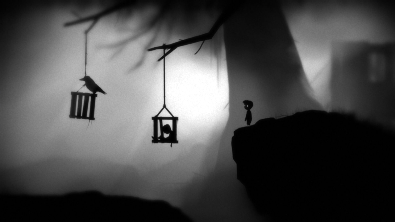
Remember when Limbo first came out? Remember how shocking, affecting, and straight damn powerful its aesthetic was? Playing through that game was like being hit with a rocket-powered dump truck full of nightmares and lullaby-singing ghosts. The haunting blend of greyscale abstraction and stark, black silhouettes gave Playdeads game a thick, disorienting, ambiance unlike that of any other game.
At first, anyway. But this year alone Ive played a few different, 2D puzzle-platformers that play with exactly the same artistic conceits. The Swapper is a rather damn good, space-based bleakathon, whose unique claymation visuals are nevertheless wrapped in exactly the same inky darkness and desaturated, diffused light--Hell, even the same sort of unsettling ambient soundtrack--that made Limbo such an artistic kick in the face. And then theres Monochroma, which Im going to explain by simply sending you to its site. And then theres OddPlanet. Oh good Lord, Oddplanet. Good Lord.
Mobile mundanity
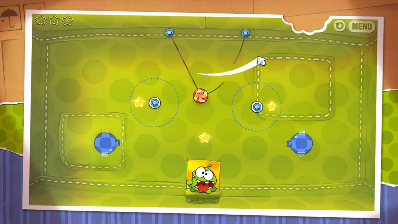
Youre going to have to make me a small allowance with this one. You see its really hard to pin down any exact defining traits of this art style. That said, you absolutely will know it when you see it. Typified by bright, colourful, but ultimately rather characterless cartoon creatures and bold, chunky environments, its become the de facto look for most successful mobile games over the last few years.
I cant help feeling that it must actually be pretty hard to create such a dearth of genuine personality when youre working in the realm of Technicolor fantasy wildlife. To evoke the 16-bit heyday of bright, breezy game art--without the restrictions of pixely sprite resolution--yet still make everything feel so samey and indistinct, must actually be quite the challenge. But Angry Birds, Cut the Rope, Puddle Puzzles, and their raft of clones and sequels all nail it remarkably. Hats off to you, chaps. In a way.
Cel shading
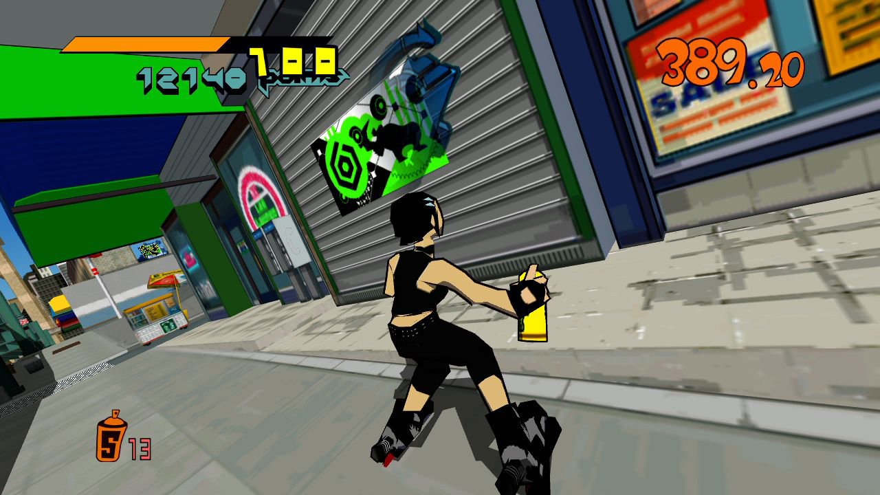
Mercifully far less prolific than it was throughout the 00s, cel shading has nevertheless left a monumental number of fake-2D, comic book-aping games in its wake. Sort-of first appearing in 1999 with Fear Effects not-quite-there approximation of cartoon cel art, and really kicking into gear with 2000s Jet Set Radio, cel shading dominated a decade of games, petering out at the dawn of the 2010s almost on the dot.
Sign up to the GamesRadar+ Newsletter
Weekly digests, tales from the communities you love, and more
Now I have nothing against cel shading. Im an absolute animation connoisseur, and anything that leverages the feel of my favourite films and TV shows in a different medium is always going to be a thing that excites me. But in hindsight, the cel-shading revolution feels a lot like a textbook case of Lets all do that, because we can now. Jet Set Radio proved the tech was feasible, and grit-hampered art designers the world over lost their shit and immediately started digging out copies of all the cartoons and comics that made them want to be an artist in the first place. A totally understandable reaction, of course. In fact an incredibly sweet one. But lets use the cartoon countenance a little more responsibly from now on, shall we?
The 16-bit indie uniform
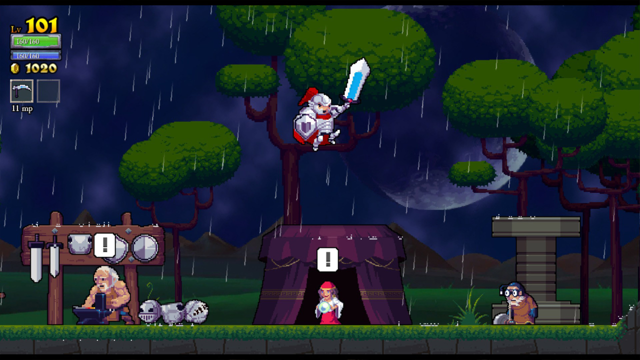
It seems weird that right up until at the start of the last generation I frequently bemoaned the loss of 8 and 16-bit style pixel art. In hindsight that now feels akin to complaining that there arent enough TV shows like The X-Factor, but at the time it was a legitimate gripe. Having grown up during the SNES days, few things in gaming have hurt me more than seeing the then-pinnacle of 2D visual craft replaced overnight with the lurching puke of low-res origami that was the early 32-bit days. But now? You cant take two steps in any direction without tripping over the chunky edges of an identikit pixelated hero.
Look, I get why pixel-art is such a big thing in indie. Its a quick, economical route to creating vibrant personality, that fits perfectly with the demands of the small-scale developer. And while I certainly dont fall into the misguided All indie games are the same! camp--those chunky graphics belie a multitude of innovative game designs--I cant help feeling that a lot of 2D games are losing identity through their use of the over-iterated art style. Still, were seeing a wave of high-fidelity, AAA-looking indie--Triple-I?--right now, so hopefully thatll help things move on.
The way that nearly every Epic game looks
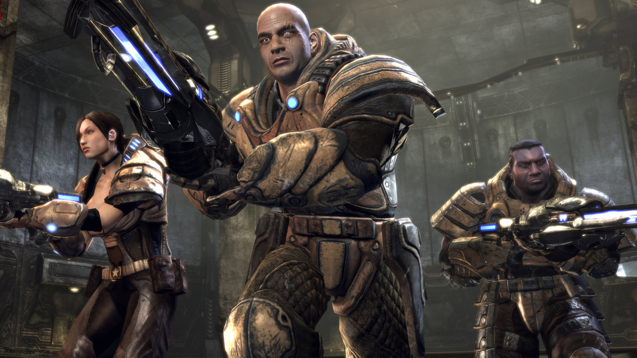
Interesting one, this, in that while its had an ambient splash-damage effect on gaming in general, the look has most fiercely gestated within the works of one singular company. In short, Epic has been ripping itself off for years.
Whatever the platform, whatever the franchise, you could pick one of their shooters out of a line-up blindfolded, using only your sense of smell to sniff out the unmistakable aroma of combat-ready American Football gear and sci-fi cathedrals. Unreal Tournament, Gears of War, even People Can Flys Bulletstorm. They all feel like theyre set in the same, biomechanics-tinged, gothic sci-fi world, with only variable levels of neon and daylight to distinguish them. Epics upcoming Fortnite breaks the mould nicely, but with a new Unreal Tournament on the way, youd better start doing those shoulder-presses in readiness for a fresh wave of collarbone-crushing armour on the horizon.
The HR Giger lawsuit-dodge
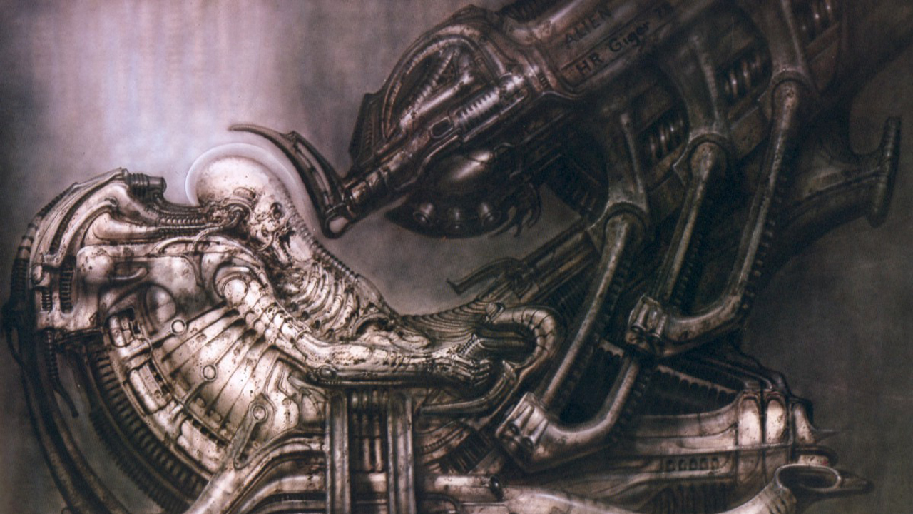
True, scientifically proven fact. Without HR Gigers signature dark, biomechanical, airbrushed art style, 87% of video games would structurally collapse. Without all of those Swiss surrealist inspired graphics to support the weight of their code and gameplay (thats how video games are put together), wed just have a giant pile of guns, ones and zeros lying around, cluttering up the place.
Everything from Half-Life, to Duke Nukem, to Gears of War, to Contra, to every other game with aliens in it ever, has rehashed Hans Ruedis craft. Rest in peace, you wily old genius. Without you, the art world would be a hell of a lot poorer, and games would be a lot more original. Maybe.
Minecraft. Just Minecraft
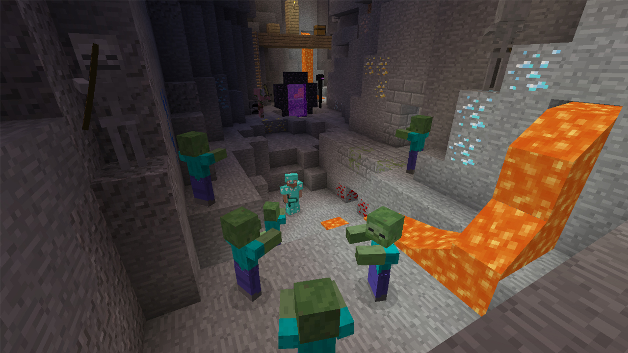
The other 13% of games that dont rip of HR Giger? Theyre Minecraft clones. Seriously, if youre not convinced that its the most ripped off game not primarily on iOS, look upon this monolithic Reddit list of knock-offs, and weep.
Even Harvest Moon is at it now. Still, newly Kickstarted game Planets3 does look rather lovely, is entirely open about its influences, and actually appears to be elevating the blockular, explore-and-craft conceit to very cool new levels. With motorbikes and SPACE!
Derive-iant art
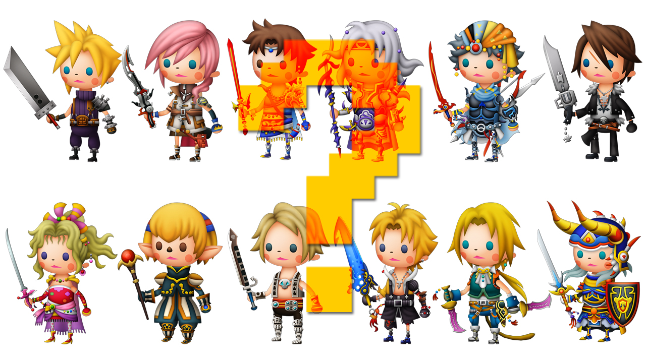
So there's my run-down of the current most overused types of moving screen-pictures. But how about you? Have I missed anything that is going to incite projectile vomiting if you see it one more time? If so, drop it into the comments. The art style, not the vomit. Depositing the latter will only ruin your monitor and make your room smell. Computers get hot.
And while you're here, check out some of our related features, like 12 great games with god-awful box art and What video game box art would look like if it hadn't changed in 30 years.

