Mu Cartographer is about teamwork, not competition
Games that help us work together are important.
Games don’t need competition to be engaging. Games don’t need a numerical scoring system for people to feel a sense of achievement. Games don’t need to be multiplayer to feel social. These are hills I’m willing to die on.
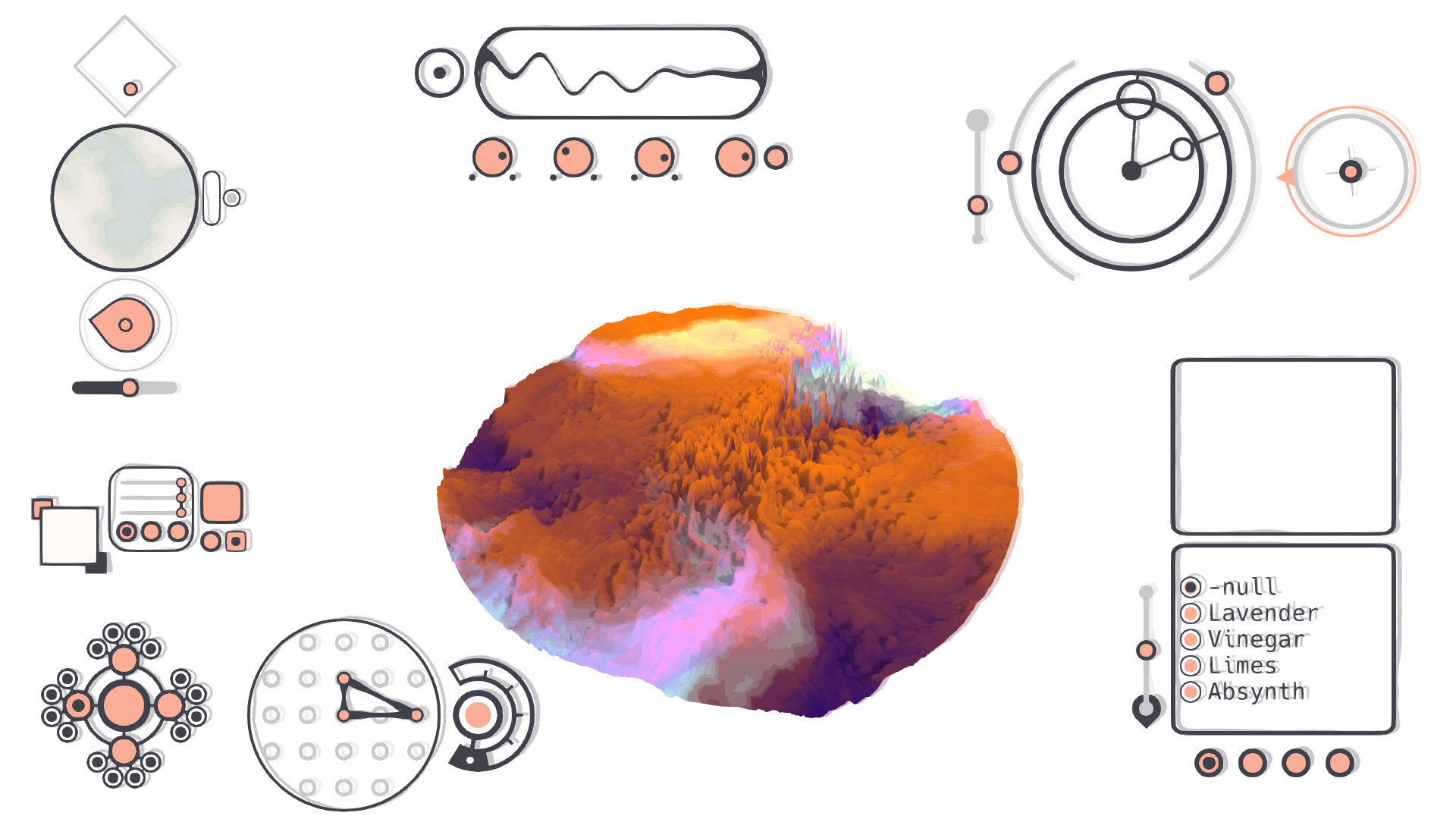
Mu Cartographer (currently on Steam and itch.io) is my latest discovery that proves games are weird creatures with flexible definitions. It’s a game about exploration—not just of a place, but also of a user interface. In fact, when you first open the game, it’s hard to know for sure if you’re even in a place, or if you’re just looking at a rippling, undulating mass of clouds. The user interface is mostly unlabelled, so you learn by doing.
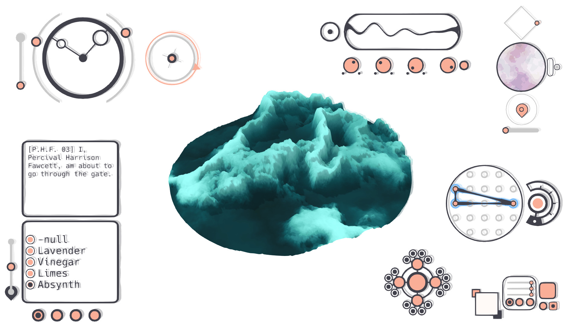
The way it teaches is actually pretty clever. There are very few words on the first screen you see, and so you are drawn to them. You press the buttons near them, and shifting blue lines encourage you to play with the next dial or knob or interface. The first action you complete is changing the map’s colours, and a new world opens up to you.
While this experimental approach is the game’s strength, the lack of immediate feedback in the game can also be frustrating. There was a point early on where I did what I thought I should do, but the game didn’t respond to me, so I assumed that I’d misunderstood. I ended up looking at a guide that showed me the interface with some simple labels; somebody more frustrated and less curious than I am might have quit at that point.
But I encourage you not to quit. The discovery of colours, items, and frequencies leads to the eventual discovery of beautiful locations, and they’re well worth it. You feel like an explorer in a new land, charting territory and being the first to tread in these new spaces. I was still figuring out tiny things about the interface and how it worked towards the end of the game. I literally found new things when I opened the game again to take screenshots for this article. Part of me wants to tell you what those discoveries were, but I won’t; you should go and make them for yourself.
Despite not being presented as a multiplayer game, Mu Cartographer works well in a collaborative environment. It’s a pleasant reminder that collaborative play is just as social as competitive multiplayer—or perhaps more so. Collaborative, teamwork-oriented boardgames are everywhere, but digital teamwork is often praised as an innovative mechanic (like when Brothers: A Tale of Two Sons was released). Mu Cartographer is not built for multiple players, but I played it with somebody else all the same, and we enjoyed passing the controls back and forth and celebrating our discoveries together.
Because of the way Mu Cartographer evolves into a game about traversing a landscape, you and your companion can become co-pilots, sharing the journey and the puzzles. There are directional puzzles that I particularly enjoyed, while my co-pilot preferred the frequency puzzles. We shared the blue symbol puzzles between us; she helped us zoom in on the items we found within each colour, and I took the controls again once we reached a location so I could capture the perfect screenshot. We shared confused discussion about how the interface worked, joy and excitement when discoveries were made, and a mixture of relief and disappointment when the game finally ended.
Sign up to the GamesRadar+ Newsletter
Weekly digests, tales from the communities you love, and more
Mu Cartographer is a game about the unexpected. It creates opportunities for collaboration, rather than competition, but is still incredibly engaging. It has no scoring system, but the satisfaction of discovery becomes the in-game achievement. It’s not built for multiple players, but it’s full of opportunities for social interaction. It’s an experience, with highs and lows, and a true sense of escapism, and it is evidence to me that we create the coolest things when we let go of arbitrary definitions of what games should be. Mu Cartographer shows us what games could be.
