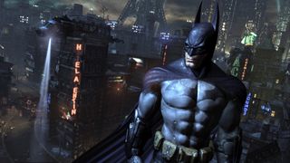
Batman: Arkham City
Latest about Batman: Arkham City

Ranking the best Batman games
By Jordan Oloman last updated
Feature We've taken the best Batman games and ranked them - how does your fave fare?

Mark Hamill explains why the Batman Arkham games allowed him to be "a whole new Joker"
By Alessandro Fillari published
News The most famous Joker has some high praise for Rocksteady's games
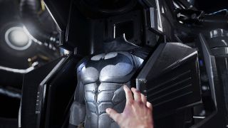
The best Batman games are coming to Switch this year
By Iain Harris published
News Who is ready to replay the Arkham games?
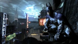
Kevin Conroy did not have fun recording the Batman: Arkham games
By Dustin Bailey published
News "What the f**k do they want me to say!?"

Batman Arkham Collection spotted for Switch
By Vikki Blake last updated
news And it looks set to release in August 2022
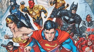
Best video game comics of all time
By Samantha Puc published
Feature Some of the most iconic video games have amazing comic book adaptations

Batman Arkham City Identity Theft side mission guide
By Matt Hughes published
Guide We show you the victims' locations in this ambiguous side quest
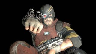
Batman Arkham City Shot in the Dark side mission guide
By Matt Hughes published
Guide We show you all of Deadshot’s crime scenes and victim locations
Sign up to the GamesRadar+ Newsletter
Weekly digests, tales from the communities you love, and more
