Ocarina of Time 3DS/N64 screenshot comparisons
Nintendo's upcoming re-release adds more than another dimension
Dodongo's Cavern
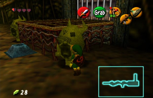
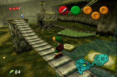
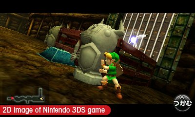
N64: A simple puzzle from the game's second dungeon - push this Armos statue on top of the switch
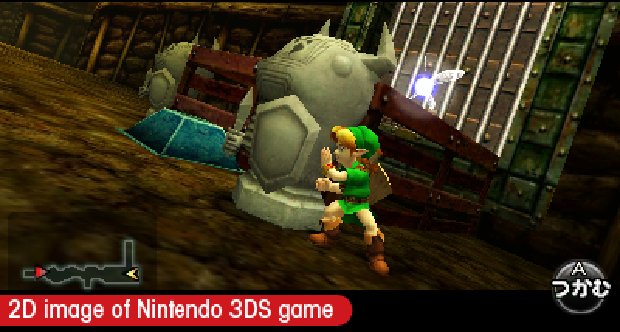
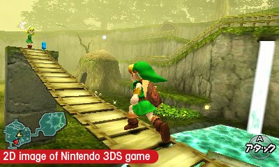
3DS: I don't think this angle exists on the N64 version, but Nintendo's 3DS shot still shows a more detailed Link and wooden platform. Thevisuals aren't as soft as the N64 game, but that's due to 1) Enlarging this image and 2) The N64's overactiveanti-aliasing
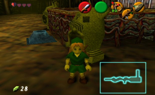
N64: Another angle, with a clearer shot of the platform in the back. The Armos statues look pretty similar
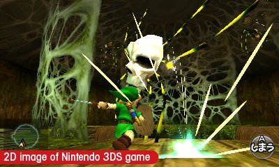
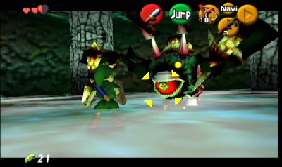
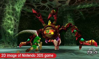
Dodongo

N64: The game's second boss, the "infernal dinosaur" first seen in the original Zelda. He's still pretty imposing, but that mouth is way too colorful and harsh to be convincing today

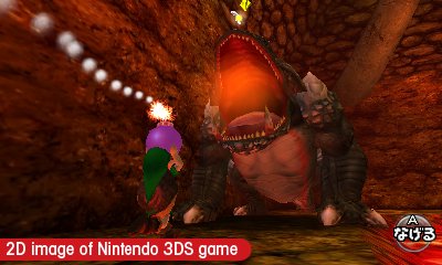
3DS: A cavernous mouth, defined chest muscles and feet and (best of all) a brand new tongue really show off the 3DS' improvements
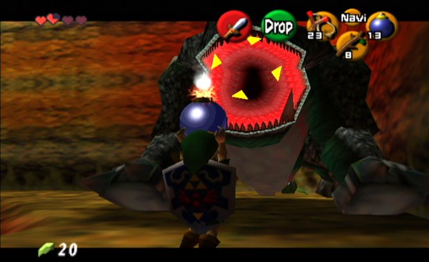
N64: A second shot of Dodongo, now with Link tossing a bomb into its gaping maw. Dodongo: disliking smoke since 1987
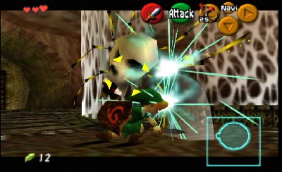
Shrunken N64 vs original size 3DS screens


What areyour thoughts on the changes? Is this level of alteration enough to make you buy Ocarina a second time, or isthis still not sufficiently remastered to justify $40? Similarly, should Nintendo have bothered cramming the huge-ass Ocarina on a handheld instead of creating a new Zelda tailored to the 3DS' specifications?
Sign up to the GamesRadar+ Newsletter
Weekly digests, tales from the communities you love, and more
January 28, 2010


Our updated impressions on the hottest new handheld

110 custom-made cards that perfectly capture the NES classic

Watch Nintendo's most intense rivalry shift and change with the ages
A fomer Executive Editor at GamesRadar, Brett also contributed content to many other Future gaming publications including Nintendo Power, PC Gamer and Official Xbox Magazine. Brett has worked at Capcom in several senior roles, is an experienced podcaster, and now works as a Senior Manager of Content Communications at PlayStation SIE.

