Sony has become the living embodiment of the phrase 'Good things will come to those that wait.' We are now no fewer than four weeks away from the release of the PS5 in North America, and a few of us were beginning to suspect that Sony would keep the PS5 UI as a launch day surprise. It didn't. Instead, Sony timed a reveal of the PS5's next-generation user experience to coincide with Microsoft's embargo lift on Xbox Series X hands-on previews – lets be needlessly diplomatic here and call that quite the coincidence. Quite the coincidence indeed.
PS5 pre-orders are already at capacity, and so the reveal of the user interface has been wielded deftly as a disruptive measure rather than a driving-force for day one sales. And it has certainly worked as intended. The PS5 UI is a complete overhaul of the PlayStation Dynamic Menu, the user experience so many of us have grown uncomfortably accustomed to since the PS4 launched in 2013. Unlike the Xbox One, which has undergone near-yearly dashboard and user interface revisions, the PS4 has remained largely static since launch for better or for worse. The PS5 UI is the last piece of the next generation puzzle Sony has been quietly assembling since 2019 and there is plenty in this picture to look at. So, you know, let's get into our PS5 UI impressions!
Introducing Control Center
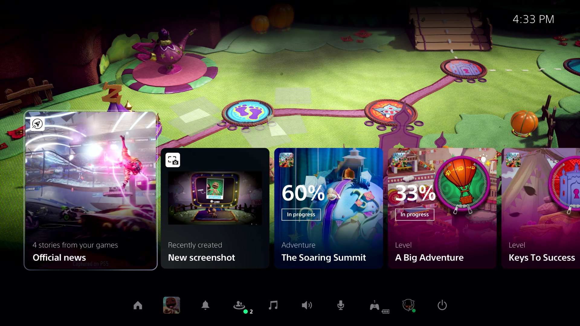
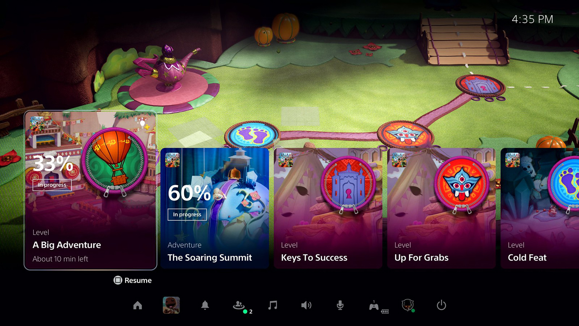
The most significant change to user experience design is the Control Center, a new feature for PS5 that provides immediate access to key PS5 system information from within a game. This can include recent notifications, which of your friends are online, the status of downloads, and the ability to manage console functions such as power, sound, and the microphone built into the controller. This is all presented as a clear overlay on whatever you are actively playing, activated by pressing the PlayStation button on the PS5 DualSense wireless controller. It's clean, intuitive, and (thanks to the PS5 SSD) incredibly fast.
It also appears to be a direct descendent of the Guide that Xbox owners have grown accustomed to since the Xbox 360. The PlayStation button has always been an underutilized piece of the DualShock 4's design; there's a transformative power in a single button that is able to wire you into a wider ecosystem without pulling you out of an experience, and the impact this will have on the PS5's useability is almost unquantifiable. Sony has given just a hint of the utility of Control Center, but in this first look we can see that it also encompasses everything from interactive party and voice chat notifications to the ability to quickly see what your friends are playing and join them in another game near instantaneously, thanks again to that SSD.
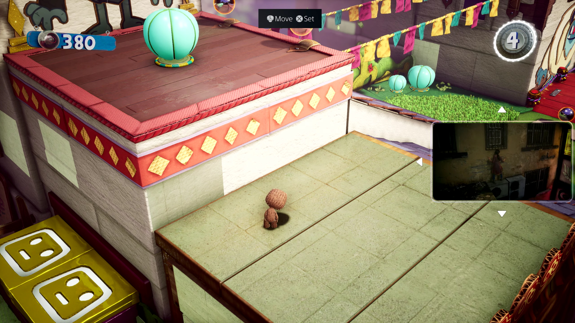
I'm somebody who has grown a little tired of the Xbox Guide over time, largely due to its somewhat sterile and analytical design. So I like that Sony has taken the kind of information, accessibility, and functionality contained within the Guide's People and Party tabs and brought it to life on PS5 in a way that is visually stimulating. There was another element to the PS5 UI that really caught my eye, and that was the ability to share your screen with other people in your party. This is an iteration of the PS4's Share Play feature, something that let you share your screen (and even the gameplay experience itself) with a friend, although network restrictions meant that few ever got to experience it. This functionality on PS5 seems stripped back, with the intent more focused on bringing friends into your play sessions without needing to broadcast yourself to the world over Twitch.
That, however, isn't what caught my eye about this feature. What really grabbed me is that it appears to realise a feature that Microsoft spent four years attempting to integrate with the Xbox One system architecture before ditching it entirely: Snap. The Snap feature was designed to let players snap the Guide into positions on the screen to run an app or watch television side-by-side around a game that you were playing, although it rarely worked as intended. Were I to hedge a guess, I'd have to imagine that has something to do with the console's limited spec. But now on PS5, thanks to the power of its custom processor and high-speed SSD, picture-in-picture appears to work perfectly. That isn't the only application for this new technology though, in fact this next one could change the way we play entirely.
A helping hand
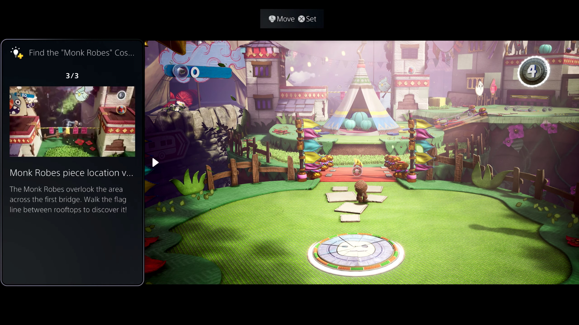
A new feature for PlayStation Plus subscribers will be the ability to pull up official Game Help from within the PS5 Control Center. With games that support the functionality, you'll be able to identify missed objectives and activities (some of which will no doubt be tied to Trophies) and call up a video guide to help you out – which can, of course, be snapped into place alongside the game itself so that you can view the video for reference. Interestingly, Sony isn't the first company to tease walkthrough functionality such as this. It was only last year that Google touted that Stadia games would be able to interact with Google Assistant, automatically search YouTube for relevant videos relating to where you are in a game, and then stream in the info at a touch of a button.
Sign up to the GamesRadar+ Newsletter
Weekly digests, tales from the communities you love, and more
Unsurprisingly, that functionality has not materialised nor did I really believe it would ever work. But it will work on PS5. It will work because Sony is handing the responsibility for making it work to developers rather than an algorithm. This does of course mean that not all games will make use of the functionality – so there is a distinct possibility that it could become as sparsely utilised as the DualShock 4's accelerometer and gyroscope. Creating new video assets, and wiring Activities cards that interlock with in-game objectives, levels and their secrets, will create more work for studios already feeling the pressure of building games for consoles demanding flawless play with 4K assets at 60 frames per second – which is to say, requiring more clarity, density, and attention to detail than ever before.
Still, it's all really promising. It's interesting. And more importantly, the PS5 UI feels next-gen to me, and in a way that the Xbox Series X's all-too-familiar user interface does not. Elsewhere, it's great to see the PS5 Control Center push key information such as Trophy progress straight in front of the player. It might not sound like much of an addition, but I can say from experience that having the ability to quickly pull up Achievement information in-game through the Guide on Xbox One, to see my progression and get a better sense of rarity, has completely changed my relationship with game completion and achievement hunting.
Into Activities
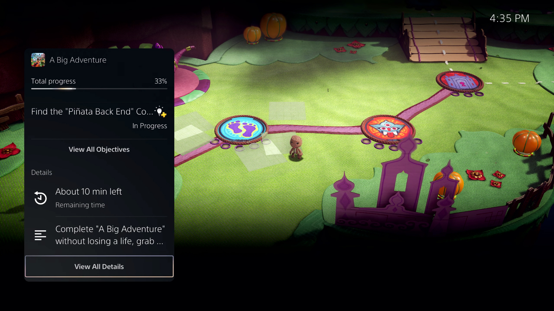
Which leads to perhaps my most favourite part of the PS5 UI design. Sony is introducing a new feature it calls Activities. These are presented as beautiful cards in the Control Center, and their appearance is context-sensitive depending on the game you are currently playing. These Activities cards are directly intertwined with in-game levels and objectives, all to give you a better sense of how far through a section you are, and, better still, what the estimated time for completion is. As somebody with a waning attention span, this is a feature I've always wanted but never knew to ask for.
Another fascinating idea presented here is that these Activities cards can even be tied to specific levels, meaning that you'd be able to quickly and effortlessly navigate through games from the Control Center Activity cards without having to mess around with in-game menus. Now, I can see how easily this functionality may work in something like Sackboy: A Big Adventure – an open-ended adventure game where you have multiple levels and objectives in play at any one time – but how it will translate to more linear and focused experiences, let alone giant open worlds, remains to be seen. I can't, for example, imagine this functionality letting me zip between undefeated Archstone bosses in Demon's Souls – no matter how close that completion bar is to ticking over to 100% for an area.
Overall, there's plenty to love in the PS5 UI and I've only really scratched the surface of it – for the full breakdown, you'll want to check out the PlayStation Blog. But even just focused on these specific elements, I like how iterative the PS5 UI looks, as if it is a smart evolution on the PlayStation Dynamic Menu and XrossMediaBar from past generations. Iterative too with respect to how Sony has clearly looked outside of its bubble and to the successes of its competition. It's about time Sony introduced an equivalent of the Guide for PlayStation, and I'm just happy that it has done so in such a convincing, impressive manner.

Josh West is the Editor-in-Chief of GamesRadar+. He has over 15 years experience in online and print journalism, and holds a BA (Hons) in Journalism and Feature Writing. Prior to starting his current position, Josh has served as GR+'s Features Editor and Deputy Editor of games™ magazine, and has freelanced for numerous publications including 3D Artist, Edge magazine, iCreate, Metal Hammer, Play, Retro Gamer, and SFX. Additionally, he has appeared on the BBC and ITV to provide expert comment, written for Scholastic books, edited a book for Hachette, and worked as the Assistant Producer of the Future Games Show. In his spare time, Josh likes to play bass guitar and video games. Years ago, he was in a few movies and TV shows that you've definitely seen but will never be able to spot him in.
