Rare struggles to regain relevance with new logo
The legendary developer rings in its 25th Anniversary with sterility!
Weekly digests, tales from the communities you love, and more
You are now subscribed
Your newsletter sign-up was successful
Want to add more newsletters?
Join the club
Get full access to premium articles, exclusive features and a growing list of member rewards.
You’ll have to pardon our nostalgic gripes today. Yes, Rareware is certainly no longer the digital powerhouse it once was. Many of Rare’s founders have parted ways with the company since their acquisition by Microsoft, so it’s not like the folks behind Donkey Kong Country, GoldenEye, and Cobra Triangle are still held aloft alongside today’s next-gen developers. That said, we’re not here to forecast darkness in the periphery of our rose-tinted glasses. Rare’s still got life left in it. Viva Piñata kicks ass, and the company is responsible for the adorable Xbox Live Avatars, currently the best custom character creator on any console.

Above: And so on...
To mark the company’s newly dedicated focus on Project Natal, as well as its 25th anniversary (of the name Rare, the developer actually began several years earlier under the name “Ashby Computers and Graphics Ltd.”) Rare is rebranding itself with the new set of logo variations you see above. Look, we understand that Rare may very well be better suited to making motion control games than creating more sequels to Banjo-Kazooie. If you’re going to compete directly with Nintendo, who better than the developer responsible for a giant percentage of its legacy… But why so damned boring, new logo?!

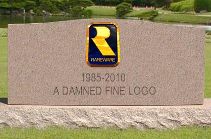
Standing at a quarter of a century, the Ol’ Gold and Blue shield was about as close as you can get to timeless. And what’s the point of waving around the classic pedigree if you’re going to delude it with a sterile design fad ripped from Apple?Or are we just being cranky old farts today?

Above: Us
Let us know what you think about Rare’s new look in the comments below.
Jun 2, 2010
Weekly digests, tales from the communities you love, and more


"Aquatic Ambiance" for that ass!

"Control Station" is almost as iconic as the Bond Theme

It's called "Simian Acres," NOT "Cotten Eye Joe"
 Join The Community


